Instead of design and art today I will be discussing a little cultural history. I finished up Teresa Riordan's Inventing Beauty: A History of the Innovations That Make Us Beautiful last night, (which, by the way, is a fun and easy read that I bet would appeal to a wider audience than just beauty addicts) and while I was reading I couldn't help but notice some inventions that seem novel now but actually have already been done many years ago. In a chapter on lipstick she discusses one introduced in the 1930s called "Tangee", (still in existence today) which was bright orange in the tube. Once applied on the lips it became a light reddish hue, depending on "how akaline the wearer's lips were." She notes that the company claimed the lipstick worked with the user's natural coloring to create a custom shade. This reminded me a lot of some relatively new products that have been touted for doing the same thing: Smashbox's O-Glow gel blush and O-Gloss, which, according to the company, work with your body's chemistry to create a custom color unique to you.
Riordan also talks about a series of lipsticks developed by the company Volupte. They were divided into two categories: Lady and Hussy. Lady was for the "girls who lean towards pale-lacquered nails, quiet smart clothes and tiny strands of pearls" while Hussy was for the "girl who loves exciting clothes, pins a strass pin as big as a saucer to her dress, and likes to be just a leetle bit shocking." Riordan further reports that Hussy outsold Lady 5 to 1. After reading this I think Poppy King, creator of Lipstick Queen, would definitely appreciate these names since her lipsticks are divided into two similarly-named types: Saint and Sinner.

(photos from lipstickqueen.com)
Sinner packs a whollop at 90% pigment, while Saint features a much lighter, softer wash of color at 10% pigment. "Sinning can be fun because it usually involves some indulgence in something taboo and delicious…It is positively naughty to get lipstick this opaque, rich and creamy with a matte yet silky finish." The description for Saint: "When I think of Saints I think of them as light, airy and floating above, beyond and around us…Absolutely no glitter (Saints are far too humble for such audacity)." The names refer not only to the lipsticks' texture but also point to the mood of the wearer. Someone feeling naughty may wear a bold color, while someone feeling sweet and saintly would wear a light, natural-looking shade.
In any case, it's interesting to take a look back and see the roots of the latest products and how they've been modified for our time.
(The Curator is very busy/tired…Couture Monday will return next week.)
A few weeks ago I posted about Shu Uemura's latest cleansing oil, the Advanced Formula, which came with an abstract design on the bottle. I didn't know when it would be hitting the U.S. and surmised that this wasn't an artist collaboration since there was no mention of an outside artist on the bottle or box. This morning though I received an e-mail from the company announcing the U.S. release of this oil and they revealed what that design is – it's calligraphy from Mr. Uemura himself! Here's my picture again:

Silly me, it should have dawned on me that it was calligraphy, and calligraphy from Shu himself – that's very fitting. But trained in Western art that I am, I thought it had more of an abstract expressionist feel to it. In any case, I'm happy to find out what it was!
In late 2007 Shu Uemura teamed up with Toy2R to sell Qee figures as a gift-with-purchase – buy a cleansing oil and get a free Qee! Each one is color-coordinated to a particular cleansing oil (the green is for the premium oil, pink for the fresh oil, orange for the enriched and yellow for the regular oil.)

But what exactly ARE Qees, you ask? They're usually small (2.5 inch) vinyl figures that can be displayed or put on key chains, taking the form of bears, dogs, cats, monkeys or bunnies. According to the Toy2R website, the company is "breaking down the boundaries between product design, art and graphics" and "instilling contemporary designer art into the vinyl toy market." Qees first debuted in 2001 and are sold in series based on a particular artist's design scheme. The company also deals with other businesses – Qees have been produced for Adidas, Benetton, Starbucks and Target.
The Shu Uemura Quees perfectly represent the oils in that they match the color to each one, and also the swirly pattern seen on all parts of the figure is reminiscent of how these somewhat viscous oils move and flow in their bottles. As with Shu's collaboration with Genius Party (which I posted about earlier), it's a puzzle as to why the company decided to use toys to promote their most iconic beauty product. Most cosmetic companies include a small makeup pouch and/or other beauty items, but Shu chose…designer toys. It's a strange but ingenious way to break the beauty industry mold.
Makeup artist Stéphane Marais launched his line of cosmetics in 2002. The collection featured bizarre designs on the packaging unlike anything I've ever seen in makeup. Naturally I had to get my hands on as much of it as possible!
Some of the eyeshadows:
Powder foundation and gel eye liners:
Stick concealer:
Brow gel:
Loose powder:
And a lipstick:
I'm not really sure what a dinosaur or phrases like "Groove flowers up to the sky. Ohh my god" and "Only for primates" have to do with makeup, but the designs truly were different than anything on the market. According to one source the images were an "ode to Marais's work in fashion shows for Jean Paul Gautier, and advertising campaigns for Dior, Calvin Klein and Givenchy." His original idea was to change the packaging every season, because "You have to keep your customer amused. The approach is very childish, rich — like a candy store.'' It's also a commentary on the fast-paced, ever-changing fashion world.1
Sadly the line was discontinued in 2005, but I'm forever hoping for something with comparable packaging.
1 "Cosmetics That Change with the Seasons," Ruth La Ferla, New York Times, June 1, 2004.
Graphic artist and creator of Tokidoki, Simone Legno, collaborated with Smashbox in the spring of 2007 and came up with a whimsical, playful collection for the company. All of the limited-edition items featured Tokidoki's signature illustrations as well as Italian names such as Bella (the cream blush stick), Stellina (the mirror outfitted with small silver stars) and Modella (one of the eye shadow palettes.) In this way it fuses Japanese and Italian cultures.
Here's the Modella eye shadow quad:
Here's the compact opened – a nice little surprise awaits on the lower-left corner of the mirror:
1 "Designs Reveal Artist's Personality", Nadine Kam, January 11, 2007. https://starbulletin.com/2007/01/11/features/story02.html. To watch an interview with Legno, click here.
Oops, they did it again! That is, Shu Uemura has released a new advanced formula cleansing oil, and in honor of its launch created a limited-edition, Asia-exclusive bottle. It’s not clear when the advanced formula will hit the States. But what’s bothering me more than that uncertainty is the fact that I don’t know if an artist collaborated on the bottle’s design.

It’s impossible to tell whether this is something the company has come up with or if an outside artist was brought in. (As mentioned earlier, Shu has a history of working with artists on designs for the cleansing oil bottles.) I’m guessing this is something the company did itself since there’s no mention of an artist on the bottle or box.
The abstract flourish is reminiscent of some of Franz Kline’s work, especially Chief (1950).
I think it’s fitting that Shu chose an abstract design for this product. The idea of a product having a new “advanced” formula is difficult to express visually, so a simple abstract brushstroke in silver works well in terms of signaling the release of a new and improved product.
I've decided that a couple days a week posts will have a certain theme. This blog could use just a tiny bit of structure! Therefore, Fridays will be devoted to retro/kitschy/just plain fun packaging. Mondays will feature makeup by the big fashion houses (Chanel, Dior, YSL, etc). The rest of the time I'll have a more freeform approach.
For the first installment of Friday Fun, I'm looking at some fall items from a few seasons ago: Benefit's Roadside Attractions palettes. Released in the fall of 2005, these kits feature either eye shadow or lip gloss and have retro images for the outer packaging, complete with cheeky phrases like "Exes Make Great Speed Bumps". The interior cleverly features a mirror in the shape of a rear-view car mirror.


(photo from benefitcosmetics.com)
These palettes definitely stay true to Benefit's mantra: "Who says makeup has to be serious to be good?" Indeed, the concept of a road trip and visiting places ("roadside attractions") along the way is fun, and the idea was perfectly executed in these palettes.
Lancôme has released its fall collection: “Inspired by the rich colors of India, from the raw earth
browns to the intensely vibrant reds, plums and oranges reminiscent of Indian
dyes, Maharani Jewels brings back artistry to Lancôme collections.” The star of the lineup is the Sun of India bronzing powder, a golden shimmery powder embossed with a rearing elephant wearing a brilliant red cover on its back.

With the pose and red saddle, it reminds me a tiny bit of this ca. 1812 painting by Théodore Géricault:
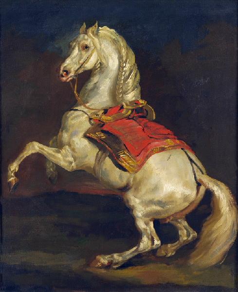
(image from commons.wikimedia.org; image is public domain within the U.S.)
Of course, 19th-century French Romanticism doesn’t have anything to do with a 21st-century bronzer, but I find it interesting that Lancôme chose to have the elephant standing on two legs rather than four, since the placement and stance of the elephant doesn’t affect the application of the product. In any case, I’m thoroughly enjoying the sumptuousness and richness of the colors as well as the detailing surrounding the elephant. Hopefully Lancôme will delve more fully into elaborate palette designs.
In the past, Japanese makeup company Shu Uemura collaborated with artists John Tremblay and Ai Yamaguchi to create limited-edition packaging for the company's best-selling cleansing oils. Shu is continuing their tradition of interesting skincare packaging with a Japan-exclusive release in honor of the 25th birthday of their flagship boutique, a collaboration with the producers of the anime anthology Genius Party.
Genius Party was released in July 2007 and consists of 7 short anime films. The bird-man and smiling egg-like characters on the bottle are taken from the opening film and namesake of the anthology, which was directed by Atsuko Fukushima.
This character is from the 3rd movie in the anthology, titled "Deathtic 4" and directed by Shinji Kimura.

Unfortunately I can't seem to find a link to watch the films, but I did come across a very thoughtful and interesting analysis of the first segment as well as a review of the entire series.
I'm glad Shu continued working with visual artists to create unique packaging. I'm always curious to know the motivations behind the artist selection, besides the obvious goal of creating designs meant to sell products on a wide scale. The Genius Party cleansing oil, however, possibly represents a departure from this. Fukushima had this to say about the anthology: "The Genius Party project is completely the opposite of the kind of approach where you first assume to target a certain audience, and then create the content to match."1 Thus, Genius Party wasn't meant to appeal to anyone in particular. This begs the question of how these artists ended up working with with a cosmetics company whose primary interest in the partnership was to sell a skincare product.
There is no tie-in to the product itself or any kind of central theme, as there was with the Tremblay and Yamaguchi designs. Those two artists were commissioned to create illustrations specifically for the cleansing oil, while the Genius Party images were seemingly slapped on rather than being linked in some fashion. What's more, the opening piece supposedly explores the vague theme of the "birth of images"2, and the third segment involves a boy rescuing a frog from something called the "Life-Form Disposal Squad". Neither of these have anything to do with selling a product, so it's unclear as to why the characters from these particular films were chosen. My conclusion is that Shu simply wanted a unique-looking bottle intended for collectors and fans of the premium cleansing oil alike, and decided to work with artists who are on the cutting edge of anime.
1 This quote was taken from an article by Roland Kelts, accessed at https://japanamerica.blogspot.com/2008/04/anime-and-studio-4c.html.
2 "Einsteins of Anime," The Japan Times Online, June 28, 2007. https://search.japantimes.co.jp/cgi-bin/ff20070628r1.html
3 Author's note: The majority of online information on Genius Party and the Shu bottle is in Japanese, which unfortunately I'm unable to read, and the automated English translations were more or less useless. If I were able to get all of the information I came across in English this post may have been a bit more insightful.
I'm pleased to announce the birth of the Makeup Museum's web presence! The Museum is dedicated to a broad range of cosmetic items, from couture false eyelashes and palettes illustrated with retro images to vintage compacts. Most people appreciate the art in cosmetic application, but rarely do people see that the objects alone can be considered art and history in and of themselves. In addition to celebrating makeup items as art objects, this blog will also feature posts with a more academic focus, weaving cosmetics with art history, cultural studies and feminist theory, to name a few. I'm striving for an intellectual perspective on the cosmetics industry and its role in U.S. culture as well as the cosmetics themselves.
In a few months there will be an actual website up and running, but for now a blog will have to suffice.
Enjoy!


