I’m pleased to see that the topic of beauty is slowly becoming a legitimate field of study. It hasn’t been looked at as critically or academically yet the way fashion has, but we’re getting there. Recently I came across several things that I found to be very encouraging.
Musingonbeauty posted about this book. While I’m a bit chagrined someone else came out with a coffee table book on makeup, I’m not completely beat down – there’s plenty of room for more makeup books!
Then I read in the June issue of Lucky magazine that there’s an exhibition called Beauty Culture that’s going on at the Annenberg Space for Photography. The exhibition “examines both traditional and unconventional definitions of beauty, challenging stereotypes of gender, race and age. It explores the links between beauty and violence, glamour and sexuality and the cost (in its multiple meanings) of beauty” and “encourages a social discussion about the allure and mystique of the pursuit of female beauty, as well as its cult-like glorification and the multi-billion dollar industries that surround it.” A little different than what I’m trying to do, but it’s exciting to see a dialogue being started about the impact of the beauty industry.
Finally, I stumbled on the coolest blog on vintage compacts while researching an inquiry I received. It is so incredibly detailed and gives a thorough history of early cosmetic companies, many of which don’t exist anymore.
So, yay! It’s nice to see that makeup is finally being recognized as something more than to paint your face with – there truly is history and art involved, which is one of the things I strive to point out through the Museum.
I must say I liked this summer's theme for Paul & Joe. I felt like it totally captured a peaceful, relaxing time at some gorgeous beach I've never been to but am dreaming of. "Paul & Joe invite you to discover L'HORIZON BLEU – a tropical and romantic place where the sea meets the sky and blur into one. You can drift off into the horizon on a tranquil sea of blue or be brave to plunge into the depth of color and tropical delights you never dream existed beneath the surface of Paul & Joe Beaute. This summer dive into the bleu, L'HORIZON BLEU from Paul & Joe Beaute."
Normally I'd think blue plastic packaging was tacky, but I really liked it in conjunction with the fish design and the warm tones of the bronzer:

With flash:


The fish are so cool – they remind me of some kind of elegant fountain you'd find in Rome or Florence, like this.
I also got the whale blotting sheets but was too lazy to take a pic. Oops. They will make an appearance in the MM's summer exhibition, however. 🙂
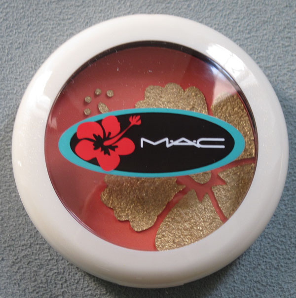
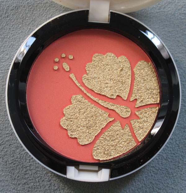
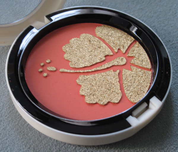
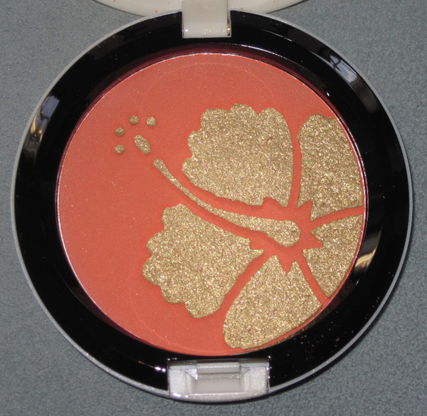
Surf’s up! Overall I liked the design for this collection, especially the yellow and grey stripes with a pop of hot pink. (Okay, I love anything yellow and grey, but I do really think it was spot-on for this.) I also liked the white casing – such a refreshing change from MAC’s usual black. The must-have from the collection was My Paradise blush, if only because it has a pretty shimmery hibiscus on it:


With flash:

I have never gone surfing nor will I ever, but if I did, I’d definitely pack this in my makeup bag. (Yes, I would wear makeup to go surfing!)
I don't really have much to say about this, except that I don't think there's anything more perfect for summer palettes than slapping on shimmery sea creatures. This starfish is especially pretty.


With flash:

I think I might prefer the starfish on MAC's Marine Life palette from last year, or Chantecaille's Protected Paradise palettes, but this is quite lovely in its simplicity.
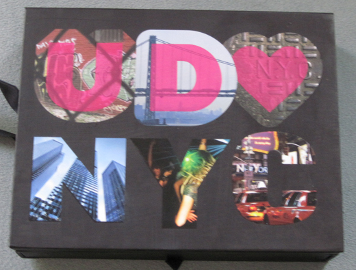
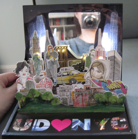
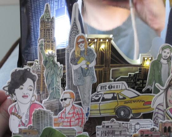
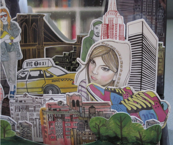
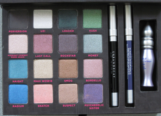
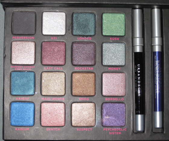
Urban Decay released its third Book of Shadows, this time devoted to New York City. Like the Alice in Wonderland palette, it's a pop-up, but it also lights up.


Details:


Here are the shadows:

With flash:

Overall I think the artwork and lights captured the hustle and bustle, not to mention the hipness and sophistication of the Big Apple, but I wish the company released more details as to who made the illustrations, and why they decided to do a palette dedicated to NYC now.
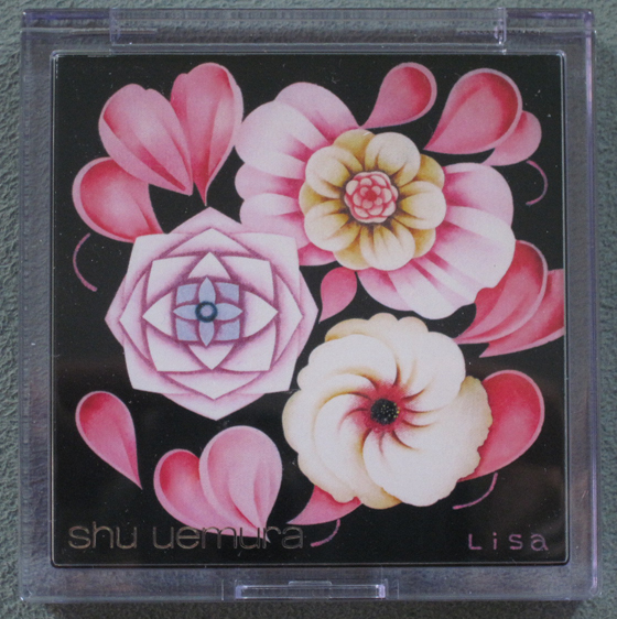
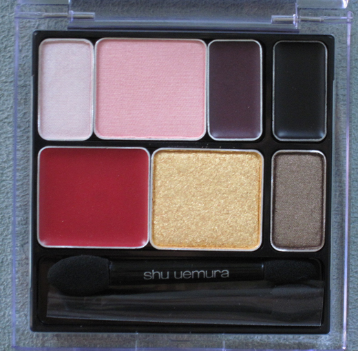
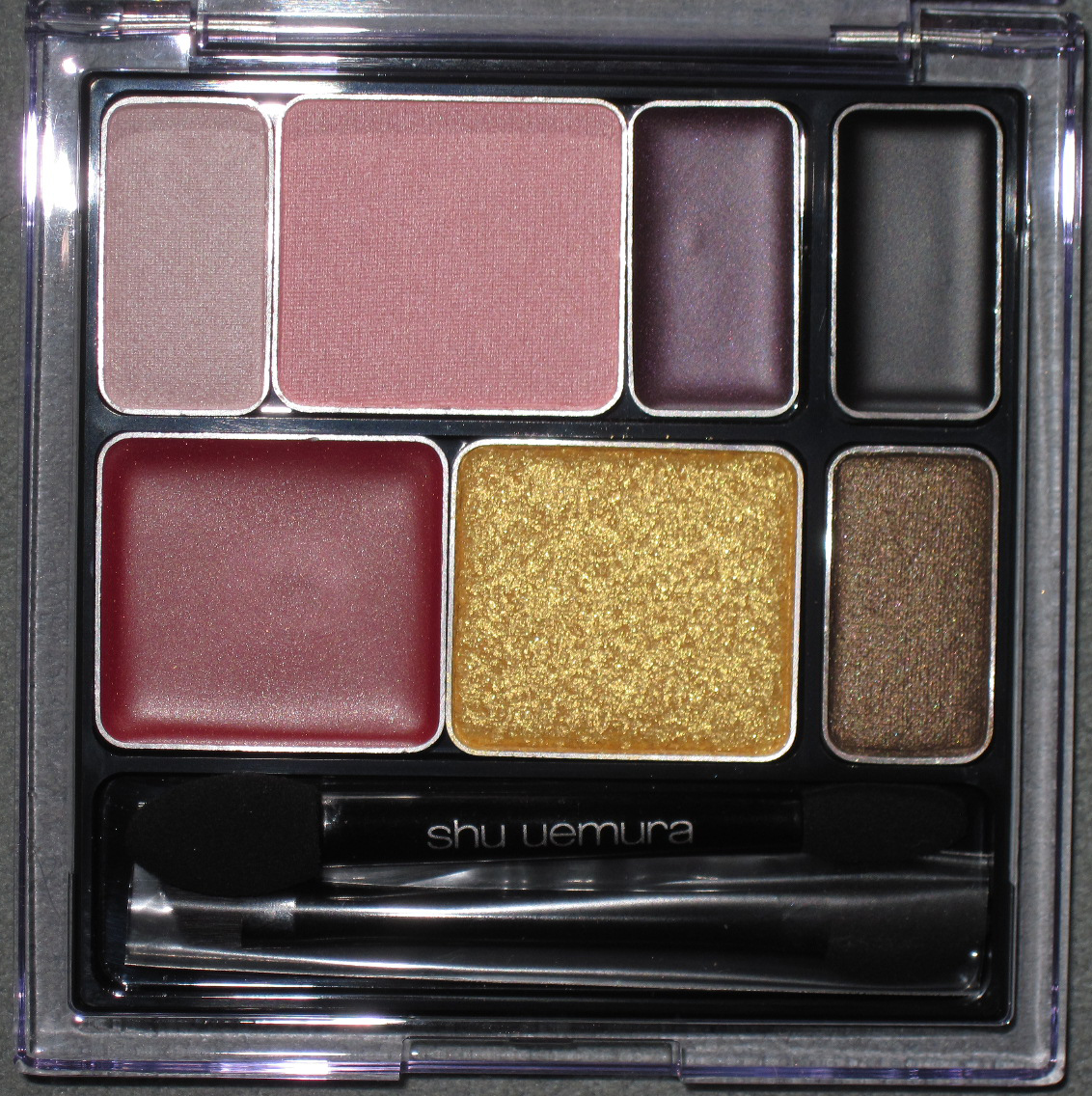
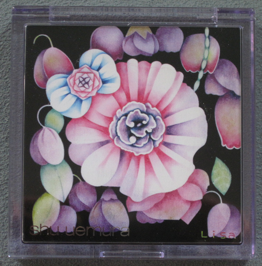
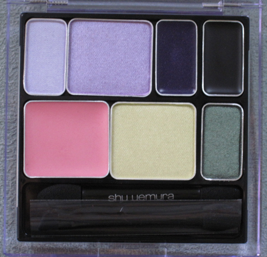
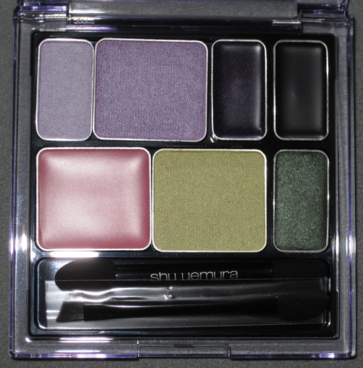
Shu's holiday collection is already up at their website, but I still wanted to present their fall collection. I must say this is an odd choice for fall – light pastel flowers screams spring to me rather than fall. While the makeup colors themselves are more fall-like, I'm still confused by the springy packaging. Here's what the website had to say: "Deeply colored petals of the flower symbolize eternal elegance, gracefulness and tenderness; the intrinsic beauty of a woman. soft and velvety texture of petals is gentle and beloved, like a warm embrace. when the flower fully blooms and matures, deep and rich colors and texture set peak elegance and incarnates in her face as everlasting femininity…" Sounds like the copy editor was really grasping at straws here.
Anyway, here is the Dreamy Petal palette.

The inside:

With flash:

The Graceful Bloom palette:

Inside:

With flash:

Overall, not one of Shu's most inspired collections. There was no info on who did the design, or why each palette says "Lisa" in the bottom right hand corner (so odd!) But the company will redeem itself with its holiday collection, since it's another artist collaboration as it's been for the past few holiday releases. 🙂
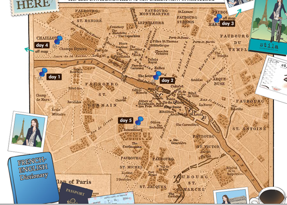
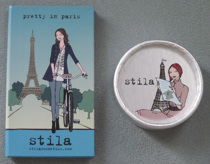
In honor of my recent trip to Paree, I thought I'd post about Stila's 2nd travel palette in their 5-part series. I really loved the journal by Stila girl "Chelsea". She talks about the rose-flavored macarons at Ladurée (they seriously became like my crack in Paris – I came back to Ladurée twice to get more after my initial visit!) and the Cafe Marly at the Louvre, where we enjoyed a beautiful view of the glass pyramid on our last night in Paris.

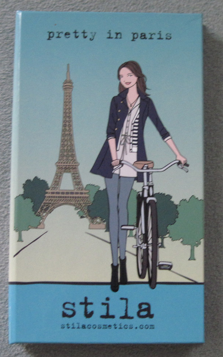
Now on to the palette itself. Here's the outside (forgive the blurriness, for the life of me I couldn't get a good clear picture!) I love that she's wearing a striped top – they were everywhere in Paris. If she had a little neutral-colored scarf tied loosely around her neck she'd look just like all the chic Parisian women I saw!

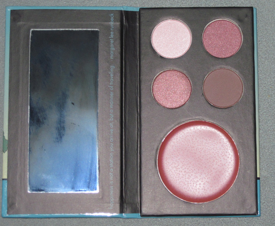
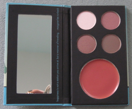
The inside, with and without flash:


The quote:

In looking at this palette I remembered Stila did another travel series ages ago, in trio form. Here's Pretty in Paris next to Passage to Paris:

In terms of Paris represented or hinted at in makeup packaging, I think Nathalie Lété's work for Bourjois is still my favorite, but this palette is adorable too. Next destination for Stila: Tokyo!
Woohoo! During the hiatus my business cards got finished. They're pretty sweet.

A big thanks to Typecast Press for making these!
The other day I was noticing how worn down my Stila Wheat eye shadow is and reminiscing about when I bought it. Then it dawned on me that it was the 10-year anniversary of my very Stila first eye shadow and Stila girl package! In October of 1999 I was a poor college student and my mother generously offered me to take me to the mall to buy me a treat. As I was perusing the makeup counters in Nordstrom (remember when Stila was still sold at Nordstrom?) this lovely little palette caught my eye:

I remember thinking that I had never seen a palette so adorable in my entire life! There she was, a brunette (like me!) putting on her makeup at her vanity. The palette is sold empty so I got 4 eye shadows to fill it: Wheat (still a staple for me to this day – its beigy-gold goodness goes with everything) Golightly (which, back then was known as Holly Golightly before copyright issues got in the way of Stila's eye shadow names) Chinois, which I was told to use as an eye shadow base (remember, this is 1999, long before real eye shadow primers had become mainstream essentials) and Espresso (Stila had yet to come out with real eye liners, so I was told to line my eyes with this deep brown shade using a thin, damp eye shadow brush.) As I started using and loving these shadows, I remember thinking that although the quality was superb, the best part about them was the palette they were housed in. And thus the obsession with the Stila girls started. No end in sight, of course. ;) I often wonder if I ever would have taken an interest in makeup packaging had it not been for the Stila girls.
So, happy birthday to my very first Stila palette! (Looking at the picture more closely, you can really tell how well-worn and therefore, well-loved, it truly is.)
Chantecaille came out with these lovely palettes last year. Five percent of proceeds went to the Pew Fellowship in Marine Conservation. The intricate fish are gorgeous, but I think the tiny seahorse on the right is my favorite part.
And the face powder:
Next to Chantecaille's butterfly eyeshadows, these are easily the most detailed of the compacts the company has come out with. While I'm still not tired of summer, especially after enduring the coldest winter my city had in almost 30 years, I'm hoping Chantecaille will come out with something equally gorgeous this fall.


