Clarins released a pretty interesting palette for fall. At first glance it reminded me of either pixels or a paused game of Tetris, ha.


With flash:


But then I was brushing up on my op art for MAC’s upcoming Art of Powder collection and stumbled across an artist named Francois Morellet. This work (Bleu Violet, 1973) jumped out at me right away. While it’s a work on paper and therefore not in 3D (meaning the little squares are flat and not sticking out as in the palette), the seemingly random scattering of different colored squares is really close to the Clarins piece. What really made my head almost explode though, is Morellet’s work from 1960, Random Distribution of 40,00 Squares using the Odd and Even Numbers of a Telephone Directory. Morellet explains, “The catalyst for the idea of the painting Random Distribution of 40,000 Squares using the odd and Even Numbers of a Telephone Directory (1960) came about after a conversation with Ellsworth Kelly, who at the time was living in France. He had recently visited Jean Arp’s studio and talked about one of Arp and Sophie Taeuber’s joint collages, Squares Arranged to the Laws of Chance, made in 1917…With Random Distribution, the purpose of my system was to cause a reaction between two colours of equal intensity. I drew horizontal and vertical lines to make 40,000 squares. Then my wife or my sons would read out the numbers from the phone book (except the first repetitive digits), and I would mark each square for an even number while leaving the odd ones blank. The crossed squares were painted blue and the blank ones red. For the 1963 Paris Biennale I made a 3-D version of it that was shown among the Groupe de Recherche d’Art Visuel installations (and re-created it again on different occasions). I wanted to create a dazzling fight between two colours that shared the same luminosity. This balance of colour intensity was hard to adjust because daylight enhances the blue and artificial light boosts the red. I wanted the visitors to have a disturbing experience when they walked into this room – to almost hurt their eyes with the pulsating, flickering balance of two colours. I like that kind of aggression.”
Now, the Clarins palette obviously isn’t influenced by this work or anything in particular, but since discovering this artist, I do like pretending the palette is a mini version of a Morellet (with soft pink colors instead of the strong red and blue that formed a “dazzling fight”). Another little piece of art. 🙂
I have to admit that Estee Lauder doesn't normally grab me (starfish bronzer aside), but this piece from their fall collection piqued my interest. According to this video, Creative Director Tom Pecheux wanted to create something "modern" and "urban", to reflect the "many faces of the city". Additionally, in an interview Pecheux says this about the overall concept: "I was inspired by modern architecture, modern buildings and all the phenomenal reflections you see on glass buildings that show the skyline. Whether it’s a blue sky, a snowstorm or a beautiful sunrise or sunset, it’s never the same skyline colors you normally see because of the unique way the light is reflected off the glass. With Modern Mercury, you can be wearing the same colors, but you will never end up with the exact same look." This theme is definitely present in the Illuminating Powder Gelee in that you can create a lot of different looks with it, since it can be used as a highlighter or eye shadow, but I'm not really seeing it so much in the actual design. I guess the wavy pattern is reminiscent of ligh reflecting off of buildings, but it looks more like a weird op-art painting to me.

(image from esteelauder.com)
Thus, I'm still on the fence as to whether the design is interesting enough to be in the Museum's collection. What do you think?
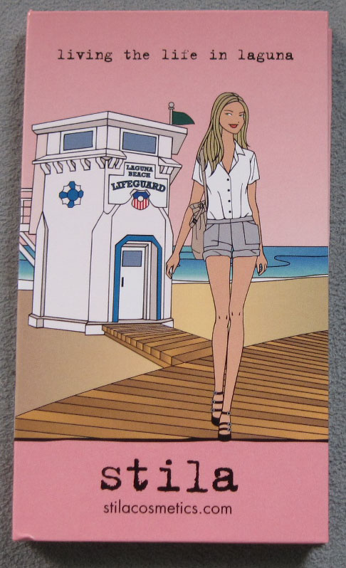
Summer is coming to a close (sniff!) and so is the second Stila travel palette series. As I've said before, overall I was disappointed in the concept for these, but that wasn't enough to prevent me from buying them, as I can't resist Stila girls! It's my dream to have an entire wing of the Museum devoted to them…an entire army marching all over the walls.
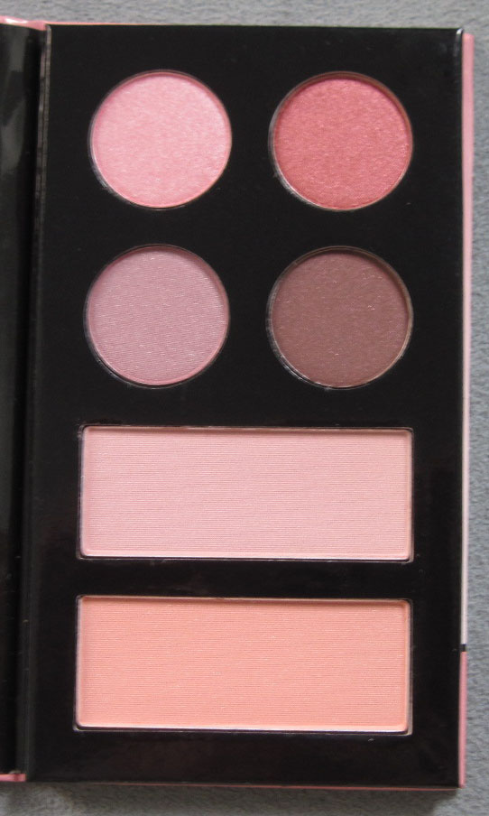
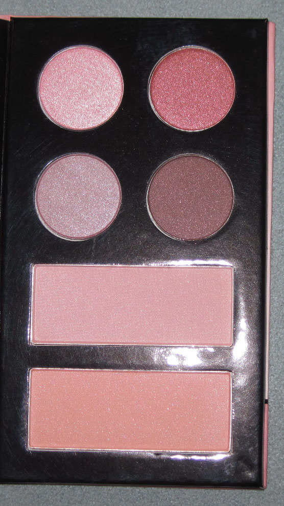
Anyway, the last palette in the series is Living the Life in Laguna.


With flash:

Quote:

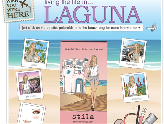
Here's a screenshot of the "polaroids" used to give more information:

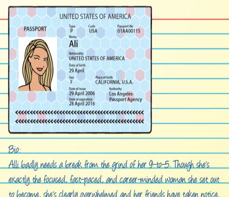
And the bio of "Ali", who I don't think appeared in any of the other palettes.

Poor Ali. Seems like a trip to the beach would be just what the doctor ordered. According to the poloroids, she hit up several beaches and a day spa; however, did anyone else notice that the "Attractions" one and the "Shopping" one are exactly the same? Why not just have one picture with both? Sigh. Oh Stila, you kinda blew it with these palettes! Please give me a job and I will take care of coming up with compelling themes and copy for the Stila girls. They're too cute not to give them their due diligence!
Since I want to end on a positive note, I will say that I adore the lifeguard house and boardwalk, especially since those images weren't pictured in any of the other beach palettes. I'll take a beach without a boardwalk any day of the week, but some of my fondest childhood memories are of strolling along the boardwalk with my family on our summer vacations down the shore. So that almost makes up for the lackluster concept. Almost. 🙂
 Greetings. It was a fairly quiet week so I was able to put some posts together…it's always fits and starts here! Here are some things that caught my eye this week.
– Aren't these paper eyelashes neat?
– I found this amazing blog, The Beheld, which focuses on the bigger concepts of beauty and the industry in general. This is not to say that I will no longer be putting up any similarly-themed posts, as one of the goals of the Museum is to present a more thoughtful and academic view of makeup, but I do I feel as though mine won't be nearly as insightful as those of the author! It's great to see a blog fully devoted to these issues.
– Jersey Shore is back! Woot! Can't wait to see what havoc the guidos and guidettes wreak in Florence, although I am a bit jealous they got to go.
– On the local/90s nostalgia front, the radio station I listened to all the time in college is back on the air! I almost fell over when I saw a commercial for HFS and just about died when I actually tuned in to listen…all my 90s faves were back!
– Finally, I am attending a mojito-themed bridal shower today and I was so thrilled to bring some goodies with me! I made mint chocolate brownies with peppermint patties, super minty ice cream (the secret to making it super minty instead of mildly minty is to add 2 tsp. of mint extract to the custard in addition to infusing the milk and cream with mint leaves!), lime sea salt chocolate chunk cookies (first time making these and they were delish – tangy and sweet and slightly salty all at once) and mojito cupcakes. I even got a Cupcake Courier to transport them all. After all that baking I was too exhausted to take pics, but I did manage to get pictures of the 2-sided cupcake flags my husband made:

Cute, eh? I do hope I get invited to more parties just so I can bring desserts! Better yet, it would be great if I could plan an entire thing. Maybe for fall I'll have a gathering of some kind. 🙂
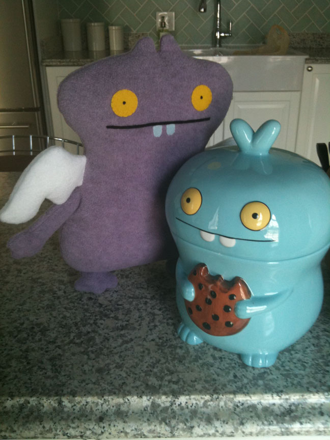
The Makeup Museum is pleased to welcome its newest staff member, Cookie Dream Babo! As you can see, within minutes of arriving he found his way to the cookie jar:

Here's his official story: "When Babo sleeps he dreams of cookies, but when he wakes up he has even bigger dreams. What are your dreams? See that building over there? See that car? That road? That all came from an idea in someone's mind. So when someone tells you it's all in your head, smile as wide as Babo does, because you're on your way. Babo may be a dreamer, but he knows the dreams become real through action. So now it's time to wake up and eat the cookie."
And as my husband predicted, he is indeed two-sided. Cookie Dream Babo will be serving as Education Specialist, when he's not asleep. I originally was going to have him work as a docent, but he kept nodding off during the practice tours (I think he might be slightly narcoleptic) so I had to move him to education. Hopefully he will dream up cool educational programs and events in addition to delicious cookies. 🙂
Whoops, I managed to make it through the entire month of July without posting. It's summer time and the livin's easy though, right? Anyway, I'm going to try to gather up the last few summer items before my acquisitions for fall begin, so today will focus on Lancôme's summer bronzer.
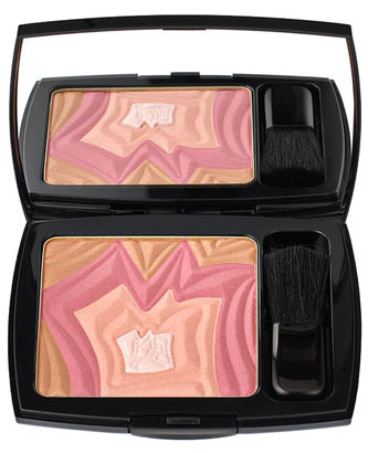
I'm not really sure what this was supposed to be. Obviously a riff on Lancôme's trademark rose, but how exactly is it a "desert" rose? Maybe the spiky-ness is reminiscent of a cactus? The pink and peach hues look like a desert sunset?

(image from nordstrom.com)
Meh. I'm not all that impressed with the design – it could have looked, well, more desert-like, like Armani's Sienna Minerals bronzer from a few summers ago. Oh well. I've got an idea of what Lancôme has up their sleeve for fall and I'm not disappointed!

Stila's 4th installment in their 2011 summery travel series features Stila girl "Zoe" (who previously appeared on the Tokyo palette) jetting off to South Beach. Loving the romper and roller-skate combo!
Here's the inside of the palette, for those of you who will actually be using it:

With flash:

Quote (like the past few travel palette quotes, this one is awfully uninspired. It makes me sad since there is no shortage of great attributable quotes out there!)

Here's a partial screenshot of the South Beach palette info page.

Zoe's bio:

(images from stilacosmetics.com)
Err, did anyone proof this? Is it "Zoe" or "Zoey"? And if they really wanted to be "forward-thinking", they should have used "apps" rather spelling out "applications". Stila, please let me write your ad copy!
Anyway, as with most of the other palettes in this series I'm not crazy about the info included in the clickable Polaroids – it just sounds like the writer looked up the most popular tourist traps and stuck them up there. I feel like with the other travel palettes from last year (especially the Paris one), they were a little more thoughtful and not so hackneyed. Oh well. I can usually overlook these shortcomings given my well-documented adoration of Stila girls. 🙂
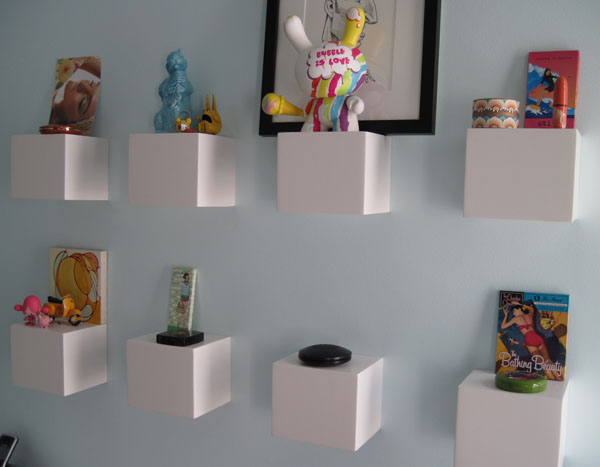
Welcome to the Museum's summer 2011 exhibition! And happy solstice. 🙂
Here's one of the auxiliary exhibits:


Auxiliary exhibit No. 2:


And here's the main exhibit:


Hope everyone is having a lovely summer and enjoying the longer days!
No posts for this week and no Curator’s Corner today, but I’m pleased to announce that Ada Calhoun, one of the authors behind the awesome 90swoman.com blog, asked me to write a piece on 90s womanhood!! I was so honored. Naturally my thoughts went to makeup and 90s beauty trends. And also naturally, I was extremely long-winded so the piece was edited ever so slightly so as not to bore readers. However, I have no issue with boring my own readers (all 2 of them, ha), so here it is in its entirety. Enjoy! And do check out 90swoman.com, even if you’re not of that generation – it’s truly a fascinating look at the era. 🙂 Thanks again, Ada!
Matte brown lipstick. Heroin chic. White eye shadow. The grunge look. These were the major beauty trends of the 90s. And they’ve been earning the attention of the fashion and beauty world in the past year or so. In January 2010 Selfridges staged an in-store exhibition devoted to the 90s, complete with a vintage M.A.C. Cosmetics face chart showcasing their (at the time) wildly popular brown lip liner named, appropriately enough, Twig. Fashion and beauty bloggers have also been covering the revival of the decade’s trends. “Messy plaids, patchwork and the overall look of 90’s grunge is back for Fall 2010, and we aren’t just talking about the fashion. The beauty industry is taking its cue from the Courtney Love days of dark, red lipstick paired with overdone, smoky eye make-up…A disheveled plaid tee layered under a floral dress and dirty boots are the perfect balance with a dramatic ‘I don’t care’ make-up look,” wrote Jessica Ciarla at The Fashion Spot. Last summer beauty blog Lovelyish provided a nostalgic look at 90s makeup trends. This year, fashion blog Refinery29 reports that the “sleeper hit” of summer 2011 is 90s grunge lip color: “Even though summer is currently awash in happy, vivid corals and pinks, there’s another lip trend we’ve been tracking, too: A modern version of grunge-inspired lips. Mixing deep magenta-red with a little shimmer, they’re like the love child of a ’90s era Drew Barrymore and Married with Children‘s Kelly Bundy… pair your tribute-to-the-nineties lip with extra dark brows and matte skin. So angst-y!” Finally, retailer Urban Outfitters named Cher from 1995’s Clueless their latest beauty icon.
Fashion trends, and by extension, beauty trends, are cyclical – usually about 20 years after the initial phenomenon began, it becomes in vogue once again and is slightly updated. So it’s not surprising that the 90s are making a comeback now.
But the point I want to make isn’t that the 90s are back fashion and makeup-wise. Rather, I want to take a look at the transformation the beauty industry underwent in the 90s as a direct response to the new notions women had about makeup. In 1995, the L.A. Times quoted a beauty newsletter editor as saying, “The creativity the department stores had 10 years ago doesn’t exist today…the top five brands control 75% of the makeup business.” Something had to give to meet the beauty needs of the 90s woman, and it did.
Between the influence of “lipstick feminism”*, Naomi Wolf’s The Beauty Myth, Riot Grrrl (and “girl power”, its co-opted, commercialized, mainstream offshoot made popular by the Spice Girls), and the smeared red lipstick of grunge poster child Courtney Love, more and more 90s women began wearing makeup not with the simplistic goal of looking pretty, but rather as a means of self-expression and empowerment. They also didn’t want to feel as though they were being brainwashed by cosmetic companies telling them that they wouldn’t be beautiful without makeup – wearing it had to be their decision alone, and they would wear it (or not) on their own terms. This outlook represented a huge shift in thinking about cosmetics, and beauty and business gurus pounced on it.
In 1994 makeup artist Jeannine Lobell created a makeup line called Stila. The name coming from the Italian word “stilare”, which means “to pen”, Lobell believed every woman’s makeup should be as unique as her signature. The cardboard containers (this environmentally-friendly packaging was a breakthrough at the time) also displayed quotes from famous women that could be seen as empowering: Elizabeth Cady Stanton’s “The best protection any woman can have is courage,” and “Failure is impossible” by Susan B. Anthony are just a few of the quotes that made an appearance on Stila’s eye shadows. These marketing strategies encouraged the idea that women could let their individuality shine through their makeup, and that it could even make them feel powerful.
1995 and 1996 saw the introduction of “alternative” makeup lines Hard Candy and Urban Decay, respectively. Both got their start by introducing non-traditional nail polish colors that the founders first mixed themselves – Sky, a pastel blue, in the case of Hard Candy, and a purple color from Urban Decay. And both were revolutionizing the beauty industry and filling in the gaps left by mainstream cosmetic companies by offering non-traditional hues. From the Urban Decay website: “Heaven forbid you wanted purple or green nails, because you’d either have to whip out a marker, or risk life and limb with that back alley drugstore junk…The first magazine ad [for Urban Decay] queried ‘Does Pink Make You Puke?,’ fueling the revolution as cosmetics industry executives scrambled to keep up.”
A 1998 New York Times profile of Hard Candy founder Dineh Mohajer, states that she was a leader in providing the modern teenage girl with the daring makeup she wanted to use to express herself. “Ms. Mohajer’s timing couldn’t have been better: young women were ready for hard-edged, ‘ugly’ colors, which were a departure from the powdery, harmless pinks that once accompanied every American girl’s journey to womanhood. Suddenly, blue lips, blue hair and blue fingernails became a statement about independence — even if independence might make you look as if you were suffering from frostbite.” Still, in the article Mohajer insists that ”I didn’t make that first batch of blue nail polish so I could stand up to men or be outrageous…or so I could make some sort of stand for women.” She continues: “[what] it’s really about is self-esteem, women being able to do whatever they want and look stylish and attractive and cute at the same time.” Mohajer, who was all of 22 when she founded Hard Candy, clearly represented the new way in which women were viewing makeup.
The decade culminated in the 1999 release of celebrity makeup artist Kevyn Aucoin’s iconic book Making Faces. The book offered details of makeovers performed on “real” women, and provided step-by-step instructions to create a myriad of looks. Women could essentially try on personalities like “The Diva” or “The Siren” through makeup. Aucoin writes in the introduction, “…it is my hope that you will find yourself, or rather, your selves inside.” His book was illustrative of the sweeping change that took hold in both the general population’s notion of cosmetics and the beauty industry.
Where does all of this leave us now? I’m of the opinion that if you asked teenagers and women today, most would say they don’t wear makeup for anyone but themselves. Personally I wear it because it makes me happy and because I think it’s fun to play with color, not because I feel as though I have put on my “face” before going out in public. While I can’t know for sure what other women think, I have a feeling most of my generation and younger generations share this perspective. That is one of the indisputable legacies of the 90s.
So, girls and women of today, bear in mind that your perception of cosmetics is in some way descended from ground-breaking beauty philosophies that were set in motion some 20 years ago. The notions that makeup can be a creative outlet and a way to express your individuality were forged back then. And if you’re a true 90s woman, relish the current comeback of makeup trends from your decade…everything except the matte brown lipstick.
*The debate between lipstick feminists and second-wave feminists is far too broad to discuss in this post. I’m leaving out the argument as to whether women should or shouldn’t be participating in beauty rituals; I’m only mentioning lipstick feminism as one of the many reasons for the change in women’s perception of wearing makeup in the 90s.
I just had to share this adorable Beautyhabit.com catalog. MERMAIDS!!! You may remember me telling you how much I love them in an earlier post. Here they are swimming happily:


Here's one admiring her long luxurious mermaid hair:

And this one looks like she's trying to catch a snack?

I don't know who the designer of this catalog is, but my hat goes off to that person for creating such a cute summery mailer!


