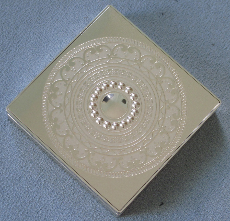
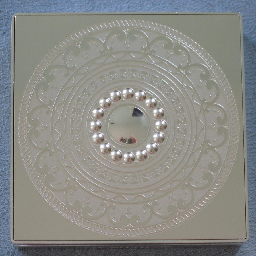
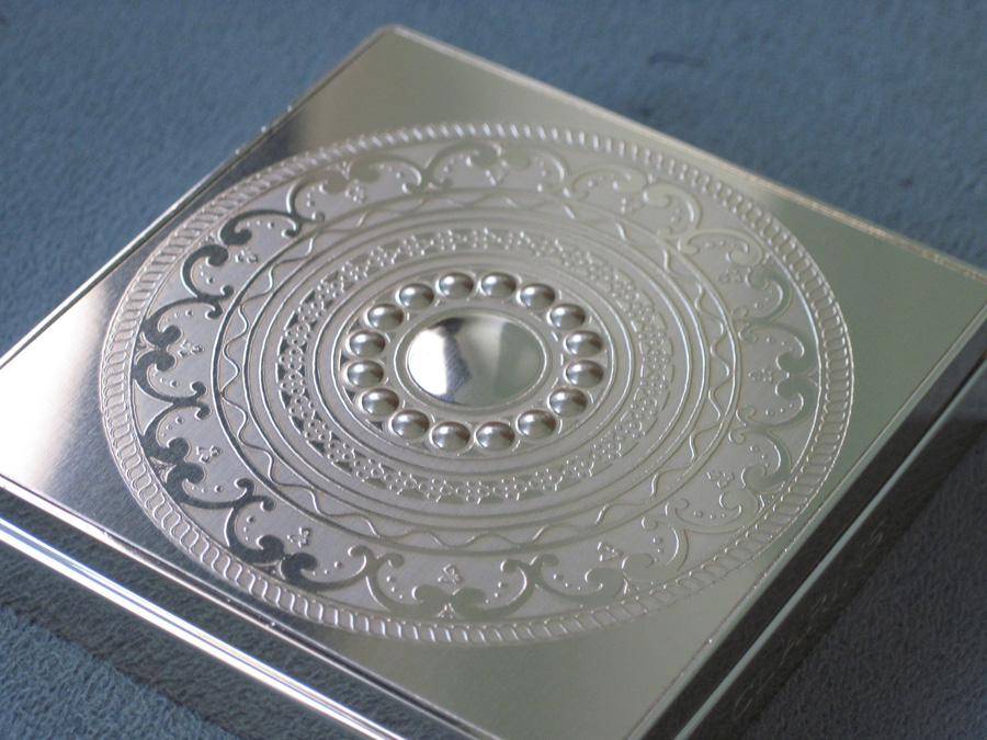
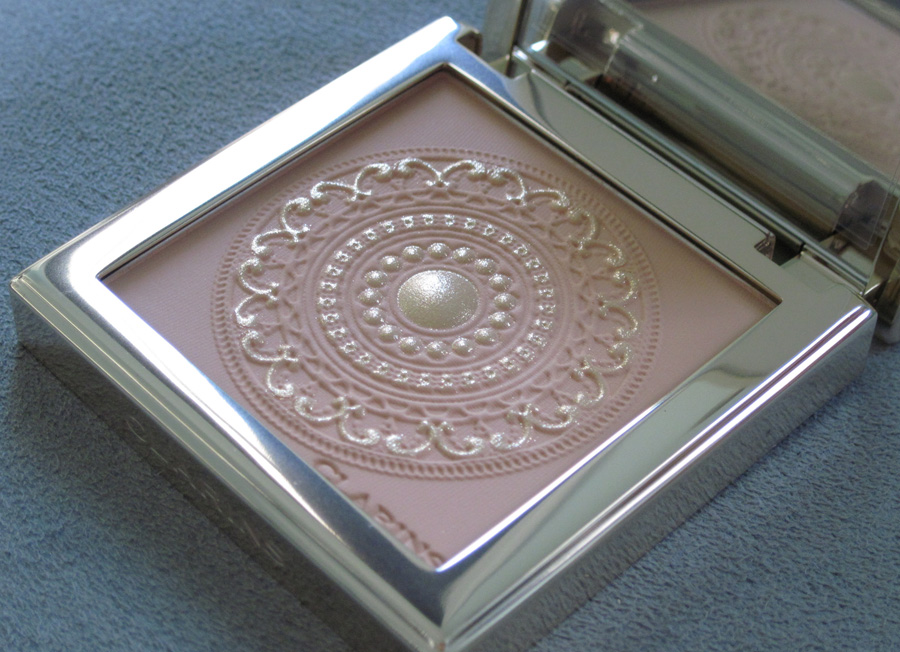
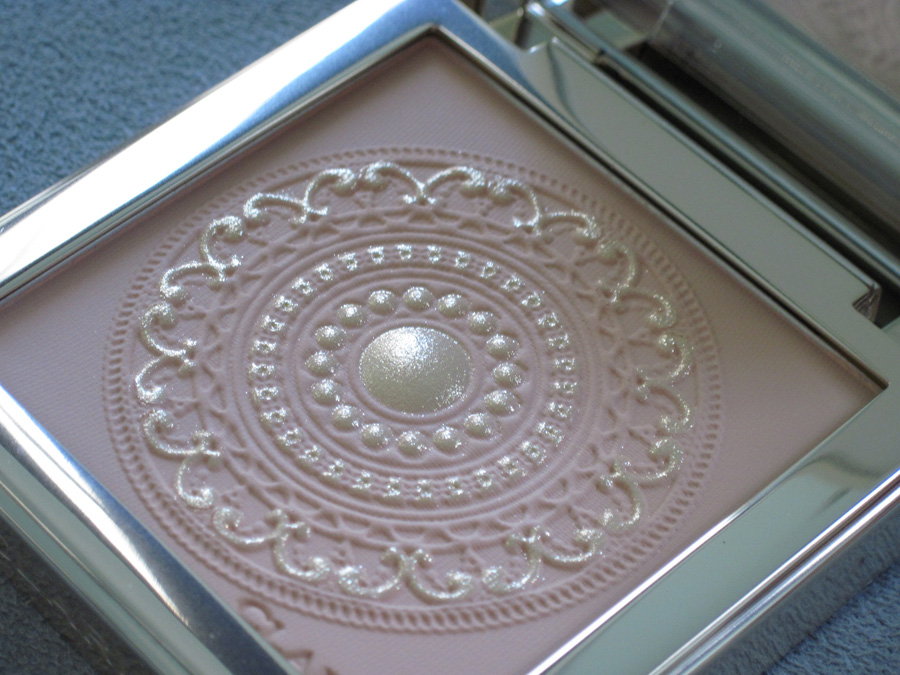
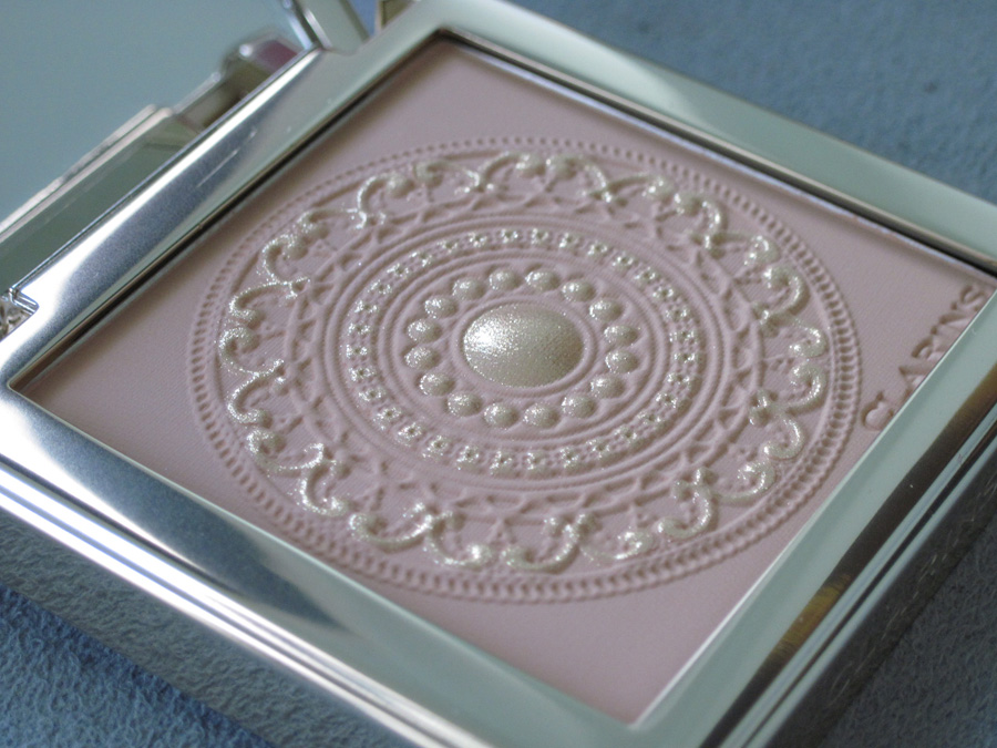
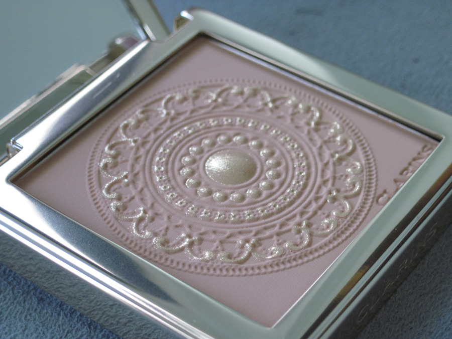
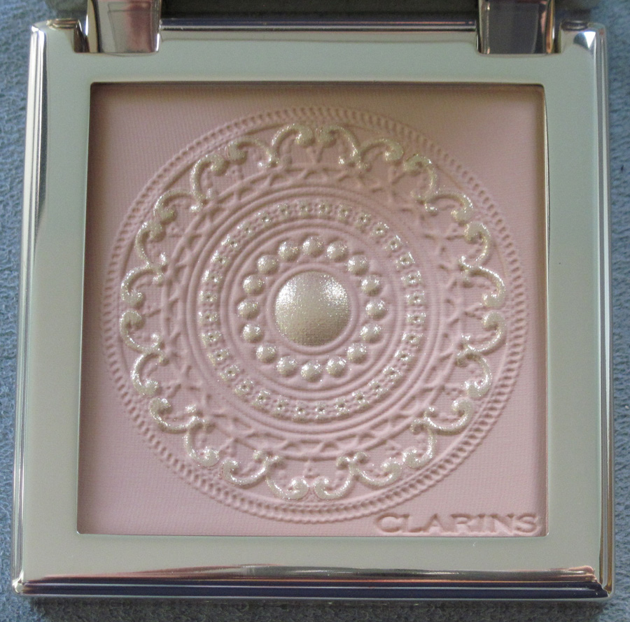
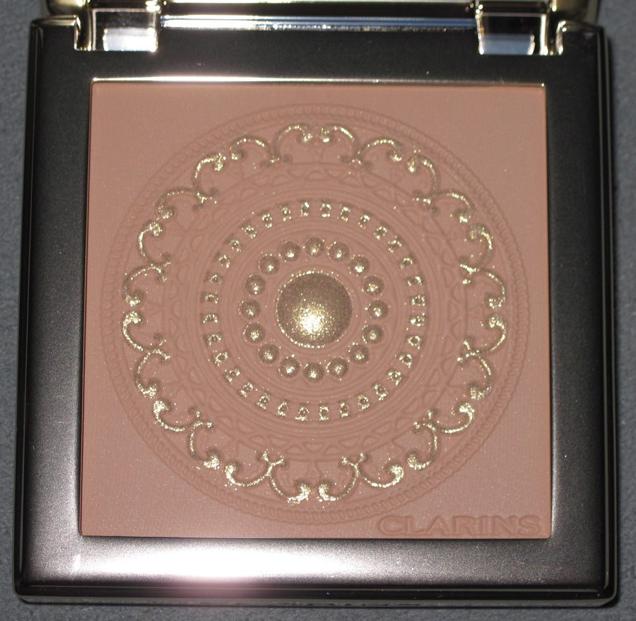
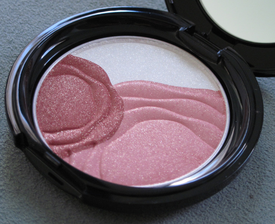
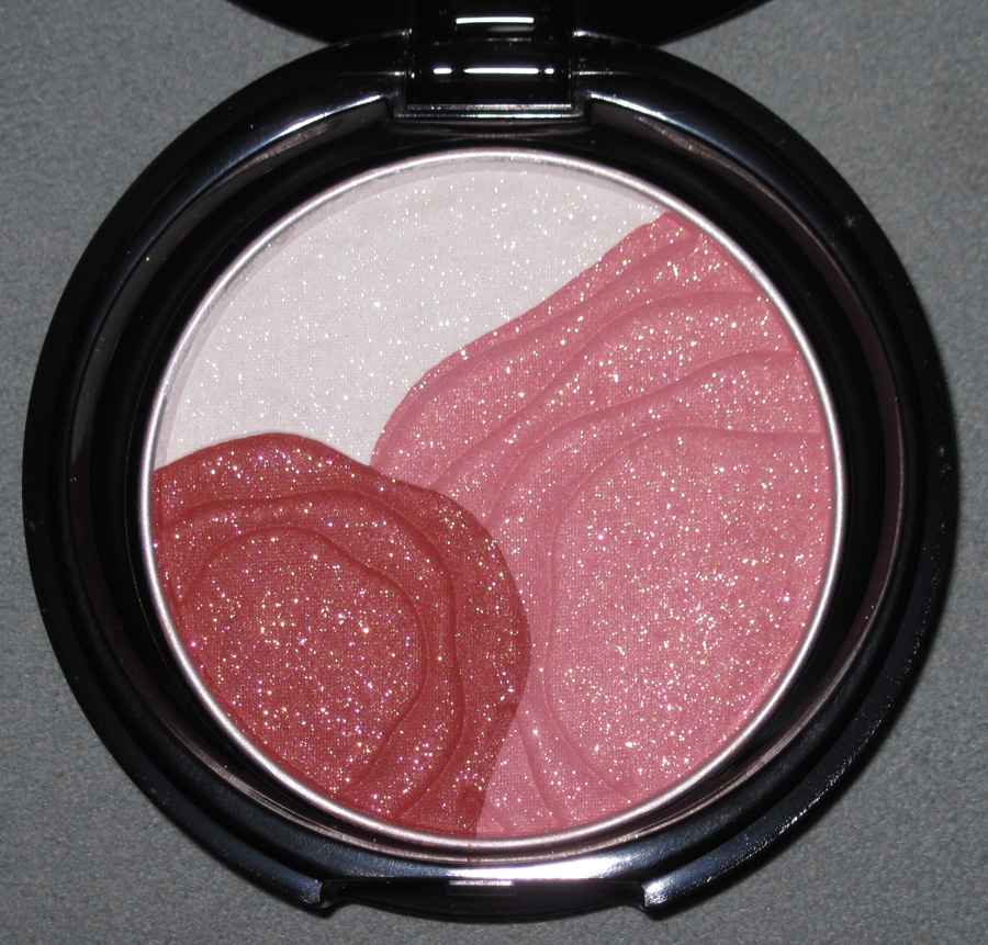
Clarins really upped their game this season in terms of packaging. This beautiful highlighting powder, from their Odyssey collection, is presented in a gold case with delicate, engraved details.


The powder inside features the same design. I’m amazed at the level of intricacy.


With flash:

The collection contains several other pieces with the same motif, including a deluxe makeup palette and eyeshadow quad.
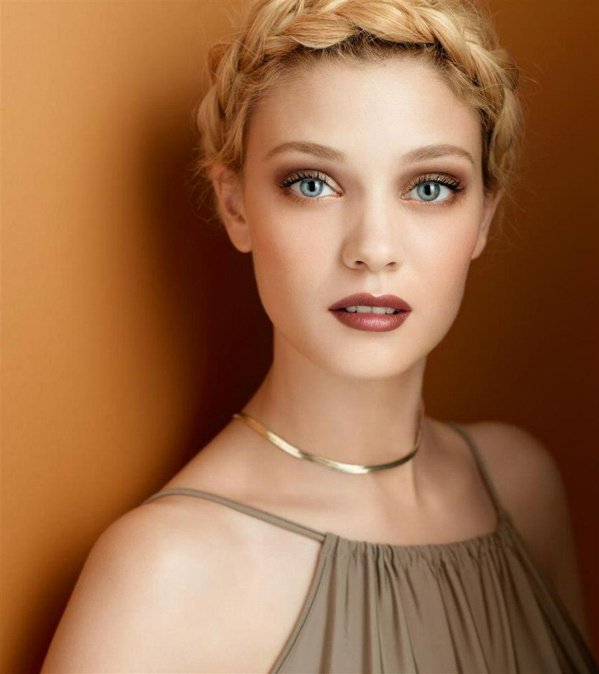
I did a little digging about the inspiration behind the collection. As the name and Grecian garb-clad model would suggest, ancient Greece played a part in the development of the design.

(image from facebook.com)
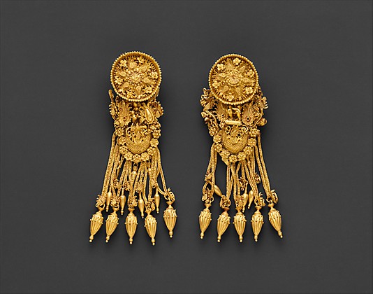
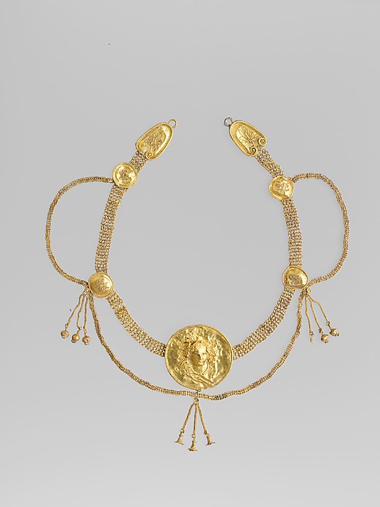
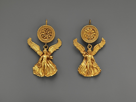
Apparently the motif is the “original Odyssey emblem of ancient Greece“. I searched high and low but couldn’t find any information on this symbol, or even anything that suggested it actually existed. I will say, however, that the lavish gold and elaborate pattern is certainly reminiscent of ancient Greek jewelry. Take a gander at this necklace and earrings, all from about 300 B.C.:


(images from metmuseum.org; all are public domain)
In that sense, Clarins captured the more extravagant, opulent side of ancient Greek culture. While I would have liked to see a more concrete explanation for the motif, it’s not as vague as some previous Clarins collections. And the level of detail is on par with more high-end brands, so all in all I’m pleased with this.
Did you/will you be partaking in the Odyssey collection?
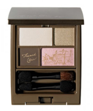
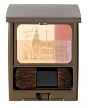
I'm more of an Anglophile than a Francophile, but I do still like anything reminiscent of Paris and the incredibly fashionable women who inhabit the city. Fancl's French Chic collection for fall 2012 consists of two palettes featuring beautiful gold sketches of the City of Light imprinted onto the makeup. While I'm not sure whether these totally capture the "je ne sais quoi" allure that French women seem to have, they're nice to look at regardless.


(images from imomoko.com)
I can't quite make out the buildings, but perhaps if I order them for use in a Paris-themed exhibition I will be able to. 😉
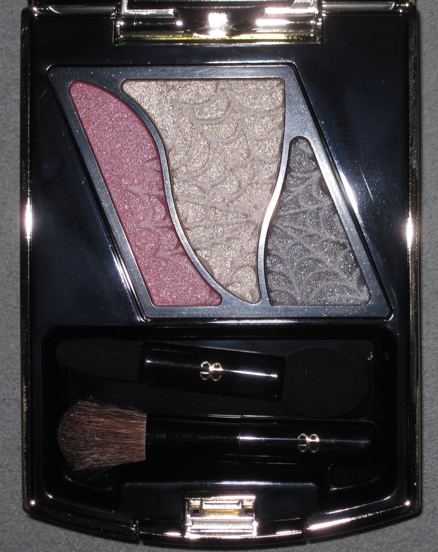
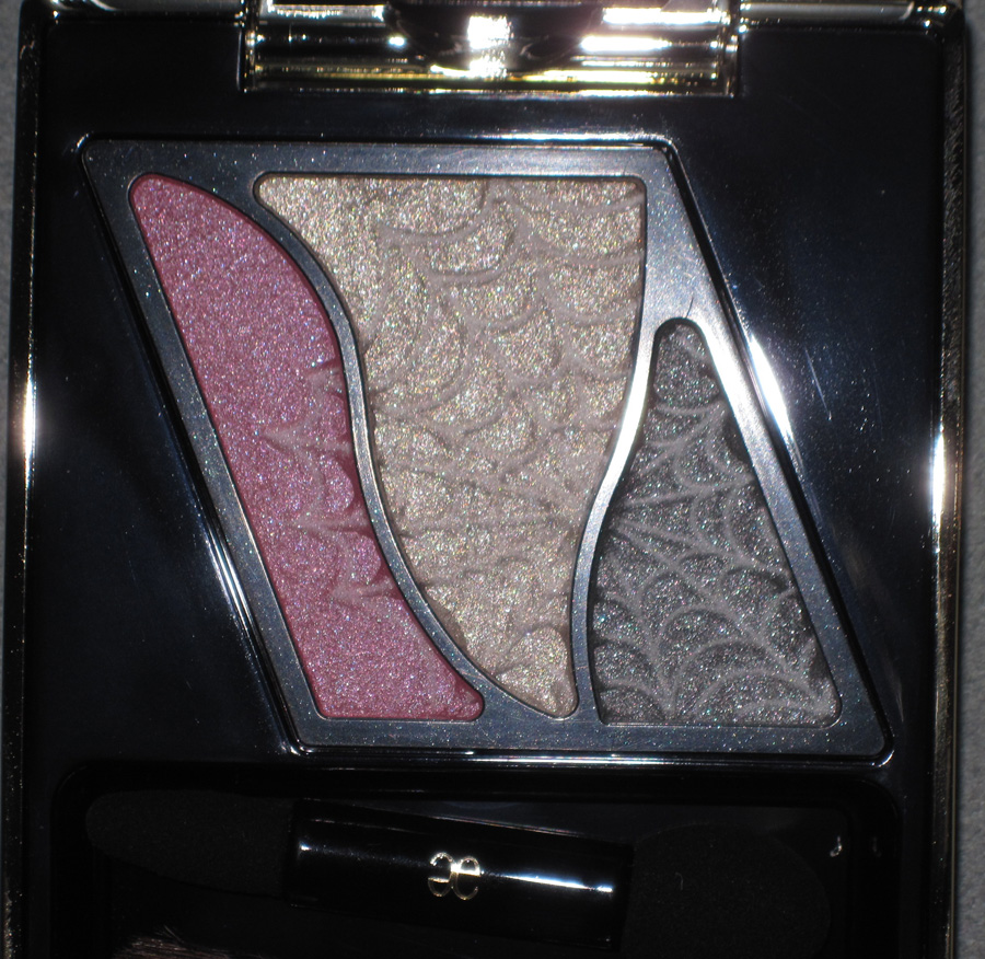
Once I saw this Elegance palette at A Touch of Blusher I knew I had to have it for a Halloween post. While I didn't receive it in time to include in the fall exhibition, it will make it in next year.

It's available in other shades (no. 27, which features beige, rose and green shades) – this is no. 26.


With flash:


I hope everyone has a happy and safe Halloween!
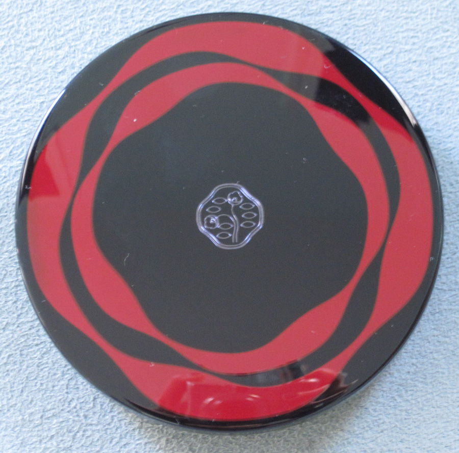
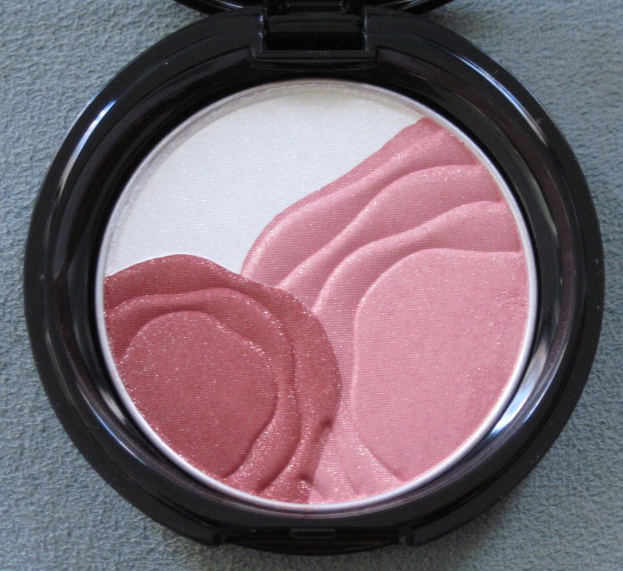
Shiseido's been rolling out new products and doing lots of events in honor of their 140th anniversary this year. To add to the celebration, the company released this lovely camellia highlighting/blush compact.


With flash:

The Shiseido Corporate Museum (more on that tomorrow) hosted an exhibition on the company's use of the camellia. "In 1915, Shiseido's first president Shinzo Fukuhara replaced the hawk emblem trademark used by the company's original pharmacy business with a camellia blossom. Ever since, this camellia trademark has been closely and fondly associated with Shiseido as a company. What does the camellia mean for the Japanese people? What does it mean for Shiseido? As the camellias came into bloom to welcome Shiseido's 140th anniversary this year, the year's first planned exhibition considered the history of the Japanese people's relationship with the camellia, and looked back on the history of the company's camellia-related products and designs using the camellia motif." I would have given my right arm to see this exhibition, but Japan is a long way off for a quick museum visit! Fortunately, at their website Shiseido fills us in a little bit as to the meaning of the flower for their brand. "When the company was known as a pharmacy, its trademark was a brave hawk, but when it shifted its focus to cosmetics, it was thought that the stern image of a hawk was unsuitable. It is said that the camellia was chosen because the best-selling product was Koyu Hanatsubaki (hair oil; Hanatsubaki is Japanese for camellia). At that time, trademarks in Japan were typically traditional patterns from ancient family crests, but the Western design of the camellia mark was a great novelty. The camellia trademark was designed by the company's first president, Shinzo Fukuhara. The original nine camellia leaves were reduced to seven by the Design Department staff. In 1918 its design was near today's, and in 1919 the trademark was registered. Many small changes have been made since, and in 1974 the present design was decided on."
Additionally, there was once something called the Camellia Club – a membership service for loyal Shiseido customers that was launched in 1937. Club members received exclusive pamphlets and invitations to beauty classes. The biggest spenders received commemorative gifts – I'm thinking this is sort of like Sephora's VIB program in which customers can become "VIBs" after spending $350 in a given year. "The first year's gift was an art deco metal vanity case, the following year's was a Nishijin handbag, and in following years continued with ceramic sash clips and other luxurious items." While I enjoy the more modern perks of today's membership programs (free samples, discount codes, etc.), receiving keepsakes from the company sounds great to a collector like me.
Stay tuned for more on the history of Shiseido tomorrow, when I will highlight some pieces from their museum.
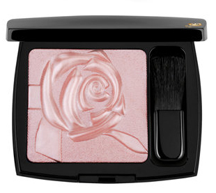
“The glittering lights of the Eiffel Tower dazzle in the distance. A gentle, magical breeze kisses your neck. An electric, captivating energy envelops you. This is Paris at dusk. Lancôme invites you and your readers to be swept away by the mystical aura of Paris at midnight with Midnight Roses, the hypnotizing fall collection that evokes the twilight hours when a woman’s beauty comes into full bloom.” To make one feel as though she is a part of this magical scene, Lancôme introduced Moonlit Rose, a pink highlighting powder that takes the shape of (surprise – not!) a rose. I haven’t been able to get my hands on it because I don’t think it was released in the U.S. However, I’m intrigued by the combination of textures – the petals have a perfectly smooth, satin-like finish while the background resembles whisper-thin gossamer threads.

(image from flare.com)
What I enjoy most, though, is the interplay of positive and negative space. Although the petals and background are the same color, the rose shape is easily visible due to the petals’ raised surface.
It reminded me a little of this work by Brazilian artist Vik Muniz. His White Rose (2003, from the Monads series) utilizes a similar concept, only reversed – the negative white space is the rose, formed by thousands of plastic toy bugs. The series “consist[s] of small objects which tell a story by themselves, linked, simultaneously, to the larger story of the whole image they form part of…In White Rose, Muniz composes the image of a pure white rose out
of various insects and animals which, in a certain way, contribute to the birth, life and death of the rose.” (source)
There is also the idea that things are not what they seem. At first glance we can tell the shape is a rose, but it takes a few seconds of looking at the photo to see what is comprising the outlines. In this way the artist “honors, questions and subverts the
traditions of representational art, treading the line between reality and illusion, representation and abstraction, idea and image, means and ends.”
You can read more about him at his website.
I have so many rose palettes, but I think this one also belongs in the Museum. The design is simultaneously simple and complex, and it is the perfect shade of pink – not overly girly or shimmery.
What do you think?
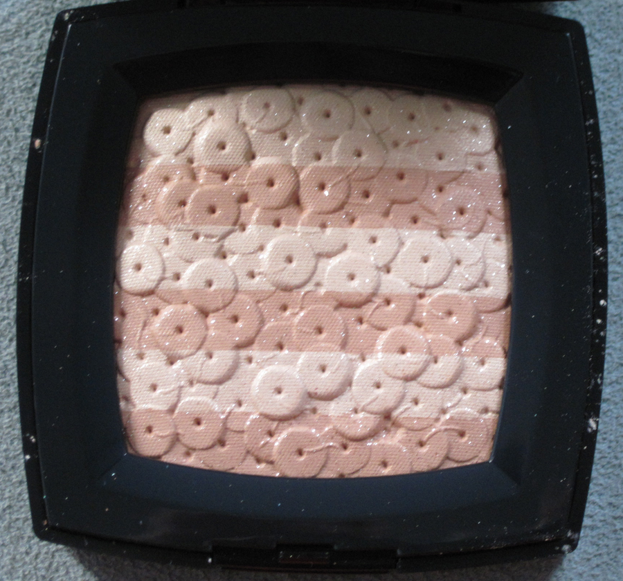
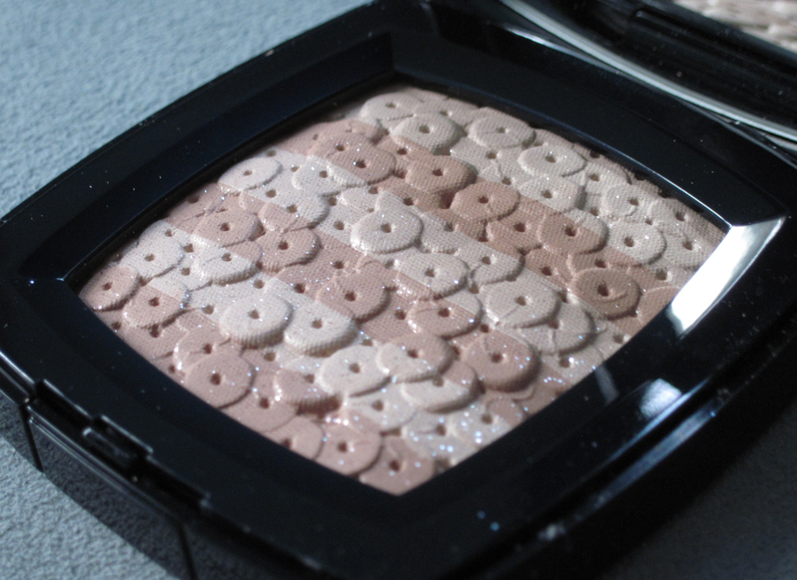
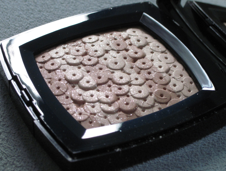
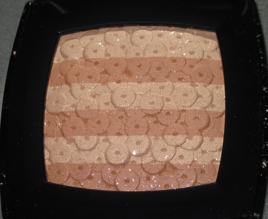
Chanel released this palette for their fall 2012 collection. The sequin embroidery design is a duplicate of its predecessor from the spring 2007 collection.


With flash:

Unlike the 2007 Chanel Lumière d’Artifices palette, this beige version actually seems to be relevant to the brand’s fall 2012 couture collection. Dubbed “New Vintage” by designer Karl Lagerfeld, the collection “showcased the
extraordinary handwork which the house’s ateliers and the subsidiary
embroidery houses that Chanel now owns, are so capable of producing… ‘All
the tweeds are embroidery,’ Karl declared. ‘Three thousand hours for
some of them.’ Whilst some were created entirely from looped silken
threads and shimmering paillettes, others were sophisticated patchworks
of color-block plaids.”
Indeed, several examples of the “looped silken threads and shimmering paillettes” came down the runway. Even one of the hats showed sequins painstakingly sewn into the fabric. And not only were sequins in abundance, there were also variations of the subtle stripes of color seen on the palette. While I’m not thrilled that Chanel put out a palette that is, except for color, the same one released over five years ago, I was pleased to see that it was consistent with the couture collection.
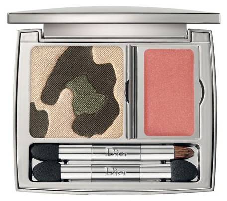
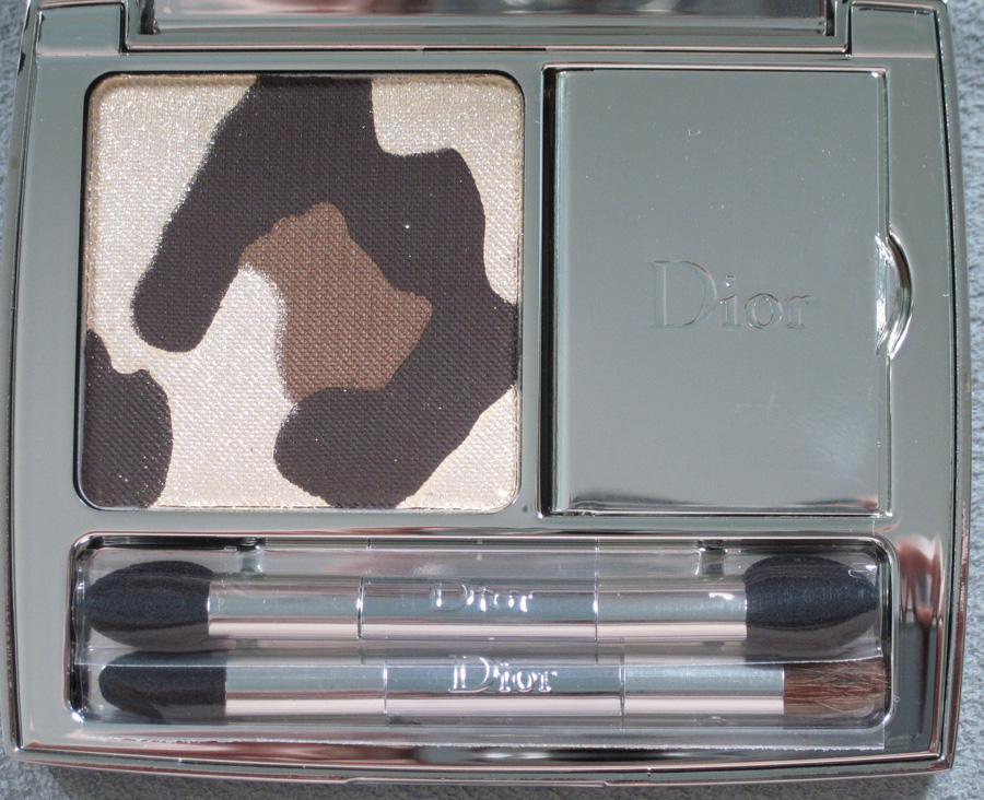
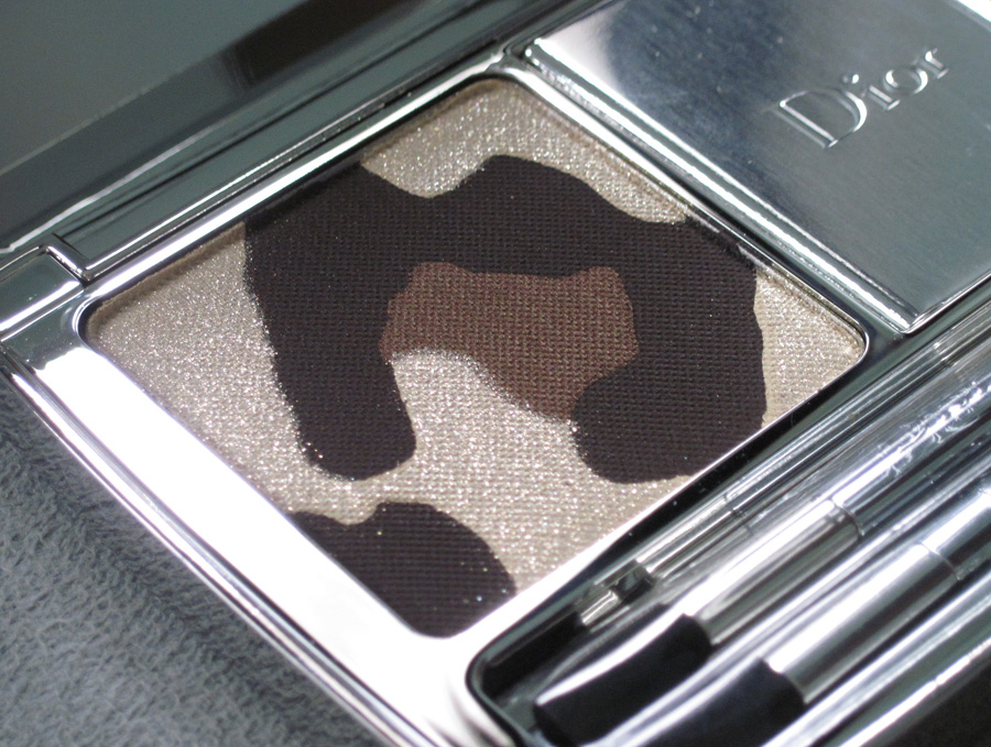
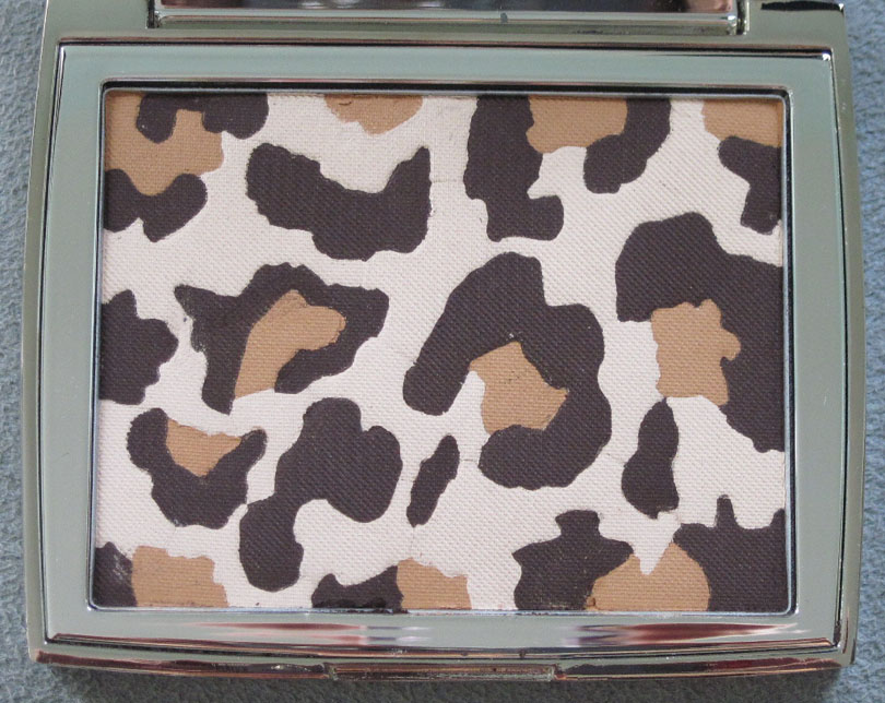
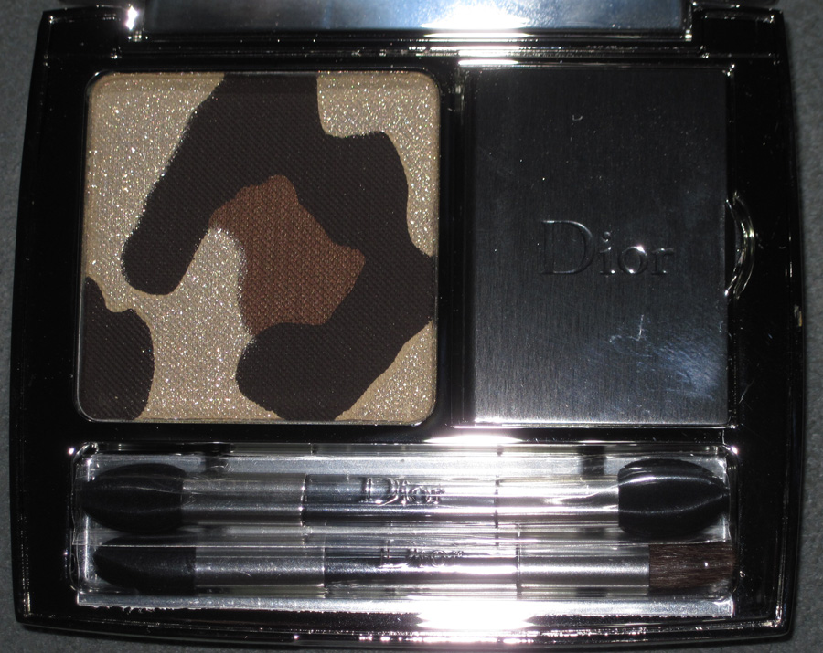
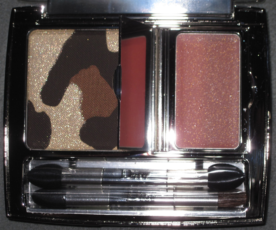
Like the revamped Tailleur Bar palette, Dior seemingly has recycled another palette from seasons past. The fall 2012 makeup collection, entitled Golden Jungle, contains a leopard print palette that borrows from the Mitzah palette from last fall. Actually there are two leopard palettes, Golden Khaki and Golden Browns, but only the latter was released in the U.S. I would have liked to have both but ultimately decided it wasn’t worth tracking down Golden Khaki.
Here it is, just for fun:

(image from retailtherapy.onsugar.com)
And here is Golden Browns.


I noticed that this particular leopard spot is exactly the same as the one that’s in the middle of the Mitzah palette.

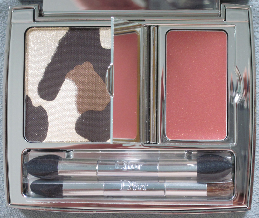
Anyway, here is the Golden Browns palette with flash:


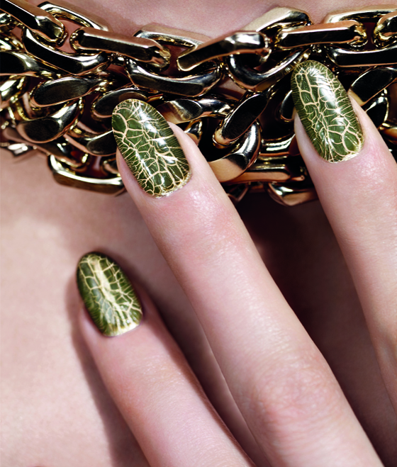
Unfortunately, the U.S. also did not receive this cool nail duo that yields a crocodile skin effect, which is a nice addition to a jungle-themed collection.
(image from retailtherapy.onsugar.com)
According to the collection’s press release, Dior’s famous leopard print has been “revamped”: “In February 1947, Christian Dior presented his first collection to the international press in the Dior salons of Avenue Montaigne in Paris. Along with the Huit and Corolle lines that would inaugurate the era of ‘The New Look,’ the couturier revealed another of his favourite themes: Leopard Print. Fashion editors were smitten, the
room burst into applause and women rediscovered the mysterious allure of this iconic, timeless print. At once avant-garde, sophisticated and sensual, the Jungle Motif has been a signature of the House of Dior from its debut. Actress Marlene Dietrich and the muse and friend of Mr. Dior, Mitzah Bricard, were its first fervent ambassadors. With each decade and runway show, variations of leopard print are cleverly reinterpreted by Dior Couture. In the Dior Autumn/Winter 2012 makeup collection, Tyen revamps the Jungle Motif with another hallmark of Dior, a touch of shimmering gold, embodying the luxury of the urban jungle and inspired by the deep, earthy tones of the jungle.”
I’m not sure why they chose to revamp it this for this season, as leopard print did not make an appearance in either the ready-to-wear or couture shows. However, there was some houndstooth pieces at the ready-to-wear show.
Why not have used that instead of essentially copying the Mitzah palette from last year? Sigh. Dior Beauty had been on a hot streak collectible-wise but this season the company is just recycling previous items. I hope they return to originality and come up with something that pays homage to the designer but isn’t a rehash of what they’ve done before.
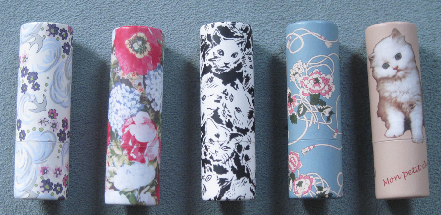
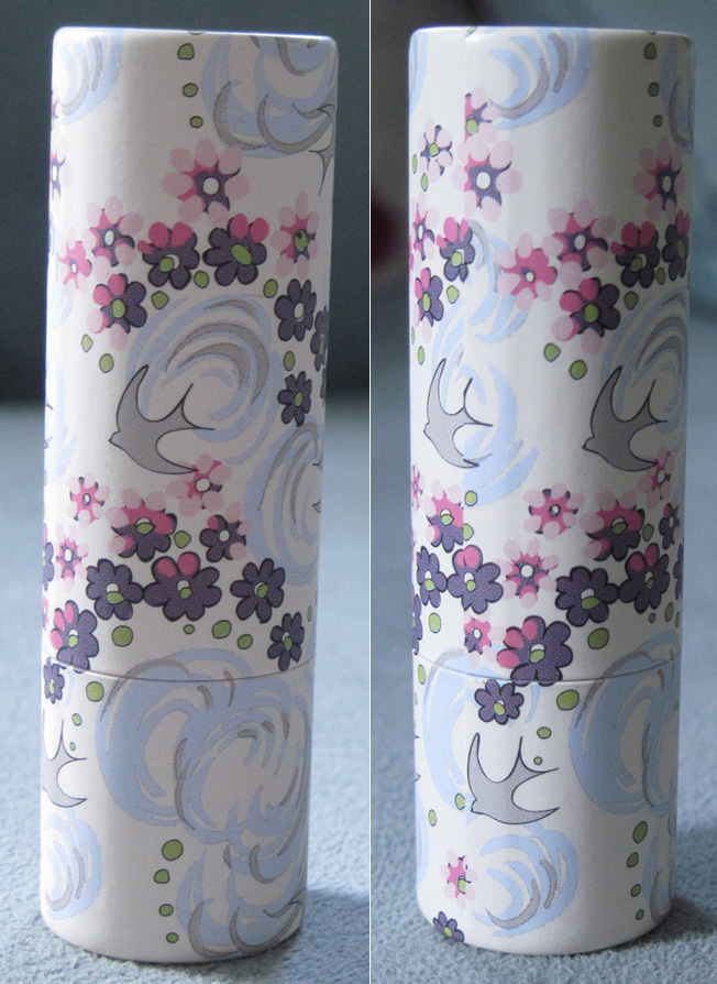
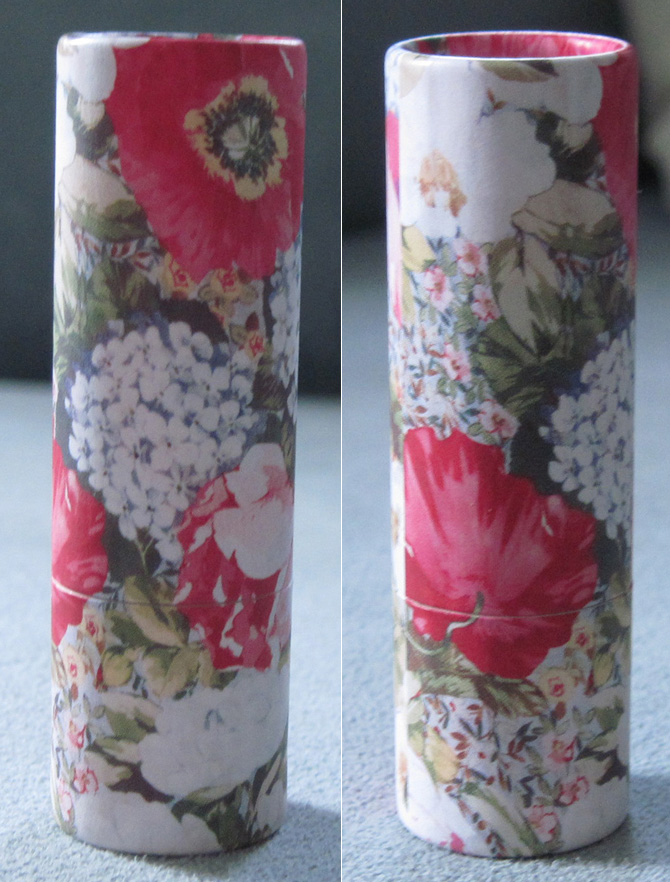
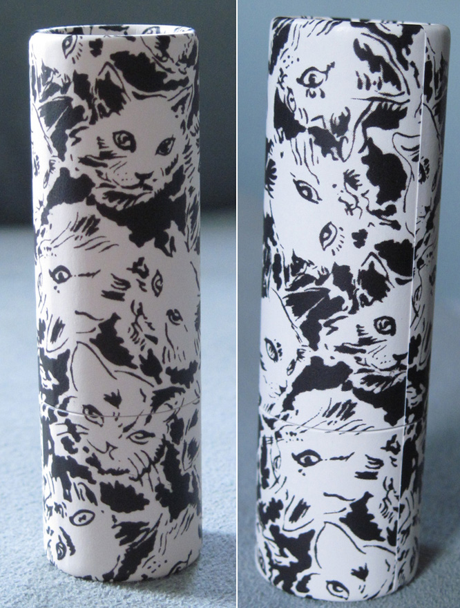
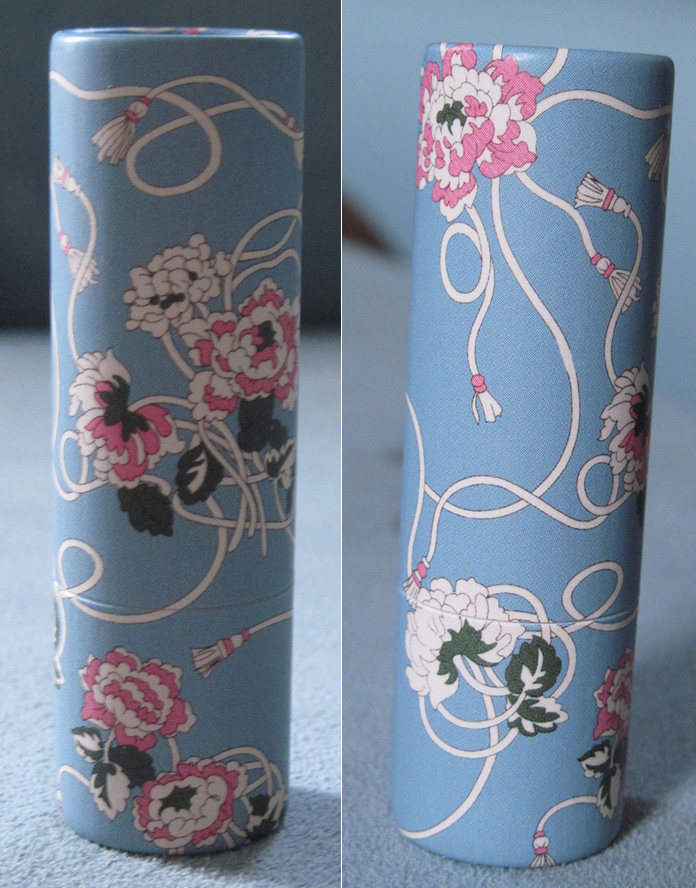
The second part of Paul & Joe's fall 2012 collection was the release of new paper lipstick cases. They're sold empty so you can put your favorite Paul & Joe lipstick into your favorite case. Pretty nifty idea! I just got them empty since I'm only interested in the packaging and won't actually be using them as lipsticks.

The first case features a melange of grey doves, pink and purple flowers and blue and grey swirls on a white background.

The next one has a showy floral pattern in white, green and bright fuchsia.

You know Sophie couldn't resist having at least one of these cases be cats, right?

I love this one – pink and ivory flowers with tassel tendrils against a baby blue background.

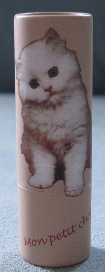
Finally, another cat. Well, a precious-looking kitten.

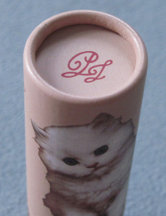
The initials that appeared on the brushes with the Collection Sparkles items are also here on the lipstick cap:

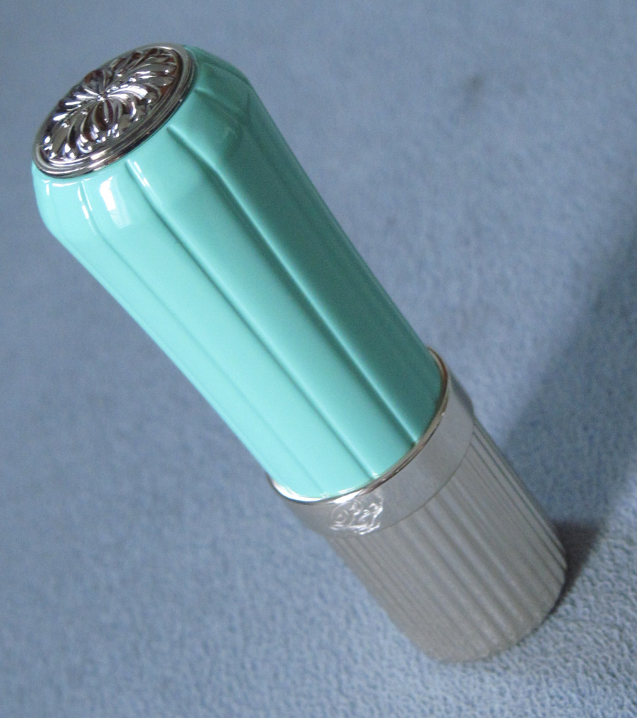
While I think the paper cases are a great idea, some people want a case that's a bit sturdier. So Paul & Joe created this retro-looking refillable metal case. I have no idea how they got that shade, but it's an absolutely dead-on '50s mint green. Plus the ridges seem more authentic than the lipstick cases from Estée Lauder's paltry Mad Men collection.

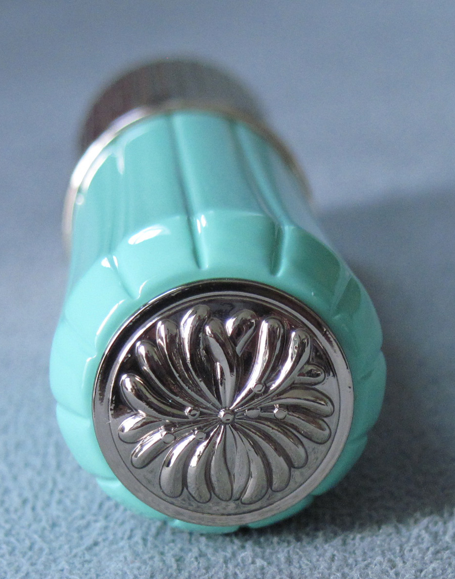
I also love how they worked the iconic Paul & Joe chrysanthemum into the cap:

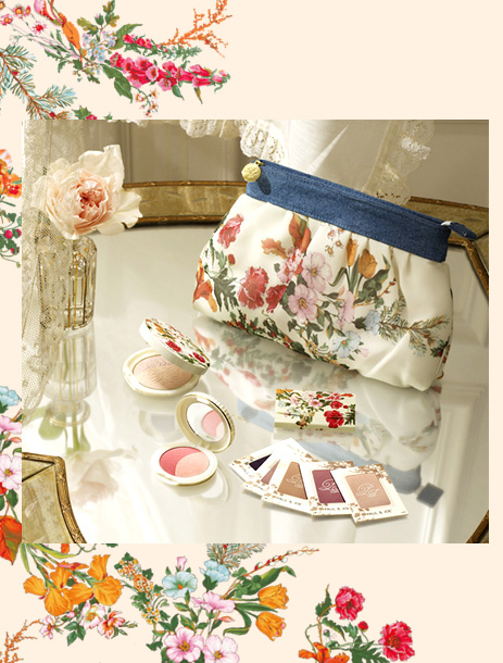
But the 10-year anniversary celebration isn't over yet! There was also this pretty set, consisting of a pouch, pressed powder, blush, blotting sheets and eye shadows. I didn't purchase it given the designs were the same on all the products and I didn't want all of them.

(image from paul-joe-beaute.com)
So that concludes all the goodies from Paul & Joe fall. Did you like the Collection Sparkles or the lipstick cases more? And which has your favorite design out of all?
Here’s an odd fall 2012 collection from Italian cosmetics brand Pupa. They’ve borrowed from other cultures before (see their nesting doll collection) but I don’t think this collection had too much thought put into it. Called China Doll, the collection is supposed to embody “the preciousness and elegance of the Eastern world to create a new, refined neo-geisha style…four new multiplay colors in a limited edition that complete the look with delicate Oriental-chic details.” Fair enough, but traditional, genuine antique china dolls (as in glazed porcelain) were mostly made in Germany, then in the U.S. and Japan – they actually don’t have anything to do with China. Even if Pupa was referring to a china doll-like “porcelain” look that can be achieved with the products in this release, it still doesn’t make a lot of sense.
What’s even stranger is the star of the collection, a highlighting blush which shows a geisha (?) holding a parasol. I don’t know what is to the left of the parasol – is that her hand coming out of a robe? A rickshaw? Hard to tell from the picture.

(image from pupa.it)
Even if Pupa was trying to do a Chinese theme, geishas originated in Japan. The company sort of glossed over what exactly was the Asian influence in the collection description, throwing out generic, made-up words like “neo-geisha” and “Oriental-chic”.
To sum up: this is yet another case of a cosmetics company getting its cultural references wrong (see my previous post on this).
(Thanks to Beautiful With Brains for bringing this collection to my attention).
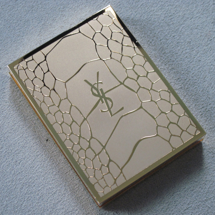
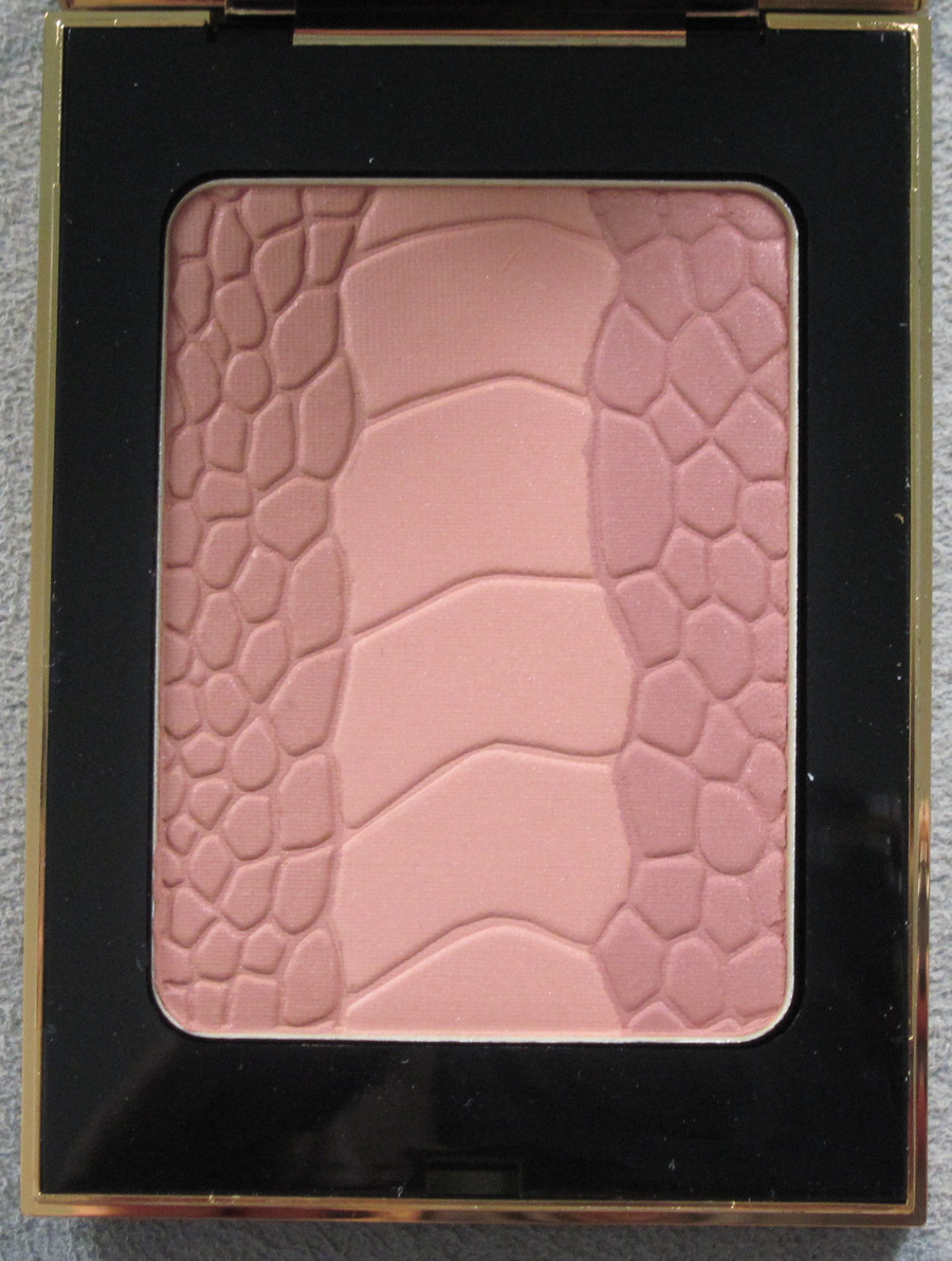
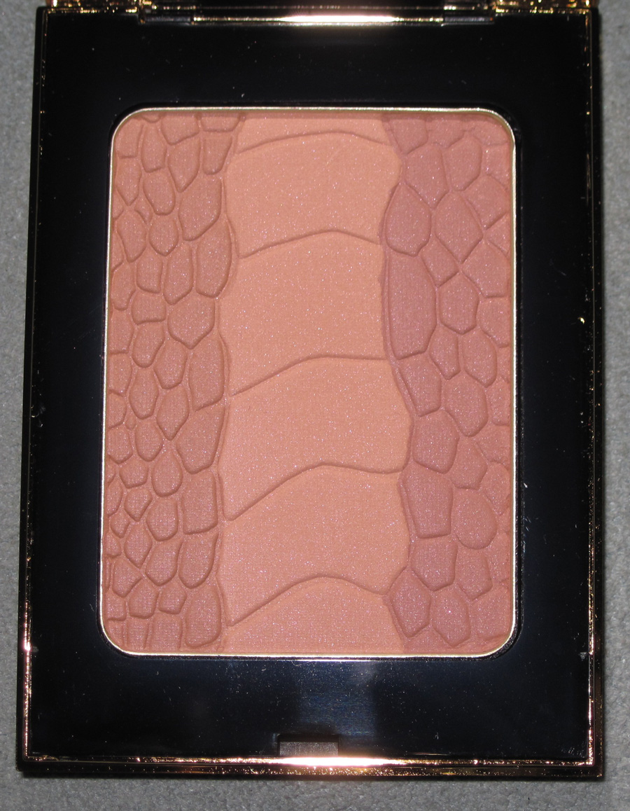
We’ve seen crocodile-patterned palettes before, but I thought the print looked particularly smashing on the gold outer casing of YSL’s Palette Couture for fall 2012. Very luxe!

Apparently crocodile is the “emblem of the YSL accessories and leather goods collection,” according to the press release. I don’t know why they never used it on a makeup item before.


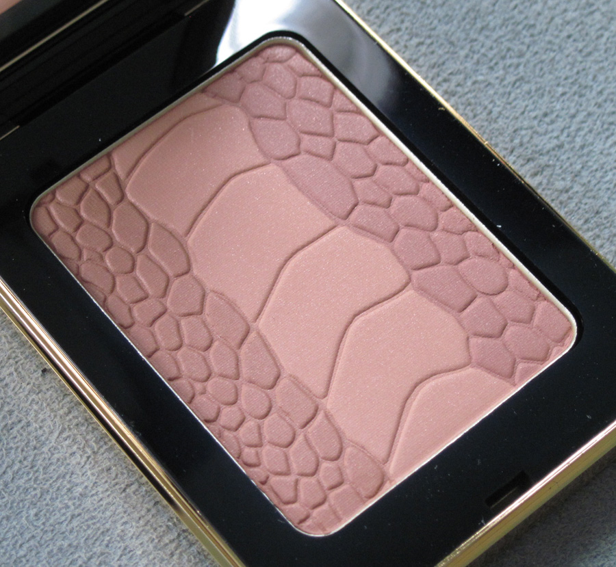
With flash:

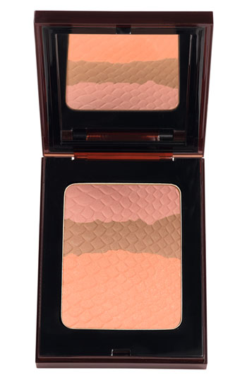
While I think crocodile-themed items always make a good addition to the Makeup Museum, I was disappointed that this was more or less a rehash of YSL’s summer 2012 bronzers:

(image from nordstrom.com)
Plus, there was no crocodile to be found anywhere for the fall 2012 ready to wear show. The look was supposed to be “contemporary Amazon” (which was also the theme for the fall 2012 makeup collection). The strong shoulder contours and metal chain mail accompanied by dark blood-red lips and slicked-back hair definitely evoked fierce women warriors. But what really stood out to me was the use of calla lillies. According to Style.com writer Tim Blanks, “Backless dresses in a chain mail made of metal and rubber were the ultimate expression of [designer Stefano] Pilati’s hypersexualized vision. So he naturally picked the calla lily, Roman symbol of lust, as the floral accent for the collection.”
I think that these flowers would have made a more interesting and relevant design for the palette than crocodile print. What do you think?
