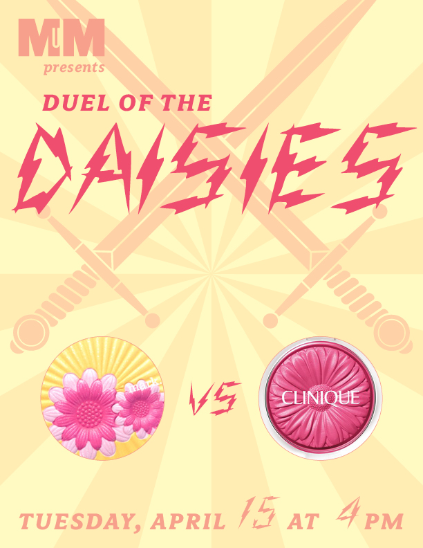
I knew I wanted Clinique's very happy-looking Cheek Pops from the moment I saw them a few months ago. Little did I know that Mark had an equally exuberant daisy-inspired design up their sleeve. And you know what that means: time for a spring smackdown!!
Let's get ready to rummmmbbbblllllle! *ding ding*
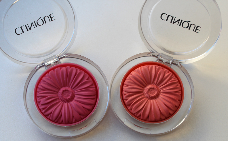
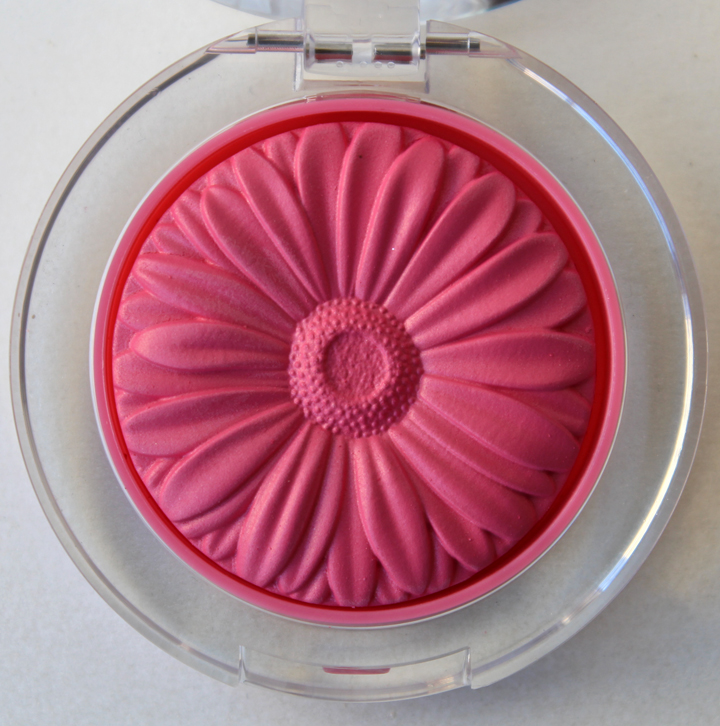
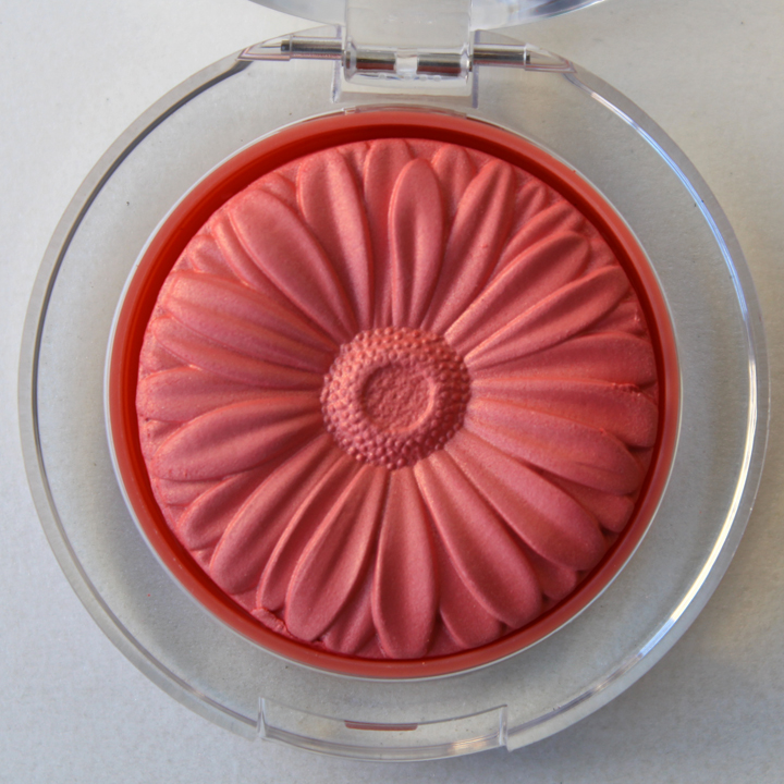
In the right corner we've got some dainty yet fierce flower blushes from Clinique. Available in four bright shades, they're intended to give your cheeks a fresh pop of color (hence the Cheek Pop moniker). I've chosen two contenders, Berry Pop and Peach Pop, to battle the palette from Mark.

Unlike a real daisy the whole flower is the same color, but the versimilitude in the shape of the petals and dotted center delivers a powerful blow to its opponent…

…not to mention that the colors are spot-on matches for real gerberas.

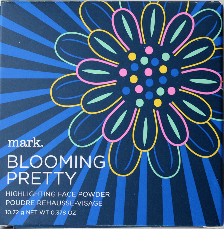
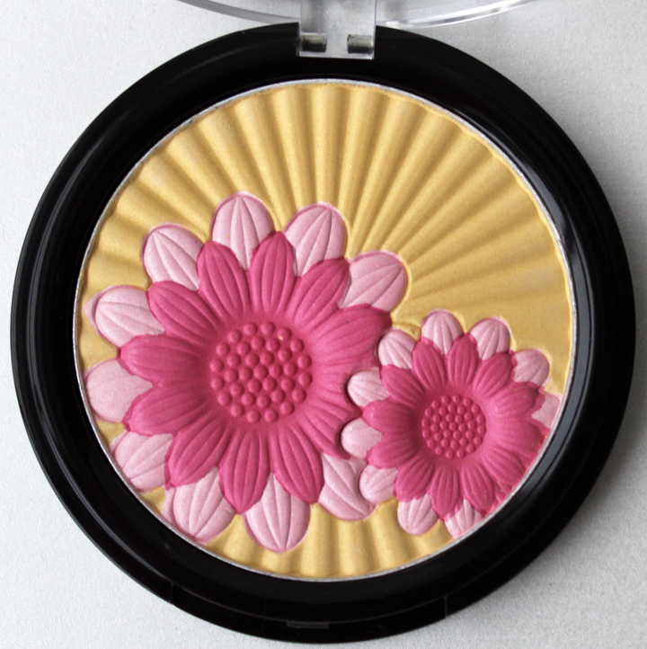
In the other corner we've got Mark Blooming Pretty highlighting powder. While it's not 100% certain that the flowers shown are daisies (the website describes them as "embossed blooms"), they were indubitably close enough to go up against Clinique. The Blooming Pretty palette's strength partially lies in its outer box, whose blue background offsets the pink and yellow of the flowers nicely…and ruthlessly pummels Clinique, who offers no such pretty outer boxes with their Cheek Pops.

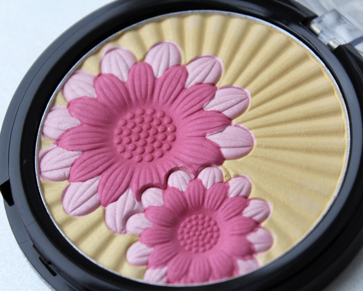
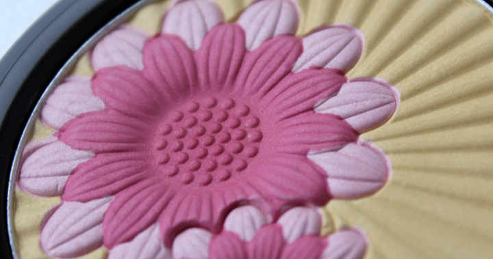
The multiple rows of petals are two-toned, unlike Clinique's monochromatic scheme, but these are more stylized and look less like real flowers. Looks like Mark's lead may be slipping just a bit.


But wait! The cheerfulness of the sunny golden rays behind the flowers is rallying to spar with Clinique's joyously vivid shades.

So who wins this daisy duel? Do the Blooming Pretty palette's larger size, pretty blue box and multi-hued flowers annihilate Clinique's Cheek Pops? Or do the Cheek Pops' simpler, more realistic design and bold colors come out on top? Tell me in the comments!
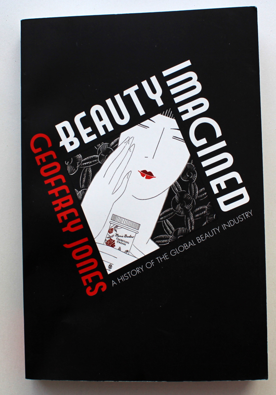
 I was a little leery of this book. While it's been on my Amazon wishlist for a while, I was concerned that the author, an economist from Harvard, would take a topic I adore and turn it into something dreadfully dry and boring. Or worse, he would use all kinds of fancy jargon that someone with very little understanding of economics (i.e. me) wouldn't be able to comprehend. However, Beauty Imagined: A History of the Global Beauty Industry by Geoffrey Jones was quite enjoyable and informative. Jones thoroughly traces the industry's origins in the late 19th century through its emergence as the mammoth business it is today, connecting company histories with cultural and economic shifts that ultimately helped shape the perception not just of the industry but also our very definition of beauty. While Madeleine Marsh's Compacts and Cosmetics and Kathy Peiss's Hope in a Jar are similar in subject matter, Beauty Imagined delves more fully into the economic side of beauty's history. Still, like his fellow authors on cosmetics history, Jones ensures his writing never gets dull by peppering the text with a plethora of interesting facts and figures.
In the first three chapters, the author gives us a compelling history of fragrance, hair products, toothpaste and soap and how these products laid the foundation for color cosmetics. It was enlightening in that I hadn't really thought of these as being the ancestral relatives of makeup; I had thought of them each having their own discrete background and not integral to, say, the development of lip gloss. But as Jones explains, without these more basic items taking root in the early 20th century, other products would not have been born.
Chapters 4 and 5 discuss how neither the Great Depression nor two world wars could stop the growth of the beauty industry, as well as the establishment of the connection between Hollywood celebrities and beauty. These chapters also explore the growing use of radio, movies and TV for beauty advertising. Chapters 6 through 8 detail the rise of globalization in the industry, describing how local companies slowly but surely transformed into regional, then national, then international brands from roughly the 1970s to the present day, along with the relationship between phamaceutical companies and beauty brands.
I thought I'd highlight some of my favorite nuggets of information:
– Coty's first fragrance, La Rose Jacquesminot, got picked up by a department store after the founder smashed a bottle of it on the counter to get customers to smell it.
– Cosmetics weren't regulated by the FDA till 1938.
– Toothpaste was available as early as the 1850s, but it was packaged in jars. Colgate invented the first collapsible toothpaste tube in 1896.
– The first metal lipstick tube was invented in 1915, and the first twist-up tube in 1921.
– Avon's original name was the California Perfume Company.
– The notion of "green" beauty goes back much further than one would think. Clarins, Yves Rocher and Biotherm were all established in the 1950s, with an emphasis on using natural, plant-based ingredients.
– As of 2010, consumers spent $382 billion (!) on cosmetics, fragrance and toiletries worldwide.
The only "problem" I had with the book in that it's not actually a problem at all is that there are complete endnotes for each chapter, and perusing them I came across a ton more beauty history books I want to read!
Bottom line: Beauty Imagined is different than other beauty books but in a good way, and an excellent read even for those of us who don't have a background in business. Oh, and if your thirst for knowledge still isn't sated, check out the videos of Dr. Jones discussing the book here and here.
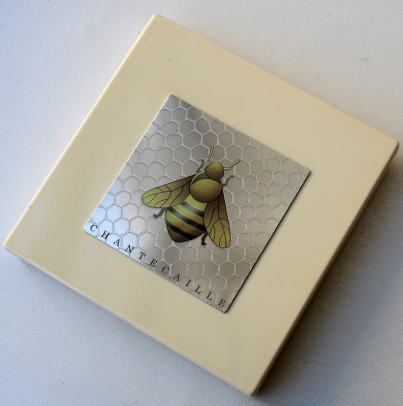
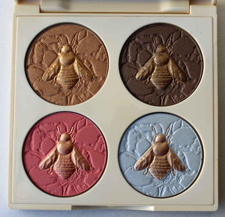
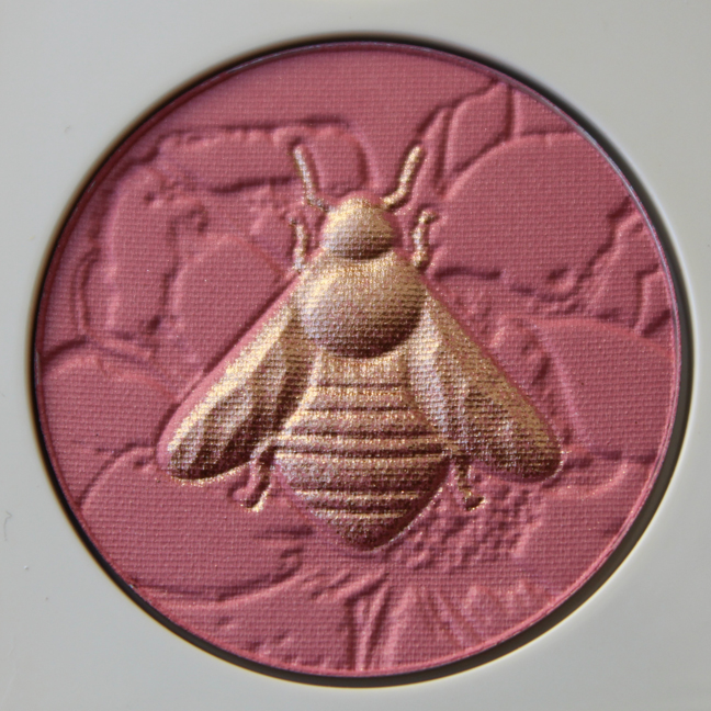
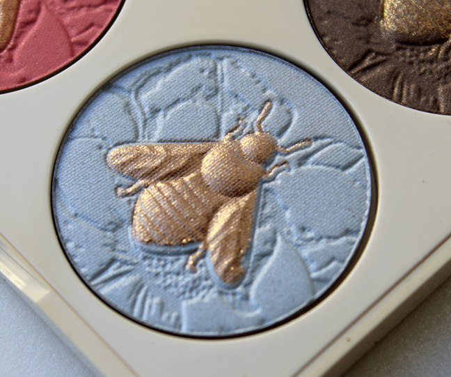
I don't really have much to say about this palette except the usual stuff I write about animal-themed pieces by Chantecaille, which is that 1. Five percent of the proceeds will go to a cause that helps the animal or their habitat (in this case, the Xerces Society); and 2. I'm getting REALLY sick of these 4-pan palettes. Please, Chantecaille, come up with something that rivals your old stuff. It's almost like they told some intern, "This is easy – just copy the design from the horses/sharks/ elephants/turtles/tigers/ dolphins palettes." Meh.

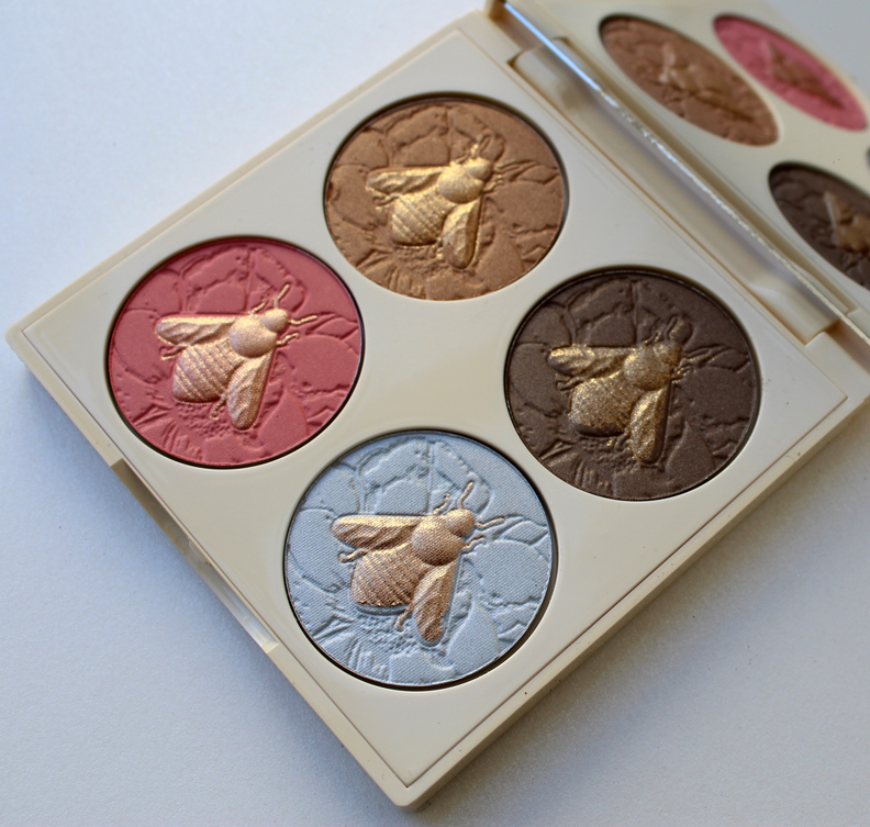
The bee design is nice, but why not make each one a different color instead of all of them being gold? Or if you want to get really intricate, make the colors of the wings different from the bodies on each, a la the butterfly eye shadows. I'm also puzzled as to why the neat little honeycomb pattern on the palette case isn't repeated in the backgrounds of the individual pans. It's not even a flower either, at least none that I can recognize – just a strange, jagged abstraction.


While I'm bored with the 4-pan format, I bought this because it's good for rounding out a spring exhibition (for some reason I associate bees/honey with spring – see last year's exhibition poster) and also because the idea of having a whole menagerie in palette form is appealing to the collector in me.
Have you gotten stung by Chantecaille's bees or are you keeping your distance?
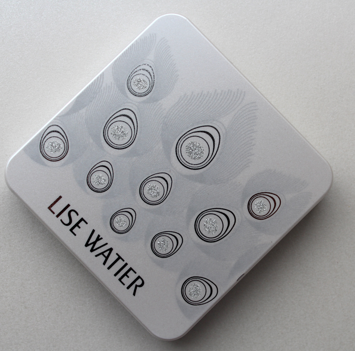
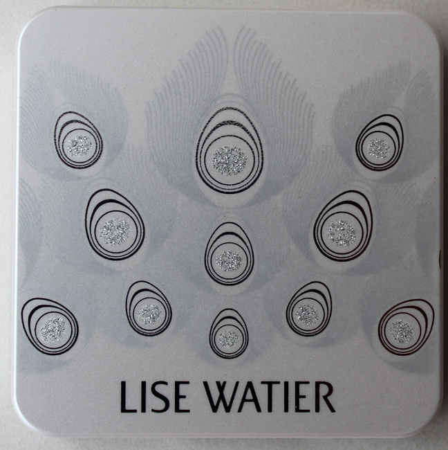
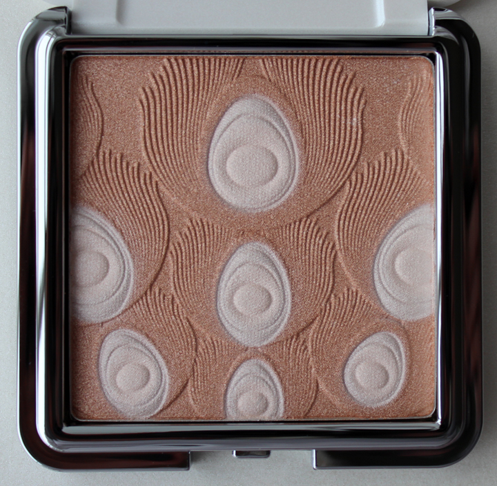
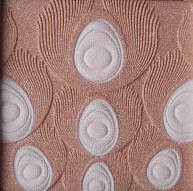
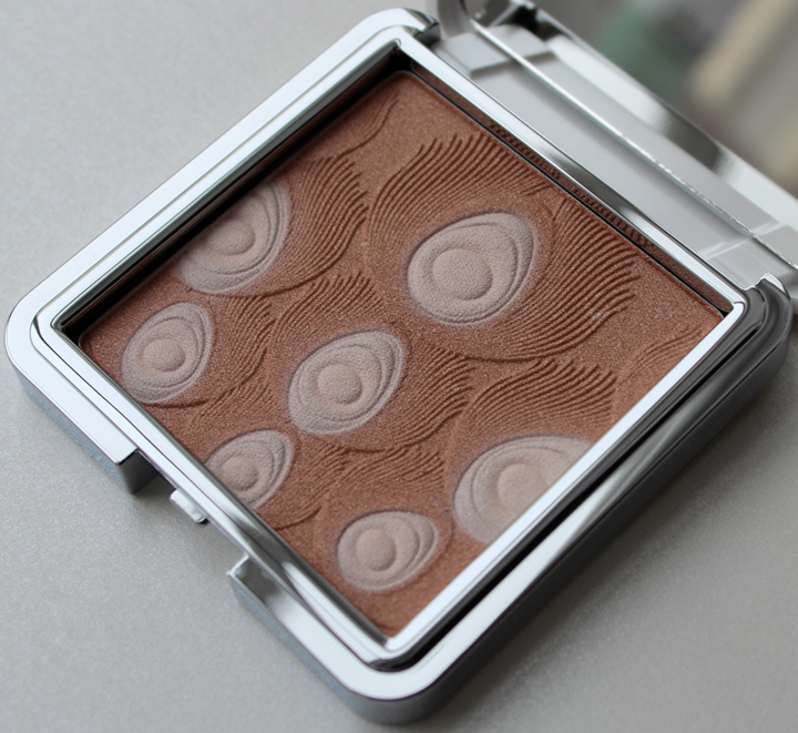
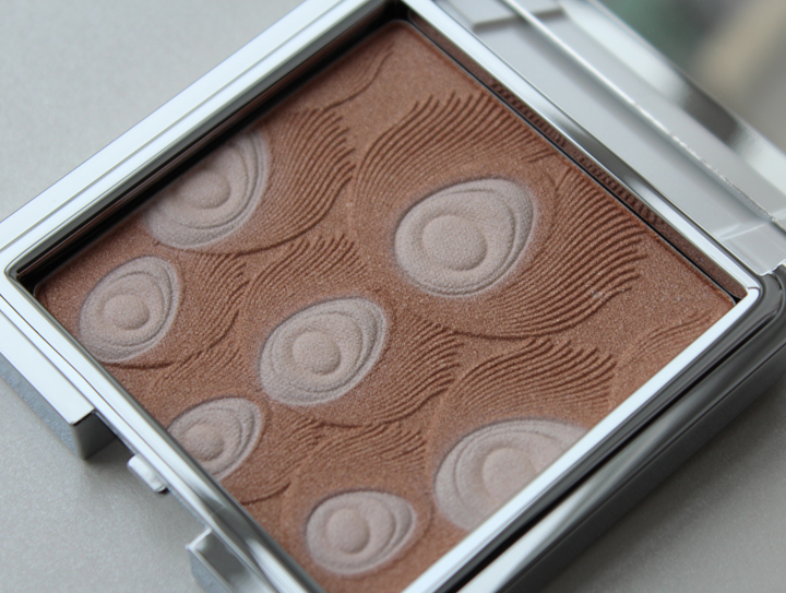
This pretty little palette from Lise Watier nearly slipped through my curating radar (curadar?) when it was released about a month or so ago with their Jardin de Givre collection. I guess technically it's a holiday piece, but the silver glitter embellishments and wintry white of the case makes me think of freshly fallen snow, so I deem it suitable for the post-holiday winter season as well. While I love the beautiful feather pattern on the inside, it was the simplicity and purity of the case's color combination that spurred me to buy it. As far as I can tell, "jardin de givre" translates roughly to "frost garden", and I think the case captures the idea of an icy garden quite nicely. While the pattern is clearly peacock feathers, the placement of the silver glitter within the billowing feathers is reminiscent of frost atop delicate winter blooms.


What do you think? While I think Guerlain's holiday 2011 Parure de Nuit palette is still tops in terms of feather designs, this one is super pretty.

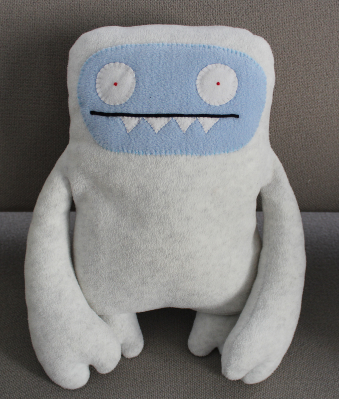
Amidst all the holiday bustle I forgot to introduce our newest staff member, who joined us a few weeks after Thanksgiving. Say hello to Ugly Yeti! As you know, it's very rare to spot a real live Yeti, but we managed to snag one! (And he is indeed rare – he's one of only 50!) He loves forests and snow and all things winter, so he especially liked hanging out with Babo Bear beneath our white Christmas tree.

He might look ferocious but he's actually quite cuddly. 🙂
I think I'm going to put him in charge of museum membership…we'll see how that goes.
One prediction I have for 2014 is that it will be the year of the strong lip. And by “strong” I don’t mean deep burgundy, neon pink or even bright orange. I’m talking about the truly extreme hues – blue, green, yellow, black and grey. Unusual lip colors aren’t exactly new, but in recent years, shades and designs once reserved for Halloween started making their way to the mainstream. After Yves Saint Laurent introduced a black lipgloss in the fall of 2008, more companies (outside of MAC and various drugstore brands, which always sold them) started offering the lip color that was previously solely the domain of the goth kids. UK-based cult brand Illamasqua joined Sephora in fall 2009 and brought their matte black lipstick with them, while Urban Decay released a sheer black lipstick dubbed Oil Slick with their fall 2009 collection. In 2010 Makeup Forever released a new line of lipsticks that included a glossy opaque black.
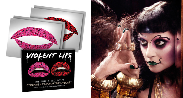
More rumblings of a bold lip trend surfaced in 2011 with the very popular Violent Lips temporary lip tattoos, available in a range of patterns and finishes, along with a sheer green lip gloss from Illasmasqua.

(images from beauty.com and illamasqua.com)
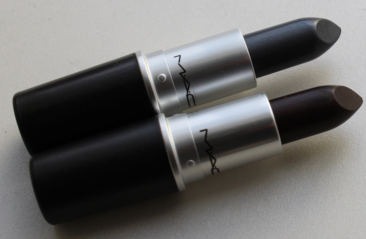
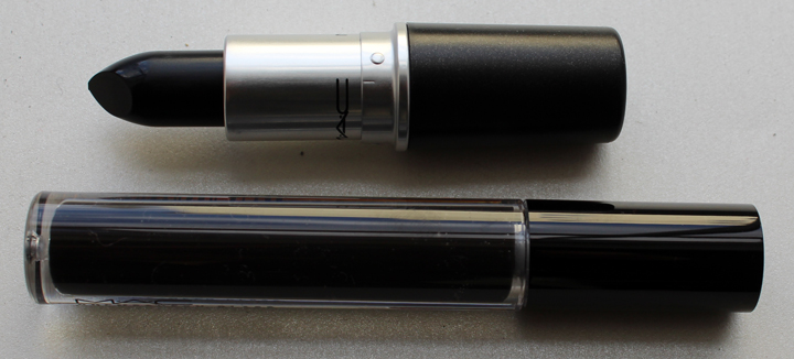
2012 proved that the obsession with black lips wasn’t over with the debut of MAC’s limited edition Grey Friday lipstick, followed shortly thereafter by a black lipstick with gold shimmer. Also in late 2012, indie fave OCC joined the Sephora fold, offering their popular Lip Tars in bright blue, shimmering lime green and bright white.

MAC Grey Friday and Firm Form
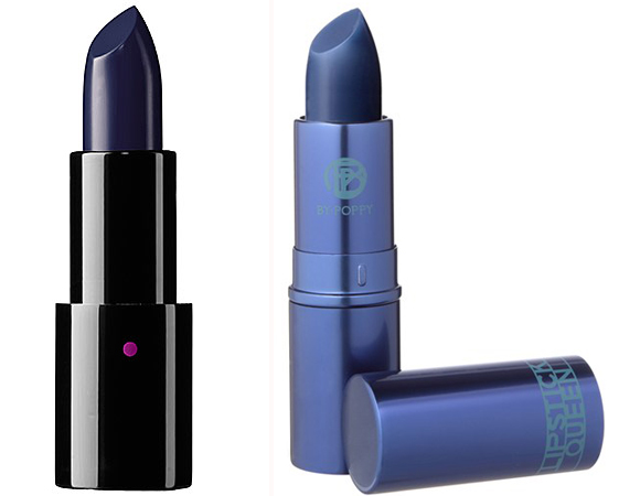
Last year, however, is when things started to get even crazier. Not only did we have Dolce & Gabbana launching a green lipstick with their holiday collection, both Ardency Inn and Lipstick Queen both introduced blue lipsticks, while music star Rihanna wore blue lips for a night out in London.

(images from sephora.com and nordstrom.com)
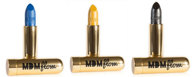
Meanwhile, new kid on the block MDM Flow made a splash in November 2013 with its hip hop-inspired lipsticks. Founder Florence Adepoju is a recent cosmetic science grad from the London College of Fashion and says that the line is “an accumulation of all my obsessions, the colours black and gold, hip hop, beauty, fashion and science.”

(image from mdmflow.bigcartel.com)
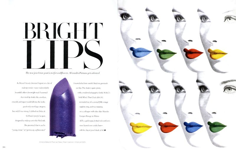
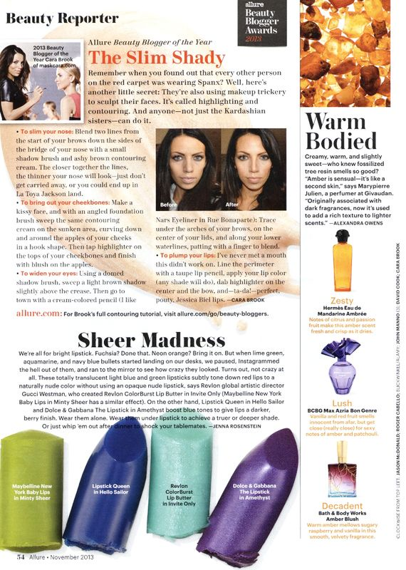
The very end of the year witnessed coverage of the statement lip trend at various blogs and print magazines. Here are some selections from Harper’s Bazaar and Allure November 2013 issues. (Interestingly, this issue of Allure also contained an article about Hunger Games-inspired beauty and how outlandish makeup is becoming more of the norm.)


MAC also kept the trend up with the Punk Couture collection that was released the day after Christmas and included a matte black lipstick – Hautecore, which was previously for sale on Black Friday, and a sheer black gloss, Dark Outsider.

Finally, based on the sales of lipstick in 2013, some are even suggesting that bold lips are edging out nail polish/nail art as the must-have cosmetic accessory this year.
Personally I’m pretty adventurous when it comes to wearing basically any color on my eyes, but lipstick is a different matter. While I’m eager to jump on the bandwagon and try all these weird colors, my lips are on the thin side and thus aren’t so accommodating for unusual hues. Plus, while I can get away with green eye shadow at work, I’d definitely get some disparaging looks if I attempted black or green lipstick. So this boring office job holder can only experiment with the trend on weekends.
What do you think? Are you up for crazy lip colors?
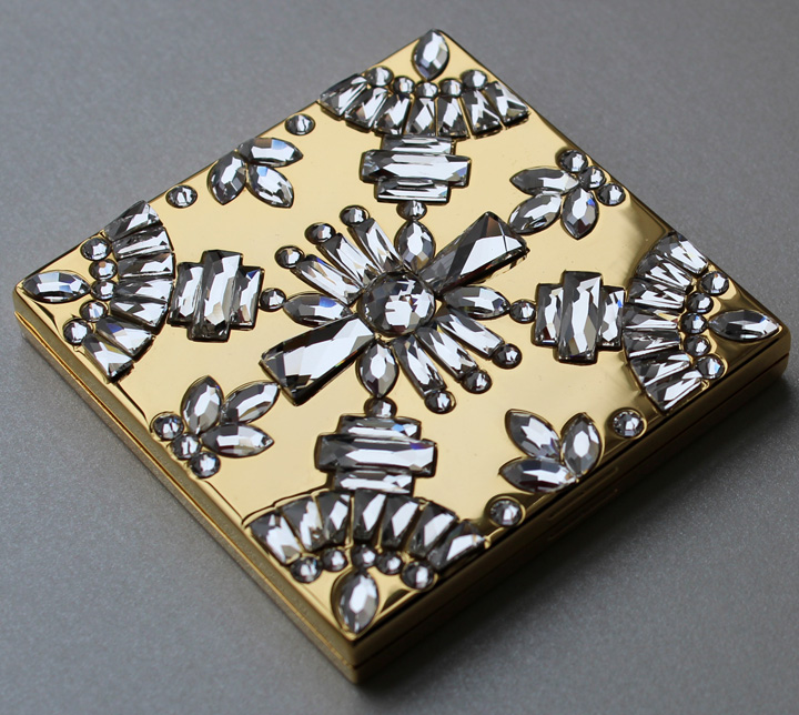
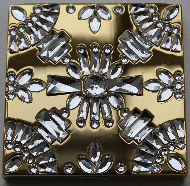
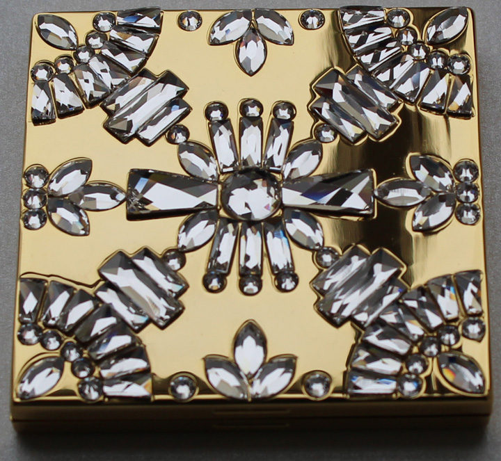
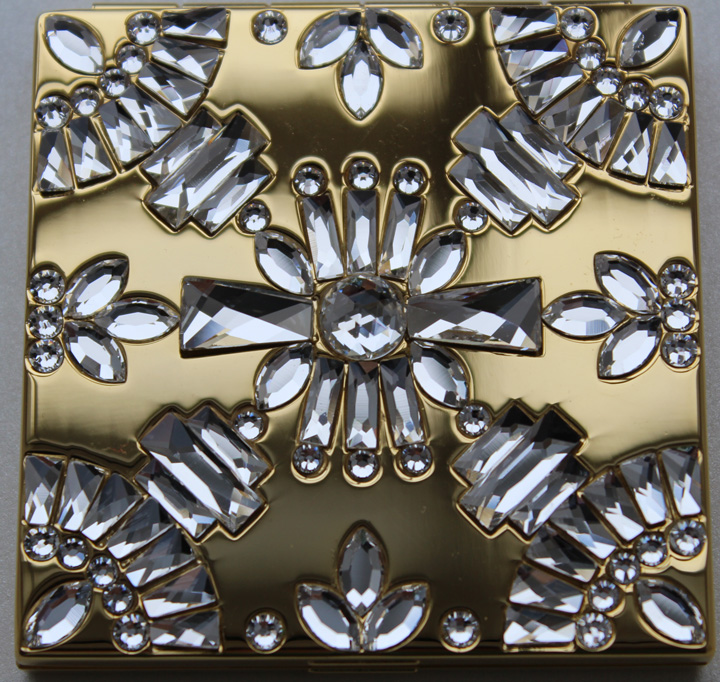
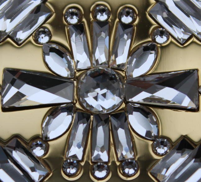
Sometimes tons of crystals on a palette can appear, for lack of a better word, cheap. Not so with this very tasteful mirror compact created by jewelry line Lulu Frost for Bobbi Brown's Hollywood-inspired holiday collection. Lisa Salzer, founder and creative director of Lulu Frost, spoke to elle.com about how the collaboration developed. "[Bobbi] bought a necklace of mine and wore it out to a wedding and loved it…she actually called us afterwards and from then on, a great relationship was born.”
I thought the pattern was really unique and pretty, and I like that there's a retro feel to it without being costume-y. It's the ultimate expression of "modern vintage".


Salzer states that the design took its inspiration from an old compact that Brown had purchased at a flea market. “So I took that [compact] and created one that was encrusted with an Art Deco pattern of crystals on top. I love Deco. It’s so classic, the craftsmanship is incredible, and there’s also a geometry to it that’s very cool.”
Since I'm short on time today I will not go into comparing this piece to Art Deco compacts or jewelry, but I will say that it's a good representation of the Lulu Frost style. Incidentally, I did look at the website to see if there was anything identical to the pattern on this compact. There were similar items but nothing identical, so I was pleased that Salzer did something different just for this collaboration but still kept true to her aesthetic.
What do you think of this compact? Too blingy or just right?
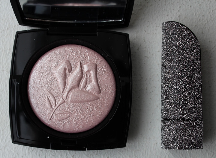
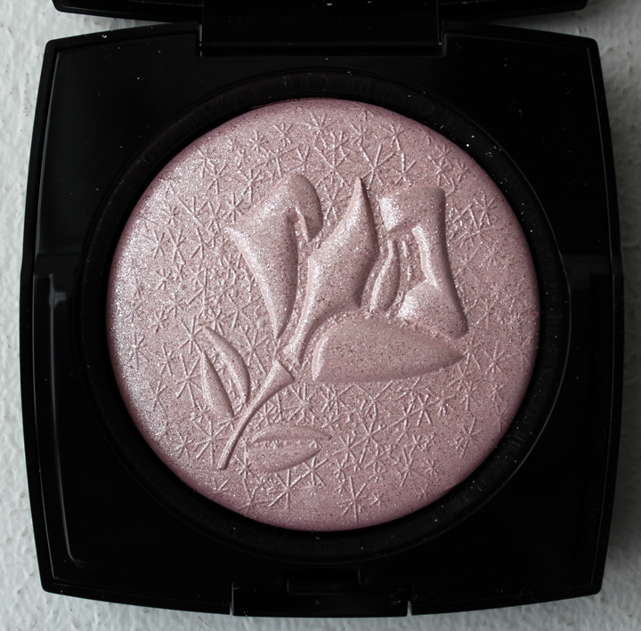
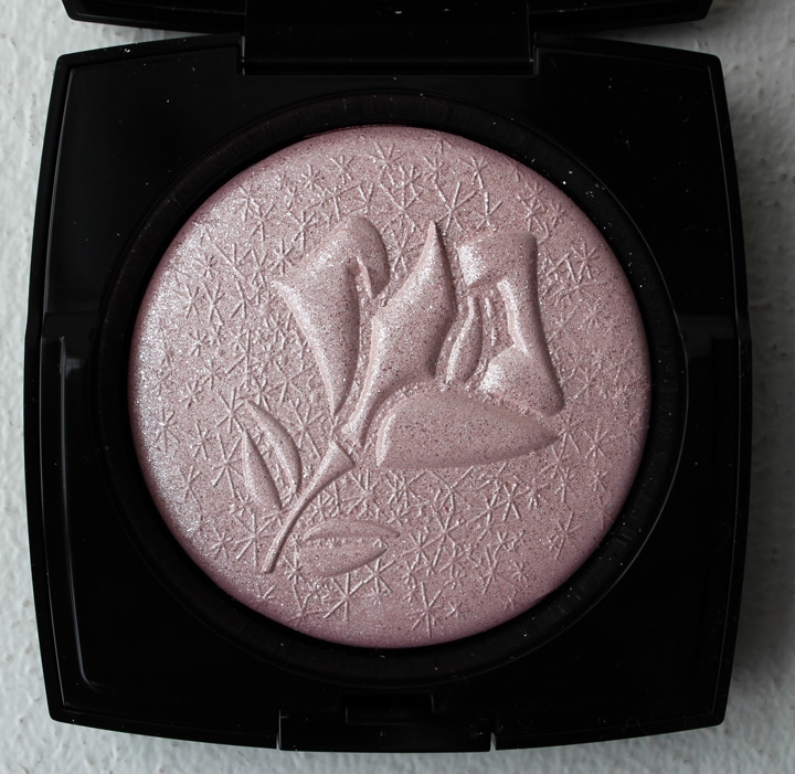
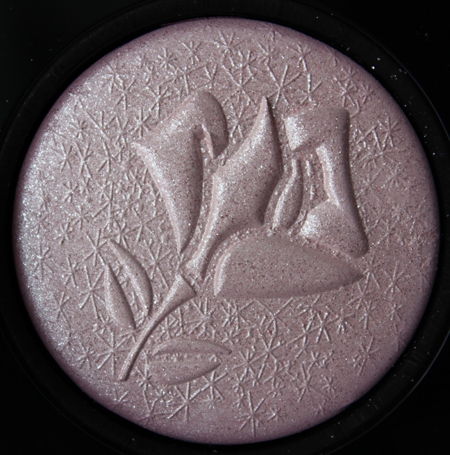
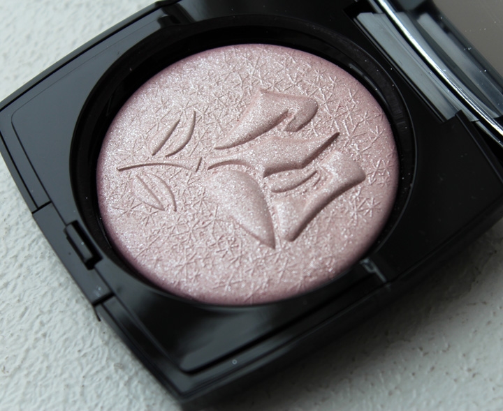
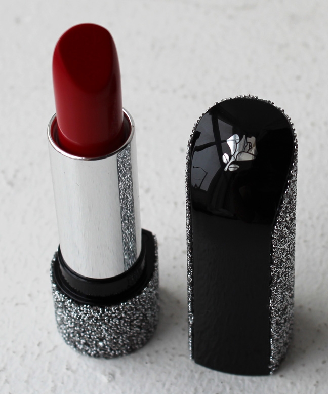
As I noted yesterday, I am defenseless in the face of glittering, glimmering makeup items come holiday season. Well, to be honest I can’t resist sparkly makeup at any time of the year, but the holidays make me even weaker. So when I saw what Lancôme had up their sleeve for their collection I pounced on the two collectible items in it: The Rose Étincelle Highlighter and the Swarovski-encrusted Rouge Absolu lipstick.

Inspired by the “magic of a snowy winter scene”, the highlighting powder features Lancôme’s signature rose surrounded by star-like snowflakes, making it look as though it’s “captured in crystalline frost.” I’d say given the highly shimmery surface, with its miniscule glitter particles, the description is apt.


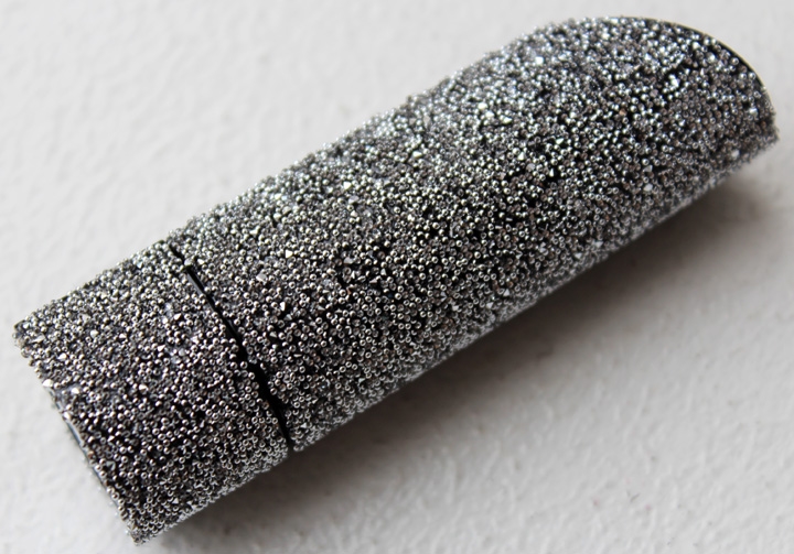
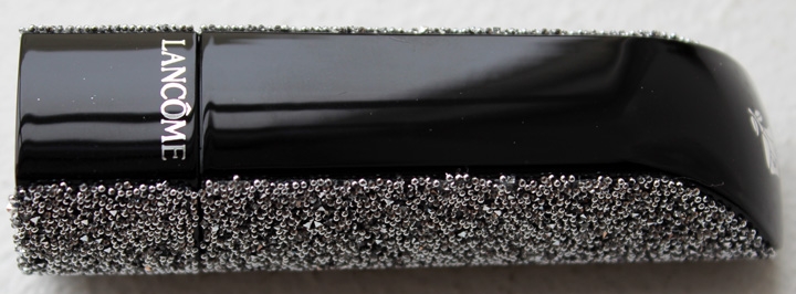
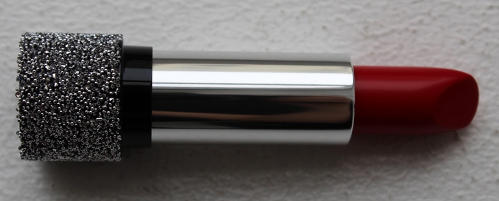
This lipstick shade is a reissue of a “heritage” shade from 1955. While I was frustrated at not being able to find much on this vintage color, I loved the use of tiny silver beaded crystals on the cap.

I also liked the relatively restrained use of the crystals. Instead of covering the entire cap, Lancôme left the middle portion unadorned, leaving the sleek black of the case to shine through.


I really could not find anything regarding the Étincelle shade or heritage collection from 1955, other than this French ad. Sadly it’s in black and white so we can’t even see the color to compare to today’s version.
If anyone can provide any insight on the original Étincelle, I’d love to hear it!
What do you think? Will you be picking up anything from Lancôme’s holiday lineup?
It's amazing what you find when you follow over 850 blogs. I came across these intricate lipstick sculptures by Hong Kong-based artist May Sum courtesy of Refinery 29. Move over, Paul & Joe kitty lipsticks!

May Sum started her career as a beauty reporter, then evolved into a makeup artist. About two years ago she carved her first makeup sculpture from a stick of concealer, and from there expanded to lipsticks and cream blush. In October 2012 she had her own exhibition in Shanghai's Wheelock Square, one of the city's tallest buildings. "Reflecting her colorful imagination and passion, May’s carvings represent many aspects of a lady's life, while also mapping women's social progress over the past century. There is a cat, a doll, dresses, high heels, saucers, alphabets and even fashion accessories, such as a small purse, each meticulously carved into the head of a lipstick." Sum also hosted a day of makeovers, "encouraging every lady at Wheelock Square to use [makeup] as a way to help realize both her personal and professional dreams." To my feminist self the location of the exhibition seems a little patronizing. The majority (60%) of office workers in the building are women, and the exhibition was held "in recognition and celebration of the importance of lipstick for so many of its tenants." An office building full of women professionals? Surely they'll love a lipstick exhibition, because, you know, all women are crazy about lipstick! Another exhibition press release states, "[Lipstick is] an indispensable part of the modern female professional's life–it is a most intimate and faithful friend. Different shades and brands, worn at different stages of life, can record a woman’s career path and key milestones of her life. No matter her position, whether intern or senior executive, and no matter in what kind of professional occasion a lady’s lipstick stays close at hand. As well as in her handbag, at least one stick of her favored color is likely to be found tucked inside her desk, laptop bag and luggage, just in case." Wait, what? I work with a staff that's almost entirely women and only 2 of them besides me wear lip color of any kind (and it's not a regular occurence either.) So it strikes me as rather presumptuous to assume all professional women are into makeup.
Having said all that, I still love the sculptures themselves. May Sum's newest exhibition, "Woman Power" was held this past August at an art gallery in Hong Kong – it's a much better venue, and as the sculptures are of influential women in fashion and entertainment, it has a more empowering stance than the 2012 exhibition.
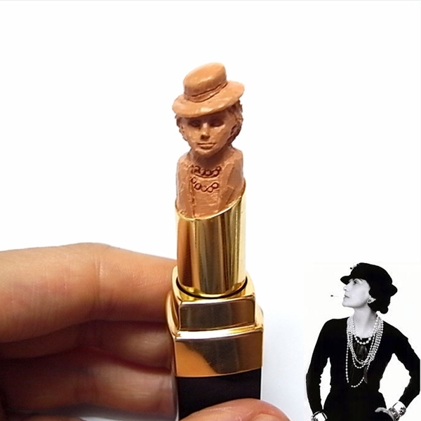
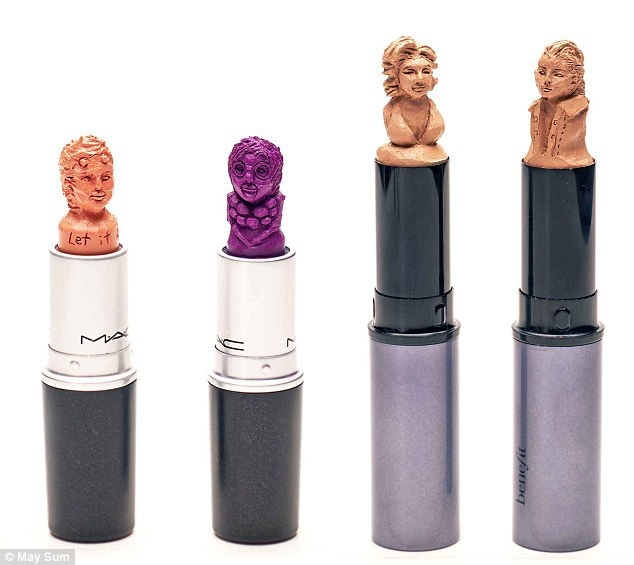
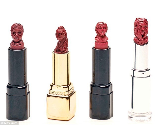
Here's Coco Chanel in a chic beige:

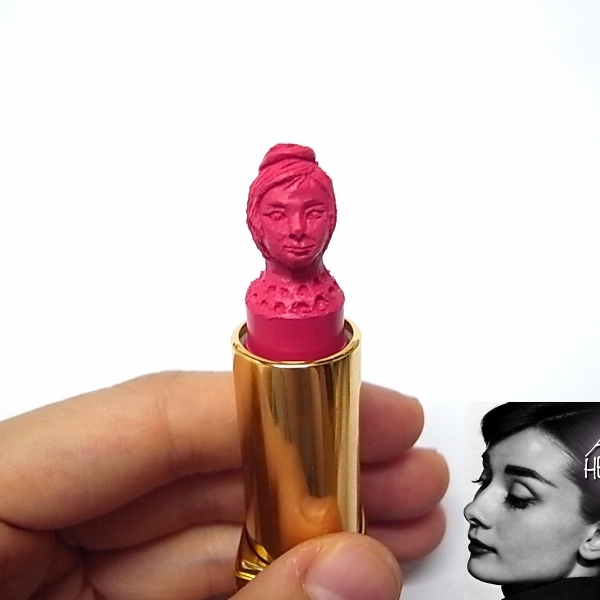
Audrey Hepburn in a vibrant pink:

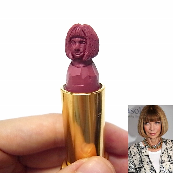
Anna Wintour in a sophisticated rose:

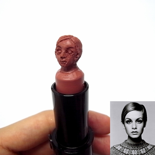
Twiggy in a mod pinkish-nude:

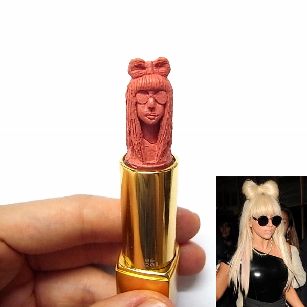
And Lady Gaga in a surprisingly understated peach:

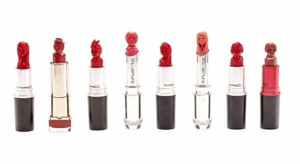
There were many others as well; in the picture below, Vivienne Westwood and Iris Apfel are on the left. I'm not sure who are the right two are, but the one second from the right looks like Marilyn Monroe, possibly?

I love Madonna from her Blonde Ambition days (second from left):

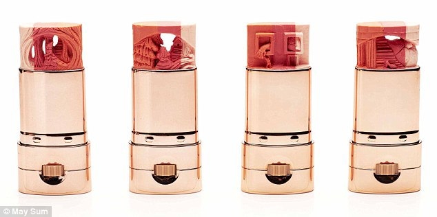
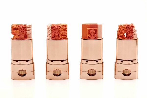
May Sum has also done landscapes and other beautifully detailed designs.


(images from sneakhype.com and astairwaytofashion.com)
As for interpretation of her work, May Sum leaves it up to the viewer. “People may be attracted by my sculptures thinking they are cute. Whether they can read more into them, and think deeply about consumerism and luxury depends on the individual," she says in an interview. While I think initially May Sum's pieces were more about the novelty of sculpting objects out of lipstick, they seem to have evolved into a more high art concept. Perhaps it's a commentary on the ever-changing relationship between women, beauty standards and power, or a convergence of an object usually associated with a woman's femininity and iconic women who re-shape or defy traditional beauty and fashion ideals.
Want one of your own? If you visit her Etsy shop, you can have anything you want sculpted into a lipstick, even your own likeness! It's not cheap (prices range from $450-$650) but I love the idea of having a custom-sculpted lipstick. I would probably have it shaped into one of my beloved museum staff members. ;)
What do you think? Is this a gimmick or art?
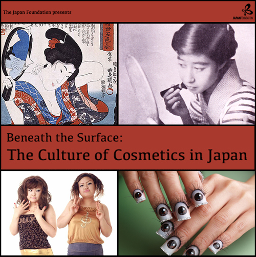
Thanks to PJ at A Touch of Blusher, I was alerted to these events at the Japan Foundation in London. "Beneath the Surface: A Culture of Cosmetics in Japan" will feature two talks by Noriyo Tsuda, Chief Curator of the POLA Research
Institute of Beauty and Culture (how do I get that job?!)

(image from jpf.org.uk)
The first presentation is "Haniwa Beauty to Snow White – Japanese Cosmetic Culture from Ancient Times to Now" and will take place tomorrow at 6:30pm. The description: "From ancient customs to current trends, Tsuda will look at Japanese
cosmetic practices over the course of history and discuss how Japanese
cosmetics have developed through the centuries. Giving an overview of
the aesthetic ideals and reasons for the use of these cosmetics, this
talk will provide examples of how lifestyle and social circumstances
have influenced the culture of cosmetics in the past and affected
contemporary standards of beauty in Japan."
The second talk is "Beauty Icons – Primping and Preening in Edo and Meiji Japan," which will take place on November 8 at 6:30pm. "In this talk, Tsuda will compare and contrast two of the most
distinguishing periods of cosmetic culture in Japan, namely the Edo
(1603 – 1867) and Meiji (1868 – 1912) eras. Exploring the
characteristics of Japanese cosmetics in the Edo period, when
traditional cosmetics are thought to have matured, she will elaborate on
what cosmetics were used and who the trendsetters were. Moving on to
the Meiji period, Tsuda will discuss how grooming standards and notions
of 'beautiful women' were impacted by drastic social reform after the
opening of Japan to the West."
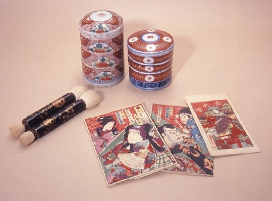
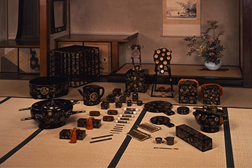
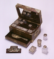
I did a little more digging and I found an event poster with these two pictures, the objects in which I'm assuming Tsuda will discuss.


(image from zo.uni-heidelberg.de)
I was greatly intrigued by this POLA Research Institute of Beauty and Culture so I gathered some basic information on it. The POLA Research
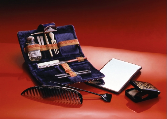
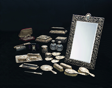
Institute of Beauty and Culture was founded in 1976 under the son of the founder of cosmetics company POLA Orbis Group, Suzuki Tsuneshi. It's now part of the POLA Museum of Art in Hakone, Japan, which displays Tsuneshi's personal art collection consisting of over 9,500 objects. While the museum boasts roughly 400 paintings by Western artists (Cezanne, Gauguin, Monet, Renoir, Picasso, Chagall), there is a section of the museum devoted to the beauty objects he collected as well. Some of these treasures include:
A silver dressing set with an iris pattern from the early 1900s:

A bride's wedding kit from the Edo period:

And a mid-19th century dressing case.

(images from polamuseum.or.jp)
I don't know about you, but I'm ready to hop on the next plane to London to catch both talks, then off to Japan to see the POLA collection! I really wish they had a museum catalogue for their beauty items available for purchase online…maybe Tsuda will spearhead the release of one eventually and/or a book based on the talks he's giving in London.
