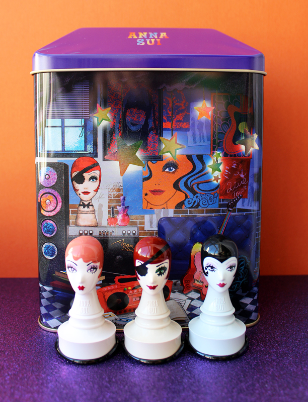
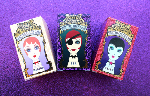
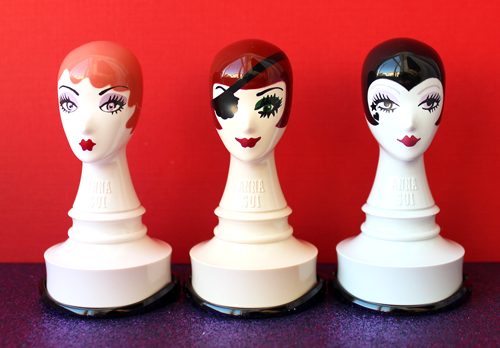
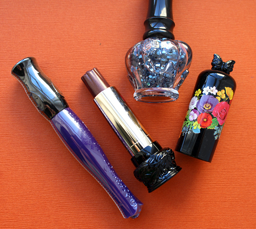
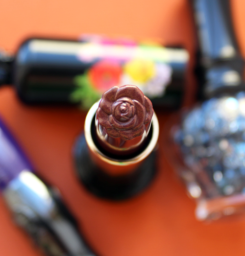
In honor of the 20th anniversary of her cosmetics line, Anna Sui debuted a new collection featuring the iconic dolly heads that have become synonymous with both the fashion and beauty brands. As soon as I saw these three little gals – Marion, Bea, and Sally – I knew they belonged in the Museum. The cases can house either lipstick or eye shadow (they twist off at the bottom.)
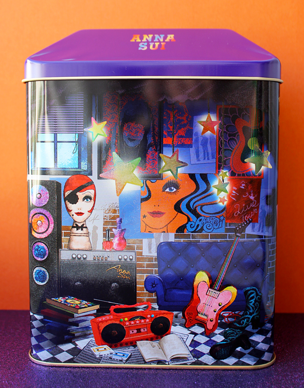
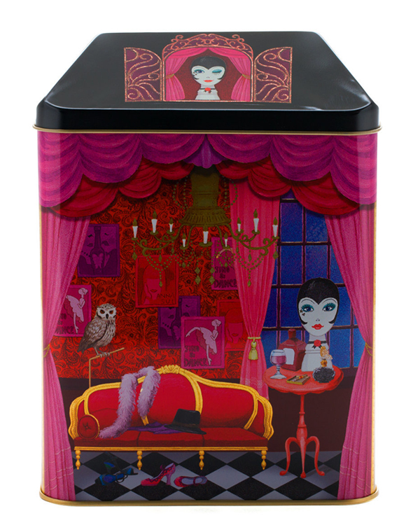
There were also three corresponding coffrets sporting little vignettes of each lady's lair. I limited myself to one since holiday collections are a comin', but obviously I'd love to have all three for the Museum. I chose Bea since she seems to be the most badass. The rock 'n roll details on this tin just spoke to me.
I also really liked the colors it came with.
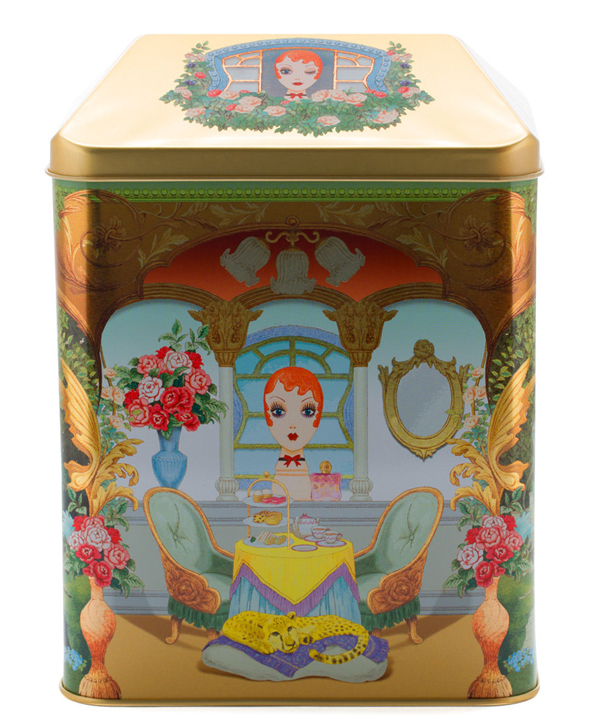
Here are the other two coffrets. How cute is the owl on Sally's tin?!
So who are these ladies and why are the dolly heads so prominent in Anna Sui's branding? Let's start with the individual dolls in the collection, all of whom were inspired by real or fictional women.
Marion was inspired by Marion Davies, a popular 1920s and '30s screen siren.
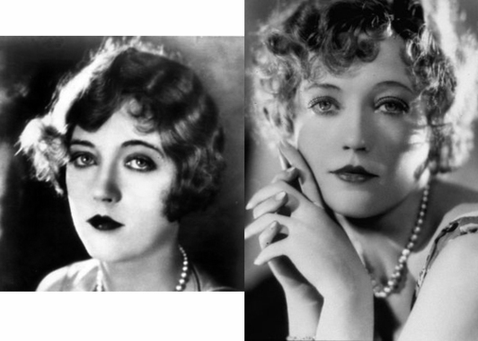
(image from huffingtonpost.com)
Bea, as I suspected, is a rock star. Her hair was inspired by another old-school actress, Louise Brooks, while the eye patch is a nod to the "space pirate" iteration of David Bowie's Ziggy Stardust persona. (A more modern interpretation might also be an homage to Elle Driver from Kill Bill…but probably not since Elle was not exactly any sort of role model.)
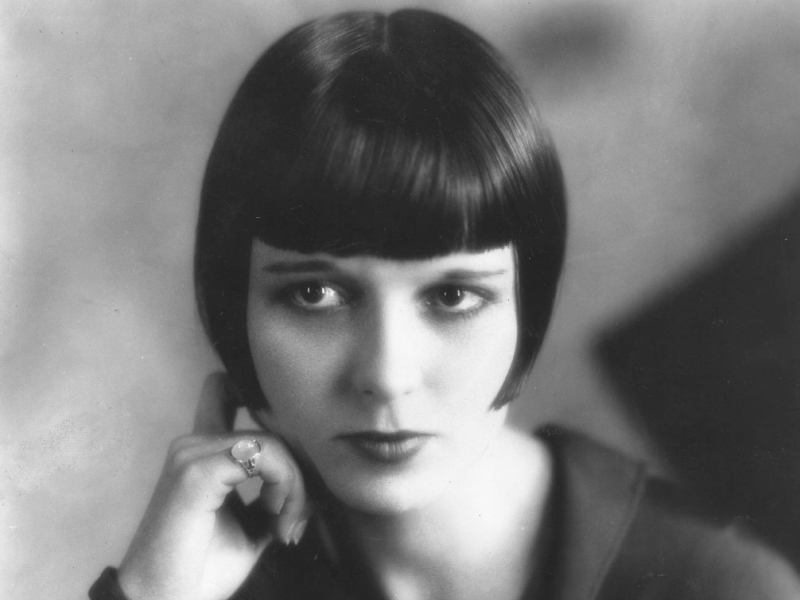
(image from independent.co.uk)
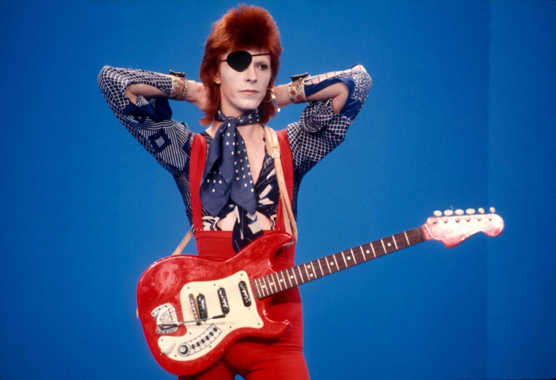
(image from morrisonhotelgallery.com)
Sally was named after Liza Minelli's character in the 1972 film Cabaret, Sally Bowles.
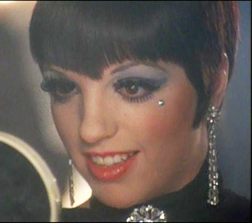
(image from lecinemadreams.blogspot.com)
Now let's explore the origins of these dolly heads. Fortunately I didn't have to do a lot of digging to find out the full scoop. In an interview with The Thick, Sui explains how the dolly heads came to be. “I first noticed papier-mâché dolly heads like this while watching the ‘60s-era British TV series, The Avengers, as a kid. I found this one years later at a New York City flea market, right before I opened my first store on Greene Street in 1992. The back of its head was cracked open, so I could see how it was constructed, and I thought, I could make this.’ So, I and friends of mine like [stylists] Paul Cavaco, Bill Mullen, and [illustrator] Tim Sheaffer started to make our own, which I used to decorate my store. And, over time, papier-mâché dolly heads kind of became symbolic of Anna Sui.” Like Benefit and Stila, who in their early days used mannequin heads and illustrations, respectively, the dolly heads' initial creation was primarily a cost-saving measure. "I found a space on 115 Greene Street, and while I was waiting to hear whether I'd gotten the lease, Bill, Paul, Tim Scheafer, and I would sit around making dolly heads out of styrofoam and papier-maché because I had absolutely no budget for decor. We competed against one another to see who could give our heads the most character: big noses, high cheekbones, prominent chins," Sui notes in The World of Anna Sui (p. 14-15).
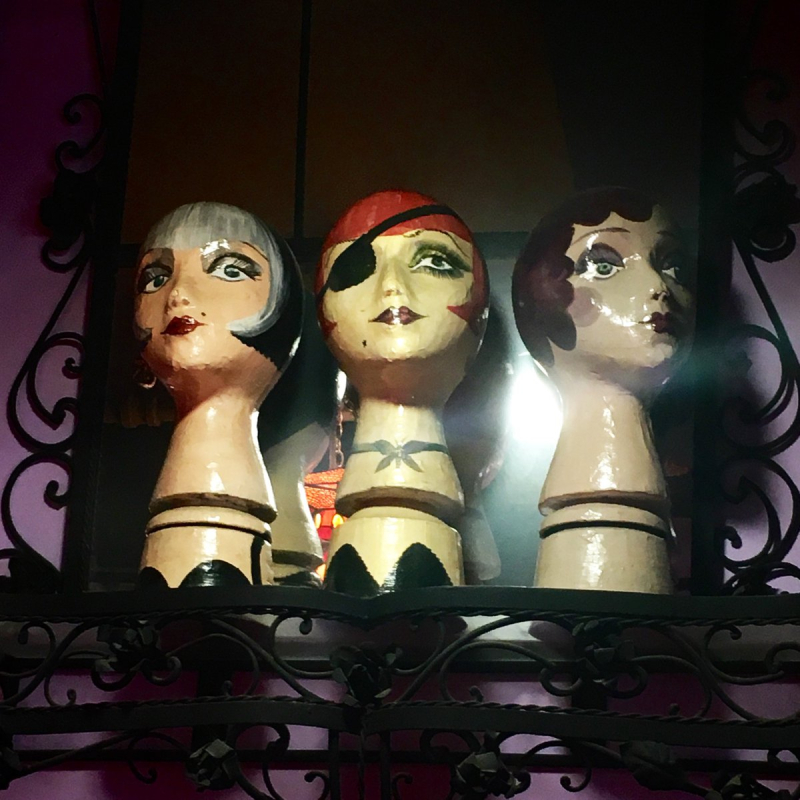
(image from twitter)
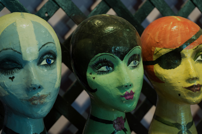
(image from thethick.com)
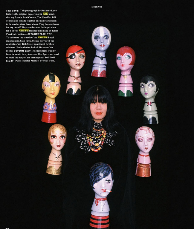
(image from The World of Anna Sui, p. 28)
Sui was also inspired by the work of papier-mache artist Gemma Taccogna. It's quite the coincidence she mentioned this artist and the lipstick tubes she made since I've spotted a few during various vintage searches and have been meaning to write a post about them. Sui reflects on the artist's influence: "[Taccogna] made everything: dolly heads, jewelry, compacts, desk accessories, and more. I love how she drew; you can recognize a lot of her stuff by the eyes…at one point, I would go to the flea market on 6th Avenue in New York City every weekend to look for Taccogna pieces. I have so many now, I can’t even count them. Taccogna works weren’t expensive when I first started collecting them, but recently I’ve seen some for as much as $500 on eBay…Carolyn Murphy gave me my first lipstick tube. She saw it at a flea market and said it reminded her of me." She's not kidding – even the knockoff imitation Taccogna lipstick tubes go for several hundred dollars. I'd love to have some of Sui's collection for the Museum!
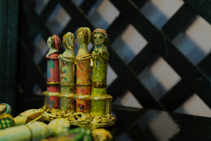
(image from thethick.com)
By 1994, a mere two years after the opening of the Sui's first store, the dolly heads – along with black lacquer, roses and butterflies, and extensive use of purple (her favorite color) – had become synonymous with the brand. Together these design elements formed a cohesive aesthetic that represented Sui's whimsical vision. Store spaces brought these motifs to life, allowing customers to be fully immersed in the designer's unique world: "Externalizing my aesthetic clarified it. Everything became more iconic. Macy's and Galeries LaFayette opened a shop-in shop for me with all the decorative elements that defined 113 Greene: the dolly heads, the art nouveau butterflies and roses, the Tiffany glass. It wasn't about authenticity – the Tiffany glass was plastic – it was about the Look, so recognizable that it made my brand successful." (The World of Anna Sui, p. 15)
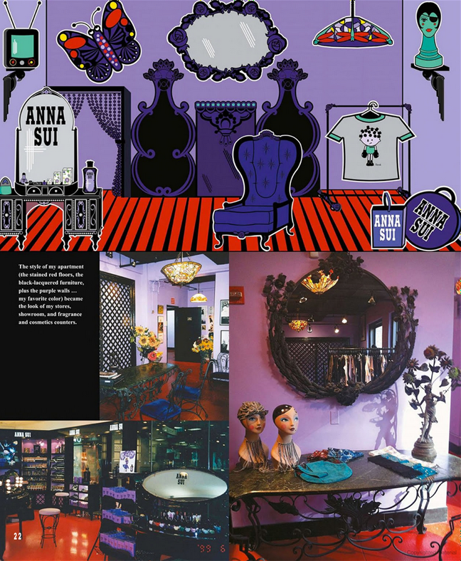 (image from The World of Anna Sui)
Artist Michael Economy created the first dolly head illustration, which appeared on the clothing in the 1994 fall collection.
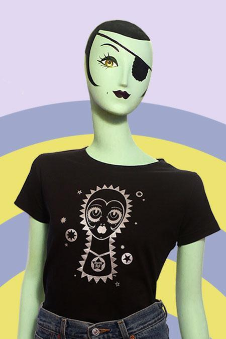
(image from annasui.com)
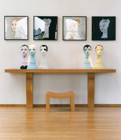
By the late '90s, so easily recognizable as a key aspect of the brand's identity were the dolly heads that they received their own full-body mannequins from renowned designer Ralph Pucci, as well as recreations of the original papier-maché heads. Says Sui, "We did them in blue, yellow, lavender, and ivory ‘skin,’ and Michele Hicks, my favorite model for a long time, was the body model. I still use them in my stores."
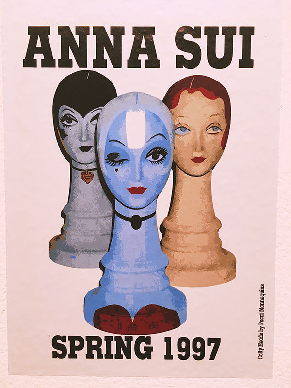 (image from craftandtravel.wordpress.com)
As a natural progression, the mannequins took on the personalities of the dolly heads. An In Style article detailing the 2015 Ralph Pucci exhibition, a show in which Sui's mannequins were prominently featured, demonstrate the significance of the dolly heads and their full-sized counterparts for Sui's design and branding. "'I’ve always been fascinated by mannequins,' Sui said. 'They give you a chance to create a character, or a symbolic person for your brand. It’s so important to show clothes with a head on top, so then you get a scale of the person. Even though the head is not you, you can picture it. And then, why not make it stylized? It’s your fantasy person…All of the idiosyncrasies of my dolly heads went into the mannequins,' Sui said. 'Through the years, the black lacquer furniture, and the purple walls and red floors of my stores, all became icons of the brand, but so did the dolly head – to the point we did a perfume bottle based on that.'" Interestingly, Sui is so taken with mannequins and their power to convey various personalities that she has one in her home. "[Sui] has a mannequin, a giant doll really, modeled after Diana Vreeland, given to her by the artist Greer Lankton. She dresses Diana up in vintage Courrèges, and poses her with guests who have passed by, from supermodels to Marc Jacobs to Liza Minnelli."
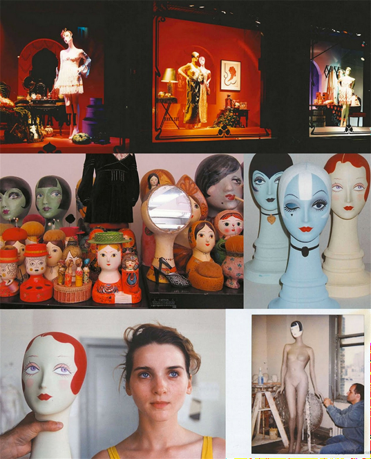 (image from The World of Anna Sui)
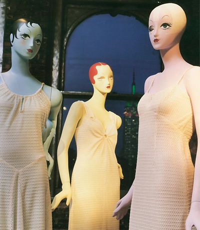
(images from ralphpucci.net)
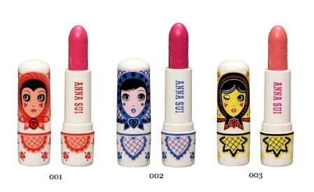
Given their iconic status, it's not surprising that the dolly heads have appeared before on Anna Sui's cosmetics packaging. Previously Russian doll-inspired versions of lipsticks and mascaras were released in the spring of 2011. Sasha, Vlada and Natasha adorably complemented Sui's fall 2011 fashion collection.
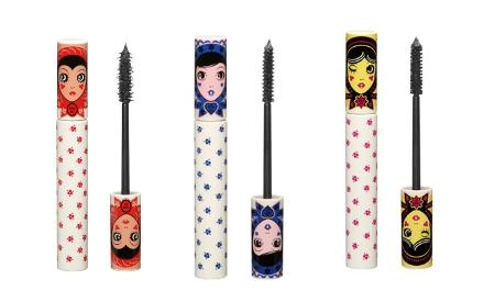
(images from atouchofblusher.com)
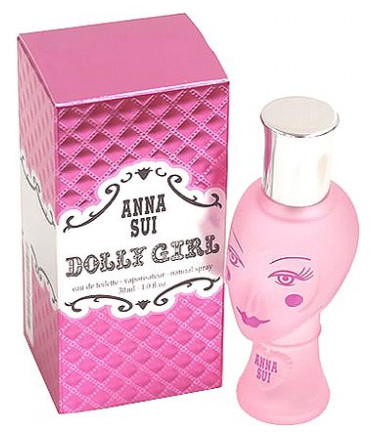
And of course, the motif was used for the famous Dolly Girl fragrance bottle, which debuted in 2003.
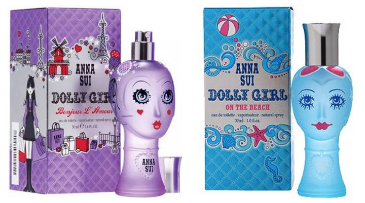 (images from fragrantica.com)
You could even buy your own dolly head as decor thanks to Sui's 2017 collaboration with Pottery Barn Teen. Personally I think they're kind of creepy – I much prefer them in cosmetic form.
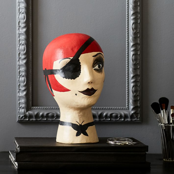
(image from pbteen.com)
Anyway, getting back to the fall collection, I'd say it was well done and quite appropriate to use such a meaningful design element for a 20-year anniversary. These dolly heads represent a significant part of the brand's DNA; they were there from the very beginning and still help define the Anna Sui identity today. I also liked that the dolly heads were recreated in miniature form and used to house lipstick and eye shadow rather than just appearing on the tins, as it's a way for Sui to put her own spin on the tradition of doll-shaped cases (in addition to Gemma Taccogna, there were also the lovely Revlon Couturine cases.)
What do you think? Which of the three dollies is your favorite?


