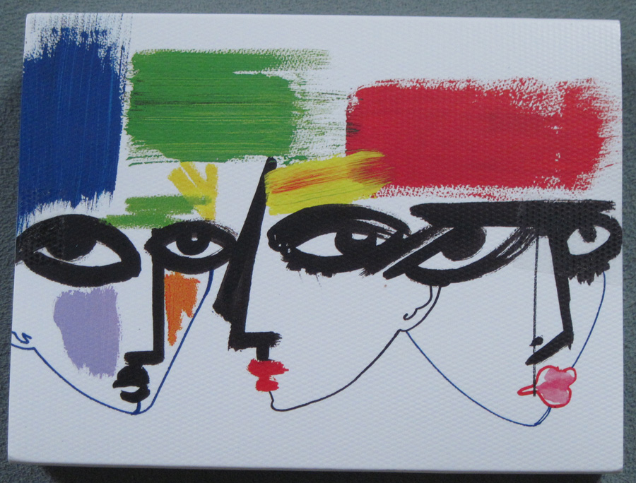
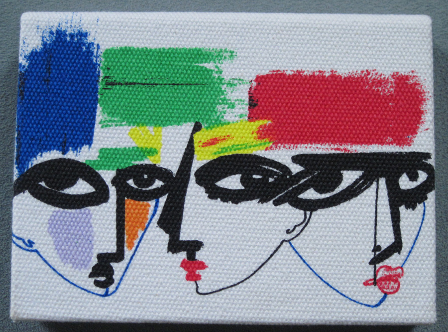
For one of their many limited edition collections for fall 2012, MAC collaborated with three distinct illustrators: Julie Verhoeven, Nikki Farquharson and François Therboud. The collection consists mostly of makeup bags, but some palettes were released for Nordstrom's anniversary sale back in July.
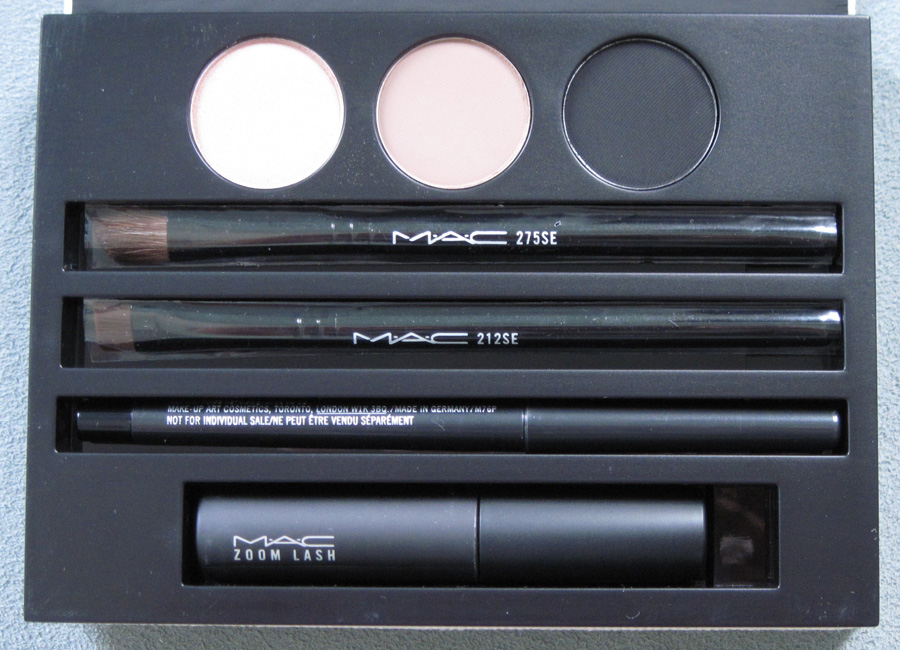
We'll start with Verhoeven. I picked up the Smokey Eye Kit from the Nordstrom anniversary sale, as Verhoeven was the only illustrator of the three in this collection to have palettes with her work on the it (Farquarson's and Therboud's designs appeared only on makeup bags).
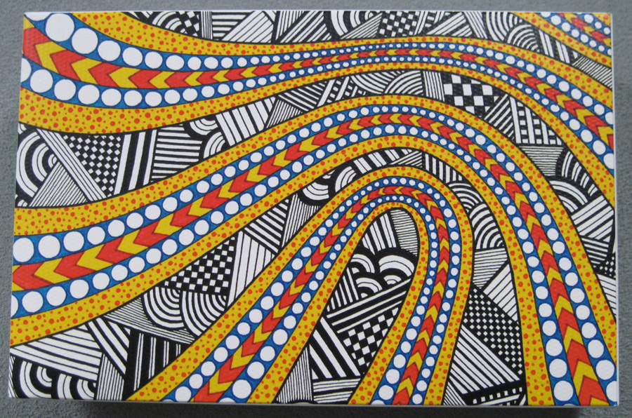
The outer case for the palette is made of a canvas-like material, the same that is used for the collection's makeup bags.
Inside, in case you're curious:
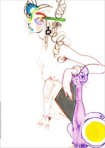
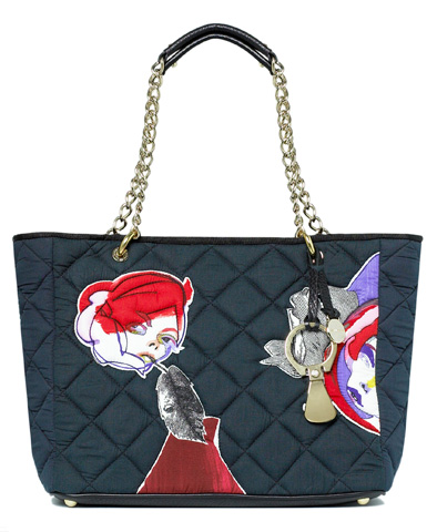
There is also this design, which appeared on the Petite makeup bag. Alas, I have to watch the Museum's budget (the upcoming NARS Andy Warhol collection is much larger than I thought!) so I did not purchase this.
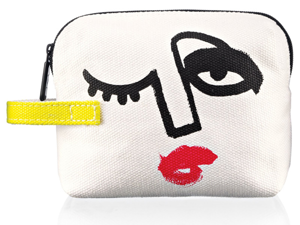
(image from chicprofile.com)
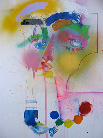
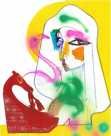
UK artist Julie Verhoeven began her career in fashion illustration and gradually moved into graphic design. She still switches back and forth between the two spheres, providing illustrations of "girls who swing between sweetheart pretty-pretty and angst-ridden and desperate" for articles in magazines such as Dazed and Confused:
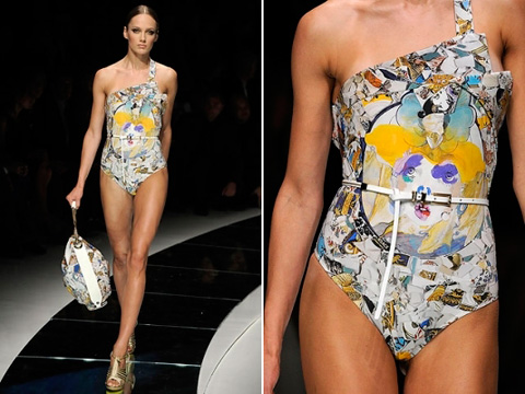
And lending her work to fashion houses such as Mulberry (2007) and Versace (2009):
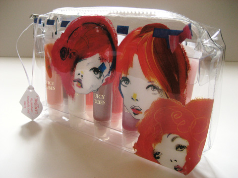
She also put of a few of her signature girls on a limited-edition lip gloss set for Lancome in 2007:
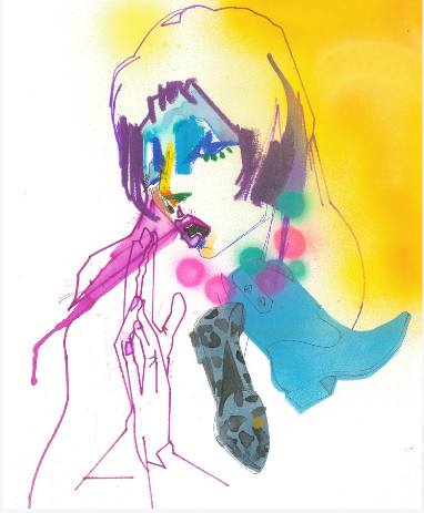
What's most interesting to me about her work is the stylistic shift her depictions of women have undergone. Illustrations from 2006/2007 are softer and more feminine than her most recent work, which has taken a turn towards stronger lines and have a more abstract feel. In a 2012 interview, she says, "My drawings are less pretty and fey
now. More visceral and crude, but fragile and steely in a way. Just a
mush of contradictions." Compare, for example, this illustration from 2006 with one from 2011:
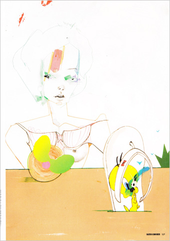
Force a Smile, Flaunt Magazine, 2011:
It is this more recent style that most resembles the faces seen in the MAC collaboration, as seen in the Winter 2012 issue of Plastic Dreams magazine.
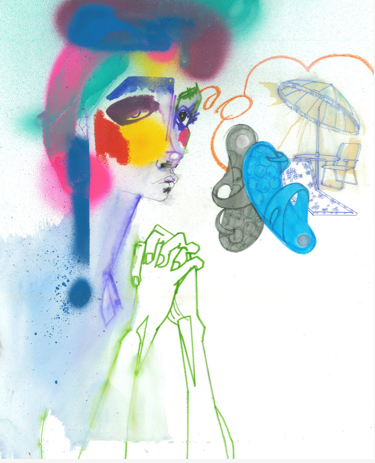
(images from clmuk.com)
The thick outlines of the eyes and broad swaths of color are similar to the ones on the palette, while the exaggerated lower eye lashes can be seen on the Petite makeup bag. I actually prefer this later style, as it appears more forceful and intense than the delicate strokes of Verhoeven's earlier work.
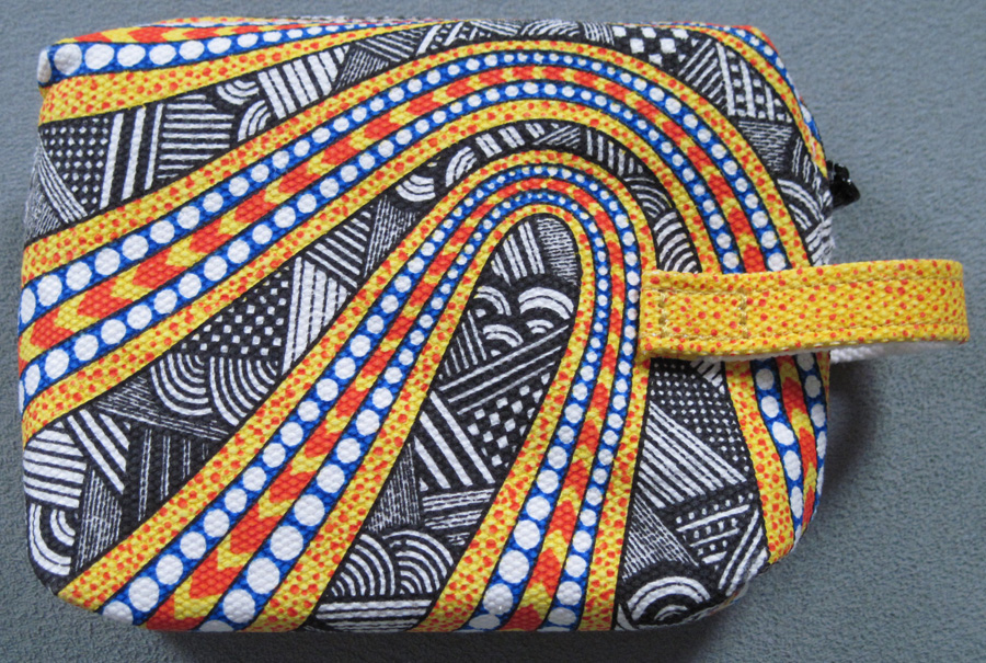
Up next is British illustrator Nikki Farquharson, whose illustration appeared on two makeup bags for MAC (the same pattern for both bags, so I got the smaller one).
According to her bio, "her goal is to combine her love of creating
work with time and care on paper with her affection for abstract shapes,
colourful patterns and assorted details. Mixed-media artwork is fast
becoming the predominant feature in her portfolio – a serendipitous
style which she intends to continue and develop." While I do enjoy the patterns she created for MAC, I'm most struck by the work that uses found images in conjunction with her illustrations.
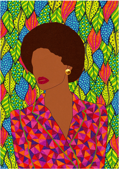
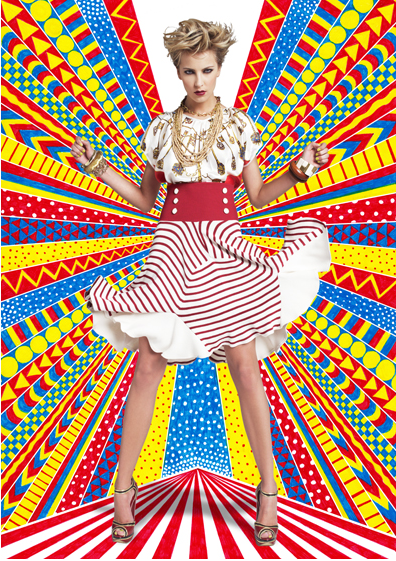
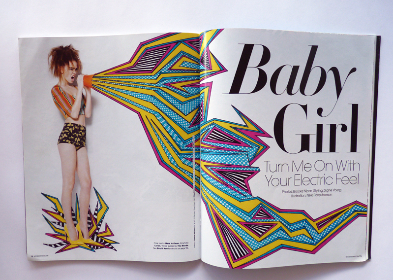
Perhaps the best examples of this type of collage are found in the work she's done for magazines and fashion shoots, where the model is placed against one of the very colorful patterns or actually becomes part of the illustration.
Here's one for Polish fashion brand Paradecka, 2009:
And New York-based Missbehave Magazine, also from 2009:
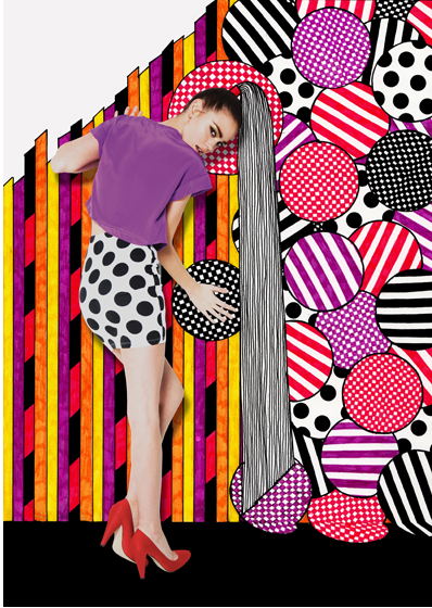
(all images from nikkifarqharson.com)
If her work looks familiar to Benefit fans, it's because she designed the patterns for the brand's Maggie and Annie collection palettes from 2010. I knew the illustrations had to have been done by an outside artist! Why Benefit chose not to disclose that they used Farquharson is beyond me. Especially since there is a great deal of work involved – each one of her patterns is drawn meticulously by hand. Anyway, I would have liked to see some of her mixed-media style in the MAC collection bags, but I'm not sure how well it would have translated to nubby canvas.
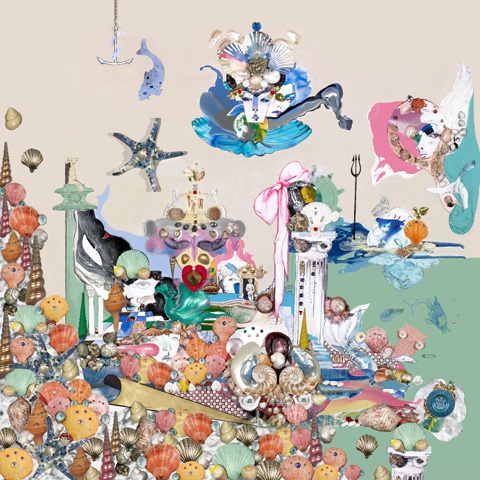
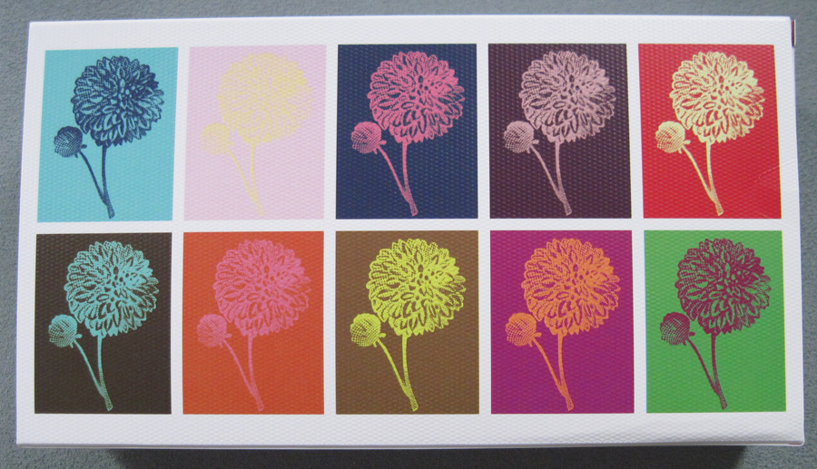
Finally, we have Swiss illustrator François Berthoud.
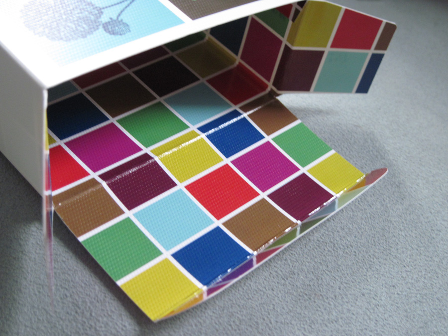
Neat little multi-colored squares on the inside of the box:
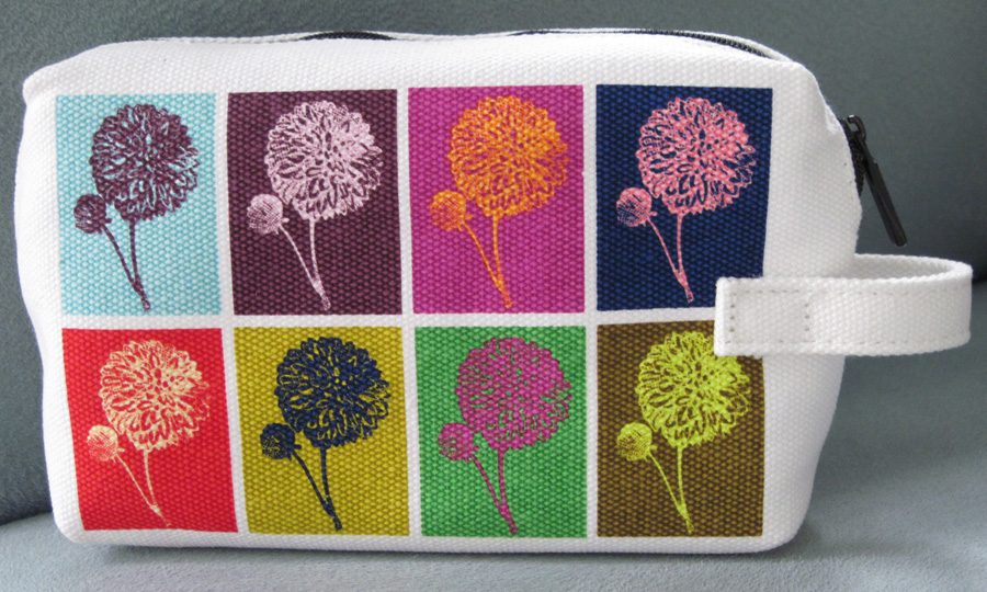
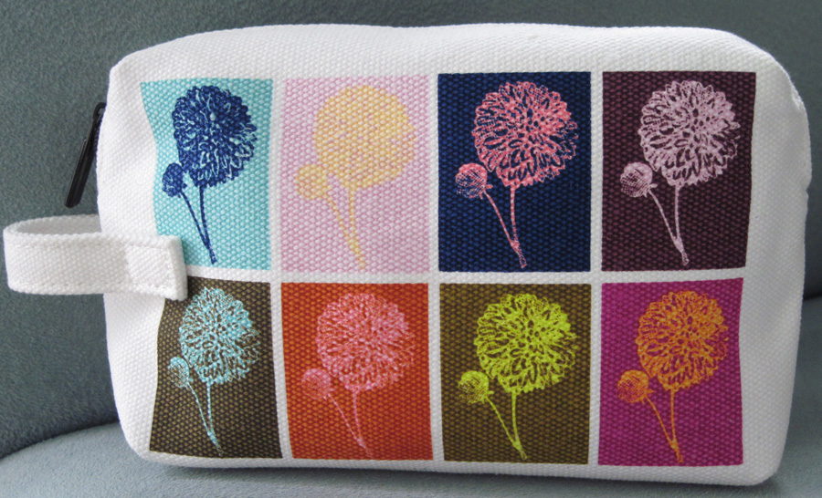
The bag itself. Something I didn't notice at first glance was that the colors are ever so slightly different on each side.
There was also this Petite bag (I got the bigger one because it had more color combinations):
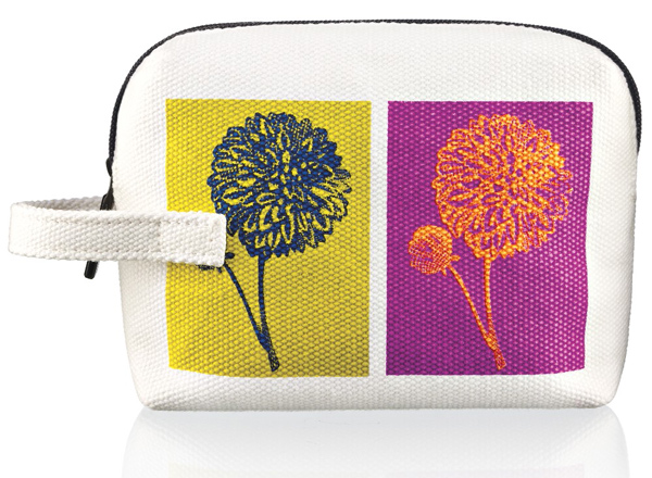
(image from chicprofile.com)
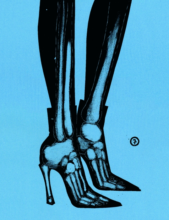
Here's Berthoud's work in a nutshell: "Trained at the School for Graphic Design in Lausanne, Berthoud crafted a
signature style that uniquely marries new digital techniques with
traditional analog methods. The artist’s expressive, aesthetically
appealing linocuts, illustrations, and computer graphics complement
exquisitely with one another…He
says, 'Eroticism is a constant theme, also in advertising. But in
comparison to photography, illustrations can offer more room for imagination and interpretation.'"
Let's take a peek at some of his other work.
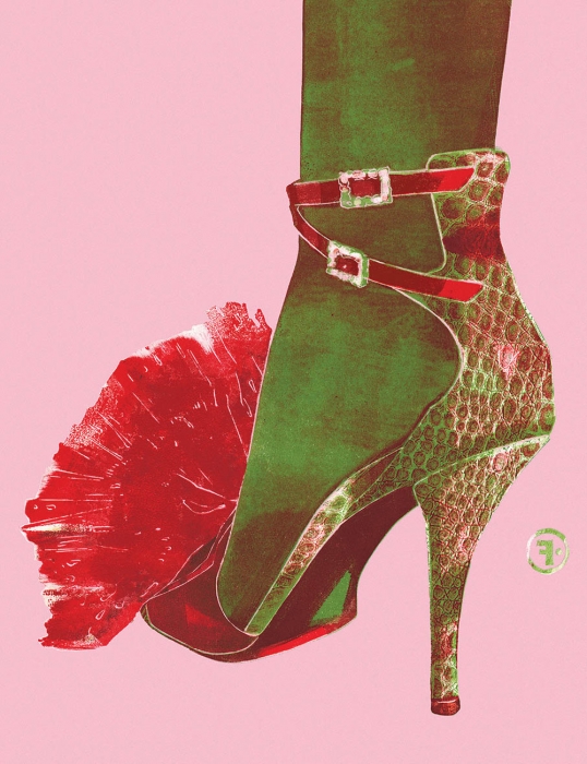
The Hen Who Wanted to Be a Rooster, 2009 (for Roger Vivier):
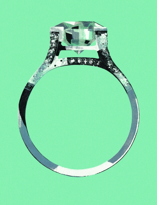
Tiffany ad, 2003:
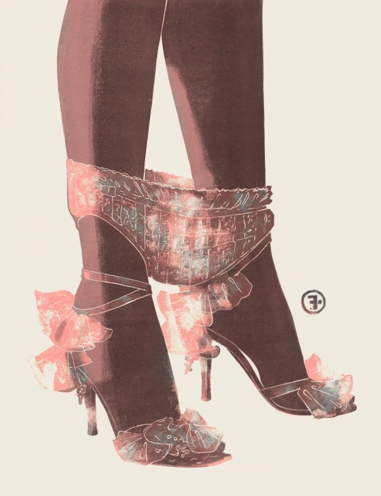
Panties, (for Dior) 2004:
Like Verhoeven and Farquharson, Berthoud did illustrations for beauty products in addition to fashion.
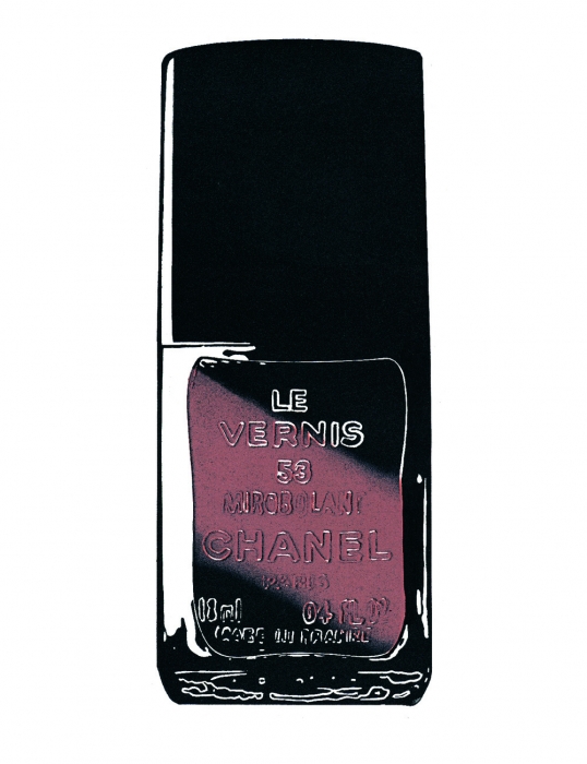
Le Vernis Mirobolant, 1999:
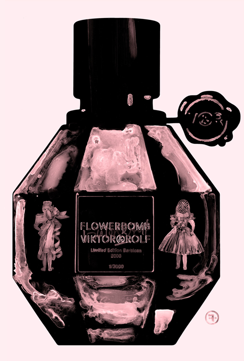
Viktor & Rolf Flowerbomb fragrance, 2008:
And here a couple more, just because I like them. 🙂
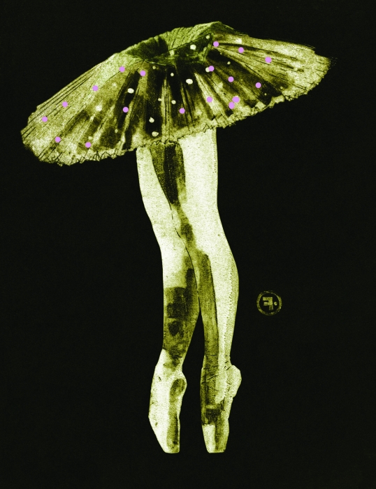
(all images from francoisberthoud.com)
I love that his work is based on photographs but the end result isn't quite photographic. You can tell that these images are made by hand (using the aforementioned linocut technique) but that they also aren't real photos.
Overall, I thought this was a good collection. I think Berthoud's work lent itself best to the canvas material. I felt as though Verhoeven's bold paint strokes became somewhat diluted and Farquharson's precise lines, not as crisp. While the canvas did prove a bit challenging for an accurate representation of these artists' works, I did appreciate that the outer packaging mimicked it. My husband was enamored of the thick, textured paper used in the boxes for the bags.
So what do you think? And which of these three artists is your fave?
