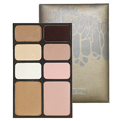
Ever since Allure magazine featured palettes by Hourglass I've been intrigued by them. Well, the not the palettes themselves but the leather case used to hold them! The delicate, understated trees have a gorgeous Art Nouveau character about them, and even the font on the Hourglass logo looks vaguely early 1900s. At the same time, the palettes have a modern sensibility in how compact they are as well as the colors and ingredients used. The colors are subtle and are carefully chosen to create a cohesive look – whether it's a tropical one (the Island palette, with its bronzes and light golds, would be perfect for a sun-kissed summer look) or a daring nighttime one (the smoky shades in the Dusk palette are spot on for this), there is a palette to fit any mood of the wearer. And as a skincare bonus, all of the blushes and shadows contain Vitamin E.
I do wish the packaging for the rest of the line outside the palettes was as interesting, or at least for the palettes to have different designs depending on the colors. They could just make the trees a different color to distinguish the palettes from one another…especially given that the makers of Hourglass seem to enjoy the tree motif – they've also created a separate bath and body line called, you guessed it, Trees. Here's hoping the palettes are merely a starting-off point for more pretty packaging!
(photo from sephora.com)


