Whew! It was a lot of work, but I’m finally ready to share the Museum’s latest special exhibition!
“Sweet Tooth: Confections in Cosmetics and Beauty” examines makeup and other beauty products that are inspired by sweet edibles. From candy to chocolates to pastries, these objects convey the charm of beautifully made desserts as well as the sheer bliss a sugar rush can bring.
The idea of using sweets and dessert fare to sell cosmetics is nothing new, dating back to at least the mid-20th century. In 1940 Elizabeth Arden released a candy-cane decorated collection that was “as gay as the circus!”
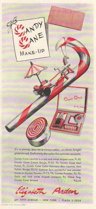
(image from ebay.com)
Twenty years later, Revlon introduced Berry Bon Bon, a shade that “lifts red to a new boiling point [and] dips it in sugar.” In 1972 Yardley expanded on their line of flavored lipsticks, this time including dessert flavors like Snappy Cinnamon Stick and Pink Fluffy Marshmallow.
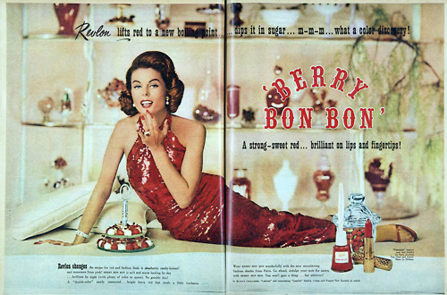
(image from vivatvintage.tumblr.com)
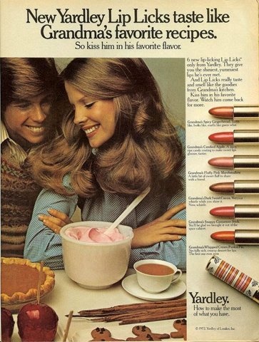
(image from flickr.com)
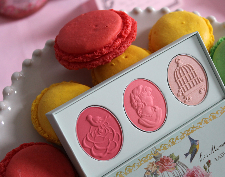
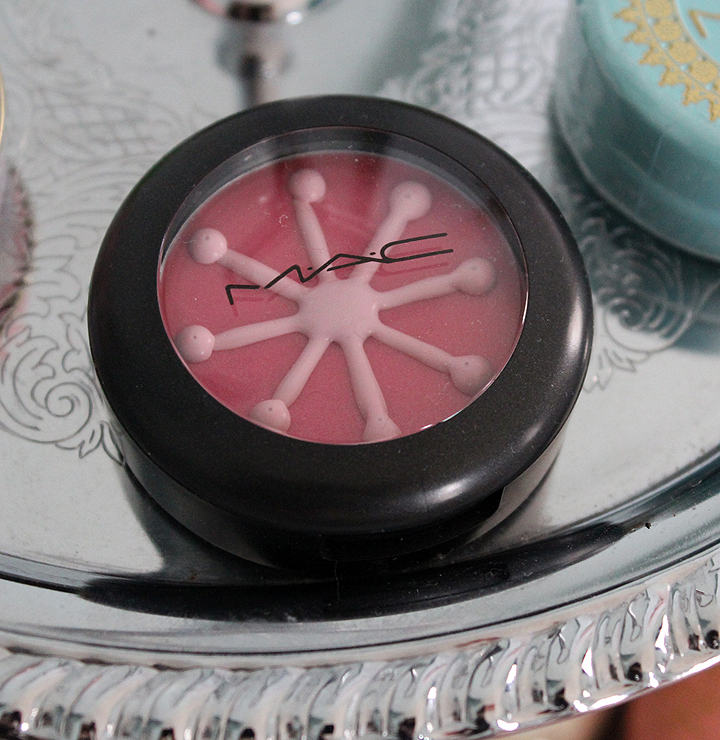
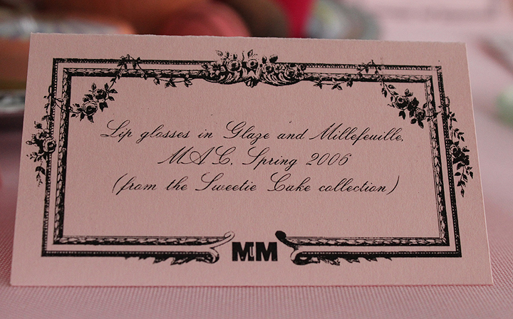
A year later, drugstore brand Bonne Bell rolled out their “Lip Smackers” lip balms in a variety of dessert-based flavors, which are still best-sellers today. More contemporary examples include Prada’s Candy fragrance, Estée Lauder’s 2008 Chocolate Decadence collection, MAC’s Sweetie Cake and Sugarsweet collections (from 2006 and 2009, respectively) and Bobbi Brown’s 2006 Chocolate collection, for which the company collaborated with gourmet chocolate brand Vosges to create a limited-edition chocolate bar. And let’s not forget high-end-turned-Walmart brand Hard Candy.
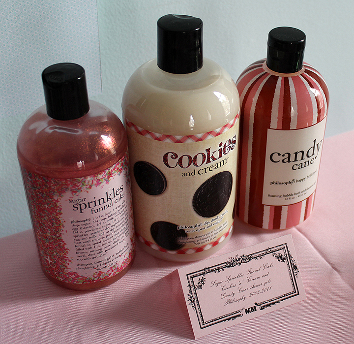
The trend doesn’t seem to be fading any time soon. Philosophy continues to produce sweet scents in their bath and body products, their latest concoctions being Pink Jelly Bean and Raspberry Passionfruit Dreamsicle. MAC will be releasing another sweets-themed collection, Baking Beauties, in April, and Catrice is coming out with a collection called Candy Shock this summer.
In addition to celebrating delectable packaging, the Sweet Tooth exhibition seeks to provide a cursory analysis of the popularity of dessert-like beauty products. Why are beauty items reminiscent of sweets, either in scent or packaging (or both) have such longevity in beauty culture?
There are several reasons. First, cosmetic companies acquiesce to basic gender stereotypes. Baking and decorating are traditionally women’s domains. In addition, there’s the common (but not necessarily factual) presumption that all women have a raging sweet tooth. It’s widely believed that women crave sweets much more than men; they have voracious appetites for all types of sugar-filled treats, especially chocolate. Cosmetic companies employ these stereotypes as marketing tactics, as women are the primary buyers of makeup.
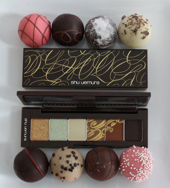
Secondly, dessert-like makeup serves as a substitute for a real, edible dessert, but still retains the sense of indulgence and luxury that comes from nibbling on sweets. Encouraging consumers to give in to temptation is a key theme. Estée Lauder challenges one to “tempt your color palette”: “From Berry Chocolate Truffles and Caramel
Pralines to swirls of marbled fondant dusted with golden spun sugar,
Estée Lauder has captured the essence of a luxurious chocolate boutique
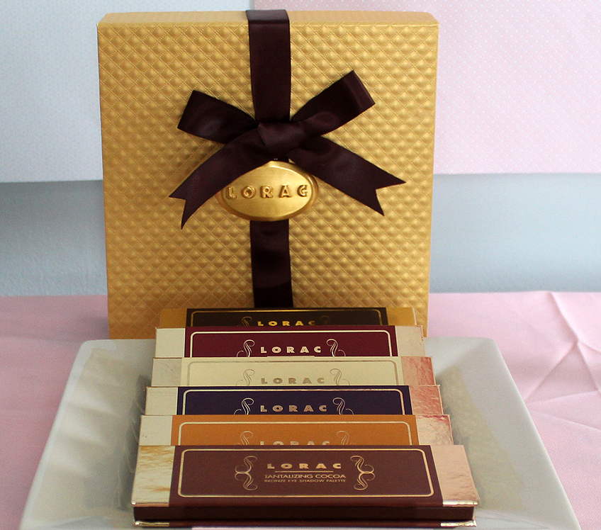
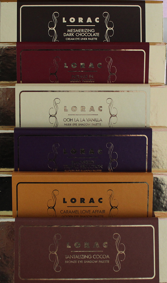
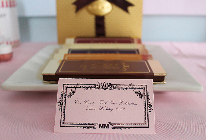
filled with rich chocolate works of art.” LORAC’s Eye Candy Full Face collection claims to “satisfy your beauty cravings” with their “deluxe
assortment of sweet, tempting treats contains a luxurious selection of
fresh colors for eyes, cheeks, and lips that you simply can’t resist”. (Sometimes the idea of indulging in makeup instead of sweets isn’t so innocuous, as some ads present the dessert-like items as weight loss aids – always a bad strategy. “Indulge your taste for sweets
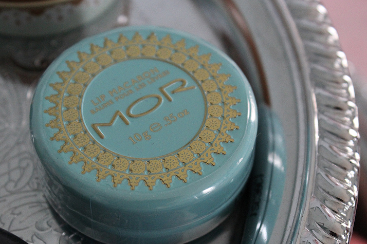
with Berry Bon Bon…you won’t gain a thing but admirers!” says the commercial for Revlon’s Berry Bon Bon. The commercial aired in 1960, and while cosmetic marketing has greatly shifted since then, this line of thinking unfortunately persists today. A 2012 Marie Claire blog post on Mor Lip Macarons states that with these scented lip balms, one doesn’t “have to book a flight or consume a single
calorie to get the same aesthetic satisfaction” as downing real
macarons.)
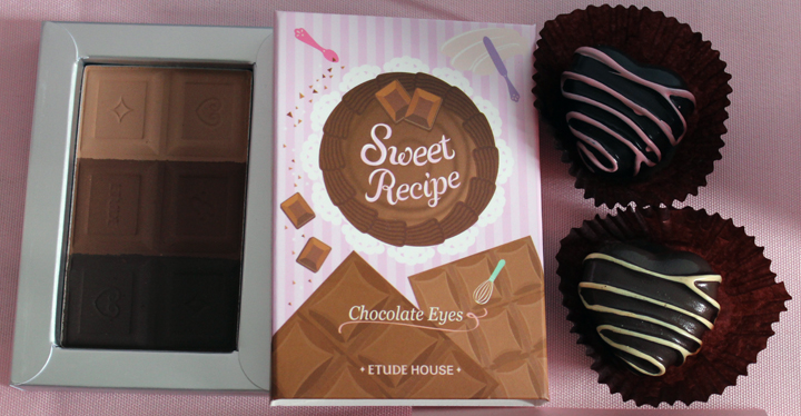
At times, the advertising for sweets-based collections goes a step further, literally transforming desserts into makeup. “Ice the eyes in almond, top your nails with sprinkles,” says the copy for MAC’s Sweetie Cake collection. Korean brand Etude House’s recent Sweet Recipe collection depicts women turning the treats they’ve just made into blush and lipsticks.
The idea of luscious, freshly-made desserts as bases for an alchemical process that results in makeup further blurs the line between cosmetics and comestibles – they become interchangeable treats. This dual nature is alluring for consumers because they feel as though they’re receiving twice the gratification. Purchasing only regular makeup or sweets is enjoyable, but buying makeup that also resembles dessert creates the impression that you’re getting two for the price of one.
Finally, the last reason dessert-like makeup prevails is simple: color. As we saw with fruit-themed cosmetics, sweets are an excellent
source of color inspiration – seemingly all shades, from deep chocolate
hues to macaron pastels, can be expressed well in a sweets-themed makeup
collection.
Now for the exhibition! Grab your sweet of choice and enjoy. 🙂
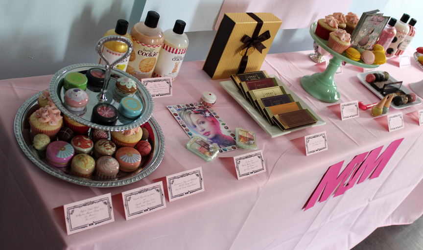
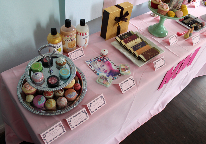
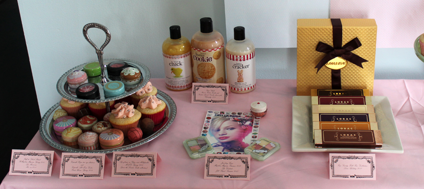
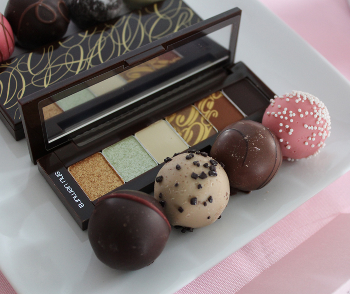
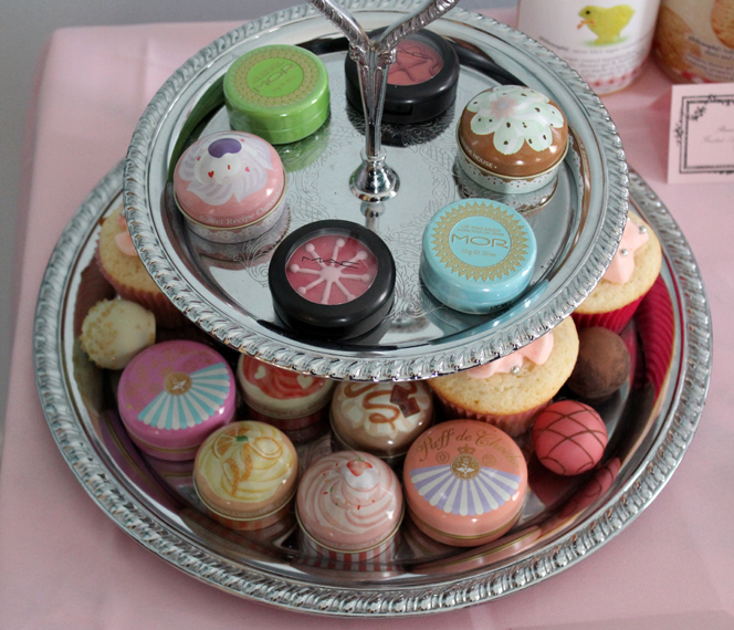
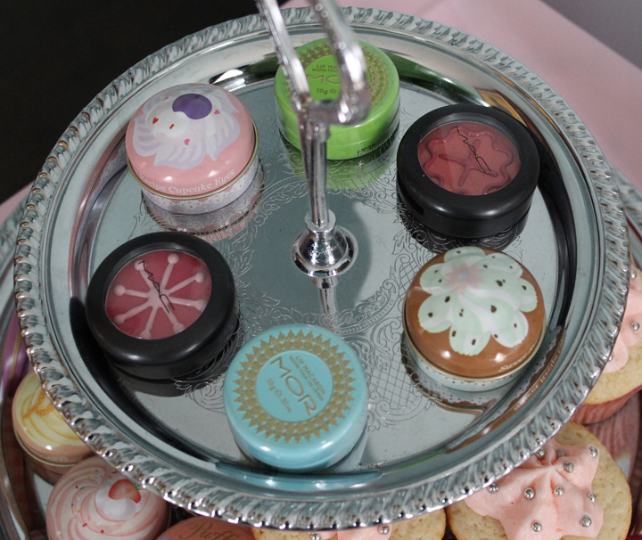
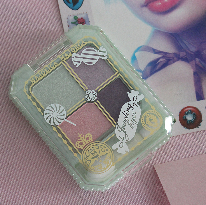
I believe this is the first time in the Museum’s history that I have incorrectly labeled an object. The palette in the back that’s closed (fortunately) is actually the Raspberry Mocha palette, not Mint and Vanilla.
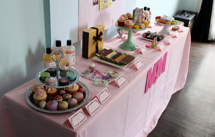
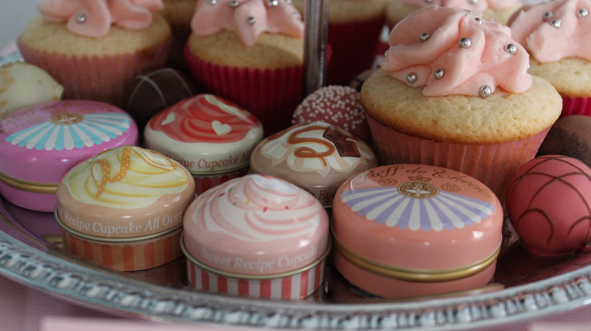
The
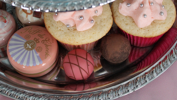
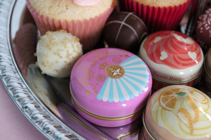
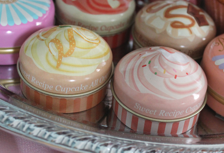
bottom tier contains Majolica Majorca Puff de Cheek blushes in
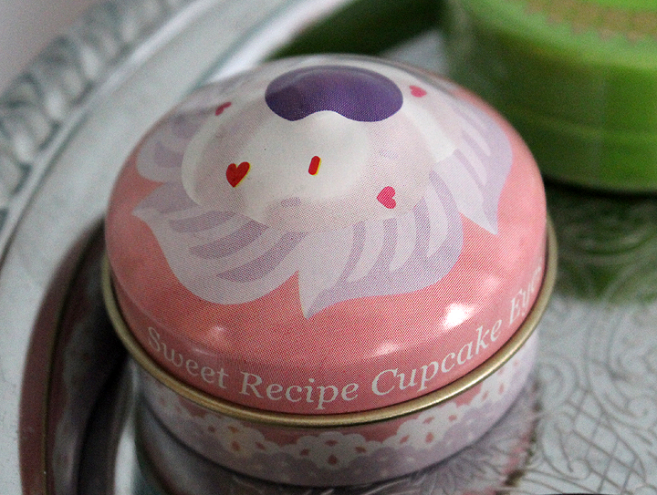
Raspberry Macaron and Apricot Macaron, along with Etude House Cupcake
Eyes and All Over Colors.
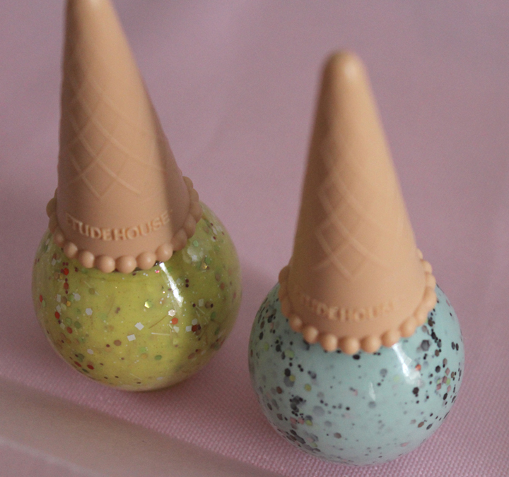
Etude House Ice Cream nail polishes:
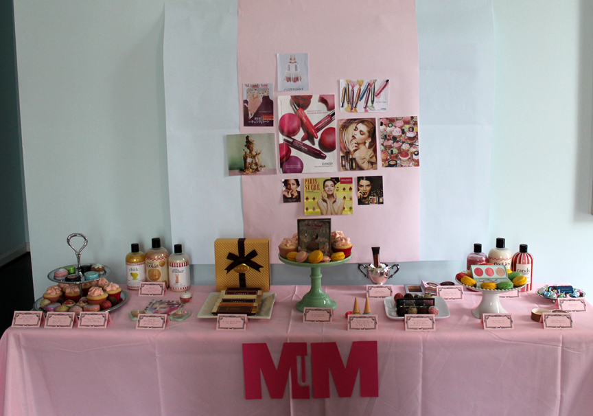
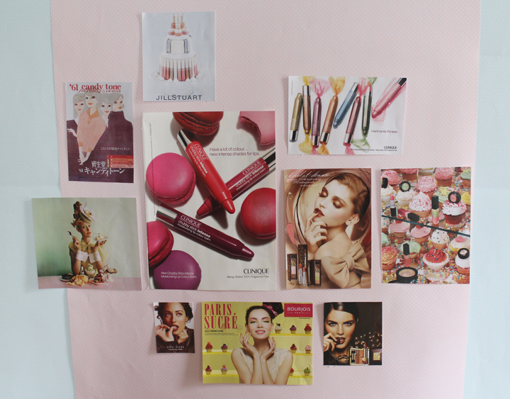
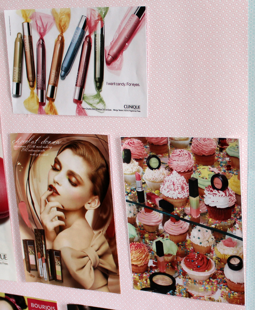
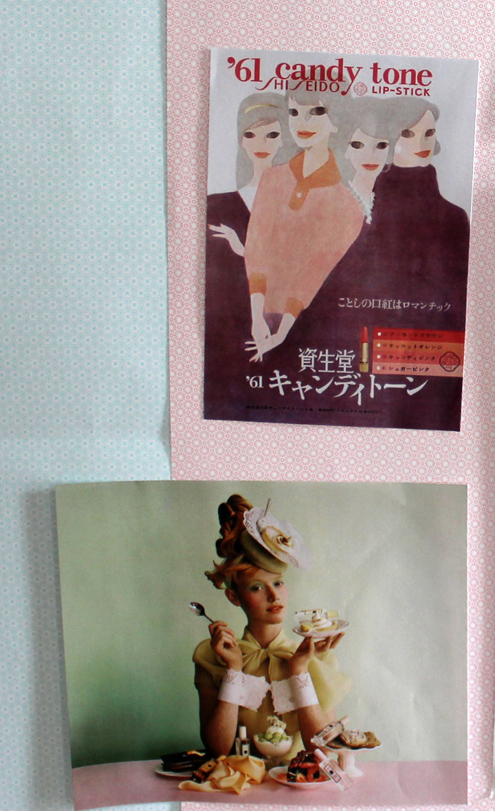
The collage consists of the following ads: Jo Malone Sugar and Spice collection, Shiseido Candy Tone lipsticks, Jill Stuart Patisserie collection, Clinique Chubby Sticks (one for lips and one for eyes), Shu Chocolate Donna, MAC Sugarsweet, Bobbi Brown Chocolate, Bourjois Paris Sucré, and Estée Lauder Chocolate Decadence collections.
Exhibition Notes
1. Inspiration
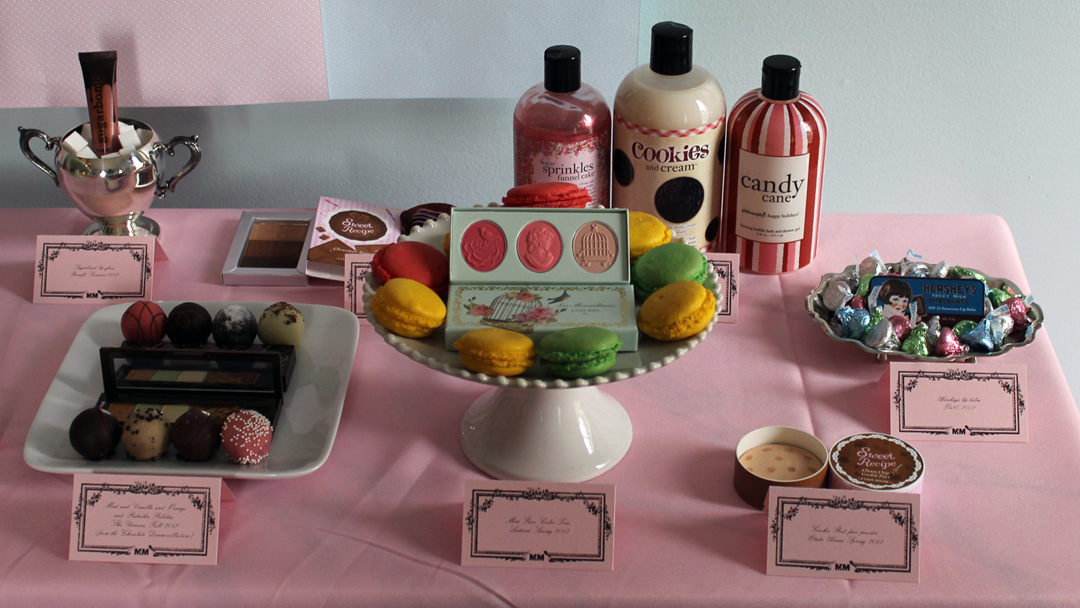
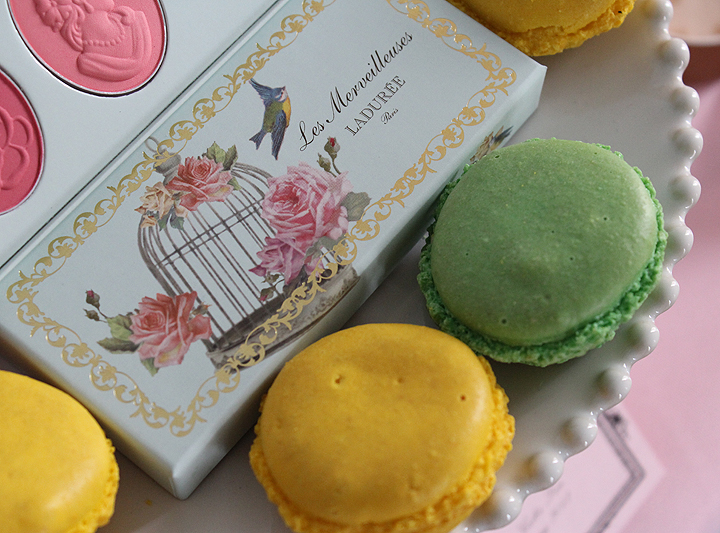
As a huge dessert fan myself (I guess I fit the stereotype!), I’m immediately drawn to any makeup or beauty item that looks or smells like I could eat it. But while the objects themselves were definitely inspiring, a French influence was strong as well. As MAC’s Sugarsweet ad says, “Temptation is everywhere – luscious, whipped-cream decadent, deliciously decorative frosting colours and sugared almond combinations. Like peering through the window of a Parisian patisserie, you’ll want to become one of each!” It’s true – when I went to Paris a few years back I was dumbfounded at the abundance and quality of the desserts. There were patisseries on literally every street, and when I had my first Laduree macaron on that trip, I realized the French really knew what they were doing when it comes to sweets. Sure, I had heard of pain au chocolat and macarons before I visited, but didn’t know just how amazing they were until I got there. So I wanted the exhibition to have a slightly French mood as an homage to their desserts. Also, the “I Want Candy” scene from Sofia Coppola’s 2006 film Marie Antoinette has stayed fresh in my mind all these years, and I wanted to highlight the luxury and extravagance of both gourmet desserts and high-end makeup. In terms of styling the actual table,well, I blame Pinterest. I never really paid too much attention to party planning and design until I started planning my wedding a few years ago, and I just fell in love with all of the little details. My aforementioned affinity for sweets, combined with my more recent interest in party planning, led to an obsession with dessert tables. And once I got on Pinterest there was no turning back. Given the theme, this exhibition was a great opportunity to depart from the Museum’s usual shelves and play with dessert table styling.
Marie Antoinette-era stylings also were the inspiration for the colors I wanted to emphasize (mint green and pale pink), but this time, it was Marie Antoinette by way of contemporary Chanel. While researching Chanel’s 2013 Cruise collection for the Mouche de Beaute Highlighting Powder, I was struck by the candy-colored wigs the models were sporting for the runway show.I also thought touches of silver (as seen in the cupcake stand, sugar bowl and candy dish) would give it a fancy, gourmet feel.
2. Time frame
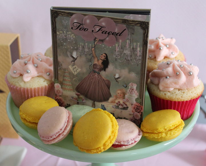
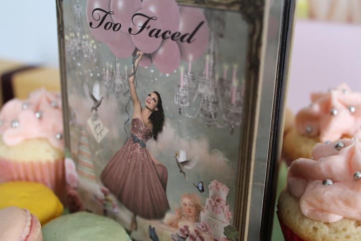
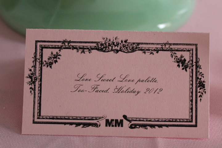
I had the idea to do a dessert/makeup exhibition since last summer. Once I saw Shu’s Chocolate Donna collection and the LORAC Eye Candy and Too-Faced Love Sweet Love sets late last fall, I knew I had plenty of fodder to pull together a good exhibition. I did want to have it posted right before Valentine’s Day, but then I stumbled across the Etude House Sweet Recipe collection and decided to postpone it, as I considered those to be essential pieces for the exhibition and it would take a few weeks for them to arrive from Korea.
3. Things I would have done differently.
I’ll start with the details. First, it would have been great if I had access to really fancy cupcakes and pastries. But no bakeries around here do anything like that and I lack the necessary decorating skill, so homemade cupcakes it was. For the labels, I would have printed them out on white paper instead of pink so that it didn’t clash with the tablecloth. I forgot to specify to the designer (a.k.a. the husband) that I wanted white paper before he printed them out on pink. With not much time left to photograph everything before what little daylight we had faded away, there was no time to reprint them on white paper. And the tablecloth…I wasn’t expecting how wrinkled it was going to be when I unfolded it, so I didn’t unfold it until right before I started installing the exhibition. Only too late did I realize that it was totally rumpled and had no time to iron it.
On a bigger scale, space is always an issue. Not necessarily a lack of space, but since the exhibitions are taking place in my home I am somewhat limited by the layout. The collage hanging in the back was really just a way to cover up the TV. The credenza that the exhibition was set up on is way too heavy to be moved conveniently, and there was also no place to move it without some of the artwork on the walls getting in the way anyway. So we had to leave that there. Same issue with the TV – too cumbersome to take off the wall, and too time-consuming to Photoshop out all the holes in the wall where the wires go in behind the TV. Overall, it was much more convenient and less expensive to make a collage out of ads rather than moving the TV or having a big poster designed and printed. However, I can assure you that if the Museum did occupy a real, public space and had unlimited funds, the backdrop for the table would be magnificent.
Speaking of funding, I would dearly love to re-stage the exhibition, possibly in a different space (don’t know where) and hire a professional photographer. While the pictures are slightly improved from previous exhibitions due to my purchase of a new camera, they are nowhere near professional and thus do not capture the beauty of the objects and table setup.
I would have done more research and written a more thoughtful and polished essay about sweets-themed makeup and the relationship between women, dessert and cosmetics (would love to work in Janine Antoni’s 1992 work Gnaw somehow). For a temporary exhibition I just couldn’t put in the time, but maybe for the coffee table book I could do this, especially if I re-do the exhibition and have it professionally photographed.
In terms of curation, I was pleased with all of the objects. The only things I would have added would be the Creme Caramel Shimmer Powder and Caramel Swirl lip gloss from the Estée Lauder Chocolate Decadence collection, Steamcream’s “Lola” tin, which is adorned with a cupcake illustration, and these gorgeous cupcake-shaped “bath bakes” from Miss Patisserie. I was going to order all of this and put the exhibition off even further, but then I decided it was probably going to be too much to fit on the table. Plus having too many objects negates the whole idea of curating – each piece in an exhibition is selected for a good reason.
If you’ve made it this far, thank you! And if you want to see more on the exhibition, check out my post on what went on behind the scenes and pictures from the exhibition opening. 😉


Amazing as always. I think the pink paper works. I would sell my soul for the Étude house Ice Cream polish! The pics look great. Have you ever played around with artificial lighting for your photos?
Heather
Amazing as always. I think the pink paper works. I would sell my soul for the Étude house Ice Cream polish! The pics look great. Have you ever played around with artificial lighting for your photos?
Heather
Thank you so much for the kind words! Fortunately you don’t have to sell your soul for the Etude House nail polishes – they’re about $5 on E-bay (plus shipping). 😀 And thank you for the photography tip. I haven’t tried artificial lighting…I would imagine I’d have to use the flash, and I don’t like how that looks (for most objects I use the flash but I prefer natural light for exhibitions). I will look into it though, if it means better pictures! I spent a lot of money on my new camera and I’m damn well going to learn how to use it!!
Thanks again!!
This is awesome. Thanks for putting this together.
This is awesome. Thanks for putting this together.
You’re quite welcome! And thank YOU for stopping by!!
You’re quite welcome! And thank YOU for stopping by!!