Makeup Museum (MM) Musings is a series that examines a broad range of museum topics as they relate to the collecting of cosmetics, along with my vision for a "real", physical Makeup Museum. These posts help me think through how I'd run things if the Museum was an actual organization, as well as examine the ways it's currently functioning. I also hope that these posts make everyone see that the idea of a museum devoted to cosmetics isn't so crazy after all – it can be done!
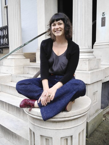
 Since my last MM Musings post on what a permanent collection display might look like in an actual beauty museum, I've been thinking about ideas for special exhibitions. But I kept getting overwhelmed with the details of a specific exhibition's themes. After a while I realized my usual musings style wasn't going to work for a post on special exhibitions, so I changed tactics to bring you something much more interesting and enlightening than my usual reflections: an interview with Ashley Boycher, Associate Exhibition Designer at the Walters Art Museum here in Baltimore. Yes, I got to chat (email) with a real-life exhibition designer at one of the top museums in the country! Enjoy.
MM: What is the basic process of exhibition design? Does the curator tell you which pieces they want and you go from there? Who else do you work with besides the curator?
AB: Although sometimes exhibition ideas come from the public, certain museum trends, conservators, and/or museum educators, the seed of an exhibition is almost always planted by the curator, and the curator is academically responsible for the exhibition throughout the process. Once the seed is planted, the curator writes an exhibition narrative and begins to make a list of objects that s/he believes will best illustrate that narrative. Then there are lost of talks with conservators about which of the objects are in good enough shape and/or can be made into good enough shape for the exhibition given the timeframe. Also, when applicable, there are talks with registrars, who are responsible for the handling and logistics of moving and storing objects, and other institutions' representatives about the feasibility of bringing objects to our institution for the exhibition from other places. This happens with almost all large scale exhibitions and the negotiations with the other institutions often includes logistics about traveling the exhibitions to those institutions as well. In fact, grant funding is often dependent on the ability to collaborate with other institutions and travel the show domestically and/or internationally. Once many of these things are worked out, the curator and I begin conversations. This is usually about 18 months out from the exhibition opening. We do some preliminary ideation about object groupings and the look and feel of the show. During that time, the curator is also talking in a preliminary way with a museum educator about different didactic and interactive elements that might enhance the exhibition experience. At about a year out, the three of us come together and begin to really hash out the meat of the show. We also bring in representatives from the other museum divisions: IT, marketing, development, security, etc, when we need to collaborate on things like how we will advertise the show and what technology, if any, will benefit the exhibition message, both outwardly and inside the exhibition itself. All of the details come together in about 8 months, and for the last 4 months of the development process we are in production mode – labels being edited, graphics being printed, cases being built, walls being painted, etc – along with any straggler details that we miss beforehand, which always happens.
MM: Do you do some kind of prototype before the exhibition opens?
AB: It depends. Sometimes we're not exactly sure how a paint color will look in the space, so we'll slap it up on the wall and look at it for a few days and adjust where necessary. That is, if we have time. Often art is coming out of a space only a week before other art is supposed to go in, which means we don't always have the opportunity to do this. Other prototyping sometimes happens when we are trying out a weird or new display type. And we almost always prototype interactives, both low tech and high tech.
MM: Do you have experience with designing decorative object-based exhibitions and if so, how does it differ from designing exhibitions for other types of art?
AB: I've never designed a show that was purely dec arts objects, but they have been a part of shows i've designed. The new installation that opens here in October has lots of dec arts in it. I would say that in my experience one of the main differences is that many dec arts objects are heartier than other art, in better shape, and often made of less than precious materials, which means that conservation does not always make us put them under a vitrine. In this way they can help to create the look and feel of a space rather than just being purely on display. I suppose that was their original function anyway. 🙂
MM: What are some of the latest, cutting-edge developments in exhibition design?
AB: Well, unfortunately the latest cutting-edge development design aren't really happening at many art museums. Science museums and natural history museums are the ones that are usually on the cutting edge when it comes to design and technology. This summer I visited the Field Museum of Natural History in Chicago, and one of their exhibitions had this amazing custom theatre system. It was made using custom craft carpentry, crazy projectors, and bit mapping. You can see a cool video about the making of it.
MM: What was your favorite exhibition you designed and why?
AB: That's a really hard question! The reason I got into exhibition design was because I was interested in too many different things to pick one thing to continue studying (I'm also just not that much of an academic eve though I really loved school). Working on exhibitions awards me the opportunity to learn about another fascinating different thing with each new project. So I guess my favorite is always whatever the latest project is. I suppose I have shiny thing syndrome.
MM: If money wasn't a factor, what would your “dream” exhibition be?
AB: When I was in graduate school, one of my big solo projects was an exhibition about the art, science, and history of tattooing throughout time and across the globe. I am fascinated by tattoos because they have so many different facets: cultural heritage, technology, biology, taboo, straight up beautiful artistry, the list goes on and on. I think a well planned and designed exhibition about tattooing could be interesting to just about everyone for one or more of these reasons. I'd love to be on a project like that.
MM: Do you have any ideas or suggestions regarding exhibitions that would have lots of small objects, i.e. makeup? I promise I'm not asking you to work for free – I'm just looking for any sort of general advice or tips off the top of your head!
AB: The hard thing about showing a bunch of small things is that the displays always want to look like retail rather than museum quality. My biggest advice would be to make sure you single out your best pieces. Put them on their own pedestals, maybe give them a bigger brighter pop of color, or a few more inches in height. Just make sure they actually stand out in a way that tells your visitor, "hey, you want to make sure you look at me and only me for a sec." If you want to do a display of a bunch of things together for impact or to get a certain point across, especially if it's several examples of one type of thing, make sure you save your 2nd and 3rd tier objects for those displays.
Thank you so much, Ashley, both for the peek into the life of an exhibition designer and for the invaluable advice!! (And I think we both have "shiny thing syndrome" – more literally for me).

