A few months ago The Dieline posted about this relatively new makeup brand that happens to have some of the most spectacular packaging I've seen in a while. Pai Pai is a Mexican brand that features the work of different artists on their packaging each season. It's a similar concept to Laqa & Co. as well as the long-gone Stephane Marais line, so perhaps it's not completely groundbreaking, but I love brands that don't have regular packaging and hire artists to create different designs for each product. (If I had my own makeup line, I'd totally steal the concept of having a new artist each season!) Plus, Pai Pai exclusively highlights Mexican artists so as to celebrate the country's cultural heritage. The company's name comes from an an endangered indigenous community in Baja California in the western part of Mexico. Sadly, it is estimated that less than 100 people still speak the Paipai language. I'm not sure whether any of Pai Pai's proceeds go to conservation efforts but it would be awesome if they did.
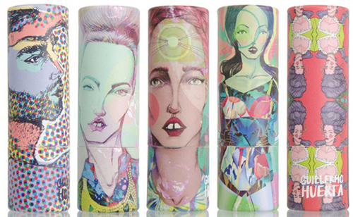
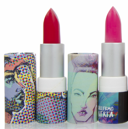
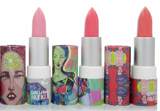
Anyway, let's get to the packaging, which I'll be looking in reverse chronological order. The most recent featured artist is Guillermo Huerta, an up-and-coming illustrator who collaborates on many different design and fashion projects in Mexico. Titled "Sueño Cósmico" ("Cosmic Dream"), the collection is about Huerta's "obsession with color" and a modern re-imagining of Mexico. My Spanish is rusty, but I think I was able to roughly piece together his take on the collection: "I have always thought more is more. For me, Mexico has always been a starting point…I love to revisit the fantasy and magic that we have and give it a contemporary twist."
Here are the cases.
And here they are with the caps off – the colors are certainly exuberant and appropriate for the spring and summer months.
(images from paipai.mx)
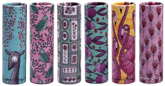
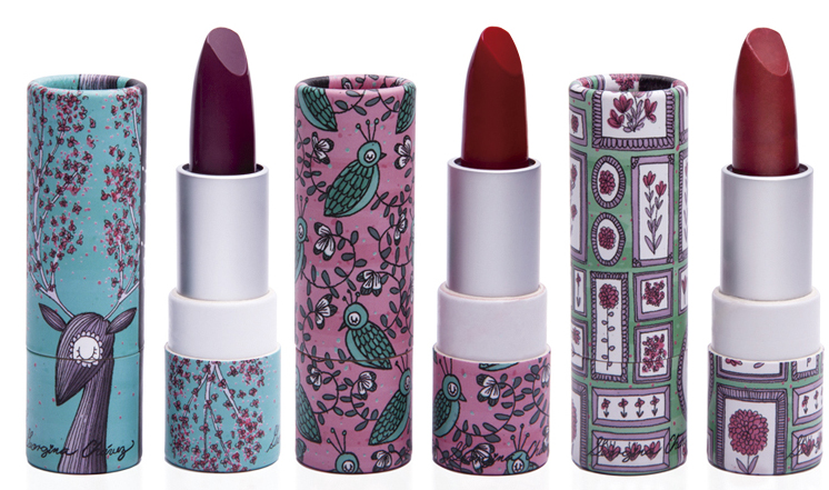
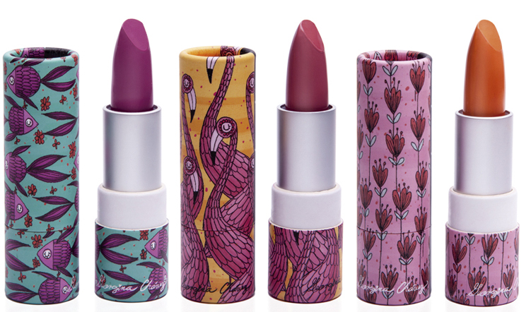
The slightly more delicate, less edgy work of Georgina Chávez was selected for the fall/winter 2014 collection. Titled "Seres" (Beings) the collection was inspired by wild animals/plants and their habitats.
(images from paipai.mx)
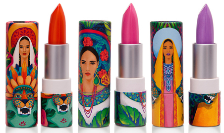
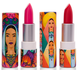
Prior to Chávez's collection, PaiPai used the work of Oscar Torres for the spring/summer 2014 collection. Torres created brightly colored, intricately patterned works depicting his chosen theme, "Virgen Santa" ("Holy Virgin") which pays homage to the beauty of Mexico's women and also gives a modern twist to traditional representations of the Virgin of Guadalupe. I love that each one is shown wearing a vibrant lipstick. Oddly enough, the lipsticks are named after flowers, but Torres named each woman so I don't know why they couldn't use his original names. From left to right is Guadalupe, Ofelia and Francisca.
The one on the left below is Aurora.
(images from winterland.mx)
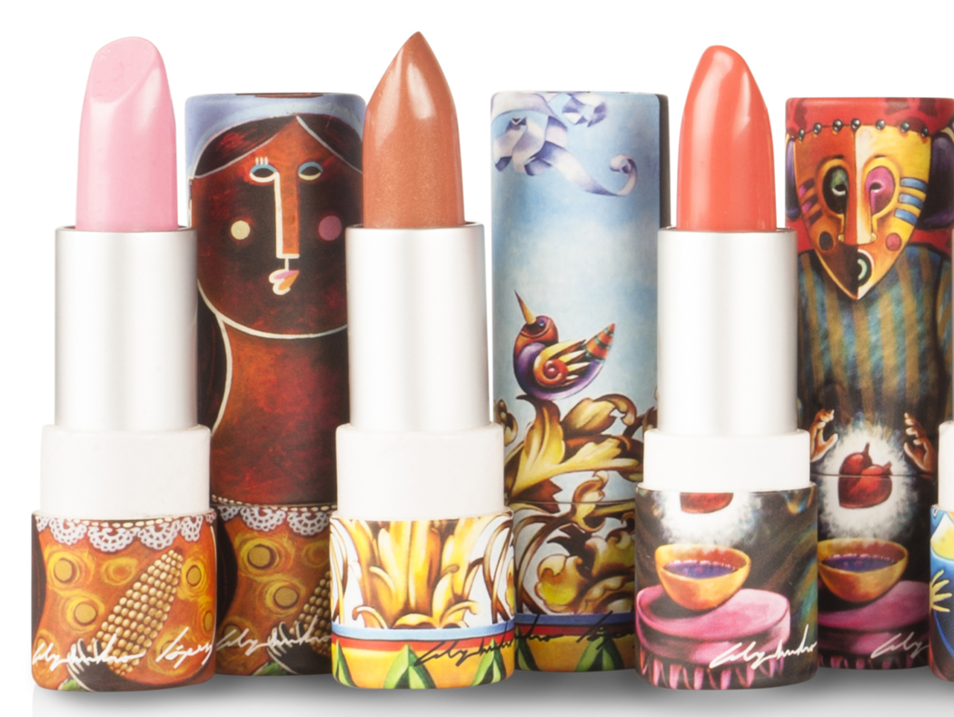
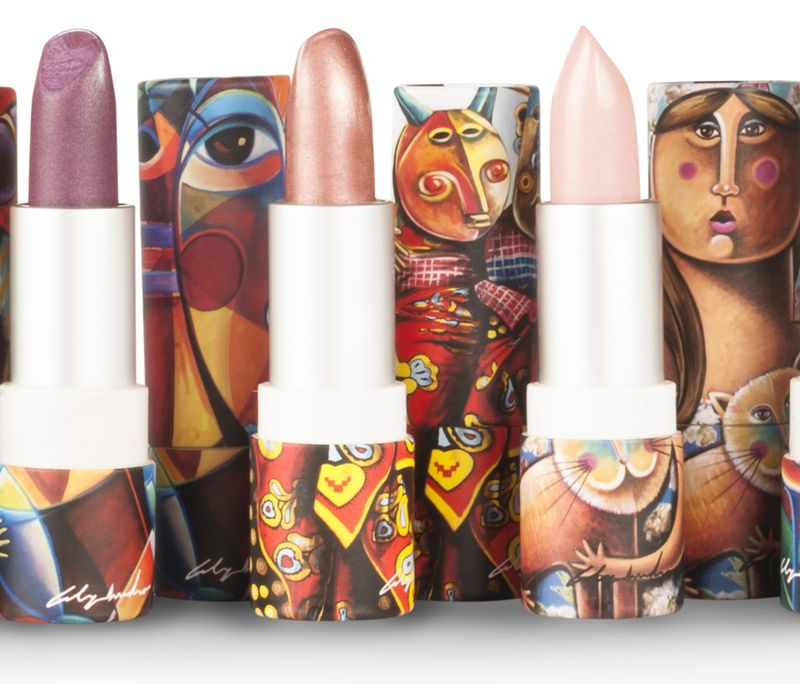
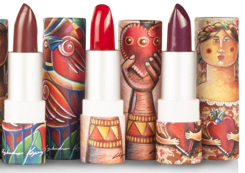
Pai Pai's inaugural collection debuted in the fall of 2013 and featured 9 lipsticks by Alejandro López, an artist whose folkloric work is inspired by the "streets of Mexico, its people, costumes, traditions, fantasies and the way in which they see the most painful situations with humor". It's hard to tell whether these were made especially for Pai Pai or whether they were existing works, but you can see them all here.
(images from liliacortes.com)
All in all, I'm really impressed with Pai Pai's concept of having a makeup line produced in Mexico with packaging that regularly honors the country through the work of different artists, and is even named after an indigenous Mexican community. You can tell a lot of thought went into the brand's development and I know someone there is very carefully selecting the artists (my dream job!) and choosing lipstick shades that are appropriate not only for the season but that also represent that particular artist's aesthetic. See, for example, the vivid, pigmented shades of Torres's collection that go perfectly with his vibrant portraits, vs. the subtle beiges, plums and pinks of Lopez's collection, which are better-suited to his slightly more understated palette.
What do you think? Which collection is your favorite? Pai Pai ships to the U.S. so I see a few of these in my future…I just wish I could have gotten my hands on their older collections!


