
Where Cosmetics & Art Intersect
Dedicated to the preservation, exhibition and research of makeup from all eras and cultures
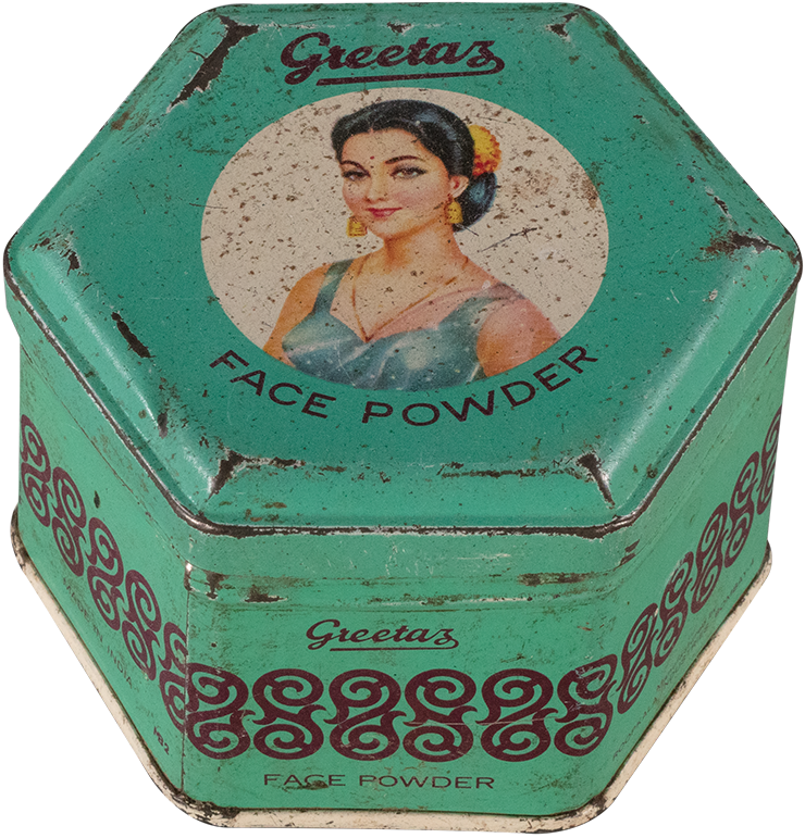
The Makeup Museum
Defining “makeup” as pigment applied in a temporary manner to the face or body for beautification, creative, artistic, health, religious or spiritual purposes, the Makeup Museum focuses exclusively on color cosmetics.
Exhibits
What’s On
Our informative digital exhibitions call attention to thought-provoking issues within makeup history and current beauty culture, while never losing sight of makeup’s playful side.
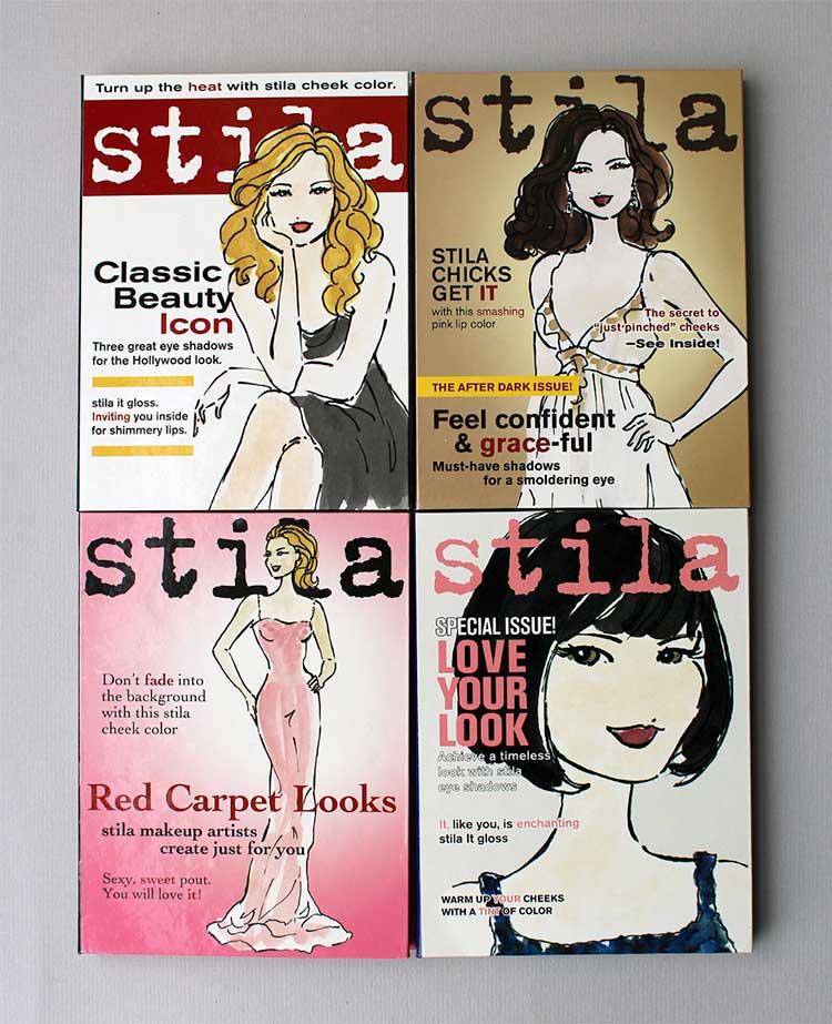
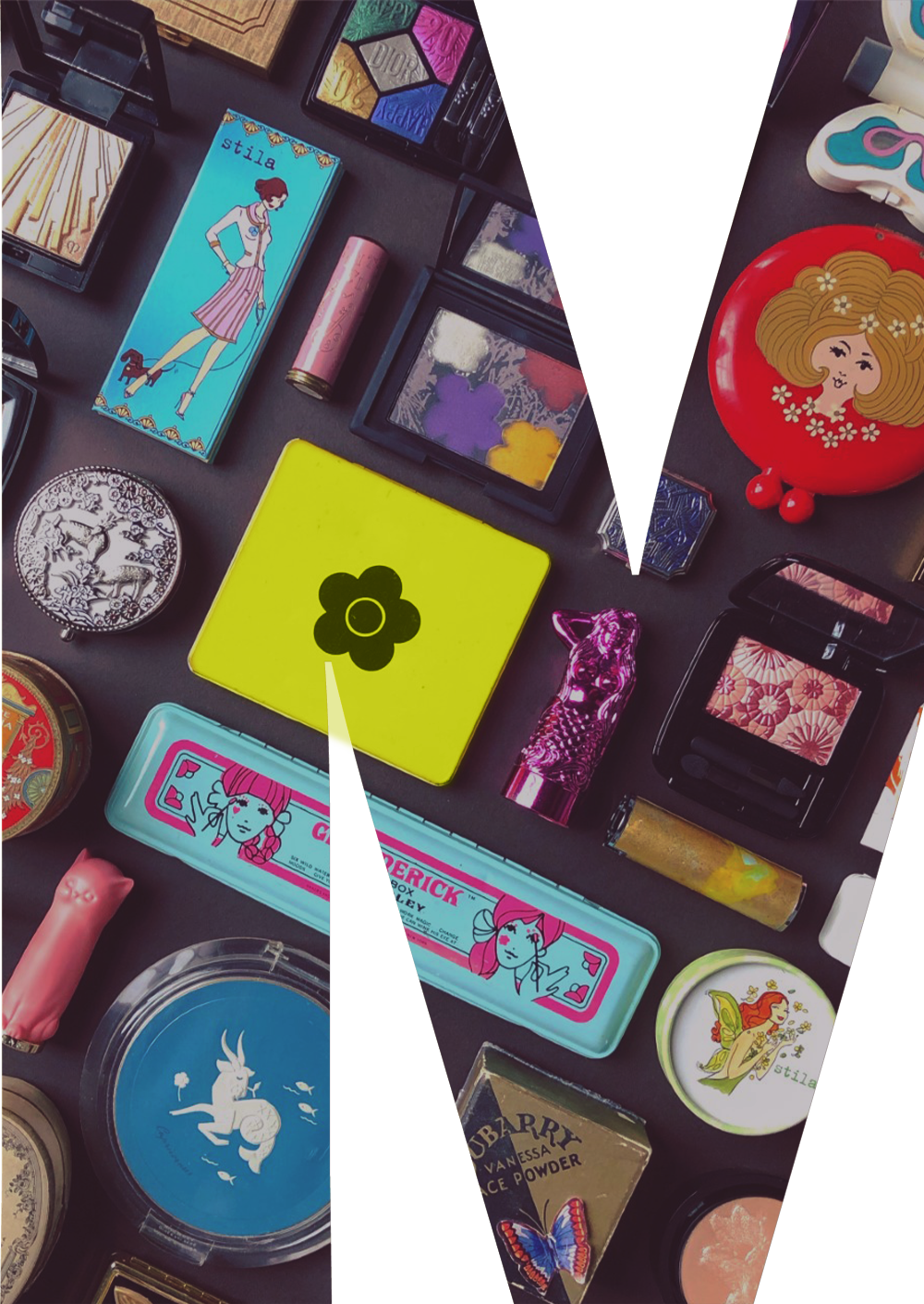
Stila at 25
The Makeup Museum is pleased to present Girls Illustrated: Stila at 25. In honor of Stila’s 25th anniversary in 2019, the exhibi…View Exhibition
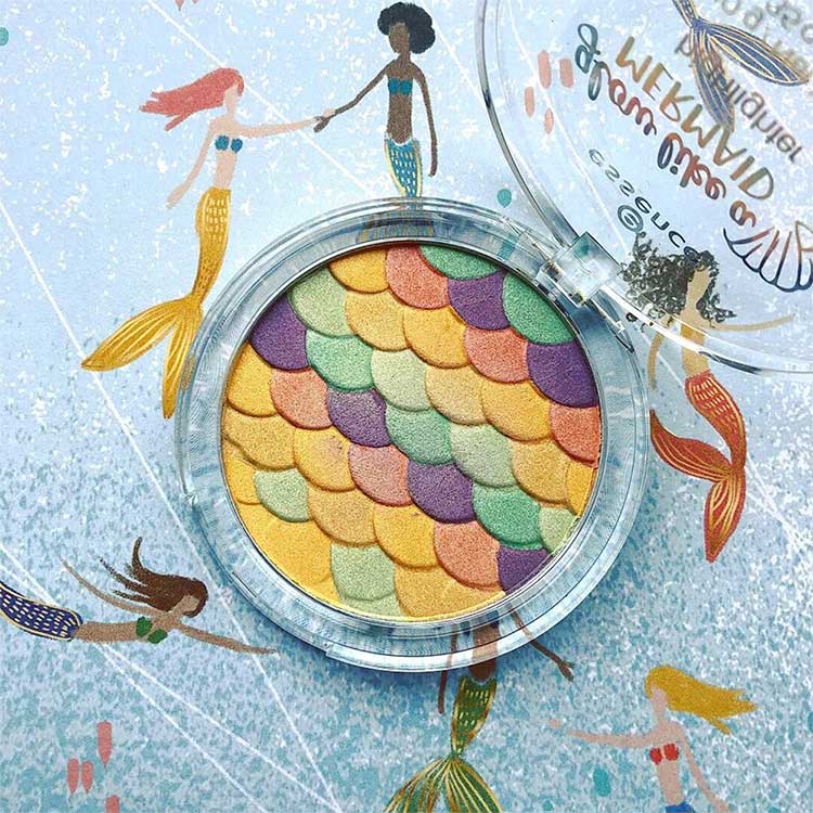
Makeup for merfolk
The Makeup Museum is pleased to present A Splash of Color: Makeup for Merfolk. The exhibition explores the the history of mermaid-…View Exhibition
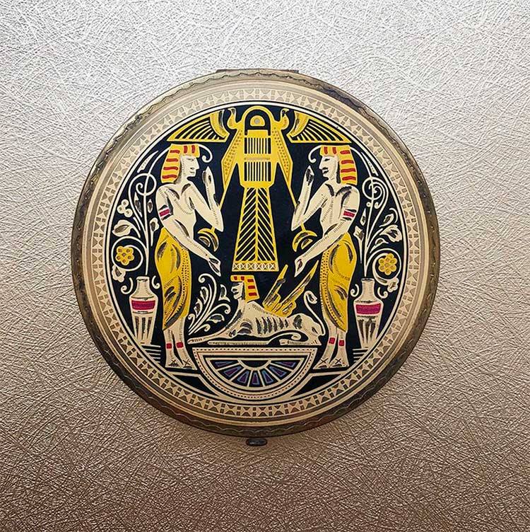
I’m Your Venus
“I’m Your Venus: The Reception of Antiquity in Modern Cosmetic Advertising and Marketing”, a conference hosted by Drs. Laur…View Exhibition
COLLECTION
Browse
Lovingly curated for nearly 20 years and continuing to grow, the Makeup Museum’s collection is one of the most extensive in the world.
Support
The Makeup Museum deeply appreciates every offer of support that comes our way. Find out more about how you can contribute.
Support
The Makeup Museum deeply appreciates every offer of support that comes our way. Find out more about how you can contribute.
Stories
Learn
Written by the founder and curator, the Museum’s blog is a casual space to learn about makeup history, the latest trends, and much more.
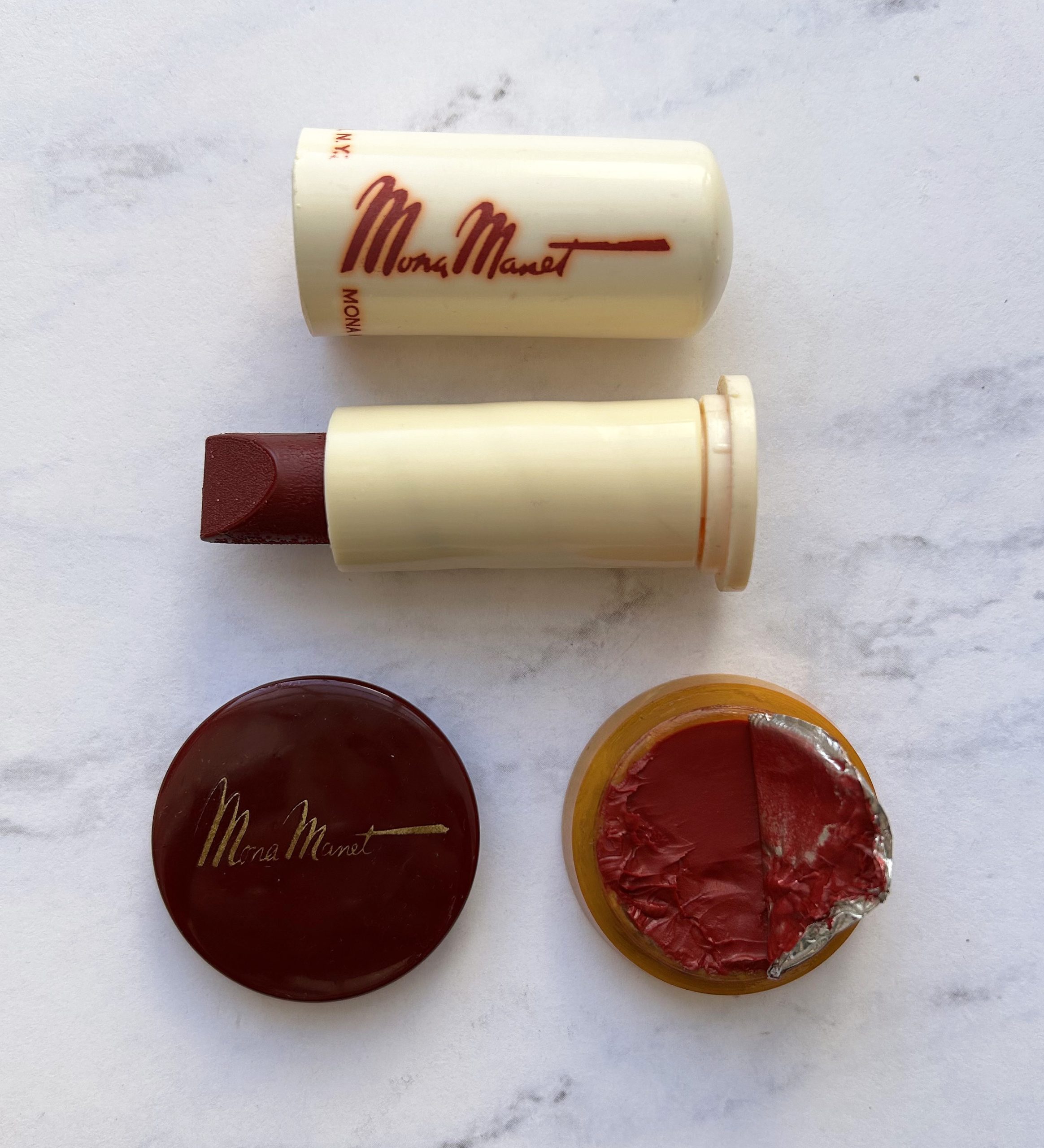
A Life in Secret: Mona Manet Cosmetics
Content warning: mention of suicide in the 3rd to last paragraph. I wish I was sharing something uplifting instead of tragic, but …Read More
MM Musings, vol. 30: on problematic objects
Makeup Museum (MM) Musings is a series that examines a broad range of museum topics as they relate to the preservation, research a…Read More
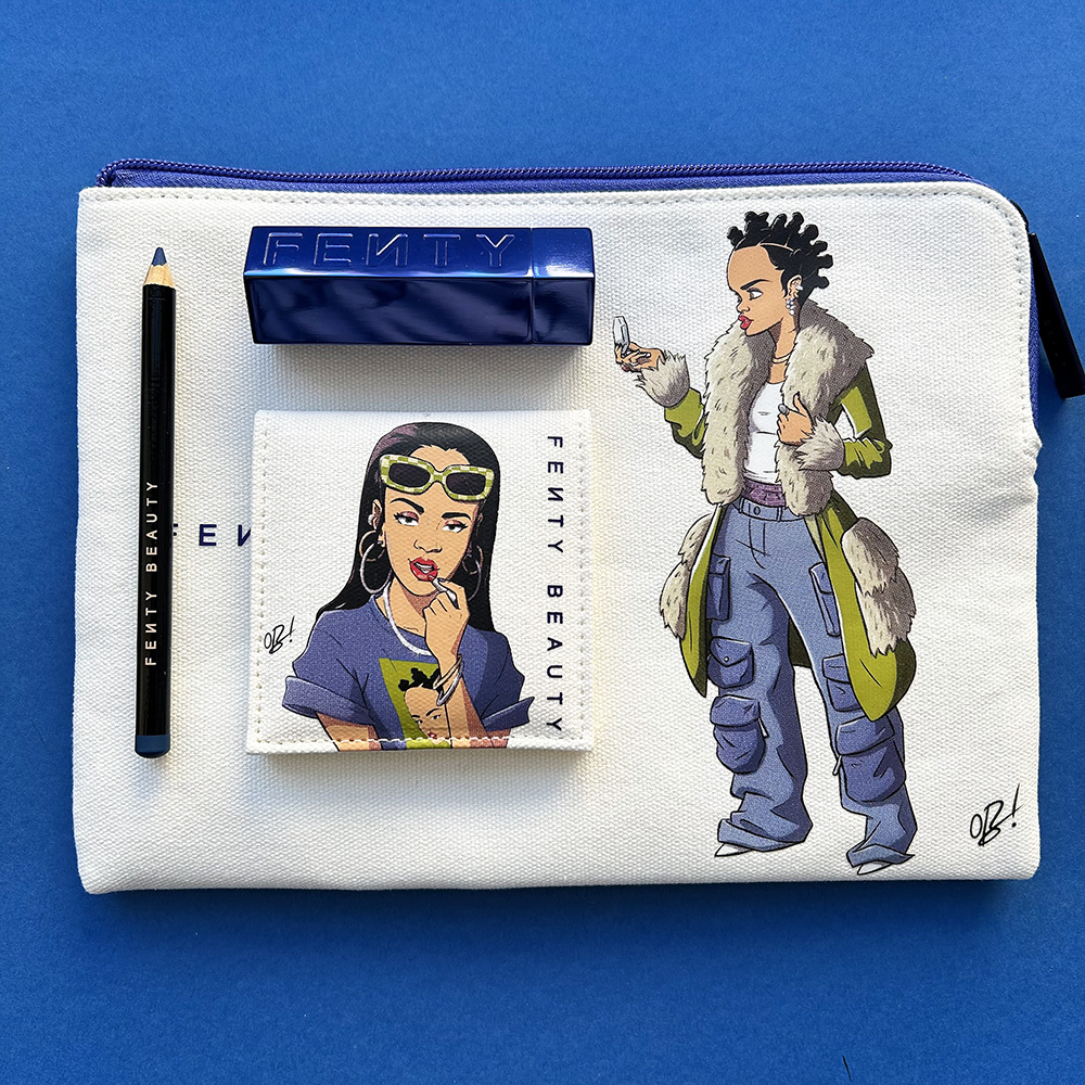
Ghosts of Christmas Makeup Past: Fenty x Obi Arisukwu
Fenty Beauty, the brand founded by musician Rihanna in 2017, had possibly its most adventurous releases in 2022. In August that ye…Read More