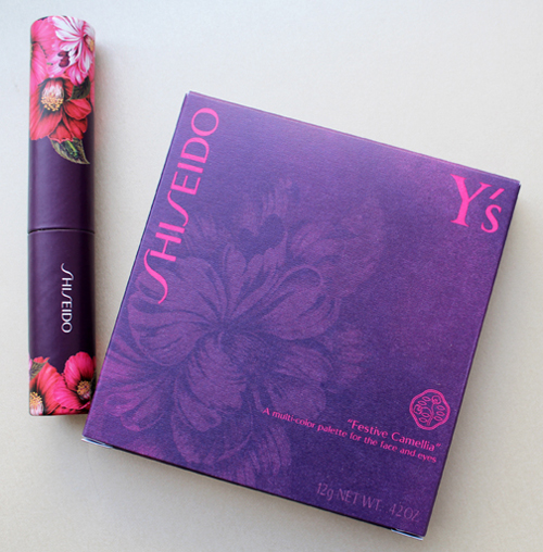
I spotted this palette way back in the fall at British Beauty Blogger and knew I had to get my hands on it. Shiseido teamed up with Japanese fashion designer Yohji Yamamoto to create their Festive Camellia palette for the holiday 2015 season. As you might know, Shiseido's symbol is the camellia flower, and they asked Yamamoto to come up with a palette design that portrayed both the significance of the camellia for the company's history and the designer's unique aesthetic. Yamamoto explains, "The camellia flower is always beautiful… at the moment when it blossoms with its greatest energy, and even at the moment when it dies. It does not die away by losing its petals like other flowers, but instead ends its life in its full blossom and form. By depicting this beautiful camellia, filled with dignity and vitality until the end of its life, I have related the camellia's most beautiful moments to those of a woman."
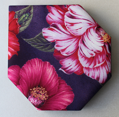
As with the MAC Guo Pei collection, the palette is encased in fabric. I'm not sure how well that would hold up in one's makeup bag, but it's lovely nonetheless. According to the Shiseido website, it's silk: "By getting the full cooperation of Y's creative support, silk has been used on the palette just like it is used in Y's clothes; and it has been specially printed in Kyoto."
If you look at the leaf on the upper left, you'll see a green beetle – I have to admit I didn't even notice the little guy hiding there until I read the palette's description!
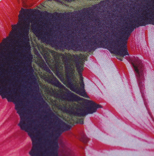
Here's a detail of the fabric.
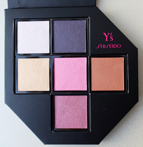
The camellia-inspired colors were chosen by long-time Shiseido adviser and makeup artist extraordinaire Dick Page, who named each color individually.
Top row: Snow and Velvet
Middle row: Japonica, Winter Rose, and Petal
Bottom color: Heart
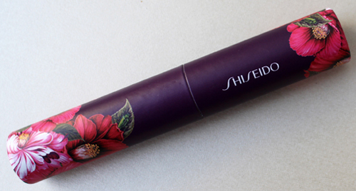
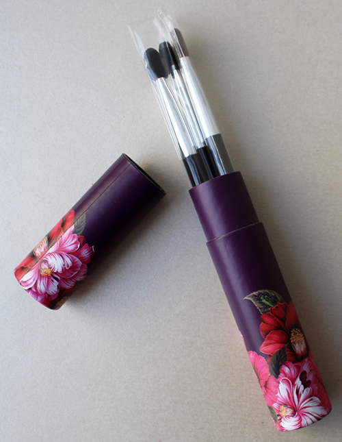
The palette came with a little brush set.
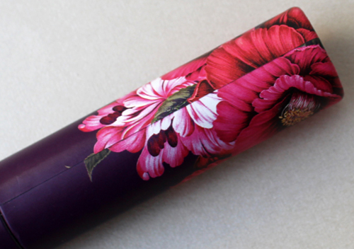
I was slightly disappointed that the pattern didn't line up on the brush set tube.
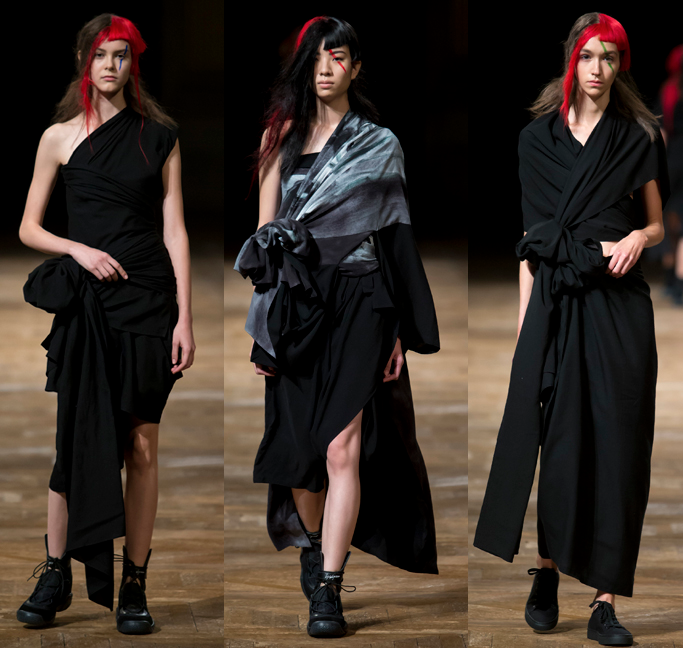
Despite Yohji Yamamoto having runway shows since 1981 (he established his line in 1972) I wasn't familiar with the name at all. So I played one of my favorite games and set about exploring his work and seeing whether the palette is a good representation of it. There is definitely a resemblance to Yamamoto's overall design – not one season in particular, but his general emphasis on asymmetry and deconstruction. Obviously designers have to know how to manipulate fabric, but this is one area where Yamamoto truly excels. Gathering, folding, wrapping and pleating fabric to create one-of-a-kind silhouettes is another hallmark of his work. He says, "Fabric is everything. Often I tell my pattern makers, "Just listen to the material. What is it going to say? Just wait. Probably the material will tell you something." He's like the fabric whisperer. 🙂
Some of my favorite examples:
(images from vogue.com)
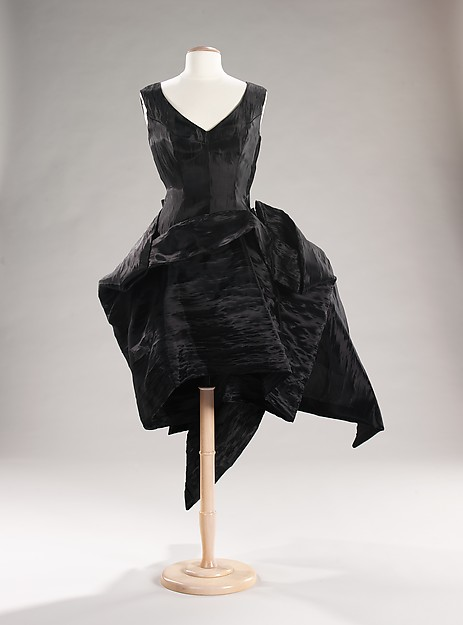
I especially loved these two dresses.
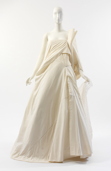
(images from metmuseum.org)
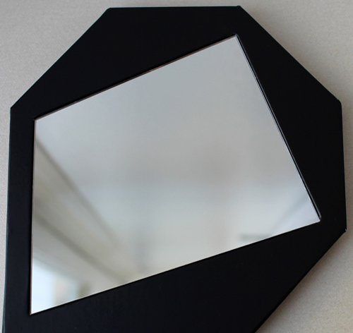
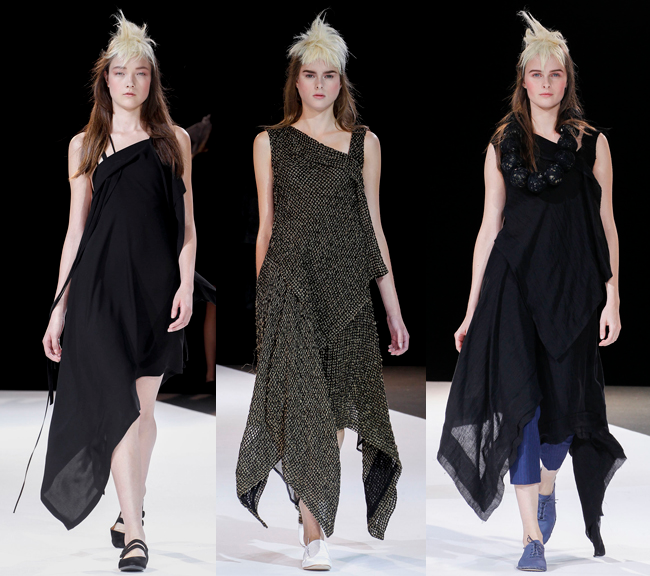
As for the palette, I was definitely seeing how Yamamoto's shapes influenced the design. The hems on these dresses from the spring 2013 collection, for example, remind me of the asymmetrical corner of the palette as well as the mirror:
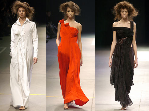
And the floral print is reminiscent of those that appeared in his fall 2014 show, with the same voluminous, detailed petals.
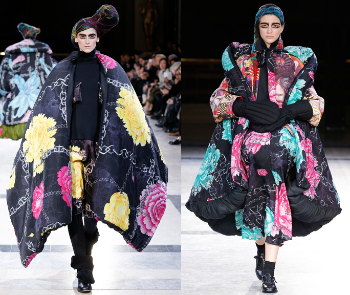 (images from vogue.com)
Once again, a cosmetics company plucks a designer from the high fashion world that I wouldn't have otherwise known about and allows me to have a little piece of couture in makeup form. I can honestly say that Yamamoto is like nothing I've ever seen, and he did an excellent job translating his work into the palette (although I think a black background instead of purple might have been a better choice, given how ubiquitous it is in all of his collections.)
What do you think?


