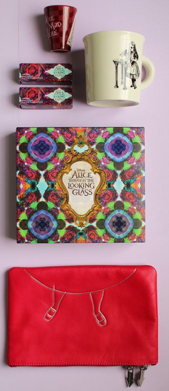
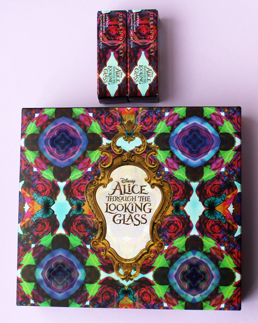
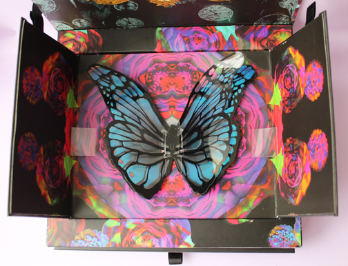
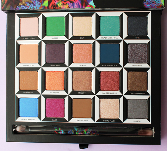
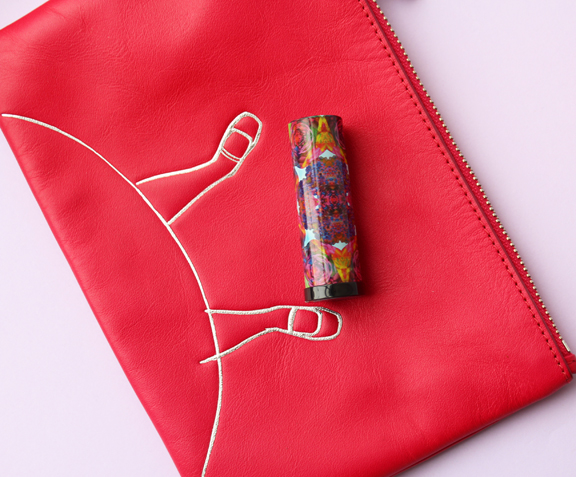
As a follow-up to their palette released as a tie-in to the 2010 Alice in Wonderland movie, Urban Decay has launched their Through the Looking Glass collection to go with this year's sequel, which will hit theaters May 27. Like the previous palette, this one features a pop-up design and a vast array of colors. There are also 5 lipsticks sporting the same crazy kaleidoscope design as on the palette's outer case.
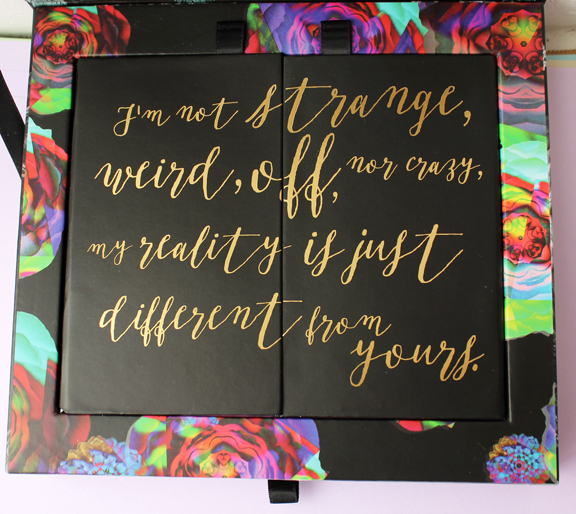
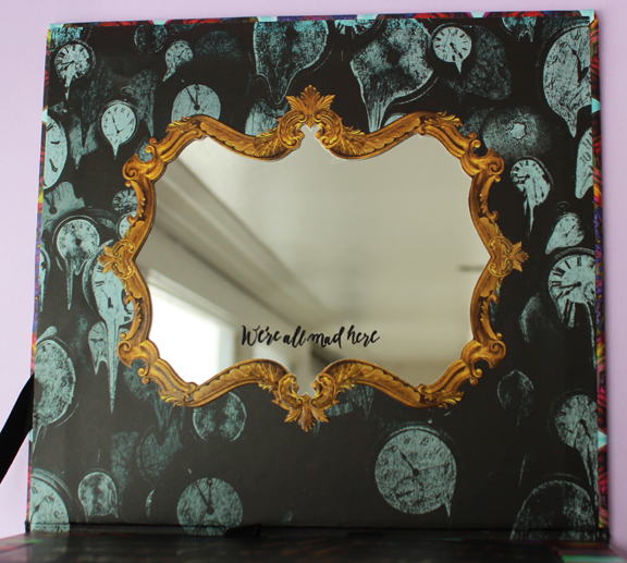
Love this quote on the inside.
As for the outer packaging, Urban Decay founder and Chief Creative Officer Wende Zomnir explains, “This was made to look like an acid trip. We took a different approach and decided, ‘Let’s make it really colorful and bright because the shades are like that'…even if you aren’t attached to the film, the butterfly tells the story of what the makeup is all about, which is transformation."
The quote on the side of the palette is also a nod to the transformation theme.
There are 20 colors total (4 more than the previous palette), and 4 are dedicated to each of the 5 main characters from the film: Alice, Mad Hatter, Time, the White Queen and the Red Queen. “We loved the original construction and keeping it in the same vein, but we wanted to tell a different story with the shades and really bring a focus to the shades,” says Zomnir.
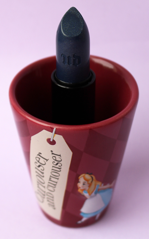
How fun are the lipstick caps? (You might remember that I bought the Alice bag for my trip to Disney.)
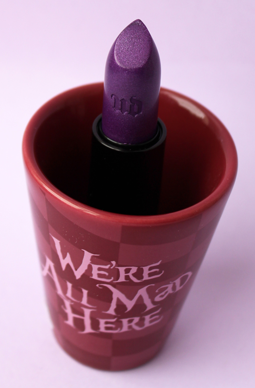
Naturally I selected the two boldest colors from the lipstick lineup. The blue lipstick was not an accidental creation – it represents both Alice's coat and also shows that Urban Decay is paying attention to the mainstreaming of what used to be considered outlandish colors. Says Zomnir, “My customer is a very independent thinker. She’s really into self-expression. She loves makeup. While Alice is a very plain character, she’s associated with the blue dress — in this case, it’s a coat — and we were able to pull in that interesting blue with her, and the makeup is rad for all the other characters…Six years ago, Anne Hathaway’s White Queen makeup was a little extreme, but now you see it on the street.”
The little cup I put the lipsticks in here is a souvenir from my Disney trip. 🙂
Objectively speaking I thought this collection was well done. But personally, I'm a bigger fan of the first Alice in Wonderland book/movie so anything to do with that I'm going to like more than items related to Through the Looking Glass. This palette is great but I so enjoyed seeing all the characters in the previous palette (my favorite, if you remember, was the caterpillar).
What do you think? How does this collection compare to Urban Decay's previous Alice-themed palette, and for that matter, other Alice in Wonderland makeup? (See here and here.)
