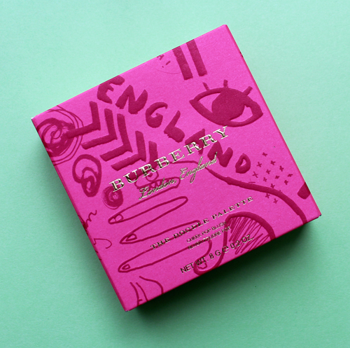
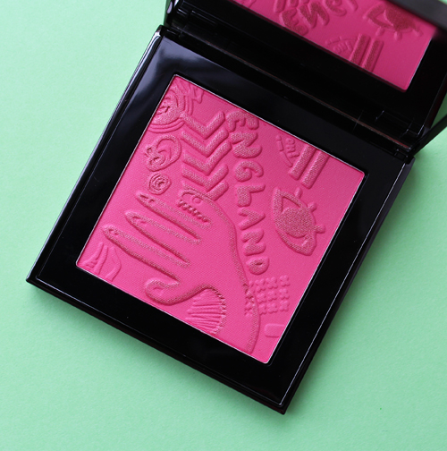
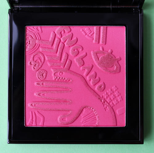
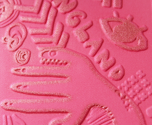
While I'm not Burberry's biggest fan at the moment, I did want to share their spring/summer 2018 blush (leftover inventory of which I'm hoping doesn't go up in flames). As with previous releases the design is a makeup version of one of Burberry's seasonal pieces. In this case, the blush borrows one of the patterns from the Doodle collection, an illustration-based lineup created by British artist/director Danny Sangra. I like that they chose the artist collaboration from their spring collection rather than blindly using an in-house design. Lovely though they can be, using the work of an outside artist is a nice change of pace.
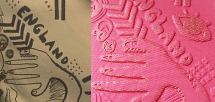
The particular "doodle" on the palette appeared on this trench coat and sweatshirt. It may have been on other pieces but I didn't spot any.
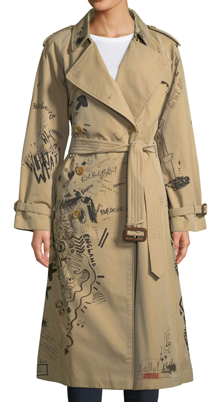
(image from bergdorfgoodman)
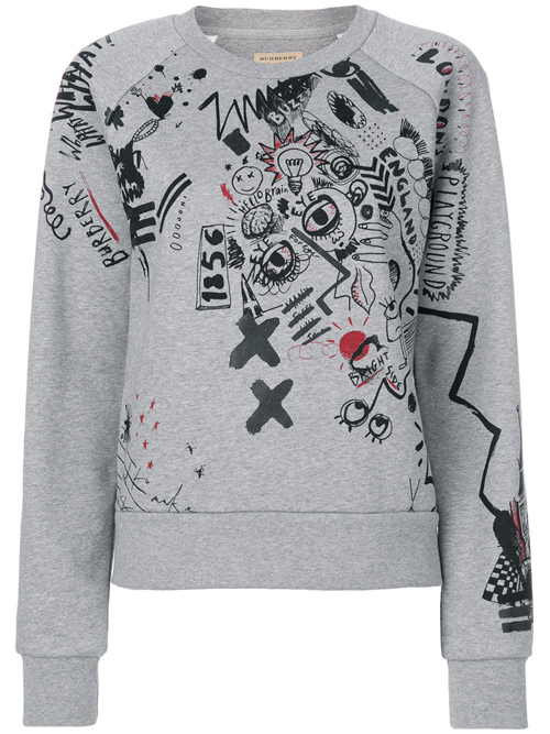
(image from farfetch.com)
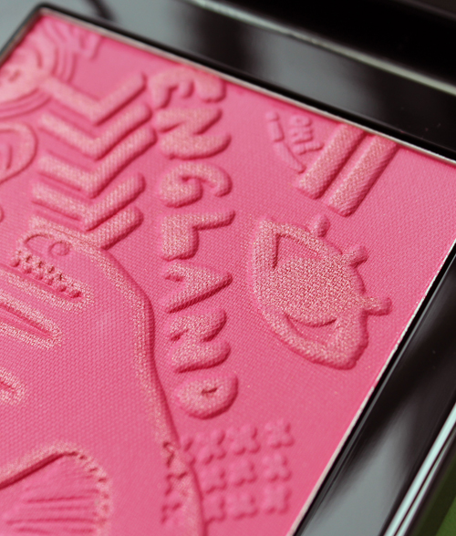
As usual, I felt the need to show the exact part of the pattern used. I believe the eye on the right was moved down from where it was in the original pattern so as to fill some blank space. It's an incredibly strange design that looks almost surreal or psychedelic to my eye. Between the hand that appears to have a pinky finger with teeth, the square made up of tiny x's, the arrow shapes and the words "oh" and "England", there's some weird stuff going on here. However, that's par for the course with this artist.
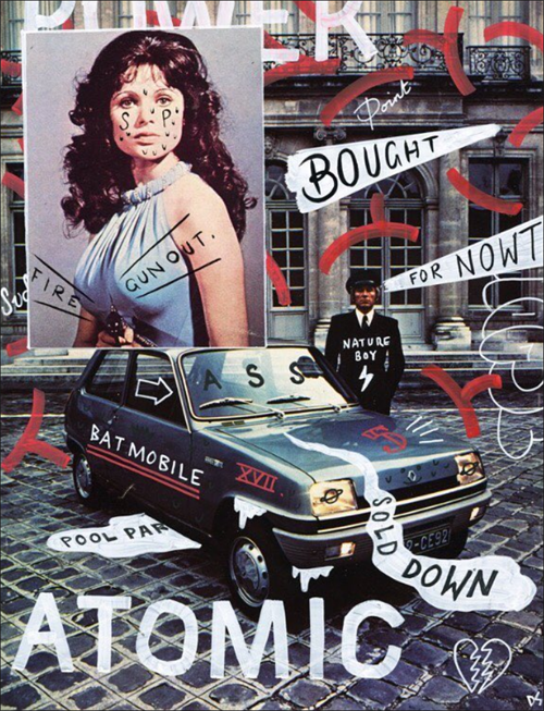
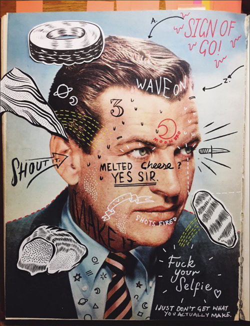
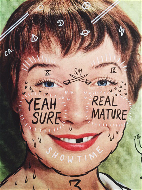
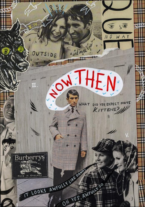
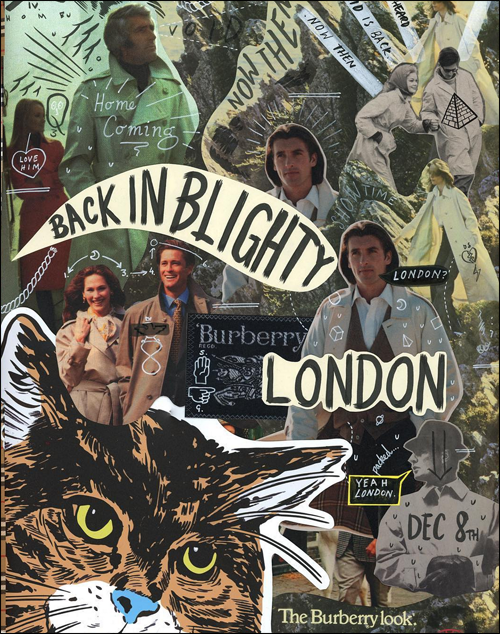
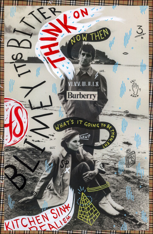
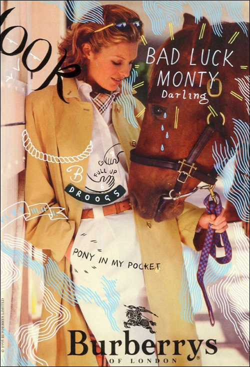
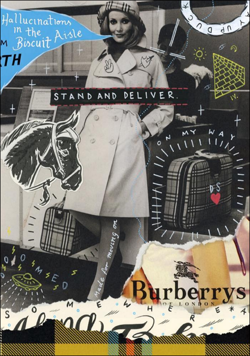
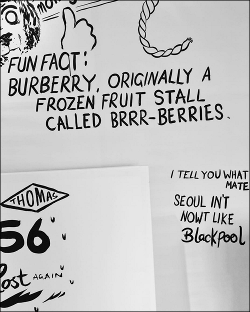
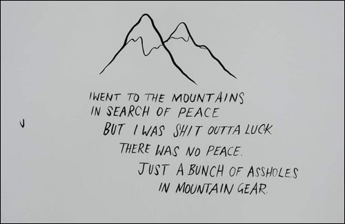
So as not to leave you in the dark about the style of the artist who created this very odd pattern, let's take a peek at Danny Sangra's illustrations and his collaboration with Burberry. I have to give them credit for seeking out a young, fresh artist who was able to infuse this venerable brand with a little cheekiness. Sangra, who studied graphic design at London's prestigious Central St. Martin's, has been drawing approximately since he was 8 years old, when he took a tumble off a chair at his mother's hair salon. "I was a little shaken so to calm me down, my mum’s assistant got me to draw some cartoons. That is literally the day I started to draw with enthusiasm," he says. Most of his images consist of vintage magazine pages covered in offbeat phrases and words – sometimes surreal, sometimes hilarious (or both), but always visually compelling. They remind me a little of drawing in your junior high textbook or passing funny notes during class; there's something a bit juvenile about marking up these images that makes me giggle.
I cracked up at this one, since it reminded me of the time I left a magazine out on the kitchen counter only to come home and find that my husband had blacked out the cover girl's teeth and gave her a mustache. I can't for the life of me remember who it was (maybe Katy Perry), but it was just one of those moments that made me hysterical laughing. Nothing like coming home from work and being unexpectedly confronted with a graffitied magazine. (I asked him why he did it and he said he was just bored and thought it would be funny. Fair enough.)
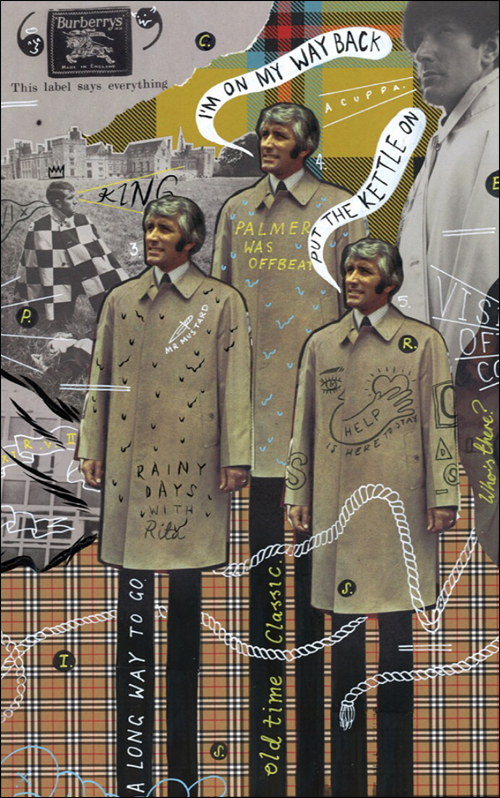
Scribbling random words and images in fashion magazines may have gotten Sangra in trouble with his parents when he was a kid, but proved to be worthwhile long-term: in the summer of 2017, his "doodles" caught the attention of Burberry, who gave Sangra free reign to re-imagine some of their campaign images from their archives with his signature humorous style in a project called "Now Then". Phrases are scattered across the photos in an almost stream-of-consciousness manner, infused with British silliness that doesn't fall into stereotypical traps. He explains, "I tend to play with colloquialisms, surreal thoughts and kitchen sink-esque observations…it feels like a very British commentary. [T]ypically, I write things that need to be deciphered. However, for the Burberry project, from the beginning it was meant to be very British – but I wanted to make sure it wasn’t just 'Big Ben’ and ’London Bus' British! I was born in Yorkshire, but have lived in London almost half my life; I wanted a lot of colloquialisms which I knew would bring a humour to the project."
This one was my favorite. "I'll put the kettle on."
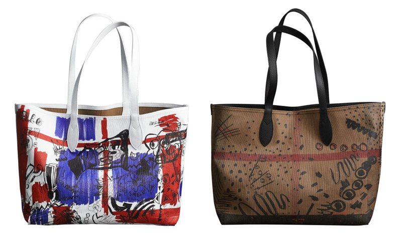
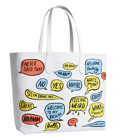
The advertising project led to more work with Burberry – an augmented reality app*, a Snapchat takeover, and of course, Sangra's work appearing on Burberry's clothing and accessories. The color schemes for both the app and fashion items were coordinated due to, ironically, Sangra's colorblindness. "I've always been very specific about colour – because I have to be!…For the bag collection, it was actually dictated by the Augmented Reality project I did previously with Burberry. Because I was painting in Virtual Reality, and the colour had to pop against whatever real-life situation people chose to use the app, I went for primary colours. Then, when it came to designing the bags, we felt it would be good to keep the world cohesive, which is why I made the bags bright unlike the archive illustration pieces." Sangra kept the primary colors as well as Burberry's traditional brown check pattern, but also added a healthy dose of vibrant shades.
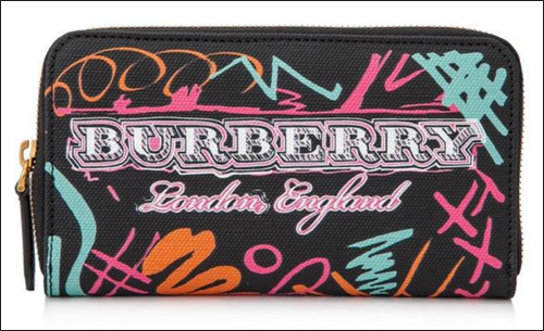
(image from tradesy)
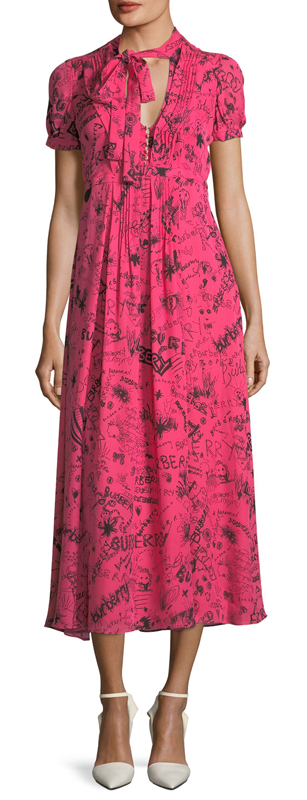
Some of the clothing even bordered on neon. (And I swear the pink on this dress is the same shade as the blush palette.)
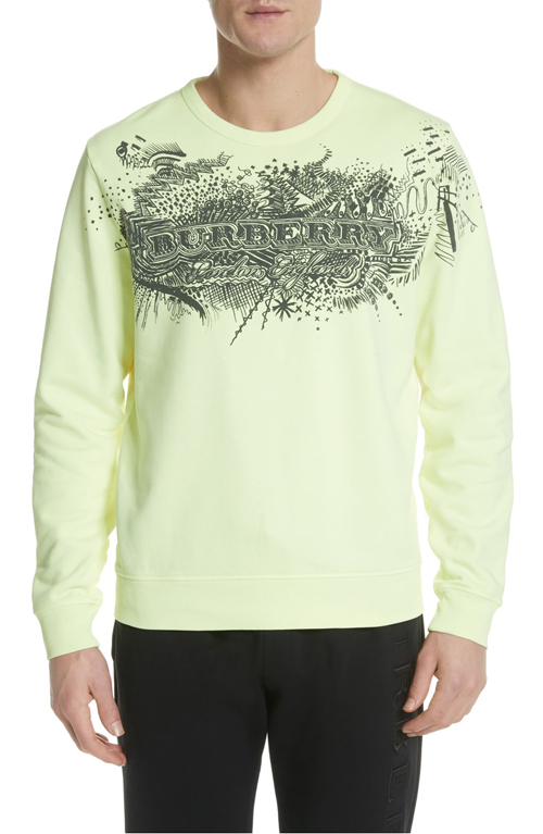
(image from nordstrom)
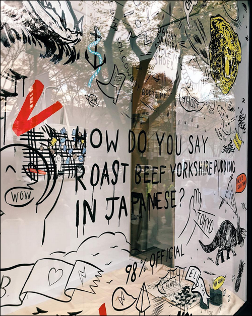
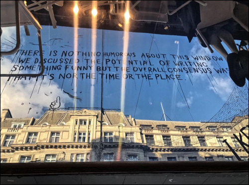
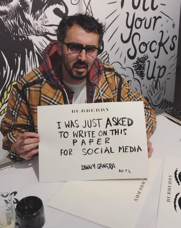
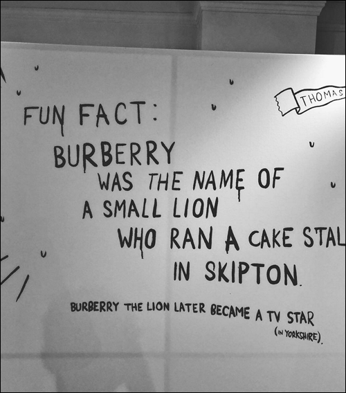
Sangra also did live illustration at several Burberry flagships across the globe, decorating customers' bags as well as the store windows. “It's always an entertaining way to connect with the people passing by…Kinda like if the store was talking to you. That seems an over the top way of describing what I'm doing — essentially it's Burberry letting a tall bloke paint random things on their windows,” he says. This sort of hands-on artist involvement with a brand isn't new – see OB for Shu Uemura and Donald Robertson – but Sangra brought his unique brand of irreverence and wit to the concept. Unsurprisingly, he didn't want the run-of-the-mill "pretty" window displays: "I knew I would write “How do you say roast beef Yorkshire pudding” in the Tokyo store window, but I didn't know I was going to lay down and pretend I was asleep! I've kept every window on the tour 'internationally local' – but once I'm in the window, who knows! I've been getting away with more and more as this tour progresses. I want people on the street to stop and take it in. I don't just want some pretty windows."
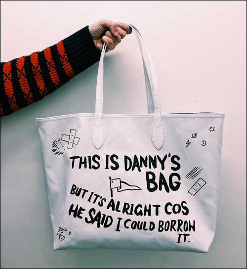
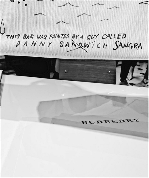
As to be expected, Sangra also had a field day with customizing the bags at these events.
It was a fruitful collaboration to be sure, but the key to its success was Burberry giving more or less carte blanche for Sangra to do as he pleased, which is quite refreshing in the land of artist collaborations. He explains, "[W]hat surprised me was how much freedom they have given me. Usually, with companies of that size, there's tons of restrictions – but Christopher [Bailey] and the team have just let me get on with what I do. Obviously, I reacted to the fact it's an illustrious British brand that is so ingrained in the culture. Whatever I did, it had to feel honest." Sangra clearly enjoyed this freedom, even poking gentle fun at the Burberry brand.
What I like most about Sangra is obviously his sense of humor; the fact that he doesn't take himself or art in general all that seriously makes his work easily accessible. His approach: "I think you need humour across the board in general. Humour allows for more interaction. It seeks to unify rather than segregate (most of the time). I have a difficult time when I see people taking art too seriously. Art shouldn't be elitist, it should inspire. Humour is just another tool to create a response. I tend to use humour as a cloaking device…I think the humour [in my work] comes from me not trying to sell the work; I'm just writing whatever is on my mind, from either my own points of view or my characters’ points of view. I don't really try make stuff funny, it's just the way it comes out. There's an awkwardness to the way I present it that adds to it – you either relate to my work or you don’t, I’m not trying to hook you in!"
Additionally, Sangra's clever use of text, whether alone or scrawled over magazine images, is the key ingredient in making his work come alive. While Sangra is also a film director, reading and writing serve as the foundation for his creative process. "I'm not a heavy reader as I lack the patience, but I'm trying! I find reading gives me the most inspiration…I write more than anything else these days. I constantly write notes. Words, conversations etc. Those tend to ignite a project. I'll hear a phrase and then I'll either think of a film I can make with it or how it could become a series of images." Jotting down a few phrases on a slip of paper seems overly simple – I can see how some wouldn't consider it "real" art – but keep in mind that the written word is essential to the work of tons of "real" artists (i.e., Basquiat, Barbara Kruger). The process is slightly more complex than you'd think. Having said that, I don't believe Sangra's scribbles are incredibly high-brow or overly conceptual pieces (although his in-store antics could certainly serve as performance art), but sometimes it's nice not to be confronted with anything that could be remotely construed as pretentious. With Sangra, what you see is what you get; there's no affectation here.
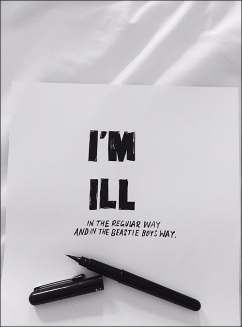
(images from instagram unless otherwise noted)
Getting back to the Burberry palette, I'm so curious to know whether Sangra is aware that one of his illustrations appeared on a makeup item. While I think it would have been incredibly fun to present him with an empty palette and have him come up with something just for the makeup line, I still appreciate that Burberry used one of his existing designs rather than relying on their usual seasonal collection. As for the design itself, the fact that it's such an odd jumble of images makes it memorable and takes away the haute couture formality and seriousness that can sometimes plague makeup releases from high-fashion houses. By choosing possibly the strangest illustration Sangra had created for Burberry, the blush perfectly represents not only his work but also a more playful, casual side of the brand that we don't often see. I must add, however, that I think it would have been hilarious to have one of the Now Then images on the outer packaging. 😉
What do you think?
*I had no idea what an AR app was. Fortunately this article explains it in a nutshell: "The augmented-reality feature interacts with users’ camera feeds to digitally redecorate their surroundings with Burberry-inspired drawings by the artist Danny Sangra…The new augmented-reality feature allows users to export the images they create, enhanced with graffiti-like doodles, to social media in a Burberry frame."
