
 (image from laguestlist.com)
Welcome to the first of what will be many holiday 2018 artist collabs. I figured I'd start with Smashbox since last year I didn't get around to writing about their fabulous collection with Ana Strumpf, so I was determined not to miss another artist collab from them this year. For their holiday 2018 collection, Smashbox teamed up with L.A.-based, Miami-born (and MICA educated!*) artist Jen Stark. For once, I had actually heard of this artist prior to the Smashbox collection, as her incredibly colorful and almost hypnotizing work had caught my eye at many of the art blogs I follow. (The more pop-culture attuned among you might also recognize the crazy backdrops she created for Miley Cyrus at the 2015 VMAs.) Naturally I was pleased to see it in makeup form.
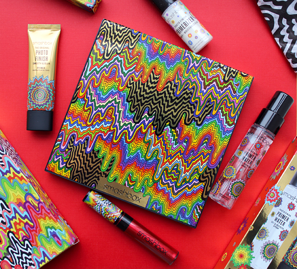
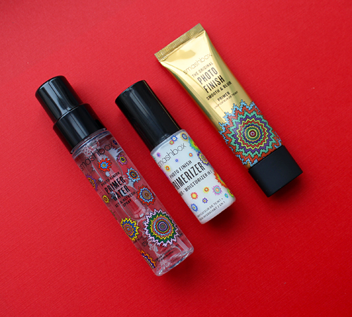
I picked up the face palette, primer set and a festive red lip gloss. I'm kind of kicking myself for not getting the lipstick set, which had some of the designs etched onto the lipstick bullets.


Let's take a look at Stark's background and work. I'll be doing my usual summary of artist/critics' quotes instead of trying to come up with my own analysis. I fully admit my laziness, but I maintain the artist's own words serve as the best description. Finding tons of information online about an artist is a double-edged sword: one the one hand I love being able to learn about their work and process, but on the other hand it can be overwhelming to try to condense it all into one blog post. There are dozens of interviews and articles about Stark's work so this fell into the overwhelming category, but I'll try to keep it coherent.
Stark was born and raised in Miami, Florida. While she was always interested in painting and sculpture, rising early in the morning before the rest of her family to draw, paint and make collages, there was one family member in particular who recognized her talent and encouraged her to continue following her passion for art. In an interview with Curator, Stark notes, "When I was very young my grandfather (who was a hobby artist) would invite me over to teach me how to paint with watercolors. He would paint things like waterbirds, landscapes and boats on water. One day during our painting session we decided to paint my [favorite] Cabbage Patch Kid doll. We each painted a portrait our own version, and when we were finished he said, 'Yours looks better than mine!' And I thought to myself 'Wow, maybe I can really be an artist'. Haha, I was probably 5 or 6 years old (and looking back now the painting was not very good, it was just such a thrill to get a compliment from my grandfather, who I looked up to)…He was just probably trying to make me feel good but he was really encouraging. Our styles are completely different but he helped nurture me. He passed away a few years ago. I’ll always remember him. I tell people how he’s the one that made it happen." I have to say, her childhood drawings are way better than anything I could do at those ages!


Stark's technique with paper cutouts has its roots in a tale as old as time: the story of a young, broke art student. During her junior year at MICA she enrolled in a study abroad program in Aix-en-Provence in France, and it was there she began finding her artistic footing due in part to her lack of funds. She explains, "Since we were only allowed to bring 2 suitcases for 5 months I decided I'll just get my art supplies when I got there. Well, the Euro was way above the dollar and things were expensive so I decided to get one of the cheapest things–a stack of construction paper–and see what I could do with it…When I arrived I had no exact artistic direction. I knew I loved colors and labor intensive work, but hadn’t pin pointed my style yet…Having little money to buy expensive art materials helped me become more creative with the supplies I had, and turn lemons into lemonade! It made me realize I could create artwork out of anything, as long as it was a unique idea and I worked hard at it. That was definitely a big turning point in my evolution as an artist. So, in this case, necessity allowed me to discover a new way of art-making."

Stark kept at it, and in 2007 she quit her job designing retail store spaces and took the leap to being an artist full-time. Around 2008 is when the first "drip pattern" surfaced, which surprisingly had its origins in a t-shirt. She notes in this video: "I just created this t-shirt design of this one rainbow drip going down the front. I wanted to make it look sort of blooming, very psychedelic…I started honing that in and kind of creating a pattern out of it. To me it references psychedelia, altered states, different dimensions. I just love how it's so dynamic, it looks like it's oozing and moving down." These sorts of patterns became Stark's signature, and over time expanded from two-dimensional to 3D mediums due to an increasing interest in Op Art effects: "The viewer's interaction with my work is becoming more and more important to me…lately I've been experimenting with Op Art ideas, like trying to get the static lines and colors in the work to sway and make the viewer's eyes vibrate. I'm also getting interested in colors and angles, having colors change as viewers walk around the piece. I have a love for all kinds of optical illusions and things that seem to distort reality in a subtle way."

, 2013") (images from jenstark.com)
(images from jenstark.com)
While it seems a bit haphazard at first glance due to the undulating lines and vibrant colors, Stark's work is actually quite precise and is based on forms found in nature as well as mathematical concepts such as fractals. She named her 2012 exhibition "To the Power Of", referencing the exponential multiplication of numbers and how her process is informed by growing patterns in a particular ratio. "I've always loved the idea of math in nature. There are so many natural forms that have complex mathematical equations that we don't even know how to calculate, yet is seems like this equation flows through so many living things from fractals to snowflakes, and from the shape of a hurricane to the similar-looking milky way galaxy," she says. In fact, every once in a while she'll get a email from a mathematician who recognizes a specific equation in the patterns she's created. (While Stark says she wasn't good at math in school, she excels at representing high-level mathematical concepts visually.) Growing up in Miami, with its abundance of lush year-round plant life, also influenced her work. She elaborates, "I’ve always had a deep fascination for nature and how it relates to science and spirituality. I feel there is a parallel between different shapes within our universe: like how the Fibonacci spiral equation relates to so many things in nature – from the shape of shell to how a fern unfurls. Sacred geometry is a big inspiration in my work. I love thinking about how enormous shapes out in the universe can have the same patterns as tiny microorganisms under a microscope. How geometric shapes and certain spiraling patterns apply to designs in nature big and small. Also, it is interesting to me how much we still don’t know about science and the way things work. I hope to maybe reveal, on a visual level, some truth or insight about these ideas." A healthy dose of psychedelia gives Stark's work a more mystical, spiritual feel that beautifully complements the exactness of the patterns. "Lately I’ve been delving into the world of meditation and consciousness and what is considered reality. I’ve been reading a book by Terence McKenna called Food of the Gods, which talks about how early humans may have evolved thanks to the help of psychedelic mushrooms and altered states from medicine plants. I’m so fascinated by all these ideas and the link between the psychedelic world, the afterlife, and how this all relates. For thousands of years our ancestors cultivated this amazing culture. My work relates to the psychedelic movement because of ideas of perception, and a sense of altered consciousness. I’m also drawn to the radiant colors associated with psychedelics and the fascination with optical patterns and mind alterations. I think in certain ways, psychedelia is a quest to discover unknowns about ourselves and the universe, and I’m striving to answer these type of questions through my artwork," Stark explains. In layman's terms, her work is pretty trippy but also oddly meditative. I feel like I could stare at it all day and feel energized due to the vibrant color palette (like I did with Smashbox's 2015 artist collaborator Yago Hortal), but also contemplative, as I felt with the work of Hilma af Klint (who also was fascinated by merging natural, organic-looking forms with the spiritual realm.) The repetition of shapes and the gentle, almost melting movement of the lines is calming and hypnotic, but the bright colors keep the viewer's eyes stimulated. The controlled orderliness mixed with vivid hues led one interviewer to coin the phrase "psychedelically precise", which I think perfectly describes Stark's style.

This meditative quality is not accidental; Stark perceives the painstaking process to create her paper sculptures as a form of meditation. "I wouldn’t say [making my art is] emotional because once I make it I’m not really attached to it like a lot of other artists. I just get it out in the world and I want other people to see it. I would say it’s more spiritual and meditative. It’s more about the process of brainstorming and coming up with the ideas…For me, the act and process of creating art is just as important as the final product. My art practice is very meditative and brings me to a trance-like state when I’m creating – especially with very repetitive tasks. I’m not a really OCD person in my life but with my art work it’s the satisfaction of doing intricate kind of work all day. There’s a joy I get from it which is weird but it happens. I don’t know, I’ve always liked repetitive motion; things like that make me happy…Repetition and movement play a huge role in my creative process. The repetition is similar to how the layers of a plant unfurl and reveal the future layers inside, waiting to grow out. I also love having a tedious process attached to my work, and feeling like I’m piecing it all together to create something amazing."

(images from jenstark.com)
In looking at her work, I can absolutely see how someone would be as mesmerized actually creating the piece as a viewer would be just looking at it. Of course, if there's a deadline I imagine it might be less fun, given how labor-intensive the process is. Speaking of which, I wanted to highlight how much work goes into each of these paper sculptures. Depending on the size and complexity of the piece, it can take anywhere from a week to a month to complete, and consist of 50 to 150 layers of carefully cut and glued paper. The paper is cut entirely by hand using an X-acto knife, then adhered with archival glue to wooden backing for sturdiness. Stark explains: "Typically, I sit down at my studio desk and begin sketching ideas in my sketchbook. I write down lots of words in addition to images. Then, once I pin down a favorite idea, I’ll begin to create it. If it is a paper sculpture, I’ll cut each layer out by hand with an exacto knife and sequentially put it together." While assistants help with the gluing of the layers, Stark eschews their assistance as well as technological advances when it comes to the actual cutting of the paper because the technique is so integral to her style – and it's individual to her. "The whole handmade thing is a part of my work. Using a laser cutter would cause the work to lose a lot…I’ll do the cutting myself because it’s kind of impossible for someone else to do that part—it would look like their hand." I think the photo below gives a good idea of the work involved to create these sculptures.
 (image from contemporist.com)
So why go through all this? Stark points out that paper is a universally recognized material, and again, she finds joy in doing repetitive work that also transforms a flat, 2d surface like paper into something three-dimensional. Plus, Stark's training in fibers helped her explore the possibilities of paper and fostered her passion for handmade pieces. In a 2012 interview, she notes: "In college, I majored in Fibers. This usually throws people off because I mainly work in paper and wood, but Fibers at my college was more of a technique and concept-based major. They taught us the basics of things like sewing, screen-printing and weaving, but there was also a big emphasis on ideas, process and accumulation…I’ve always been drawn to intricate work and labor-intensive, handmade things, so discovering the paper sculptures was a gradual journey from age two to 28! I love how common and versatile paper is. It is in everyone’s daily lives and people tend to overlook the amazing things it can do and be transformed into. I also love the idea of taking something that’s two-dimensional and flat and making it three-dimensional and intricate."
 (image from jenstark.com)
The drawings and paintings are less labor-intensive, and for Stark these provide relief from the repetitive nature of the sculptures. It makes sense; I think we need a break from even things we enjoy. "I make drawings too, and see these as more of a spontaneous, organic process. They allow both my mind and hands to take a break from the monotony of the sculptures. [Drawings are] a way for my mind to just breathe. The sculptures are structured and I have to go through this strict process to create them. The drawings are spontaneous, I literally put paper down in front of me and start making a little mark here and a little there and it just grows." This organic process also reflects Stark's fascination with nature and how natural shapes evolve as they grow. "I kind of want [my works on paper] to seem like some sort of cosmic, chaotic eruption but at the same time still beautiful. I try to make them an organized type of chaos, like what happens in nature…[they're] kind of an escape from doing sculptures. They're a breath of fresh air because they're very spontaneous. I usually don't have an idea of what they'll look like in the end. I don't do any sketches, I just start making marks on the paper and it grows from there. I really like the idea of an object, through slow, gradual, layered changes, completely changing over time…I feel like a lot of my work comes from that, taking one shape and tracing it, changing it a little bit through the layers of evolution."

Since my love of makeup stems mostly from my love of color, I wanted to briefly discuss Stark's use of color. As with the patterns she creates, her sense of what shades to use are also inspired by nature. "My process with color comes from the interest of color in nature and how color is such an attention-grabber…to caution poison in mushrooms, or to reveal a delicious fruit that will spread it’s seed. I love how certain colors look next to each other and attract the viewer’s attention. The exact color schemes are not typically planned out. I usually spontaneously pick colors that I think will look great next to each other and build from there." Stark also relies on her own artistic instincts. "I took color theory in college, so I absorbed all of that, but in my own way of choosing colors, it’s very instinctual. I’ll just know what colors to put next to each other. Usually it deals with contrasting, light and dark hues, stuff like that, but it’s pretty much just my brain deciding. I normally don’t have to think about it too hard." While there's not a creative bone in my body, I feel like this approach is similar to mine when it comes to makeup. I never really have to think about which colors go together, I just sort of know. (I also wake up "feeling" certain colors or textures – not synesthesia, per se, but similar.)
 (image from jenstark.com)
Since her move from Miami to L.A. in 2012, Stark has continued expanding the materials and techniques she uses (though the dry weather there is a great boon to working with paper, since it doesn't "wrinkle or do weird things" as is the case with Florida humidity.) "Living in LA has helped to expand my ideas on fabrication and thinking about what artwork can be. There are so many possibilities to be able to create work using particular materials, with so many fabrication houses. The possibilities seem endless. Also living in LA has made me more open to the definition of what an artist can be. I’m diving into all different avenues of artwork like creating clothing, digital animations, public art, working with great brands, etc. It has made me realize I don’t have to have one set path, I can create my own world. I use many different materials in my work, like wood, plastic, paint, metals, etc."
Finally, while I admire Stark's smaller works, it's the large-scale ones that capture my imagination the most. Seeing these mind-bending designs on a building feels even more tremendous than viewing a painting or even a sculpture in a gallery. Once again, Stark's interest in natural forms drives her desire to create public installations that have "visual and environmental benefits": My dream commission would definitely be a public sculpture in nature. I’d love to create a large scale sculpture that incorporates renewable energy and gives back energy to us, yet at the same time is an intriguing and beautiful object. It would be amazing to do this in a park or at a school (and that same energy would go directly into the school). It would be great to make big installation type work where the viewer can be immersed and actually walk through the piece out in nature…I would absolutely love to someday make a monumental artwork that transcends a gallery. Maybe something dealing with outer space or in the ocean would be great." Stark also recognizes the importance of making art accessible. "I would love to keep doing more public art because I think that’s the most powerful, and people don’t have to go into a gallery or a museum to view it," she says.


I particularly enjoy this mural she did for the Fashion Outlets of Chicago in 2013. Can you imagine going underneath the escalator and being greeted with that?! Makes one's shopping experience far more interesting, that's for sure.
 (images from jenstark.com)
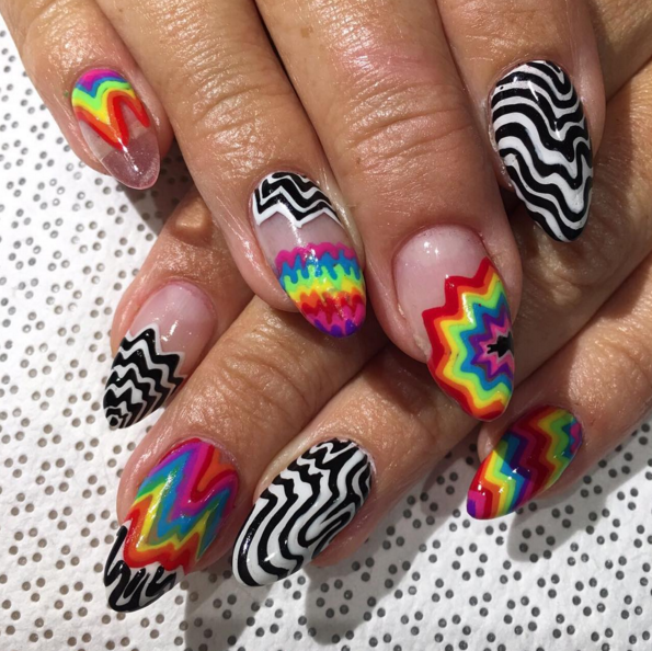
Getting back to the Smashbox collab, despite the numerous articles and interviews, I was unable to find anything specific about their partnership (and obviously was too intimidated to reach out to the artist directly, especially since I had been burned before.) Stark is no stranger to collaborations, having previously teamed up with Vans and Google, but there was nothing about her experience working with Smashbox or how it came to be. I'm assuming Smashbox contacted Stark since they prefer championing L.A.-based artists, and her work looks as good on a palette as it does on a building. I'm wondering if the company got the idea to team up with Stark based on a December 2015 Vogue article in which she mentions her admiration for the brand, among others (MAC and Urban Decay also had shout-outs). "Lately, I've been wearing a lot of Smashbox, and love their lipsticks and glosses for nighttime." The article also provided some insight into Stark's approach to makeup, which, as you probably guessed, is as boldly colored as her sculptures. "I try to dress as colorfully as my work, and wear amazing vibrant makeup to connect everything," she says. "Your face becomes its own blank canvas—it's fun! I usually keep my face au naturel—no powder, or even foundation—and focus on the eyes and lips, using vibrant colors to add brightness to my face." I have to say, in nearly every photo I've seen of her, it seems she wears minimal makeup with muted colors (or at least they're not visible in the photos.) Anyway, Stark also got the attention of nail art company Vanity Projects, who recreated the artist's patterns in gel nail form for Art Basel Miami.
 (image from observer.com)
As for the collection packaging, I honestly couldn't tell which exact paintings of hers made it on to the palette and other items. Did she create something entirely new for Smashbox or did they recycle one of her earlier pieces? This print from 2015, originally created with nothing but paper and markers, seems very similar but it's not identical.

I couldn't even begin to try to guess the designs on the other products. In any case, I thought it was a great collection despite my preference for seeing Stark's work on a larger scale. As for the artist herself, she doesn't seem like she's interested in cashing in; as one article notes, "[Stark] is especially mindful about how much commercial work to accept and for which companies. It's more than just a desire to avoid overextending: she wants what she does to fit." In everything I've seen, Stark remains humble and simply wants people to enjoy her art. As I always say, artist collabs are a wonderful way for people to access art if they can't purchase it or even see it in person, which can be difficult if you're not part of the art world. Stark's take: "Good art should be inclusive rather than exclusive. I enjoy that my artwork attracts all different types of people from students, to teachers, artists, designers, middle-aged housewives and even mathematicians. My audience isn’t just limited to people in the art scene. Many different types of people are able to enjoy it and take something away from it." Coupled with her passion for public art, it follows that she would be enthusiastic about a makeup collaboration with a brand as well-known as Smashbox.
What do you think of this collection and Jen Stark's work?
*As someone trying to move out of Baltimore City, I can't help but be amused at Stark's comments regarding her brief time living here while attending MICA. "I guess the cold weather and fear of crime rate sort of forced me to become creative in the studio," she states (silver lining?) and also: "I don't recommend Baltimore." That makes two of us, Jen!