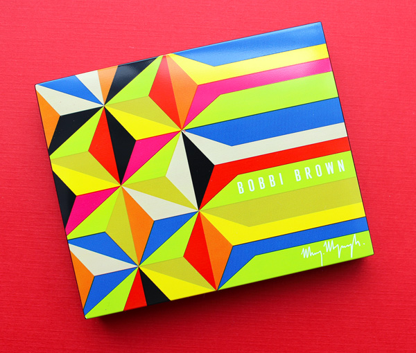
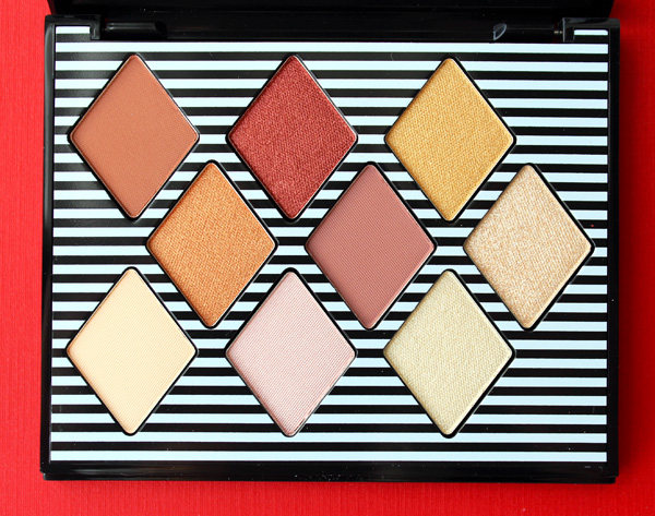
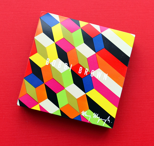
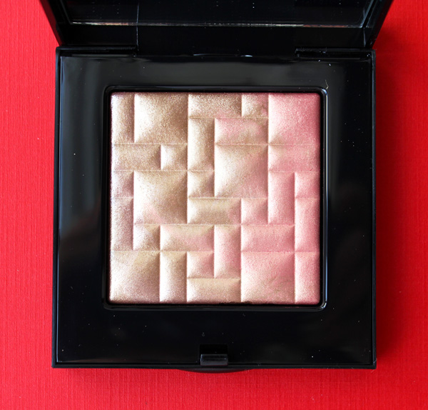
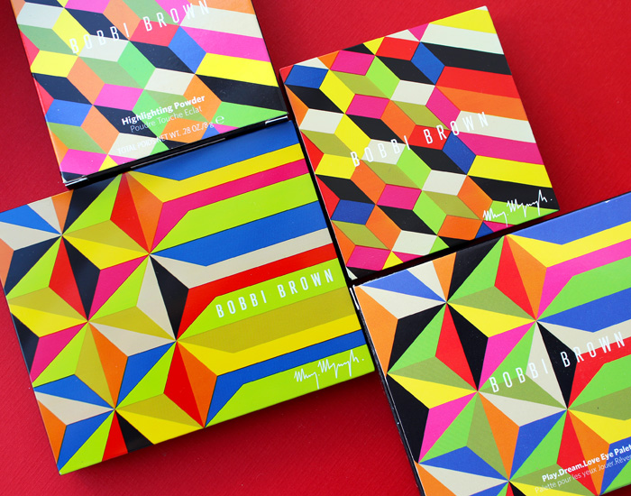
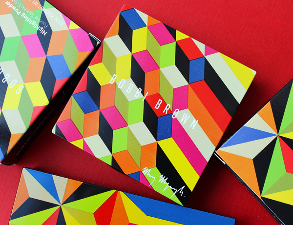
I'm quite far behind on artist collaborations, so I'm doing some more catching up. Today we have British artist Morag Myerscough for Bobbi Brown, whose collection was released in the spring of 2020. It was a small collection consisting of an eyeshadow palette, highlighter and two lipsticks. I purchased one of the lipsticks and the two other items…and of course I can't seem to find the lipstick. (I'm really hoping to take a full week off of work this summer to properly re-organize the Museum's collection, as things keep going missing or take literally hours to locate. Sigh.)
Born and raised in London, Myerscough came from a family of artists. Her father was a highly sought-after session musician in the 1960s and '70s, while her mother was a textile artist. Myerscough was settled on an artistic career even before she was out of elementary school. After graduating from St. Martin's where she studied graphic design, Myerscough attended the Royal College of Art. In 1993 she established Studio Myerscough, and in 2010 Supergrouplondon, a collaborative studio with fellow artist and partner Luke Morgan, was born. You can read more about her professional background at Eye Magazine.
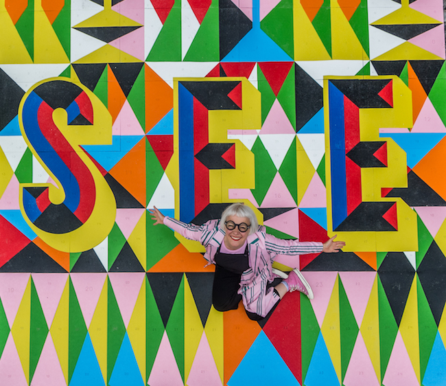 (image from colourstudies.com)
Myerscough's vibrant color combinations are influenced by her mother as well as several artists, including Josef Albers and '80s collective Memphis (remember them from my Hermès post?) She explains, "[My style of] colour could be from my mother, I think my colour sense comes from being very young and understanding the difference between a dye made from a natural source and one from an artificial source. When I make my big pieces of work I much prefer to paint them as I can get pure pigments and as they are used in spaces it is important how colour responds to light. There is nothing better than to see an amazing colour in the right environment, it can change your whole mood. I like to be brave with colour, at college I was introduced to Albers, and I was very interested in his theories on how colours respond to each other." She adds, "I really hate when people say that colour is exclusive to children, what sad people they must be. Adults need colour in their lives as much or maybe more than children. Colour is so abundant in nature and we need it more in our built environment." Hear hear!
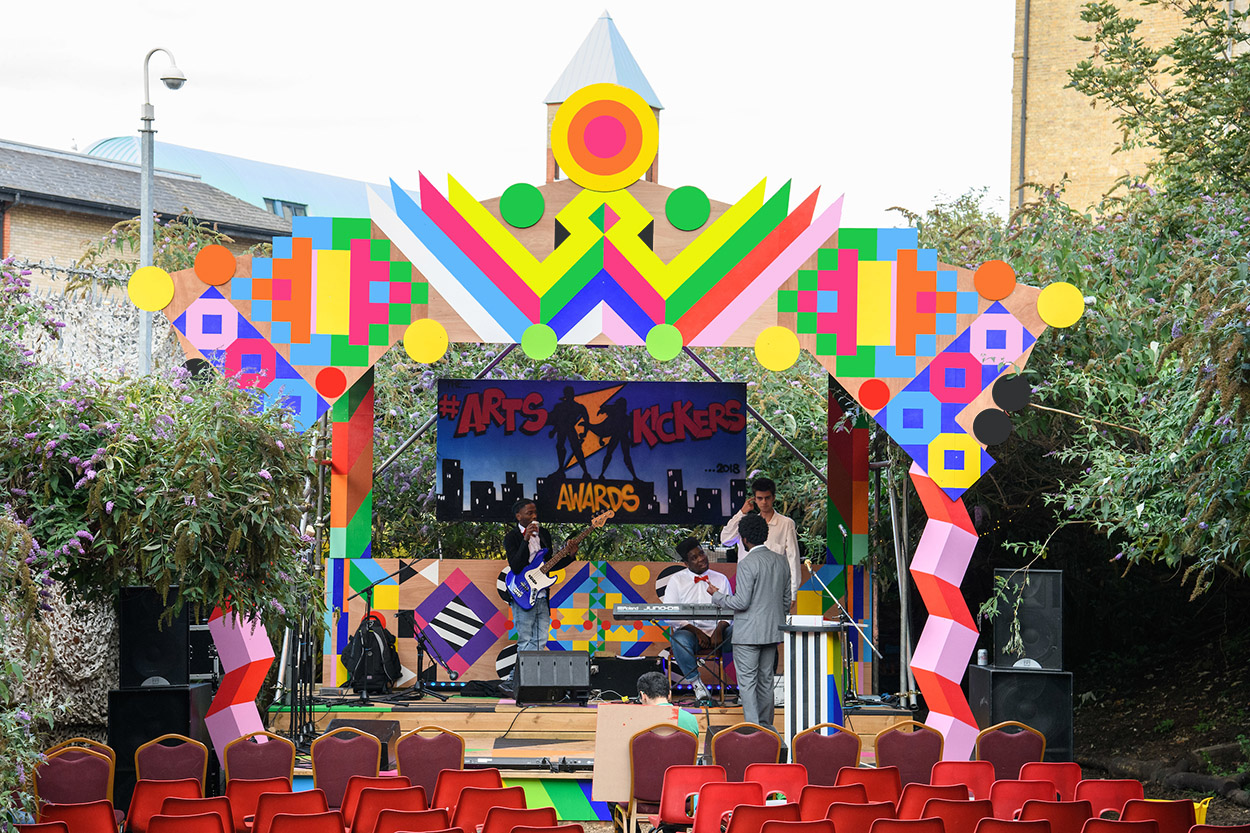
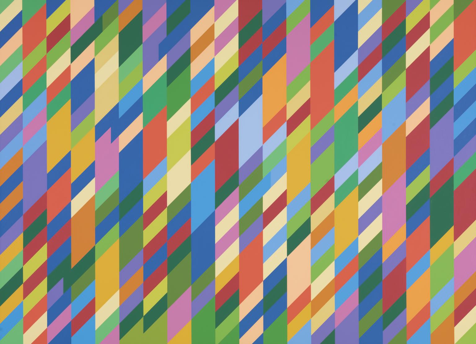
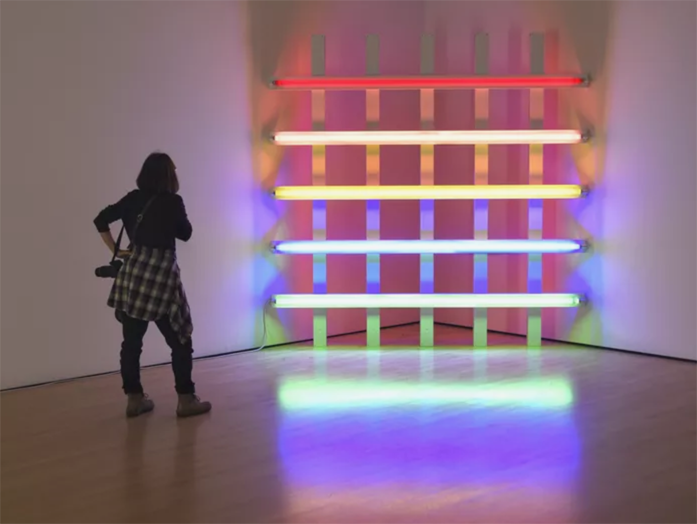
Her color choices combined with the tidy, modern geometric patterns reflect both her graphic design background as well as the influence of artists such as Bridget Riley and Dan Flavin. Here are a couple examples so you can see the resemblance.
(image from tate.org.uk)
(image from thoughtco.com)
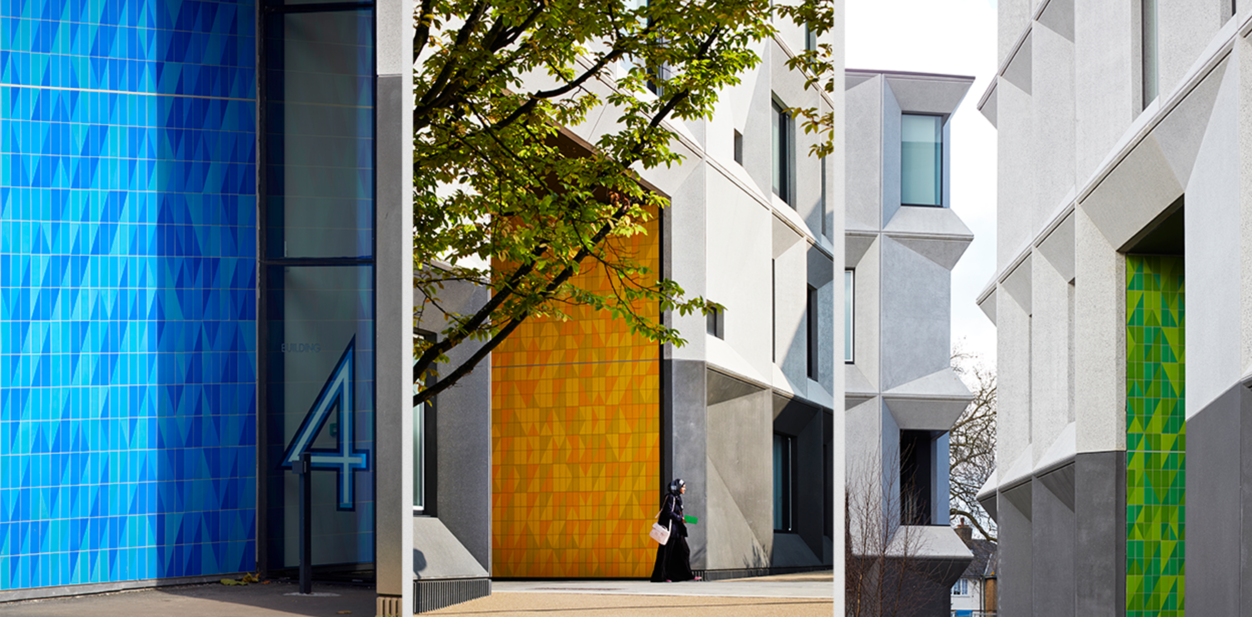
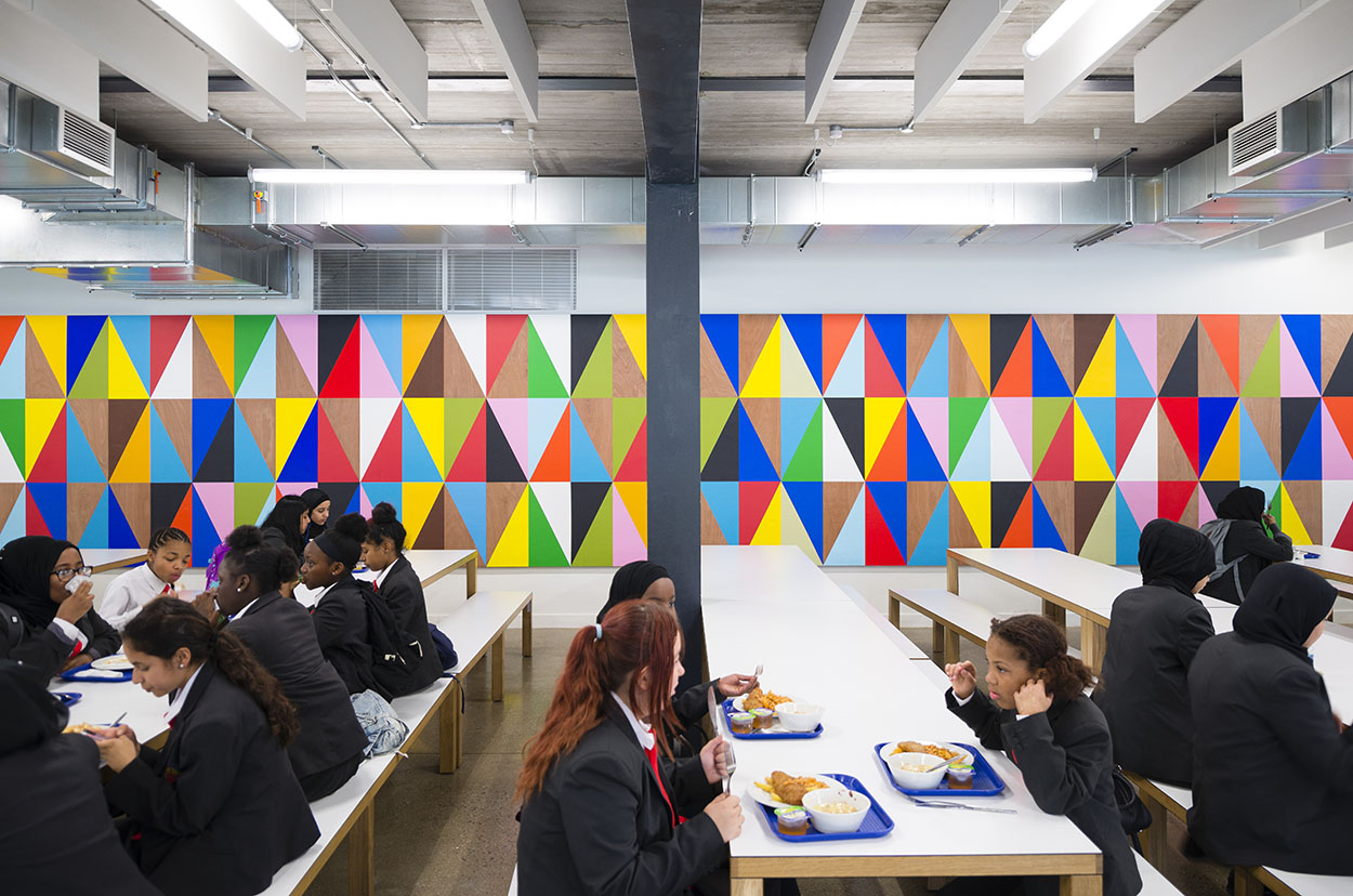
You know I adore big bold swathes of color, but it's Myerscough's dedication to community engagement and overall approach to art that speak to me the most. Adopting a Chinese proverb as her mantra, "make happy those who are near and those who are far will come," Myerscough aims to instill a sense of belonging among the people using the space she's been commissioned to reimagine. She believes art is a unifying concept that can bring people together and connect them to certain places. A beautiful example is the Burntwood School, where Myerscough designed many of the interior and exterior wall patterns. "I put a narrative in the building, we make places where people feel they belong. I like working collaboratively with architects…we have made some great steps in how schools are used and how the students connect with their schools. The team needs to want the same result and for the project to be successful this involves everybody. The students' grades have increased hugely, I believe this is because they have a building that works for them, that they can be proud of, with teachers that care about them and when you put all the parts together it produces success," she says. I wonder if my anxiety would have been mitigated if I had attended a school with this sort of art everywhere. Probably not, but it's at least nice to look at.
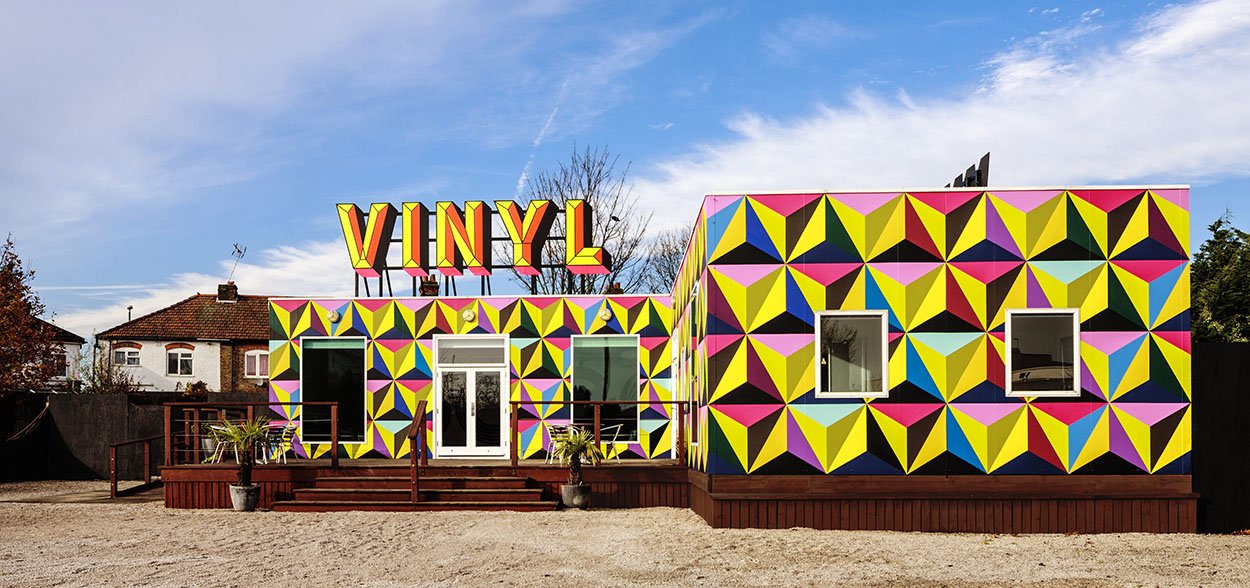
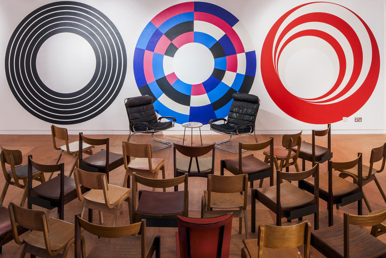
I also love the Vinyl Lounge, a mixed-used space that used to be an office owned by British music company EMI in the '70s. Myerscough carefully researched the history of the buildings to design something that paid homage to their past while accommodating modern needs. The furniture and other decor consisted of vintage eBay buys or made by Luke Morgan with reclaimed materials. The "lounge" itself served as a gathering place. In this way the space incorporates local heritage and engages the community. "I do focus on belonging. I want to find out from people what it means to them. Because it may mean different things to different ages, like for the older ones it might be family, while with young ones it might be friends. I also try to see what part of it makes you feel belonged; is it just your culture or is it about talking with each other? It does not matter that you do not come from the same place but can still belong together."
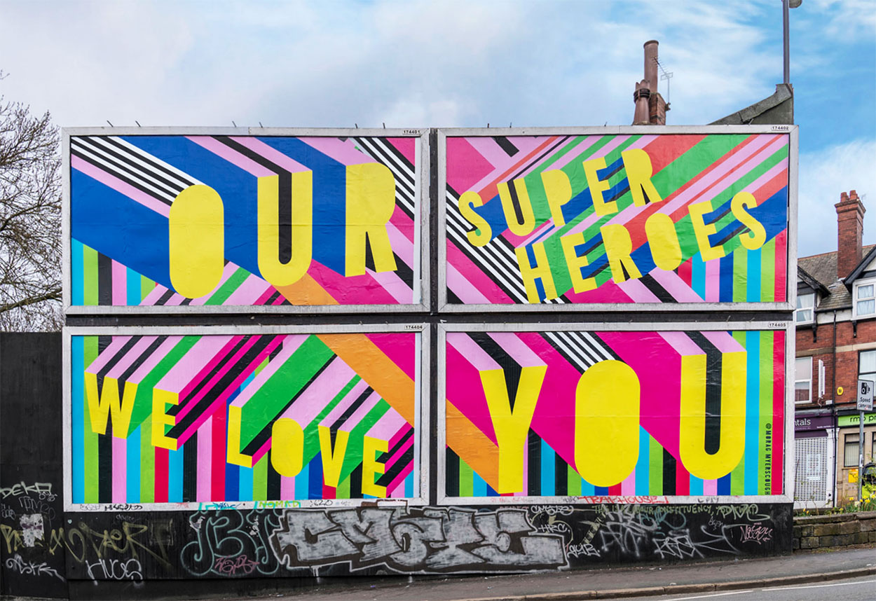
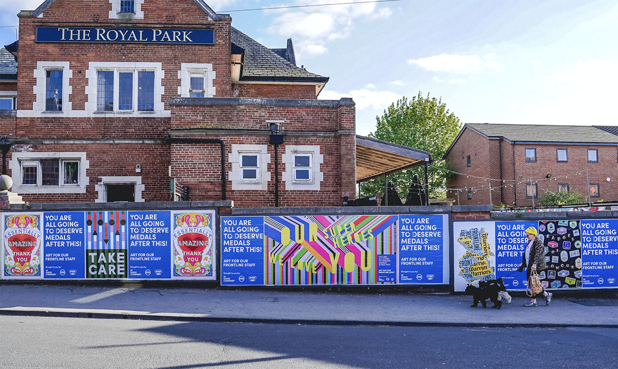
But I do have some mixed feelings towards other projects. While I admire Myerscough's approach and would be honored to be able to visit one of her works in person, at the same time I'd most likely want to punch it. Perhaps I'm too cynical not about public art in general, but Myerscough's optimistic outlook more specifically. It's a bit too cheerful and positive for my grumpy, pessimistic self, or at least, the text is. If I was confronted by Love At First Sight, for example, I'd roll my eyes and walk right on by. Ditto for the billboards painted in honor of the frontline NHS workers during the early part of the pandemic. It's a really nice thought, but calling them "heroes" is problematic, and frankly a mural comes off as much as an empty gesture as clapping did. Overall, I think her installations work better with no words, because there's no direction then and people can take whatever they want from it. Words create additional meaning and context, so without them there's more freedom of interpretation. However, I don't think Myerscough would be offended if she read this because at least I have some sort of reaction. We share the same belief that art should have some kind of impact on the viewer, whether it's bad or good. She says, "The main aim is that people aren’t indifferent to it. I want people to react. I totally understand some people might hate my work and I would rather have that than just dismiss it with indifference. I want people to have conversations; to experience something they didn’t expect. That’s why I love making work in public spaces, where people might stumble across a piece of work and have it change their thoughts for the day – ideally for the better." I agree that part of art's purpose is making one feel something and not nothing.
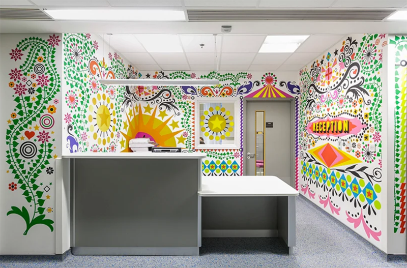
Anyway, I wholeheartedly applaud and respect the incredible work she's done for children's hospitals, but I fundamentally disagree with the notion of art in hospitals. The rooms at the Sheffield's Children's Hospital are very welcoming, and at the Royal London Children's Hospital, she used the children's own drawings part of the decor. "In hospitals I really do want to brighten people’s days, to raise their moods, to make them feel positive and hopeful. I want to make spaces that feel like home, which people enjoy being in. And ultimately to help people feel better…when I was commissioned by Vital Arts to design the five dining rooms at the Royal London Children’s hospital, I proposed to work with [poet Lemn Sissay] on the project. He did poetry workshops with the young patients and I ran visual workshops with the words. We then made murals by combining the words with the visuals, so the dining rooms belonged to the young patients – it was their ideas on the walls. I also displayed all the young patients’ original drawings in frames on the walls, so they and their parents could see it and it was clear the patients were at the centre of the artwork. It’s important that young patients and their families feel comfortable in these environments, because often they stay for long periods of time or return regularly as a child grows."
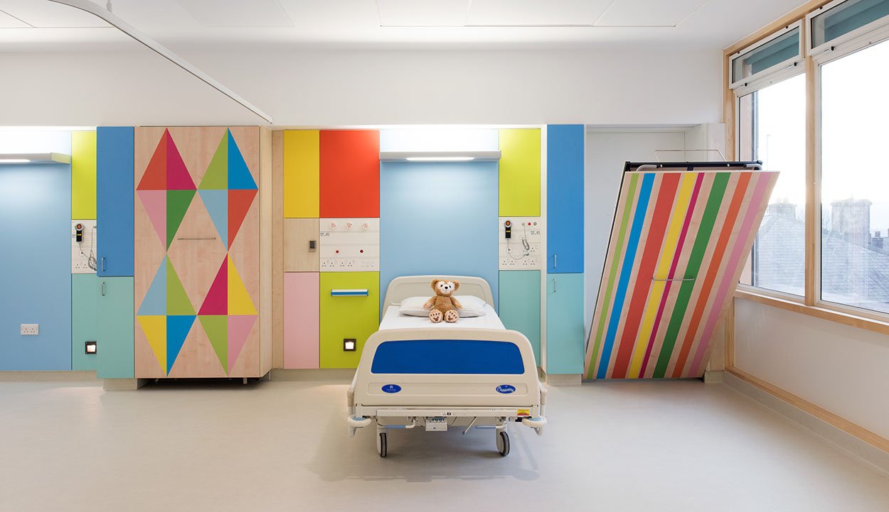 (images from moragmyerscough.com)
These are wonderful, innovative ideas and Myerscough's style is absolutely perfect for this type of project, but as someone who has spent far too much time in hospitals on account of ailing parents, I can tell you that absolutely zero amount or style of art is going to combat the dread and fear. Hospitals are for the very ill and dying, and despite some spotty evidence of the benefit of art in hospitals, I still think there's no artist in the world whose work can even come close to offsetting that type of negative energy. As both a patient and a visitor I'd honestly prefer it if art wasn't in hospitals and have them remain drab and depressing – it's far more appropriate for the space. Again, this is all just a matter of opinion. (And I certainly support art therapy where the patient creates art themselves.)
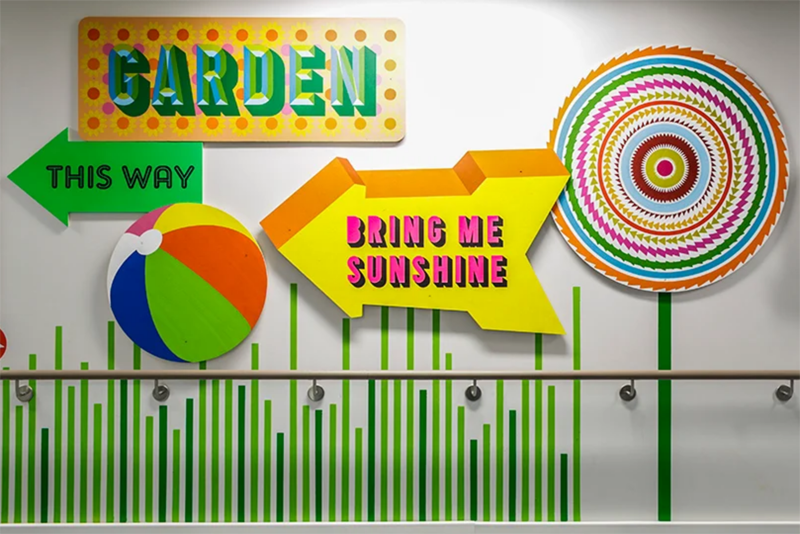 (images from designboom.com)
Getting back to the Bobbi Brown collab, I'm not sure how or why it came about. Nor do I know why she designed the patterns she did for the collection, or if she had an input on the makeup shades. I did reach out for an interview with the artist but didn't hear back. I will say I think her work translated well to the packaging, which can be tricky for artists who typically work on large-scale designs. But I'd love to hear Myerscough's thoughts on makeup colors, how makeup can help bring people together and why she took on the collaboration. She works primarily on big environmental graphics for community spaces and doesn't have a lot of commercial collabs – the only other thing with her work that you'd find in a store was a collection for Method cleaning products, and even that was part of the larger Sheffield hospital project – so I'm curious to know what attracted her to designing the packaging for a makeup collection. It's a bit inconsistent with Myerscough's usual commissions. Perhaps it's precisely how different it is that piqued her interest. In any case, the Bobbi Brown collection is not even mentioned on her website.
Thoughts on Myerscough's work? What does the makeup community mean to you? Do you feel as though you're part of it?


