Established 2008

Dream Teams: Black Artist edition, part 2 (and a bit of makeup history)

It took me way too long to return to Dream Teams, but it's back in time for Black History Month! The second installment features five more Black artists whose work I think would make fantastic beauty packaging. Sadly, since the first edition of this series in the summer of 2020 there has not been a single Black visual artist featured on a mainstream makeup brand. My pleas continue to fall on deaf ears. Since companies still aren't collaborating with Black painters/photographers/multimedia artists, I figured it may be at least somewhat useful to keep sharing the work of notable Black artists within the context of makeup. As noted previously, the artist bios are kept quite brief for now – especially because the volume of information is overwhelming – but if they ever appear on beauty packaging I will go more in-depth. And obviously I acknowledge that artist collaborations, particularly imaginary ones, won't magically solve the beauty industry's racism problem, but it's a relatively easy step towards better representation and increased visibility.

The artist: Lorna Simpson

The brand: Adwoa Beauty

Why: The collages of Lorna Simpson (b. 1961) are a perfect match for modern, gender-neutral hair care brand Adwoa Beauty.1 Both celebrate the beauty of Black and/or multicultural hair textures – Simpson through combining vintage magazine cut-outs with vibrant colors and naturally occurring phenomena, and Adwoa through normalizing natural hair. Haircare is usually beyond the Makeup Museum's purview, but the similar perspectives of the artist and brand were so obvious I had no choice but to highlight them. Adwoa Beauty was founded by Liberian-born, New York City-raised Julian Addo, who was frustrated by the lack of modern, non-gendered products for natural hair. Every item on the market was being continually updated except products for natural hair. "I didn’t see the [modernization] happening with textured haircare," she says. "The packaging and the branding looked the same in 2015 as they did in 1994…Initially, I didn’t want to start a company. I was used to working behind the scenes. So I pitched a concept [about a modernized haircare brand for textured hair] to Sally Beauty and some of my other clients, but no one really moved on the idea. That’s how Adwoa Beauty was born–out of my frustration with the industry and how it represented Black women, and from my desire to have a clean, modern, gender-neutral brand that caters to textured hair. That didn’t exist prior to us launching in October 2017."

Adwoa Beauty
(images from sephora.com)

Around 2011 Simpson stumbled across her grandmother's old copies of Jet and Ebony magazines while cleaning up her studio. Her first instinct was to preserve them in archival sleeves, but then she was inspired to make collages. Over 150 of these pieces from 2011-2017 are included in the compendium Lorna Simpson Collages. A selection of images from the Phenomenon and Earth and Sky series would be fitting for Adwoa Beauty's packaging. Pairing women from '60s and '70s issues of Ebony and Jet with geological and astrological illustrations from old science textbooks, Simpson replaces their hair with gems and galaxies.  "The overall effect – both regal and otherworldly – is a joyful homage to the irrepressible stature of Black hair," notes Emma de Clercq at Infringe.

Lorna Simpson, Earth and Sky #24, 2016

Simultaneously celestial and earthly, the works do not erase Black women's hair but rather elevate it. Black hair re-asserts itself as a locus of self-expression and beauty instead of discrimination. As author Elizabeth Alexander writes in Collages' introduction, "In Lorna Simpson’s collages 'the black and the boisterous' hair is the universal governing principle. Black women’s heads of hair are galaxies unto themselves, solar systems, moonscapes, volcanic interiors. The hair she paints has a mind of its own. It is sinuous and cloudy and fully alive. It is forest and ocean, its own emotional weather. Black women’s hair is epistemology, but we cannot always discern its codes."

Lorna Simpson, Earth and Sky #50, 2018

Lorna Simpson, Phenomena, 2016-2017(images from lsimpsonstudio.com)

The simplicity of the collages' design and attention paid to the advertising aspect are echoed in some of Adwoa Beauty's marketing. Compare Simpson's thoughts on makeovers used to sell products and the brand's images. "I try to keep the collages very simple, as well as the character, the facing, and all the tropes of advertising from those particular moments. In a lot of the advertising from the sixties and seventies, there’s this whole focus on before and after in terms of makeup and appearance. The forlorn, concerned expression is before the makeover. They are amazing portraits, even for that time, because there is a subtext of political strife in terms of the before and after during the civil rights era. You have these expressions of concern that appear in advertising that are somewhat parallel to what’s going on culturally." While Adwoa Beauty's before-and-after photos don't hold the same significance described by the artist, they are powerful in their own right for normalizing and celebrating the hair textures of people of color. "Our images and marketing can fit in anywhere that beauty products are sold," Addo says. "'Normalize Being Kinky' is one of our taglines, and we are making sure that people of color know that there’s an assortment of products for them, including in prestigious retailers like Sephora. They can walk in and shop in the same aisles, not just the ethnic aisle."

Adwoa Beauty
(images from adwoabeauty.com)

Both Simpson's work and Adwoa Beauty's products enhance rather than "correct" and express the true meaning of Black hair, and for this I believe they are meant for each other.

The artist: Richard Mayhew

The brand: Viseart

Why: The abstract landscapes of California-based artist Richard Mayhew (b. 1924) have some of the most exquisite color schemes I've ever laid eyes on. Just like the eyeshadow palettes of French brand Viseart, Mayhew's use of color is vibrant but not overpowering, and provides unusual yet harmonious shade combinations.

Richard Mayhew, Desire 2019

Viseart Loveletter palette(image from sephora.com)

Mayhew is inspired by his Native American and African American heritage and chose the landscape genre to express his peoples' spiritual connection to nature. "What I do with landscapes is internalize my emotional interpretation of desire, hope, fear, and love. So, instead of a landscape, it’s a mindscape…My mindscapes are also about the healing of the long trauma that Black and native communities have experienced collectively," he says.

Richard Mayhew, Lumbee, 2009

He does not sketch or plan his paintings; they are mostly improvised, much like the jazz he listens to while working. "I just put paint on the canvas and that’s suggestive of what will emerge," he says.

Richard Mayhew, Good Morning, 2000

While Mayhew, an active arts advocate and teacher, has had over 40 solo exhibitions over the course of his career, his work is not as recognized as other Black artists of his era, especially compared to the ones from Spiral, a notable group of Black artists he helped establish in the 1960s. Unlike other Spiral artists, Mayhew's work isn't overtly political and does not employ figurative or narrative components. "Even though he was very much part of the movements in New York City, he doesn’t really fit that niche that some people want Black art to fit into: narrative quality, political and Civil Rights [imagery]. Because of that I think a lot of people don’t know how to address his work," says ACA Galleries curator Mikaela Sardo LaMarche. "And as a consequence, he’s been on the sidelines a bit." Adds Richard’s daughter Ina, "His contribution was different. It is spiritual. He’s taking on the spirit of the time and Civil Rights movement in tones of color."

Richard Mayhew, Nyack, 1975(images from sfmoma.org)

As for Viseart, the brand was originally intended for makeup artists; most of the palettes were geared towards the needs of professionals. In the past 3-4 years, however, they've expanded their eyeshadow palette selection that skew towards the average makeup user, creating appealing color stories and textures that retain an artistic spirit yet are foolproof for regular consumers. While the color combinations are unexpected, they are tremendously pleasing and different than most of what's on the market, much like Mayhew's landscapes.

The artist: Alma Thomas

The brand: Clinique

Why: Maybe because I'm still in awe of the Alma Thomas exhibition I had the great fortune of seeing back in December, but her work is truly stunning and I would dearly love to see it on makeup packaging. Heck, I want to see it on everything. Thomas (1891-1978) taught art at public schools in DC for most of her life, only taking up painting seriously in 1960 upon her retirement from teaching. Previously she attended art classes at American University and while she painted and exhibited still lifes in group shows, it wasn't until the 1960s that she embarked on abstract color paintings. As art historian Regenia Perry explained in the 1992 book Free within Ourselves: African-American Artists in the Collection of the National Museum of American Art, "From the window of her house she enjoyed watching the ever-changing patterns that light created on her trees and flower garden. So inspired, her new paintings passed through an expressionist period, followed by an abstract one, to finally a nonobjective phase…Color was the basis of her painting, undeniably reflecting her life-long study of color theory as well as the influence of luminous, elegant abstract works by Washington-based Color Field painters such as Morris Louis, Kenneth Noland, and Gene Davis…Earliest to win acclaim was her series of Earth paintings — pure color abstractions of concentric circles that often suggest target paintings and stripes. Done in the late 1960s, these works bear references to rows and borders of flowers inspired by Washington’s famed azaleas and cherry blossoms. The titles of her paintings often reflect this influence. In these canvases, brilliant shades of green, pale and deep blue, violet, deep red, light red, orange, and yellow are offset by white areas of untouched raw canvas, suggesting jewel-like Byzantine mosaics."

Alma Thomas, A Fantastic Sunset, 1970
(image from christies.com)

Thomas began a second major series entitled Space, which was inspired by the moon landing in 1969. "Like the Earth series these paintings also evoke mood through color, yet several allude to more than a color reference. The majority of Thomas’s Space paintings are large sparkling works with implied movement achieved through floating patterns of broken colors against a white background." My favorite of this series is The Eagle Has Landed. (Pardon the quality of the next few photos…the lighting at the Phillips was not the best.)

Alma Thomas, The Eagle Has Landed

Clinique has done a number of collaborations over the years, but to my knowledge, none have been with Black artists or designers. Unlike the work of some color field artists that can appear a bit somber despite their vibrant palettes, Thomas's work appears remarkably upbeat, making it an excellent match for the playful mood of Clinique. And while fragrance is not in the Museum's wheelhouse, I would absolutely buy a bottle of Happy fragrance if Thomas's work was on it, as it conveys a wonderful sense of joy (or at least, I got immense joy looking at her paintings.)

Alma Thomas, Cumulus, 1972

Here is a reproduction of a dress she wore to her exhibition openings, originally designed by Maceo E. McCray. Per the wall label at the Phillips, "Thomas was known as a fashionable dresser who often selected clothes that coordinated with the palette of her works. McCray's design went further, using texture and color to both complement and contrast Thomas's paintings, ensuring the artist would shine at her exhibition openings."

Dress for Alma Thomas originally designed by Maceo E. McCray

So I also think Thomas, with her interest in fashion, would have been in favor of her work appearing on a makeup line.

The artist: Gordon Parks

The brand: Fashion Fair

Why: Gordon Parks (1912-2006) was a truly legendary master of photography. Entirely self-taught, he purchased a camera at the age of 25, referring to it as his "choice of weapon": "I saw that the camera could be a weapon against poverty, against racism, against all sorts of social wrongs. I knew at that point i had to have a camera." While Parks is best known for photojournalism, spotlighting social justice issues relating to race and class, more recently his fashion imagery has garnered attention. Along with many other outlets, Parks worked for Life, Vogue and Ebony magazines. Ebony co-founder Eunice Johnson created Fashion Fair and its accompanying line of cosmetics, so a collection featuring Gordon Parks is meant to be, especially considering both Parks and Johnson broke barriers in their respective fields. Plus, the minimal design of Fashion Fair's current packaging would make an excellent vehicle to display the quiet elegance of Parks' subjects and his equally graceful images of them.

Gordon Parks, Sally Alvis Parks, 1947(image from artbook.com)

Fashion Fair Cosmetics, 2021

Parks launched his photography career in 1939 at a high-end department store in St. Paul, Minnesota. He wrote in his 1990 autobiography, about Vogue: "Along with its fashion pages, I studied the names of its famous photographers—Steichen, Blumenfeld, Horst, Beaton, Hoyningen-Huené, thinking meanwhile that my own name could look quite natural among them."

Gordon Parks, Marva Louis, 1941(image from cartermuseum.org)

Dr. Deborah Willis, professor and author of an essay from the catalog that accompanied the 2018 exhibition Gordon Parks: The New Tide, Early Work 1940-1950, believes an 1890 photo of Parks' mother, Sarah Ross Parks, was responsible for his interest in fashion photography and the notion of Black women asserting both their personal agency and sense of style through photography. She explains, "I imagine Gordon understood his mother through the lens of that image, his mother outside of raising children…I see this image as pivotal of what it meant to have a portrait made at that time. It allowed Sarah Ross Parks to create the personality and character of a woman who, within a 30-year period after Emancipation, and how she is using this space as a place to acknowledge not only her femininity and her sense of self as a free woman…Gordon was placing these women in this clothing in these high powered places like New York or Chicago – and seeing these spaces, they had a right to dress and be in these environments."

Gordon Parks, Eartha Kitt, 1952
(image from potd.pdnonline.com) 

This photo is noted as an outtake from a 1978 Revlon shoot so we can assume Parks was responsible for photographing the Polished Ambers campaign, or at least some of it. Here's proof he was skilled at beauty photography too, which makes a collab with a cosmetics brand all the more apt.

Gordon Parks, Revlon outtake featuring Iman, 1978(image from vogue.com) 

I'm envisioning the above photos on palettes encased in heavy-duty acrylic (like NARS' Man Ray collection), as that simple yet sophisticated design would be a fitting tribute to Parks' photographic style.

The artist: Charles C. Dawson

The brand: Sweet Georgia Brown

Why (and what?!): Charles Dawson (1889-1981) was the artist and designer behind the packaging for, among other notable brands, the Chicago-based Valmor Products. Dawson essentially served as the brand's first creative director, establishing an early pop-art style that fused traditional femininity with bold sexual appeal. (Jay Jackson later took over for Dawson at Valmor.) However, the (white) owners of the company would not permit Dawson to sign his work. It wasn't until recently that Dawson was finally credited for his work for Valmor.

Vintage Sweet Georgia Brown face powder

In a very informative article on Valmor at the Made in Chicago Museum's website, curator Andrew Clayman notes, "Though he might have been caught up in some of the cultural assimilation trends of the era—a survival requirement for some black professionals—Dawson was far from an apologist for blackness or someone running away from his heritage…his designs used sex to sell mainstream products in a way rarely seen before, with characters of ambiguous race, if not overtly black or Latino, and women who were just as pleased to seduce a man as pine for one."  The article also features the insight of the "godmother of brown beauty blogging", Afrobella creator Patrice Grell Yursik. She adds: "The packaging by Charles C. Dawson spoke directly to the aesthetic of the time. There absolutely is a light-skinned ideal in his design, but the fact the products existed in a time of need and offered a glimpse of black beauty in a Eurocentric landscape makes this far from a shameful chapter. I believe the products and positioning of Valmor ultimately helped to inspire future generations of beauty entrepreneurs to create even more products for an always-underserved market, celebrating more accurate reflections of diverse beauty over time."

Sweet Geogia Brown face powder ad(image from ds-exhibits.swarthmore.edu)

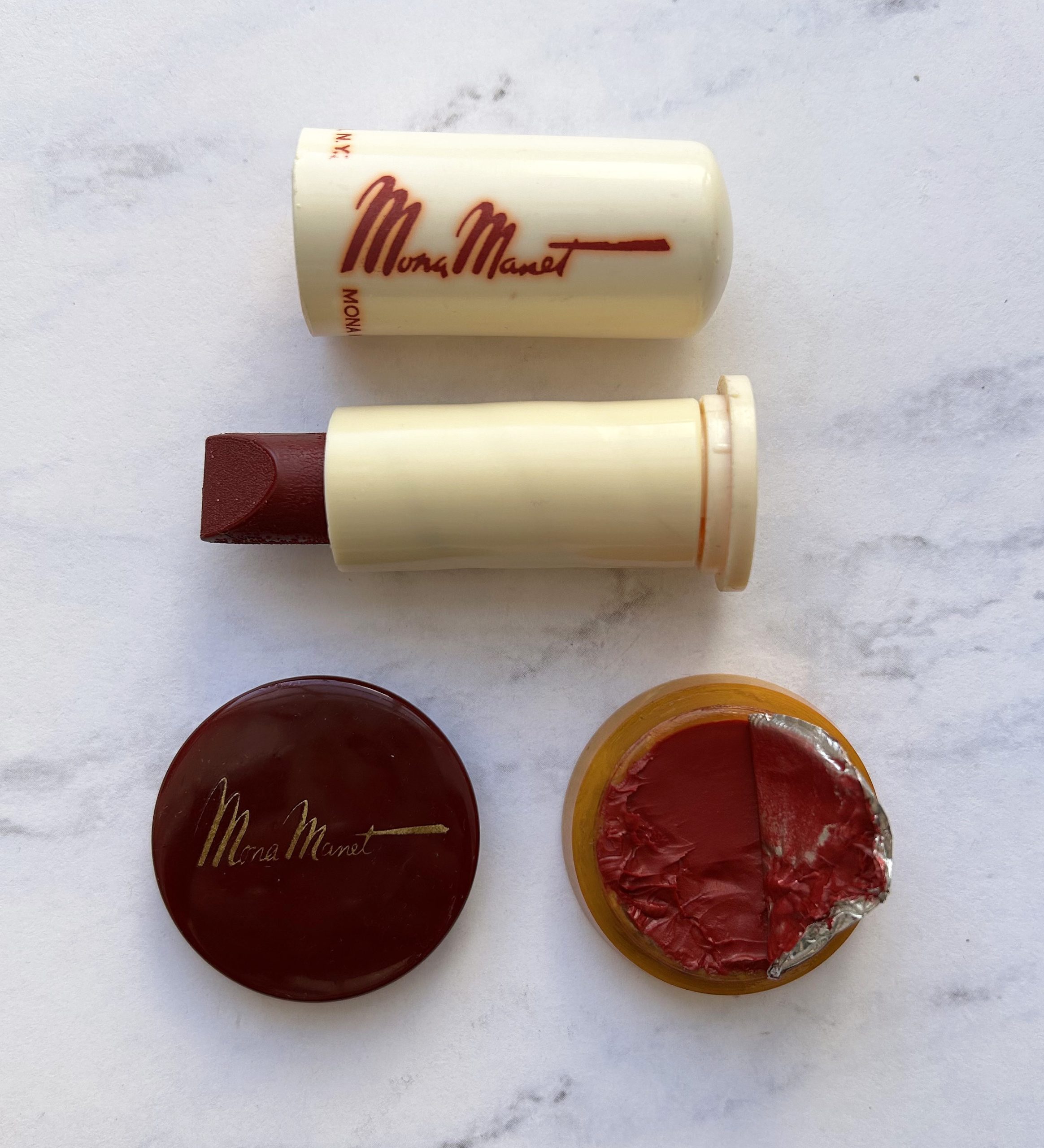
My fellow Gen X'ers might recall a brand called Sweet Georgia Brown from the mid-late '90s that used the same graphics as the original line owned by Valmor. But instead of catering to Black clientele, this iteration of Sweet Georgia Brown was geared towards the tween/teen set and featured lots of glitter and scented products.

Seventeen magazine, June 2000

So how did this happen? Well, according to the Made in Chicago Museum article, Valmor was sold to Richard Solomon, owner of RH Cosmetics, in 1985. Though most of Valmor's archives and products were thrown out (the horror! Solomon was only interested in the hair pomade), Richard's wife Myra apparently took notice of the Sweet Georgia Brown packaging, for she is credited with "revamping" Sweet Georgia Brown as a youth-focused brand.2 RH Cosmetics was sold to AM Cosmetics in December of 1996 and the sale included the Sweet Georgia Brown line.3 AM Cosmetics continued to produce it until 2003 or so.

Seventeen magazine, September 1996

Sadly, in all of the marketing, there was no mention of the history of the brand and zero effort to make it diverse. Not only did the fact that Sweet Georgia Brown was originally intended for Black customers go unmentioned, Dawson's role was completely unacknowledged once again. It's very probable that neither RH Cosmetics nor AM had any idea that Dawson was responsible for the graphics, and obviously diversity wasn't a priority for most cosmetic brands in the '90s, but both companies should have at least known Sweet Georgia Brown was meant for Black customers. All of this is to say that my recommendation is for a Black entrepreneur to take over the rights to the hair pomade (which is still available in some retail outlets, although it's not clear who owns it) and re-introduce Sweet Georgia Brown as a fully inclusive beauty line that ensures the public knows its origins, with Dawson's name printed on the packaging for every product. A brand new Sweet Georgia Brown website would have all of the company's history and extensive information on Dawson and his successor Jay Jackson.

What are your thoughts on these artists and the brands I've matched them with? Would they make good collabs or no?


1A year ago Simpson produced a series of collages featuring Rihanna for Essence magazine so it would seem that Fenty might be a better company match, but after exploring Simpson's work and other beauty lines, I thought a minimal hair care line made more sense for a collaboration.

2Women's Wear Daily, April 22, 2005.

3Myra Solomon sometimes used the name of her first husband, Smolev. Richard, Myra and her daughter Sydra were subsequently sued by AM for allegedly stealing trade secrets. Shortly thereafter Myra and Sydra began a new company called Just Having Fun Cosmetics, which mimicked AM's portfolio of teen/tween focused brands.

© 2008-2024 Makeup Museum | All Rights Reserved | Privacy Policy | Design by Pixel