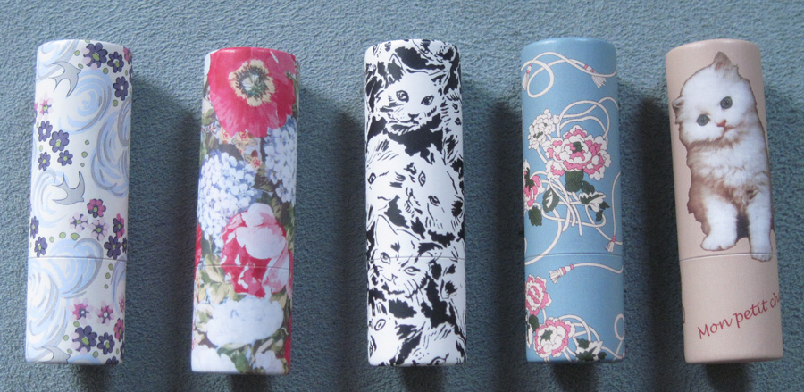
The second part of Paul & Joe's fall 2012 collection was the release of new paper lipstick cases. They're sold empty so you can put your favorite Paul & Joe lipstick into your favorite case. Pretty nifty idea! I just got them empty since I'm only interested in the packaging and won't actually be using them as lipsticks.
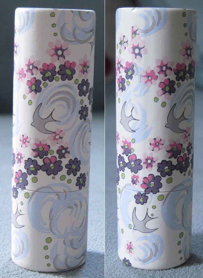
The first case features a melange of grey doves, pink and purple flowers and blue and grey swirls on a white background.
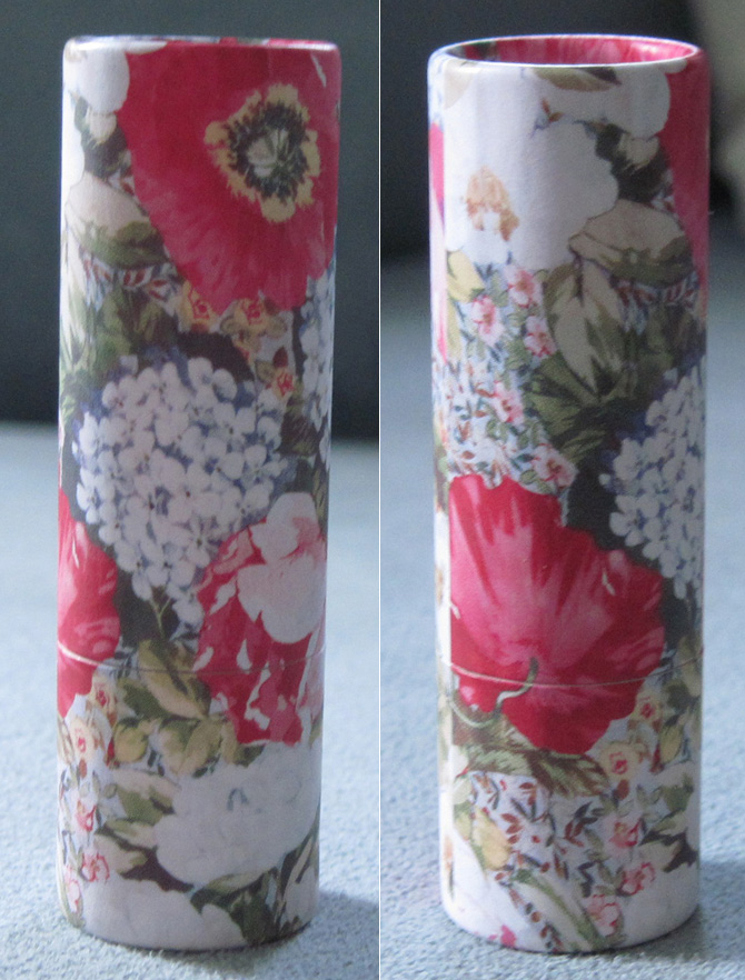
The next one has a showy floral pattern in white, green and bright fuchsia.
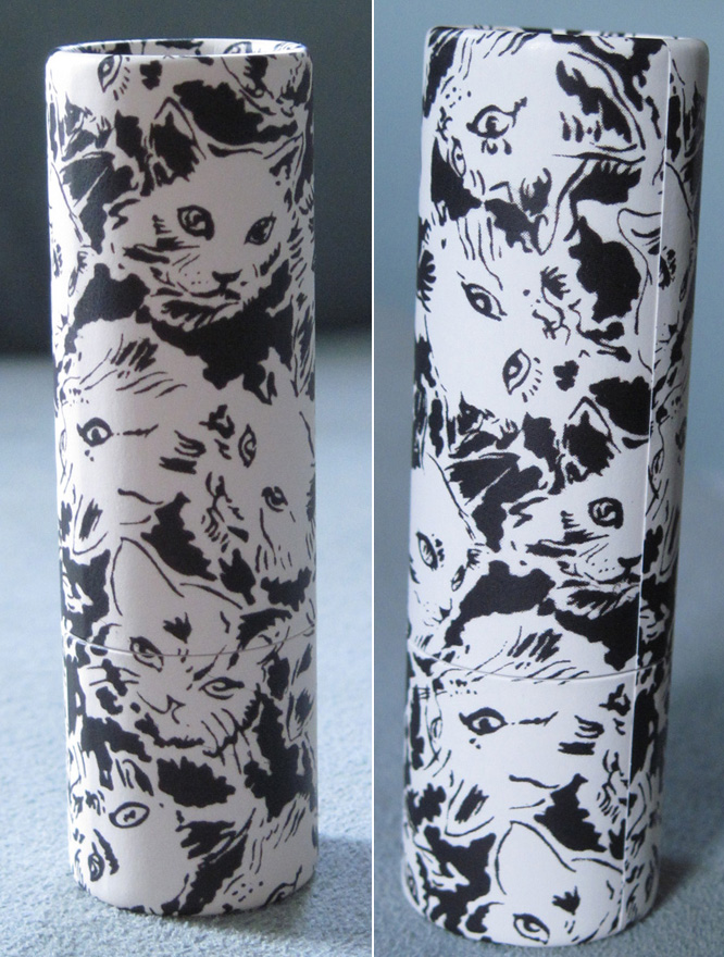
You know Sophie couldn't resist having at least one of these cases be cats, right?
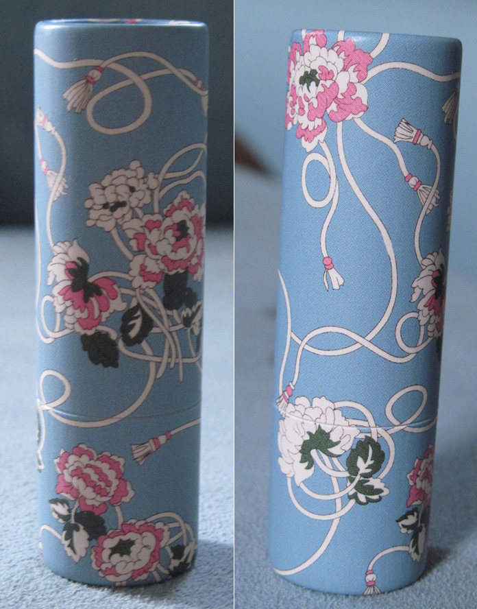
I love this one – pink and ivory flowers with tassel tendrils against a baby blue background.
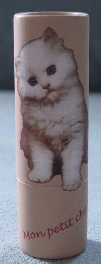
Finally, another cat. Well, a precious-looking kitten.
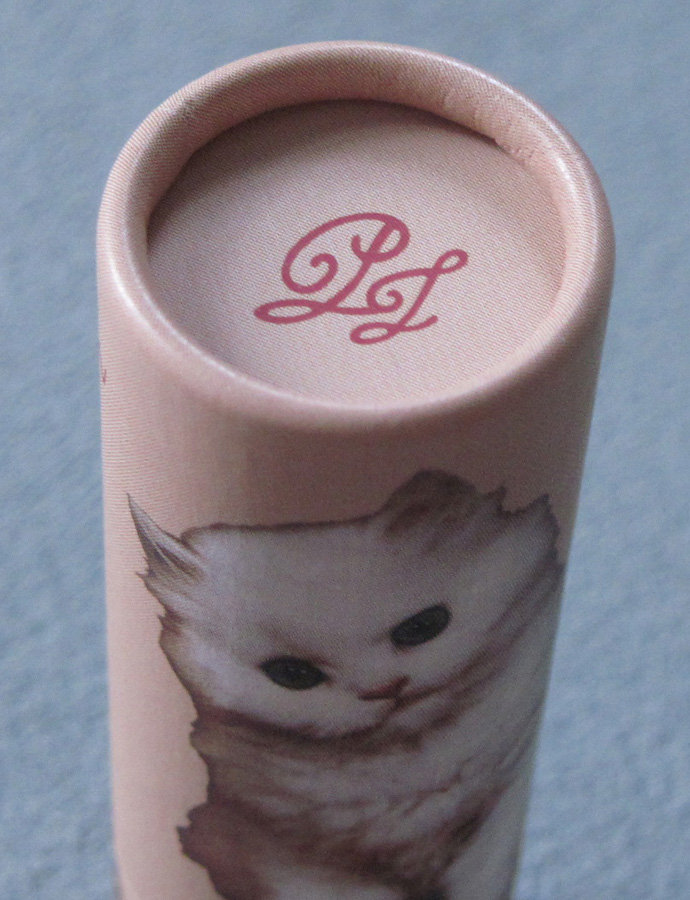
The initials that appeared on the brushes with the Collection Sparkles items are also here on the lipstick cap:
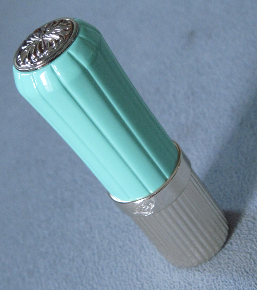
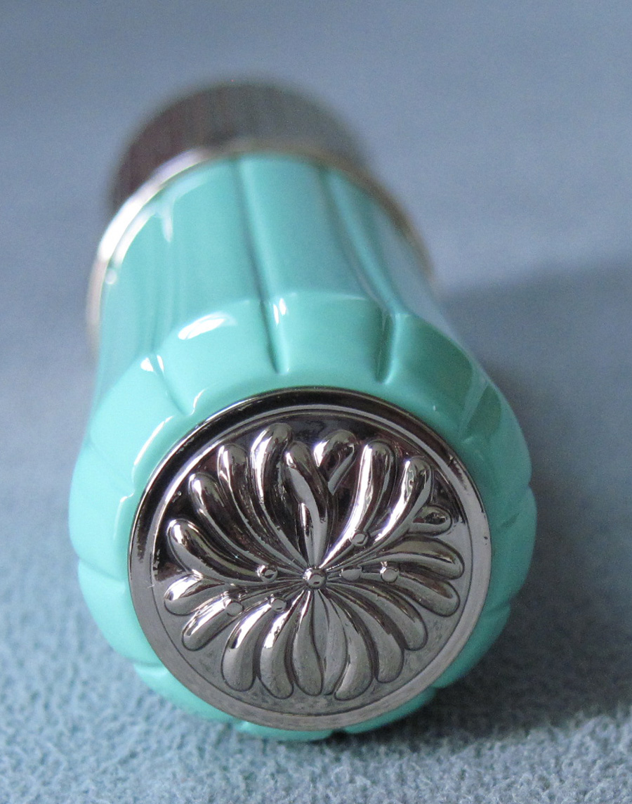
While I think the paper cases are a great idea, some people want a case that's a bit sturdier. So Paul & Joe created this retro-looking refillable metal case. I have no idea how they got that shade, but it's an absolutely dead-on '50s mint green. Plus the ridges seem more authentic than the lipstick cases from Estée Lauder's paltry Mad Men collection.
I also love how they worked the iconic Paul & Joe chrysanthemum into the cap:
But the 10-year anniversary celebration isn't over yet! There was also this pretty set, consisting of a pouch, pressed powder, blush, blotting sheets and eye shadows. I didn't purchase it given the designs were the same on all the products and I didn't want all of them.
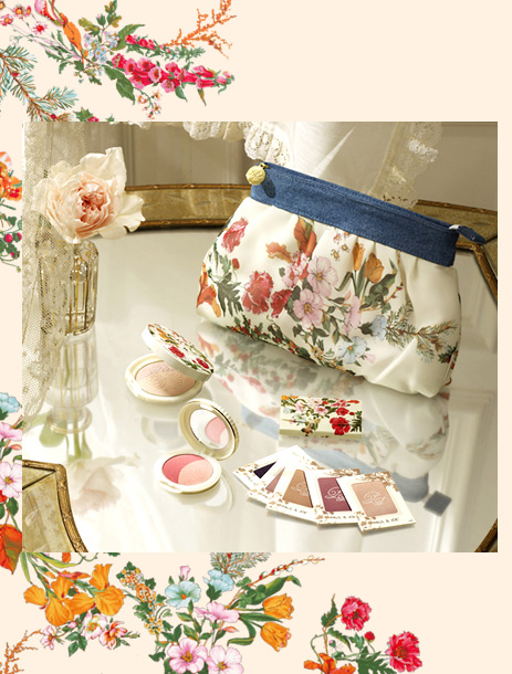
(image from paul-joe-beaute.com)
So that concludes all the goodies from Paul & Joe fall. Did you like the Collection Sparkles or the lipstick cases more? And which has your favorite design out of all?


