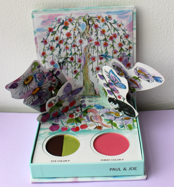
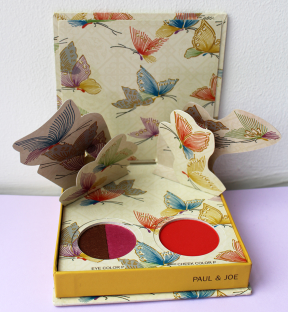
Paul & Joe's spring 2016 collection is sheer prettiness. This year the company borrowed a page from children's books and created two adorable pop-up palettes. We've seen these before with Urban Decay and Too-Faced, but Paul & Joe did a great job as well, especially since one of the lipstick cases is tangentially related to children's books (more on that later.)
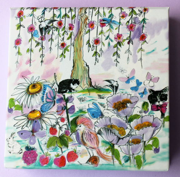
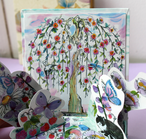
It doesn't get any springier than this palette – dragonflies, butterflies, flowery vines, fruit, bunnies, and even snails are all portrayed in one extraordinarily idyllic scene. And of course, cats!
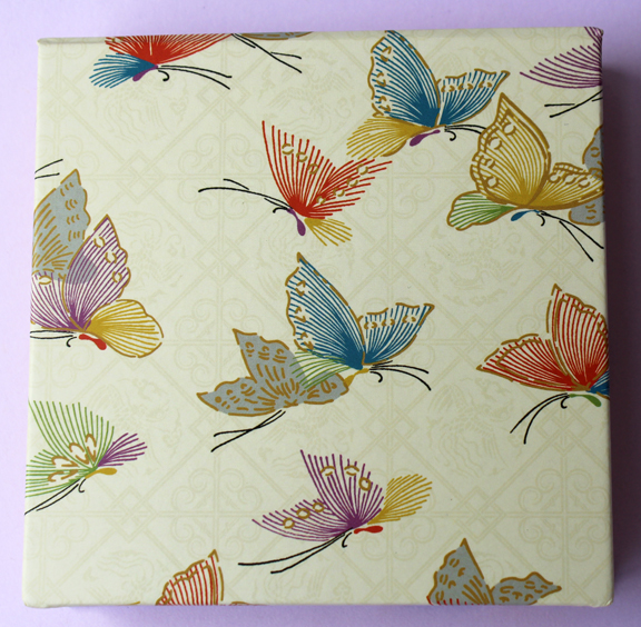
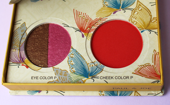
I didn't like the design on this palette as much, but it's still pretty. That weird tiled-looking background doesn't seem to go with the butterflies.
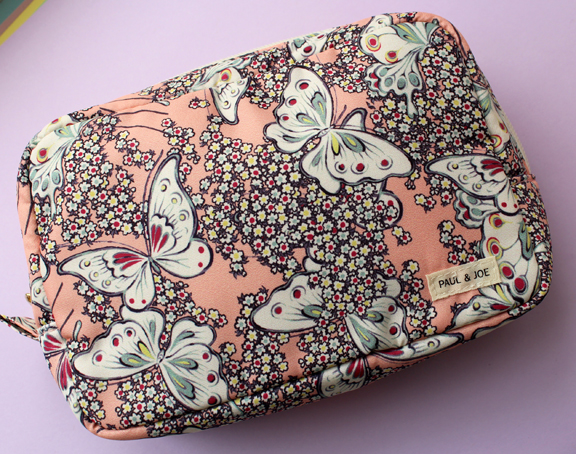
We all know how much I love free swag.
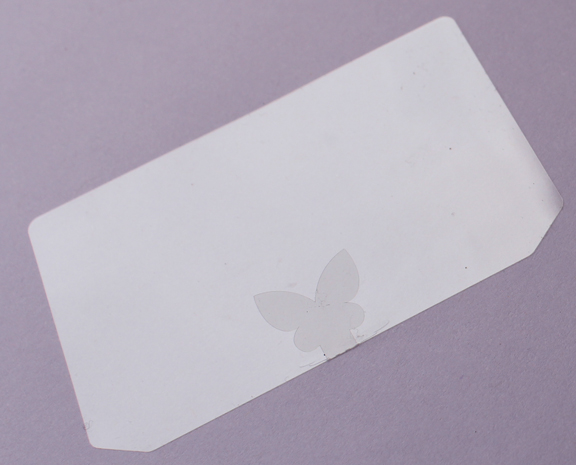
And I always appreciate their attention to detail. Even the plastic cover for the eye shadow and blush has a butterfly!
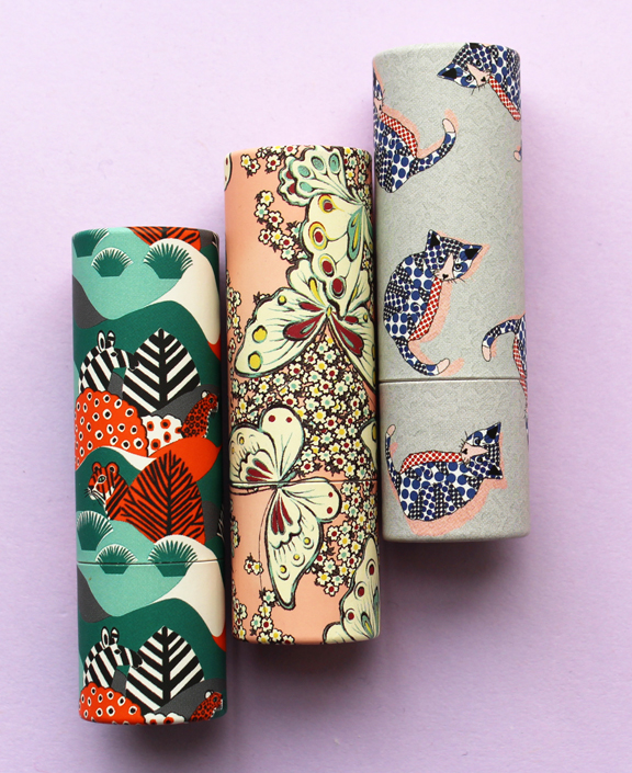
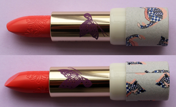
The palettes are cute and I commend Paul & Joe for doing something a little different, but the lipstick cases are what most intrigued me.
I couldn't resist picking up a refill since it has a butterfly on it.
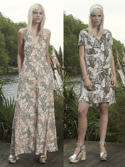
The butterfly print was borrowed from the line's 2016 resort collection and also appeared in several pieces of Paul & Joe's collaboration with lingerie brand Cosabella.
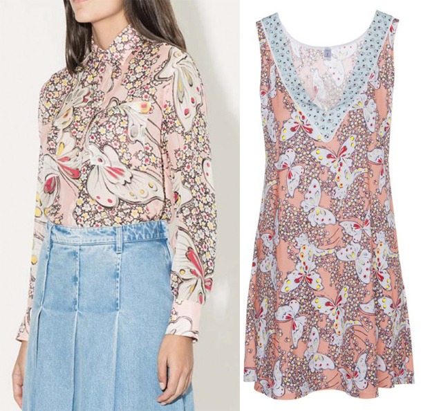 (images from vogue.com and paulandjoe.com)
The cat print is from the Paul & Joe Sister spring 2016 collection.
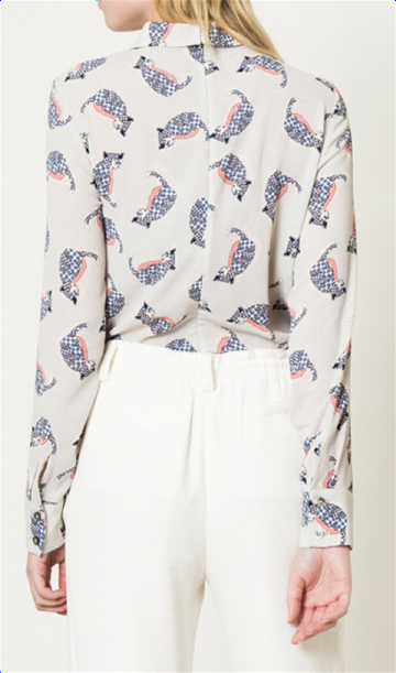
(image from paulandjoe.com)
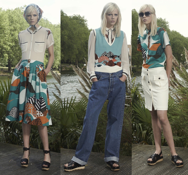
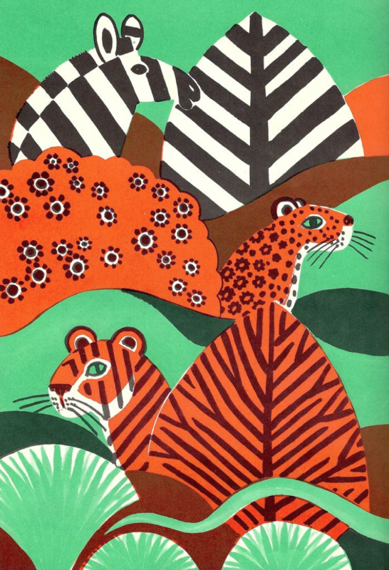
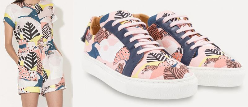
But my favorite was the jungle print, which appeared on many pieces in the resort 2016 collection.
How cute is this romper?!
 (images from vogue.com and paulandjoe.com)
I grew even more enamored after reading that it's an original print by illustrator Dahlov Ipcar. I had never heard of her but she does a lot of children's books and just really beautiful illustrations in general. She's still working at 98 (a fellow Scorpio, cool) and is actually on Facebook! Meanwhile, I can't even get my dad to learn how to email and he's significantly younger…anyway, I do find it strange that I wasn't familiar with her work, given my love of reading as a kid and my love of design as an adult, but I'm sure glad I found it now.
The print borrowed by Paul & Joe is from a 1981 book called Lost and Found: A Hidden Animal Book.
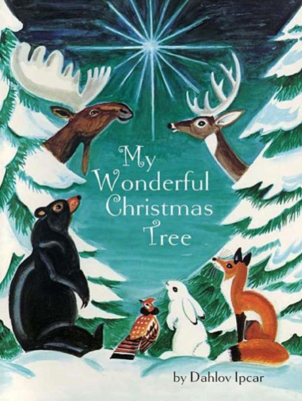
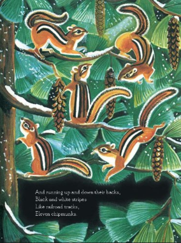
I don't want to make this post all about Ipcar because it would take forever, but I do feel the need to share just a few more pieces. I clearly need this book to put under the Christmas tree since we have kind of a woodland theme going.
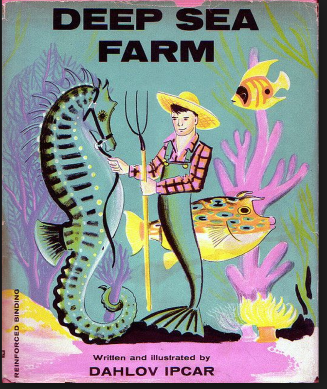
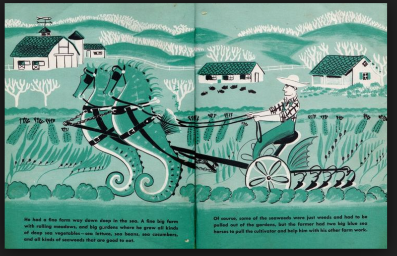
But I saved my favorite for last. Mer-farmer!! That's right, Ipcar illustrated a 1961 book called Deep Sea Farm featuring a very hard-working undersea farmer. Needless to say, this book (along with the Christmas tree one) is on its way to me.
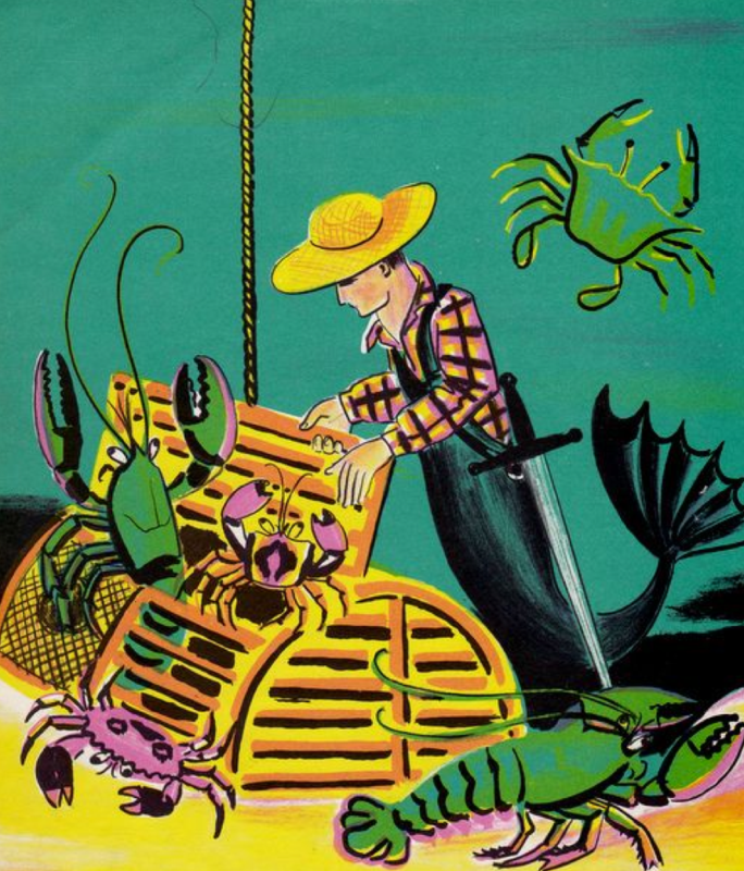 (images from pinterest.com)
If you ask me, Ipcar deserves a whole museum retrospective (and a makeup collection!) in addition to a fashion tie-in. Even though she's had a couple exhibitions, I would love to see an incredibly comprehensive show overflowing with her whimsical illustrations…and I think I might keel over from awesomeness if a makeup company ever put her work on their packaging. Paul & Joe's lipstick case with Ipcar's print was amazing, but I'm envisioning a much more extensive collection. If that merman farmer ever showed up on a palette my head might explode. 😉
Getting back to Paul & Joe, I think they did a nice job with their spring collection. Yes I still miss the little stories behind each one, but I do enjoy pop-up palettes and thought they tied in well with the fact that the company borrowed a print from a children's book illustrator. As always, Paul & Joe excels at walking the fine line between playful and juvenile.
What do you think?


