Today's post highlights two recent collections that once again show the enormous range in makeup packaging design. As I did last time, I'll start with the cute.
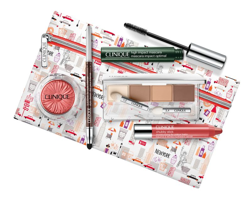
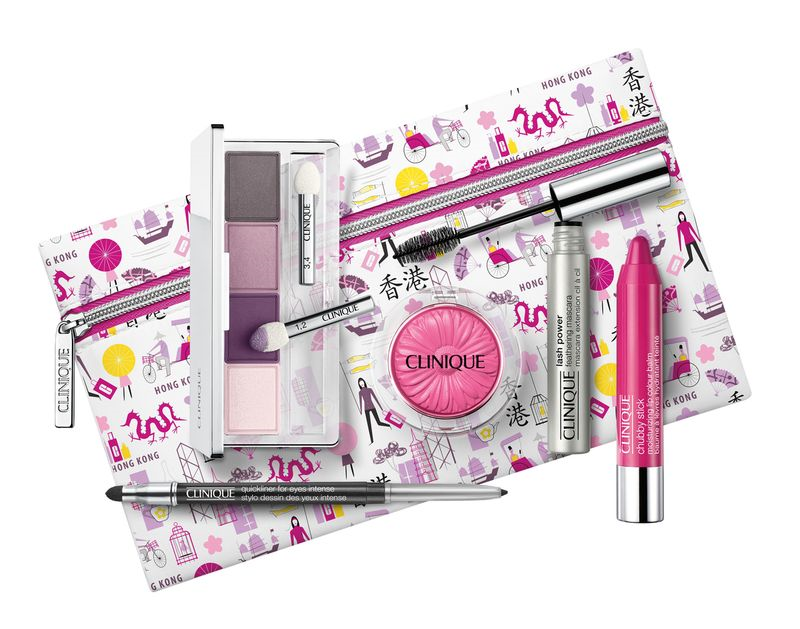
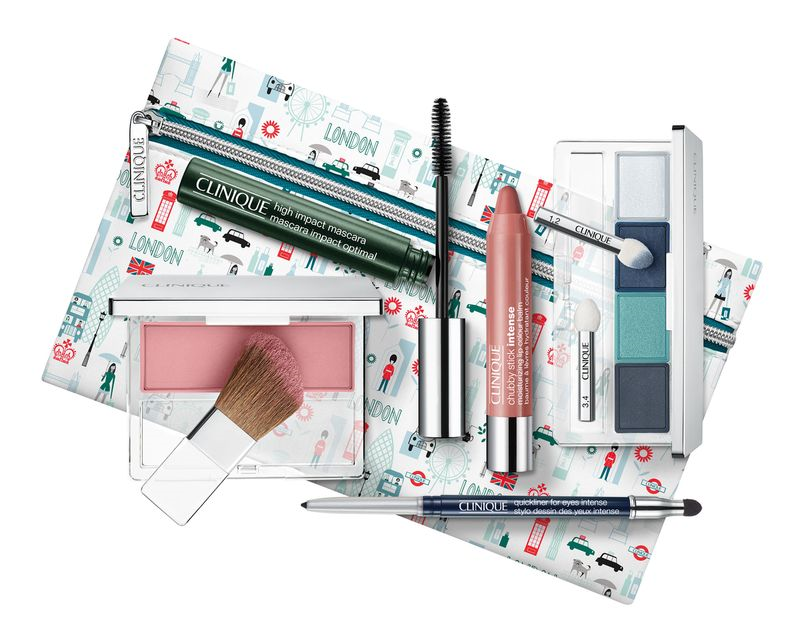
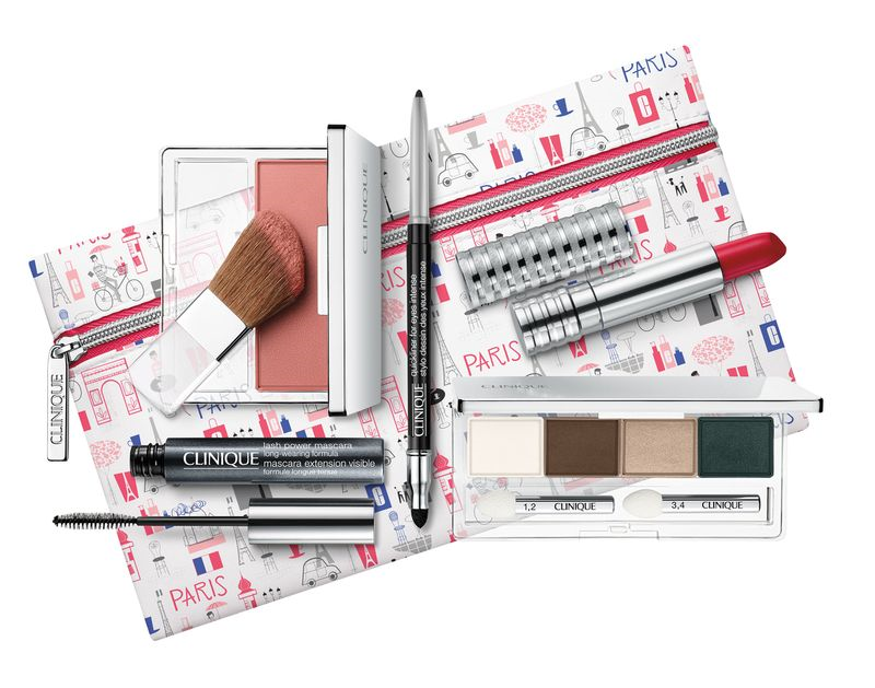
Both Adrienne at The Sunday Girl and Karen at Makeup and Beauty Blog reviewed these Clinique travel bags that are currently being sold exclusively at duty-free stores, so that means I will not be getting my greedy little paws on them (which sucks as I really need two of them for the fall exhibition.) Each bag is not only adorably illustrated with motifs of a given city – New York, Paris, Hong Kong, and London – but are also filled with the best-selling products from each city. That's a pretty genius concept and one that also yields a truly useful makeup set. I so rarely buy sets or even palettes because I know I won't use everything in them, but when a company offers its top-selling products in a variety of colorways in amazingly cute packaging, it's a home run. I'd use every product in these bags (well, maybe not the Chubby Sticks as I have…issues with their name) and of course the bags are purchase-worthy on their own given the illustrations.
 (images from dutyfreehunter.com)
I doubt Clinique hired an outside artist to create the illustrations, but whoever made them did a fantastic job. I could also see these working on stationery – wouldn't they make great wrapping paper?
Now on to some creepy (to me, anyway) packaging. Chic Profile posted this Estée Lauder gift with purchase for edgy store Opening Ceremony. You know I love quirky, weird fashion and makeup and I actually enjoy browsing Opening Ceremony on occasion, but this was decidedly off-putting to me. Not to mention the fact that you'd have to spend $500 to get the gift. Then again, given Opening Ceremony's inventory that wouldn't be difficult to do.
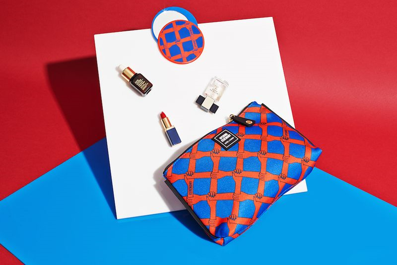 (image from openingceremony.us)
Something about those disembodied hands grasping each other into infinity just creeps me out. Sort of reminds me of a more fashion-forward version of a horror movie where zombie hands rise up from graves grabbing at the living. A rather ugly shade of orange is used for the flesh of the arms, making them look burned, while the nails are blue, further heightening the dead hand effect. I love blue nail polish but here I think it looks corpse-like given the overall design. I mean I realize the blue is the same shade as the background, but they should have chosen a different color scheme. I still don't like the pattern in black and white, but it's not as bad. It's also worth pointing out that the disembodied hand is par for the course for Opening Ceremony, so it's not completely out of left field. It was even the star motif for their fall 2014 collection, inspired by Belgian folklore. I guess I just don't like it in any context. I especially don't like it in these colors, and I don't think it's a suitable print for a makeup tie-in.
Thoughts on these pieces from Clinique and Estée? Are they as disparate as they seem to me?


