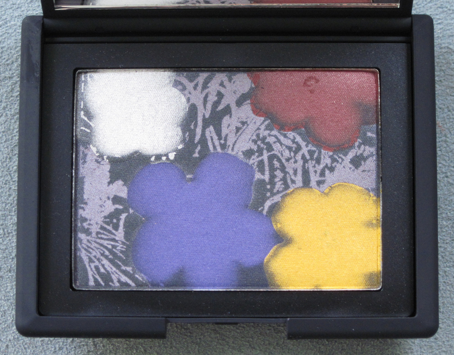
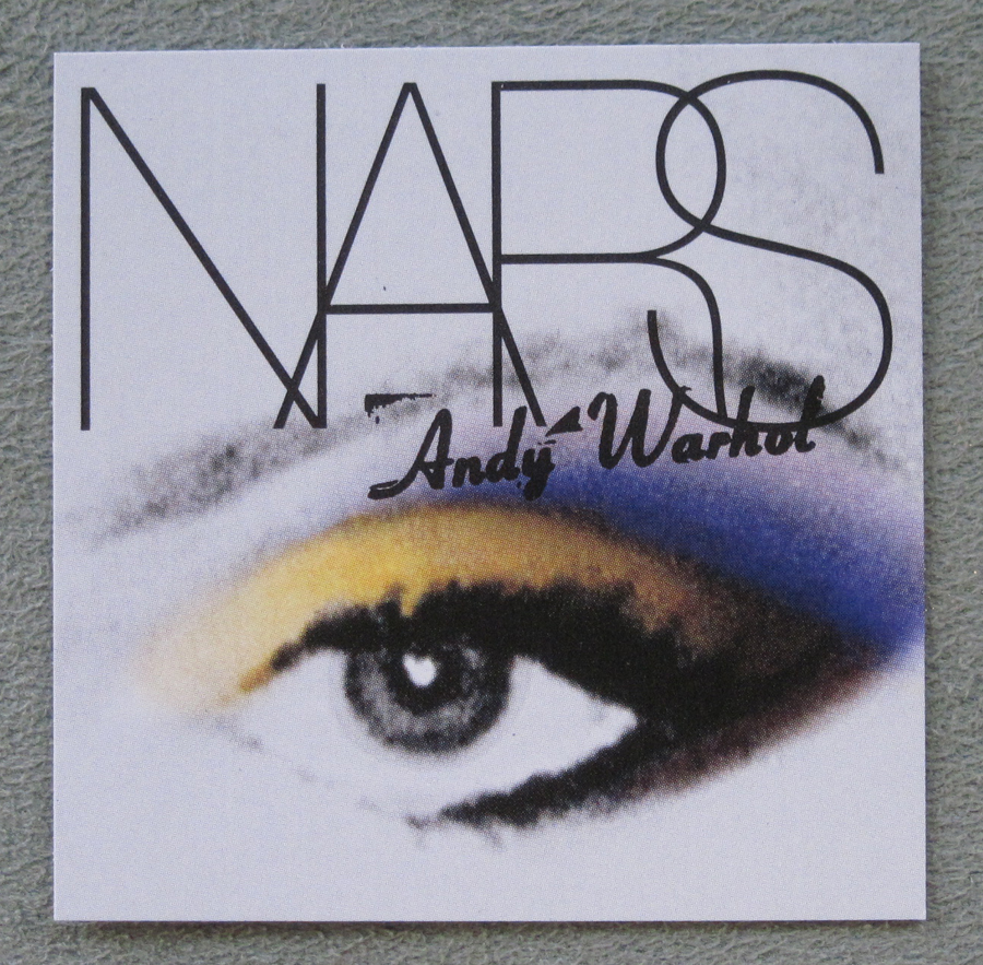
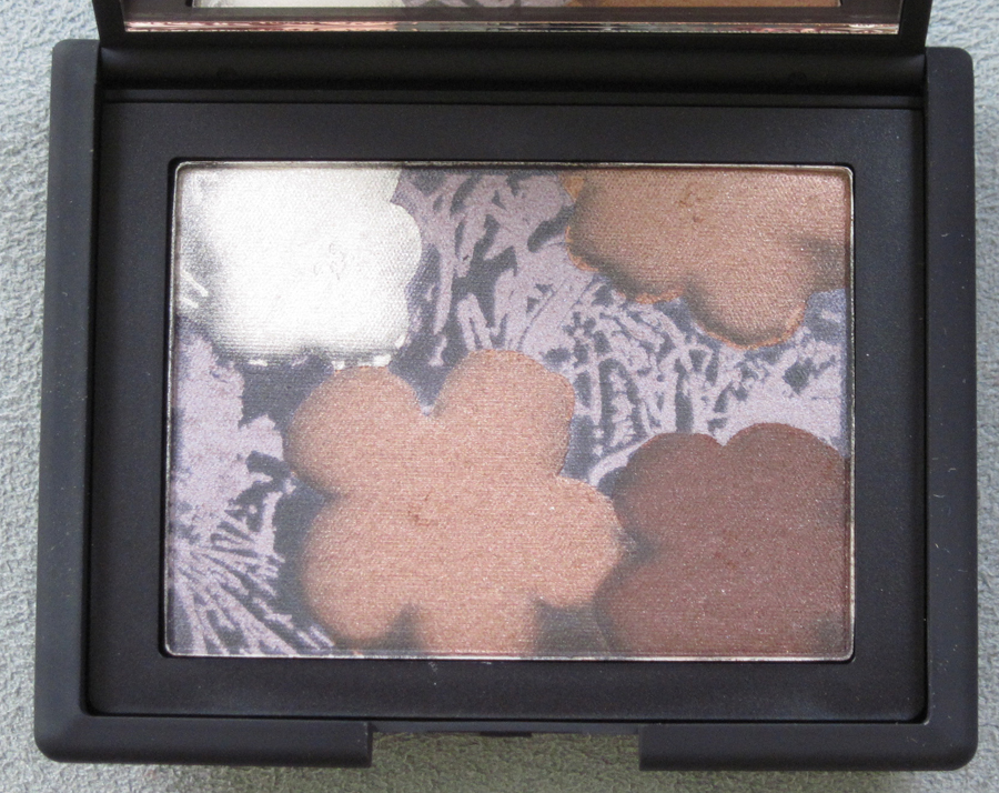
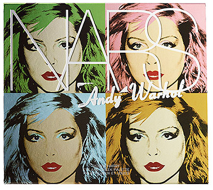
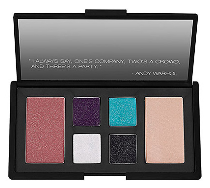
Whispers of a collaboration between cutting-edge brand NARS and pop art pioneer Andy Warhol started circulating in March, and now it’s finally here. I can honestly say this is my all-time favorite collection for the Makeup Museum thus far. It perfectly embodies why I started the Museum in the first place – to showcase the connections between makeup design and art – and to date, this is the ultimate marriage of the two.
Warhol, like Marilyn Monroe, is getting a great deal of attention in 2012 – the 25th anniversary of his death. Campbell’s issued limited-edition Warhol print-adorned tomato soup cans, there was a tribute at a New York gallery and of course, let’s not forget the huge exhibition focusing on Warhol’s influence on contemporary art at the Met.
M. Nars has always been a fan of Warhol’s, given that the names of some of the items in his line (Edie eye shadow, Chelsea Girls lip gloss) were an homage to the artist. In an interview for New York Magazine, he says, “Over the years, I had so many
connections with Andy. When I was creating colors, I was inspired by his
movies and paintings, the Factory superstars, and his whole world, so
it felt like he was the right person to start with. ..he loved makeup. He was always experimenting with it. If you look at his silkscreens and old issues of Interview magazine,
everything was painted in a way that almost looked like slashes of
makeup. So we probably would have connected pretty well, I think.”
The Warhol Foundation was equally happy to collaborate with NARS. According to an AP article, “Michael
Hermann, licensing director for the Warhol foundation, said it decided
to venture into cosmetics with Nars because of the latter’s ‘fearless,
cutting-edge approach.’ ‘For Warhol, makeup was an arrow in the
quiver one could use to embody his democratic approach to beauty best
embodied in his own words when he said, ‘If everybody’s not a beauty,
then nobody is,’ Hermann explained.”
This post will examine the Pop collection, which is the first part of the collaboration to be released. A second collection called the Silver Factory collection will be released on November 1.
Warhol’s prolific output is way beyond the scope of my little blog. I will, however, highlight several of the works that are used in the NARS Pop collection. First up: the flower eye shadow palettes.
From the press release: “Andy said: ‘Pop art is about liking things.’ Like flowers. Soap. Money. Celebrities.
Warhol loved silk screens because if you get the picture right, you can make
more just the same. But in a range of colors – something different every time.
Andy said, ‘I use mostly artificial color.’ If you’re not trying to be real you don’t
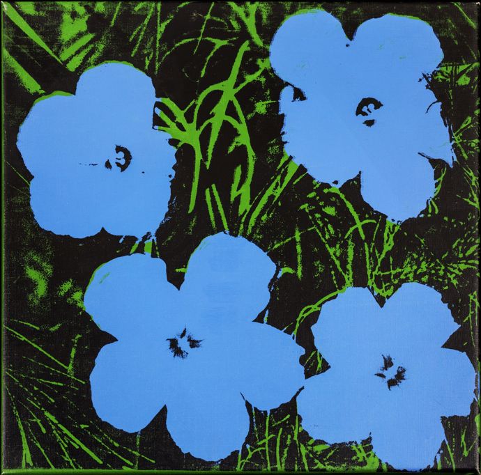
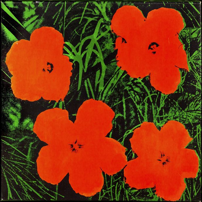
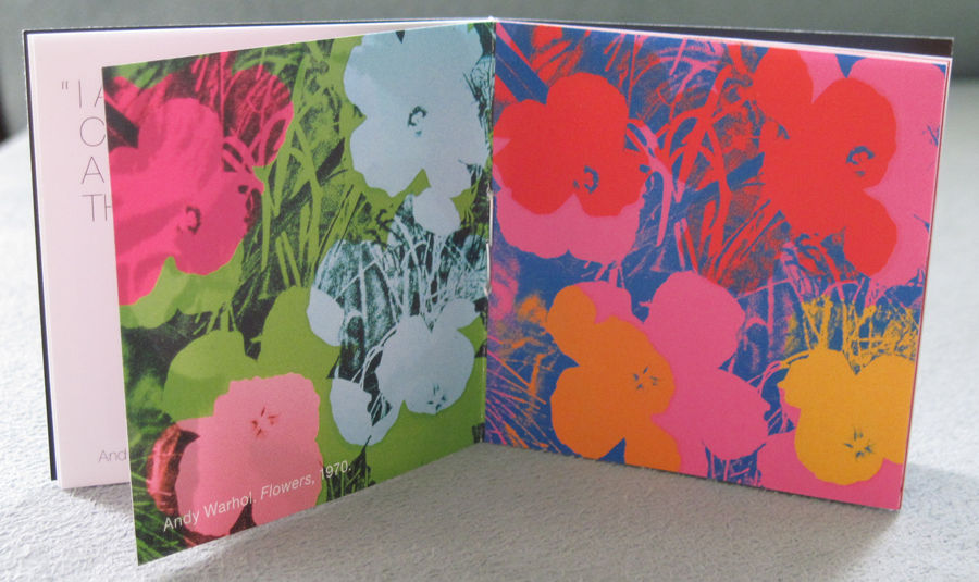
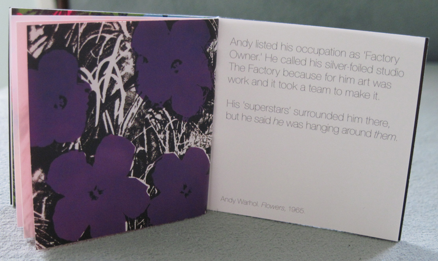
have to get it right. That’s art.” The press release notes that the palettes are variations on Warhol’s Flowers from 1965, and Warhol had started the Flowers series a year before that. Here are the some of the prints from 1964.
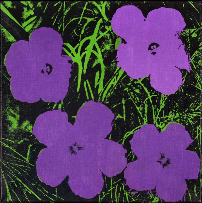
(images from voltcafe.com)
And here’s another from 1965.
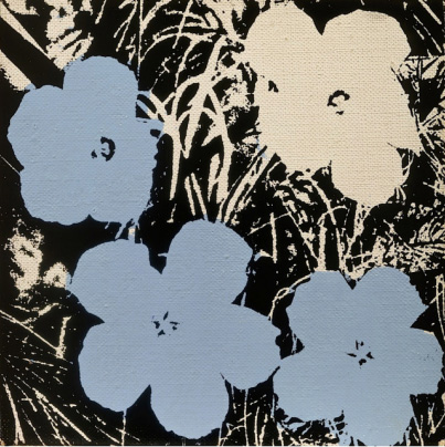
(image from art.com)
Henry
Geldzahler, then assistant curator at the Met, suggested Warhol take a break from his Death & Disaster
series. “Geldzahler gestured to a photo of flowers in Modern
Photography magazine, which Warhold in his deadpan style seized as his
subject.” (The photographer of the flowers, Patricia Caulfield, brought a lawsuit against Warhol for using her photograph without her permission. He offered two sets of Flowers portfolios as payment. She declined and the two arranged a cash settlement. If Caulfield is still alive, I bet she’s kicking herself now seeing as how the original Flowers silkscreens are worth millions.) The series was created for an exhibition at the Leo Castelli Gallery in New York. To reach maximum graphic impact, Warhol cropped the original image to fit a square format and rotated one of the flowers (you can see the slight distortion in the grass pattern). There was no “correct” position for the images and they could be hung in any order.
There are two main themes within Flowers. One is how the manipulation of the original image both turns the traditional art historical floral/still life genre on its head and simultaneously provides a commentary on commercialized mass production. “Just as he did with Marilyn, here Warhol reduces the subject
to its image — flattening, artificially coloring, and dismembering it.
In so doing, he rids the flowers of their assumed vitality and
prettiness…This work updates the
age-old genre of still life; Warhol’s choice of a vibrant palette is
consciously synthetic and an outright rejection of the complex color
harmonies normally associated with the genre. In place of painterly
illusion, Warhol’s choice of unnatural color emphasizes the flowers’
manufactured plasticity and relevance. His version is consciously banal,
yet unexpected and enchantingly beautiful. Quintessentially sixties in
their colors and floppy petal shapes, Flowers is a wonderful example of
the counterintuitive elegance of Warhol’s work. Technologically
mediated, repetitive and depersonalized, characterized by the modes of
mass production, the formal aspects of this work force viewers to
question the disconnect between image and reality, culture and nature.” (source) The Yale Art Gallery describes Flowers: “The mass reproduction of the image through the silkscreen process
reinforced the banality of the subject matter, perhaps even more bland
than his commercial imagery such as Coca-Cola bottles and soup cans of
the same period. Such repetition created the effect of wallpaper or
decoration, a form of ‘low’ art that stood in contrast to the elevated
poetic vision and emotive gestural abstraction of Abstract Expressionist
painting during the 1950s. Through distortion and flattening, and their
placement on black background with magnified, abstracted blades of
grass, Warhol’s flowers are completely removed from nature.”
The second idea Flowers hints at is death, even though Warhol was actively trying to shift away from the darker themes of his earlier series. Several accounts indicate that the 1964 works express a more threatening tone than the seemingly cheerful hibiscus blooms would initially suggest. Ronnie Cutrone, Warhol’s assistant for ten years, had this to say about the series: “The Marilyn paintings are about life and death, the Flowers are with their black, menacing background…I’m talking about
the first Flowers from 1964 – they are a bit menacing. We kids
– Andy used to call everyone a ‘kid’ until they were eighty-five years old
– all knew about that. Lou Reed, Silver George Milloway, Ondine, and me
– we all knew the dark side of those Flowers. Don’t forget, at
that time, there was flower power and flower children. We were the roots,
the dark roots of that whole movement. None of us were hippies or flower
children. Instead, we used to goof on it. We were into black leather and
vinyl and whips and S&M and shooting up and speed. There was nothing
flower power about that. So when Warhol and that whole scene made Flowers,
it reflected the urban, dark, death side of that whole movement. And as
decorative art, it’s pretty dense. There is a lot of depth in there… You
have this shadowy dark grass, which is not pretty, and then you have these
big, wonderful, brightly colored flowers. It was always that juxtaposition
that appears in his art again and again that I particularly love.” Indeed, one critic remarked, “It is the flash of beauty that suddenly metaphors that becomes tragic
under the viewers gaze. The garish and brilliantly coloured flowers
always gravitate towards the surrounding blackness and finally end up in
a sea of morbidity. No matter how much one wishes these flowers to
remain they perish under one’s gaze as if haunted by death.” This sense of dread is heightened by the fact that the last room in the original Castelli exhibit included one of Warhol’s portraits of Jacqueline Kennedy, which was based on a photo taken shortly
after her husband’s assassination. Allegedly “this led some observers to associate
the flower-covered gallery with a funeral parlor.” (source)
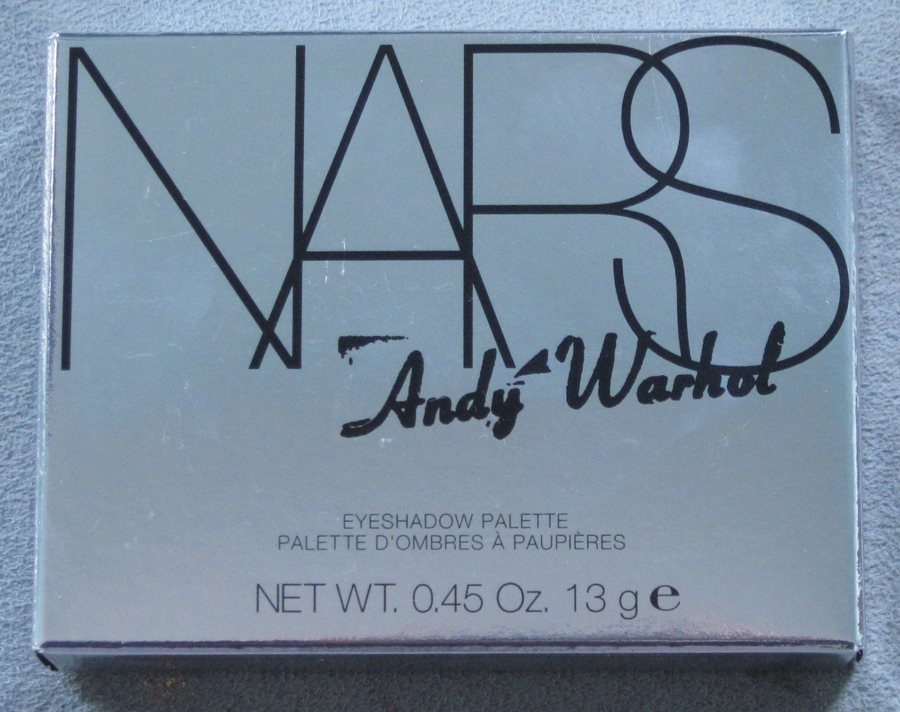
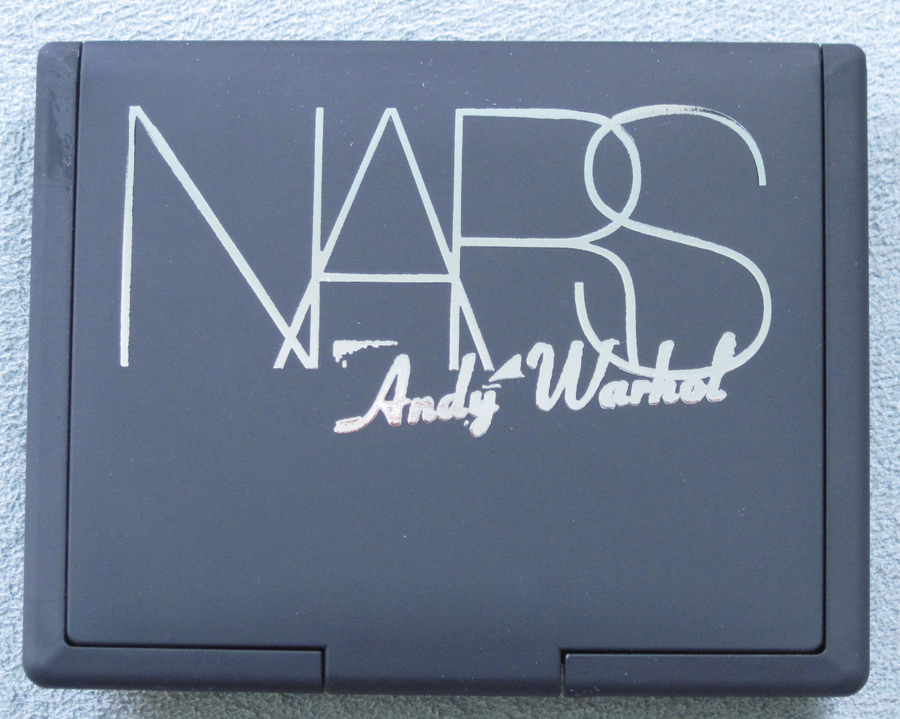
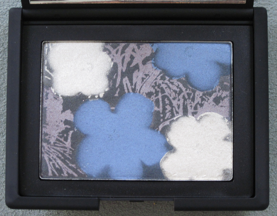
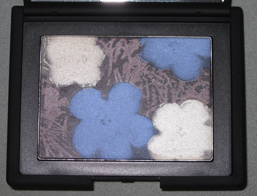
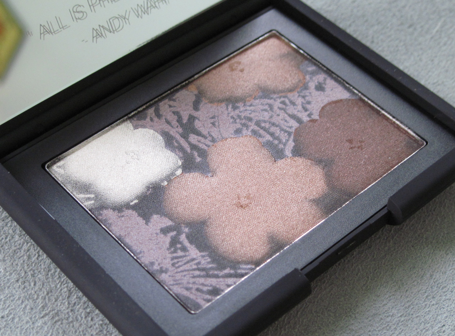
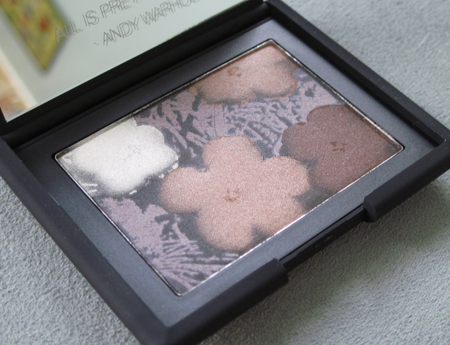
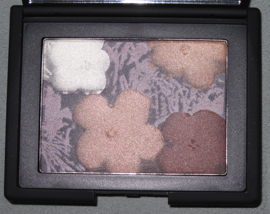
Now let’s take a look at the palettes, finally! The outer boxes are shiny silver, and the plain black rubber compact gets a silvery update too.
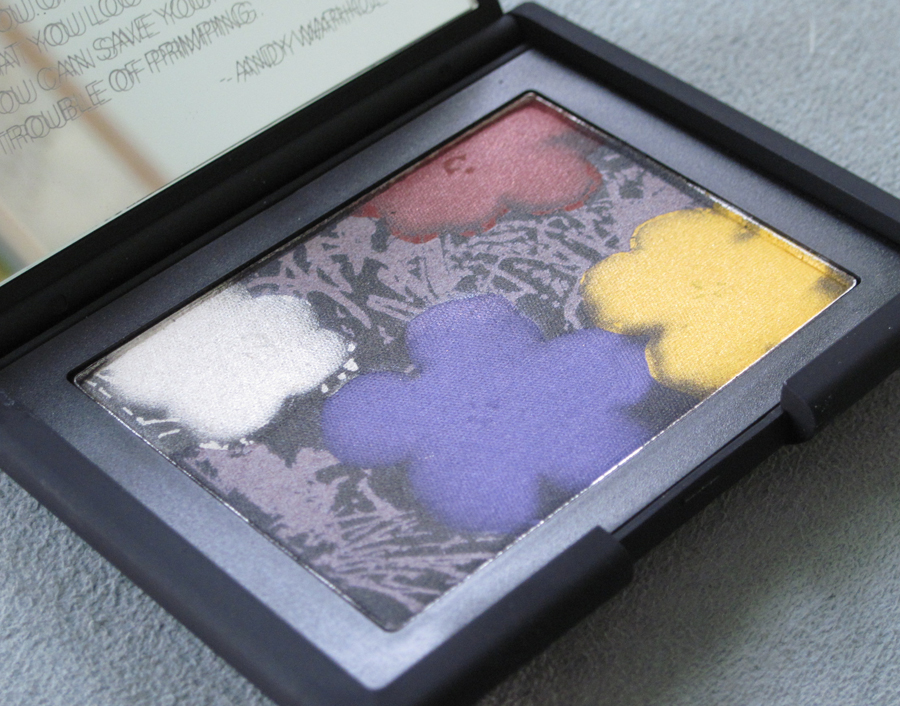
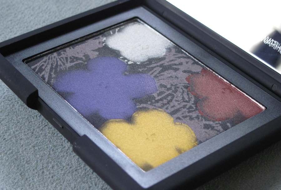
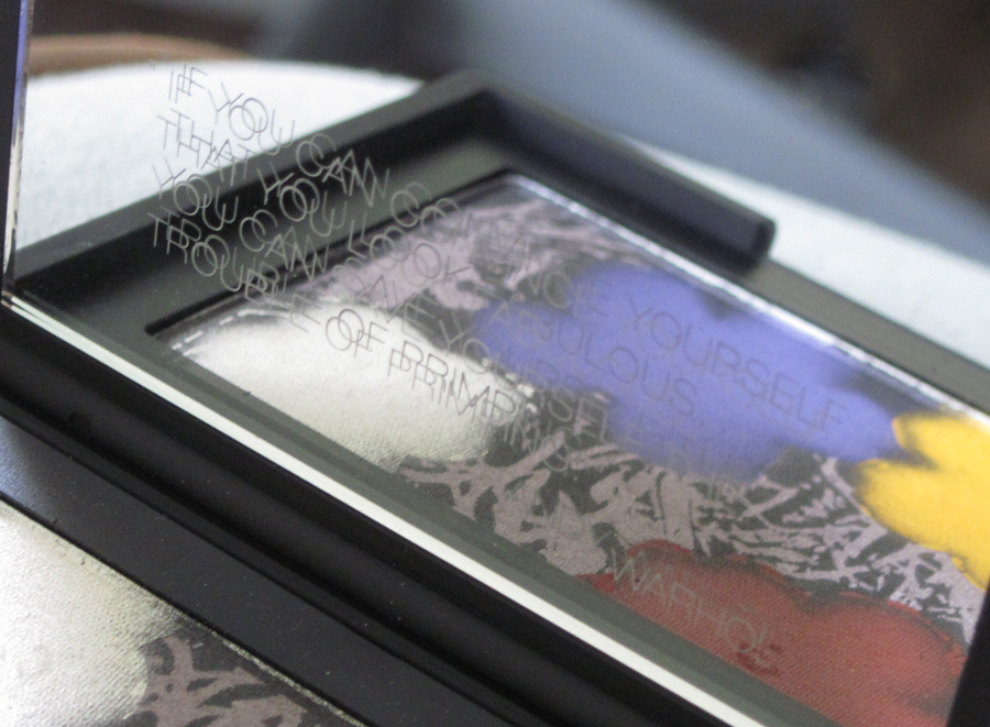
Flower palette No. 1:
The Warhol quote on the mirror: “If you can convince yourself that you look fabulous, you can save yourself the trouble of primping.”
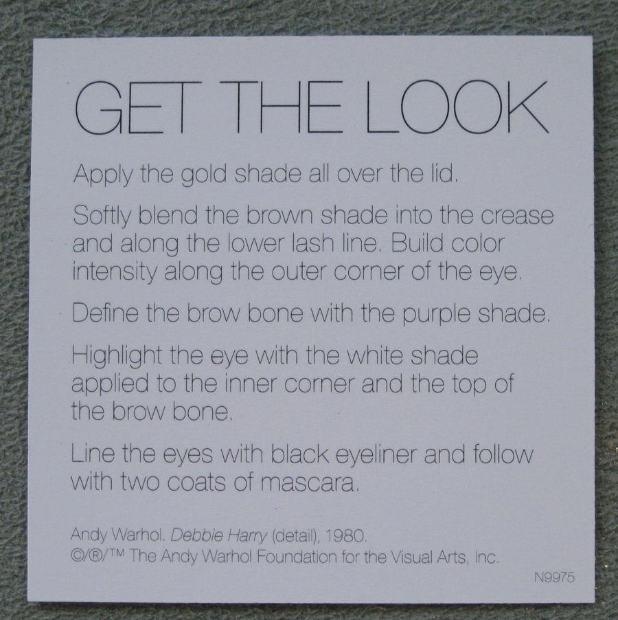
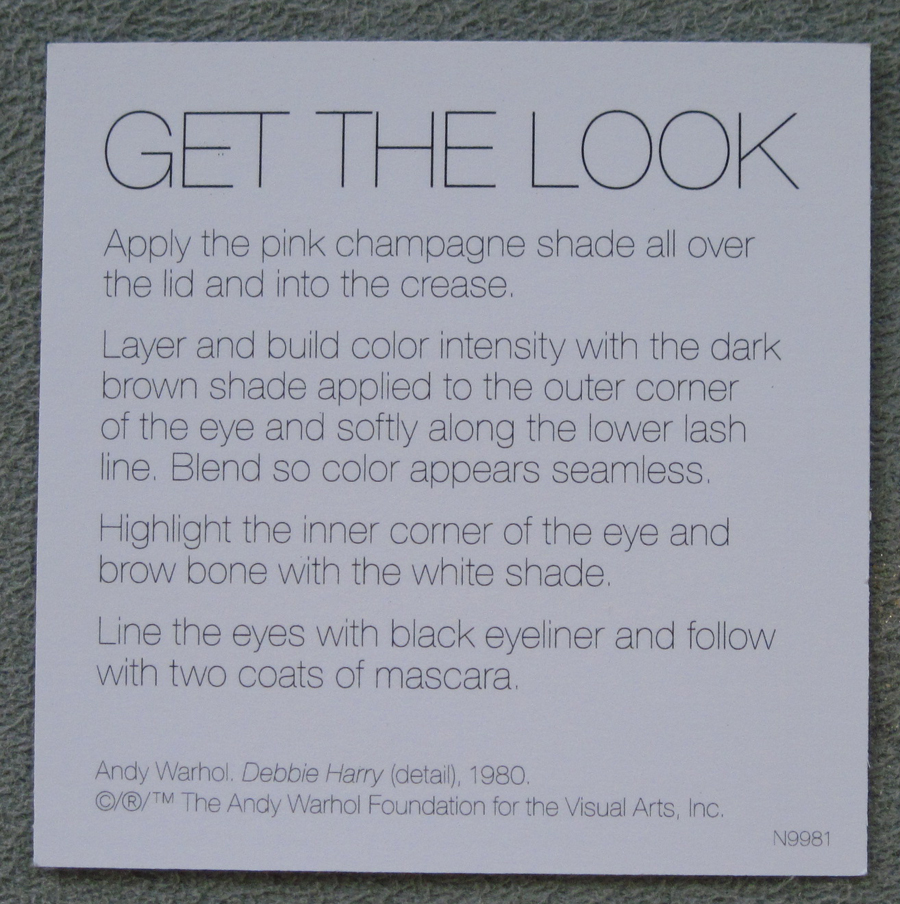
There were these little “Get the Look” cards to show you where to place each color.
Flower Palette No. 2:
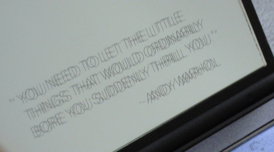
Quote: “You need to let the little things that would ordinarily bore you suddenly thrill you.”
Get the Look card:
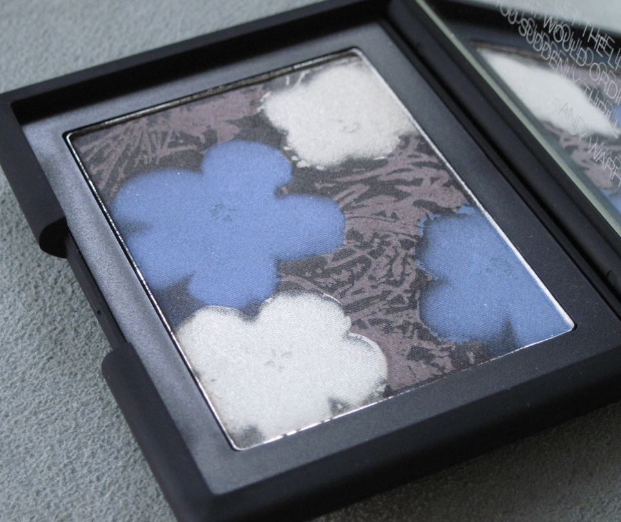
Flower Palette No. 3:
With flash:
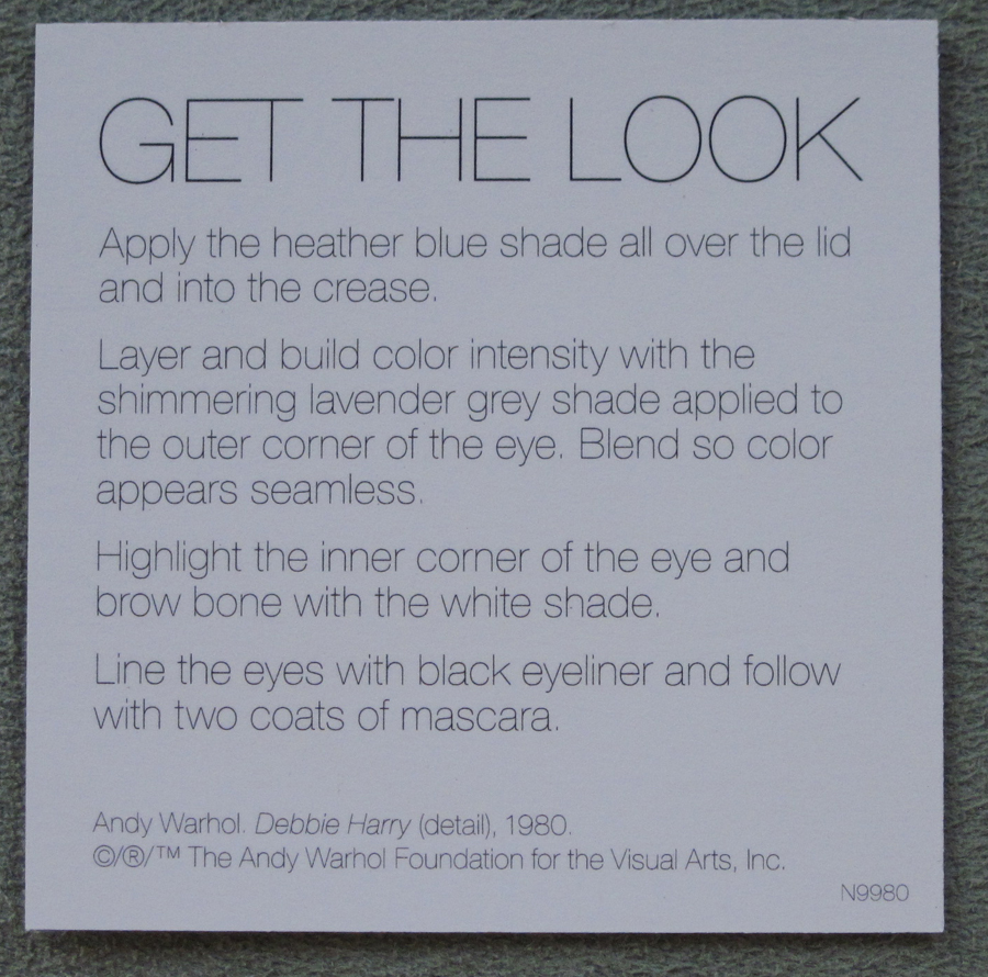
Get the Look card:
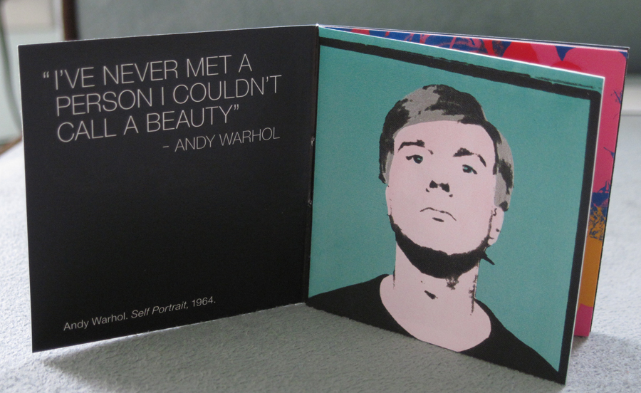
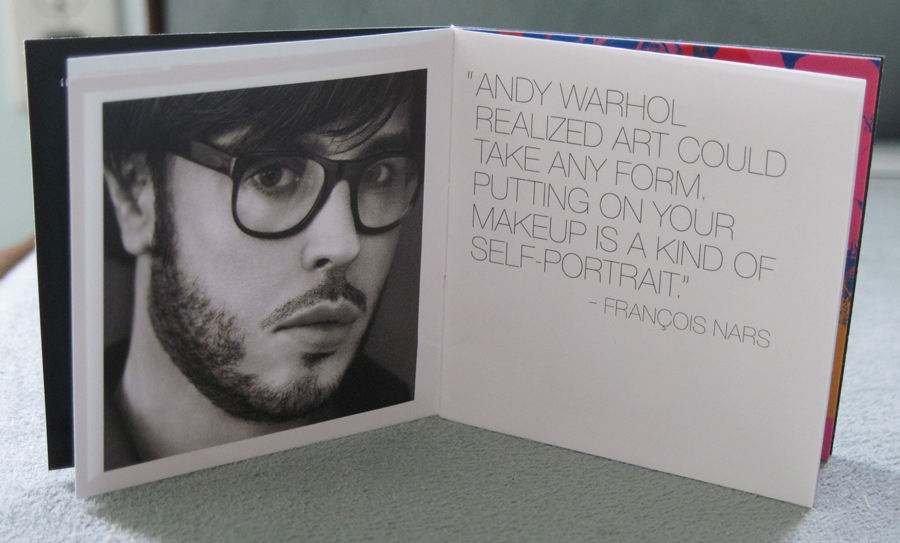
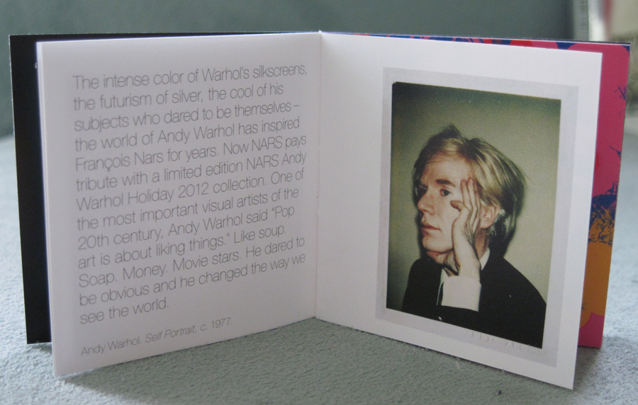
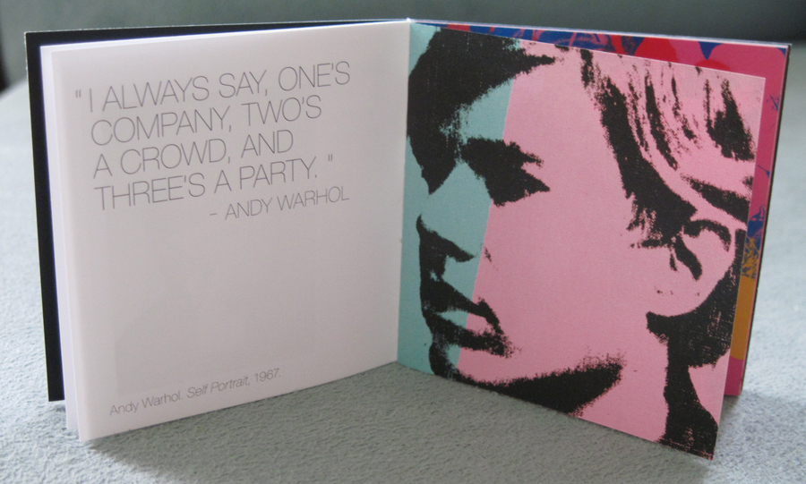
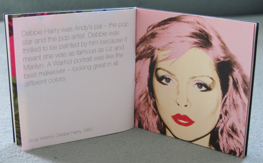
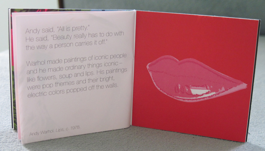
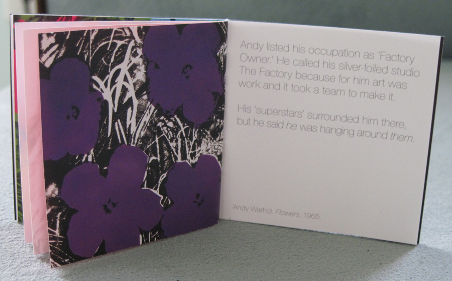
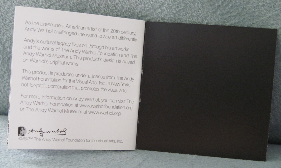
All three palettes also came with this adorable booklet, which was also quite informative.
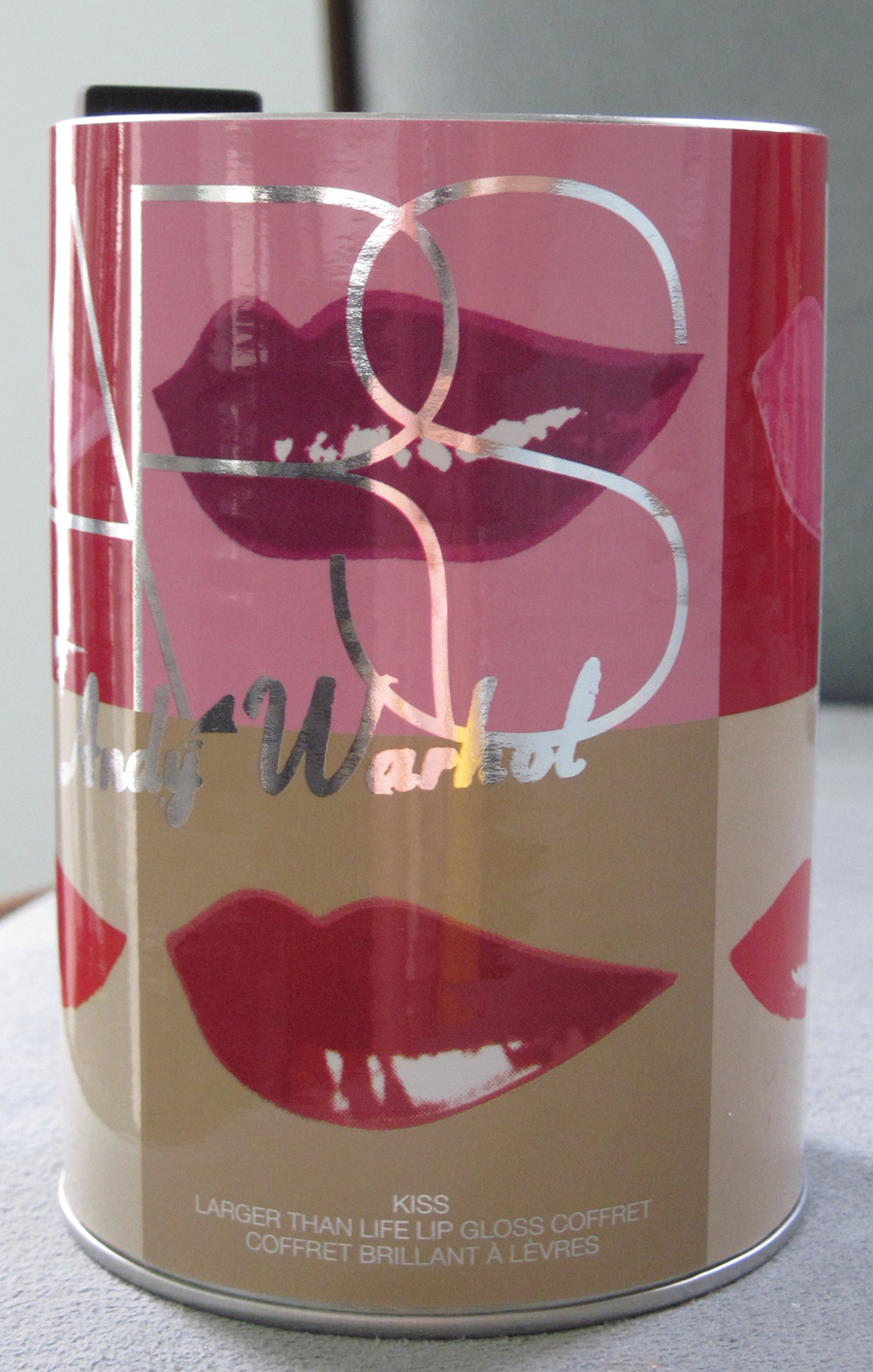
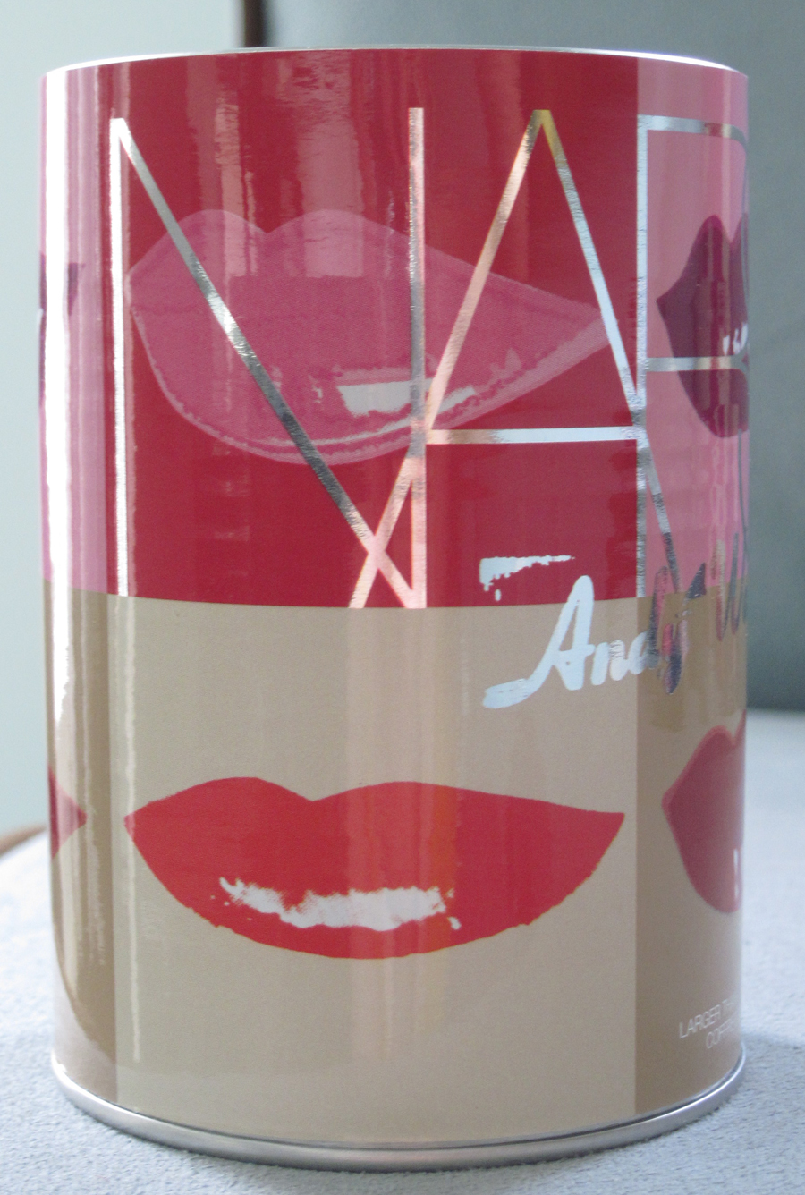
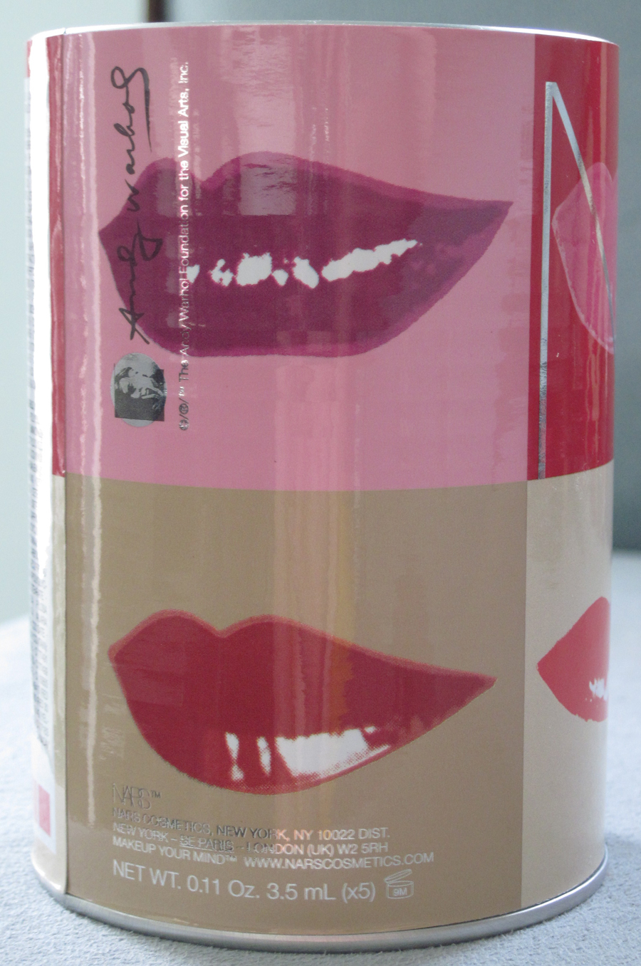
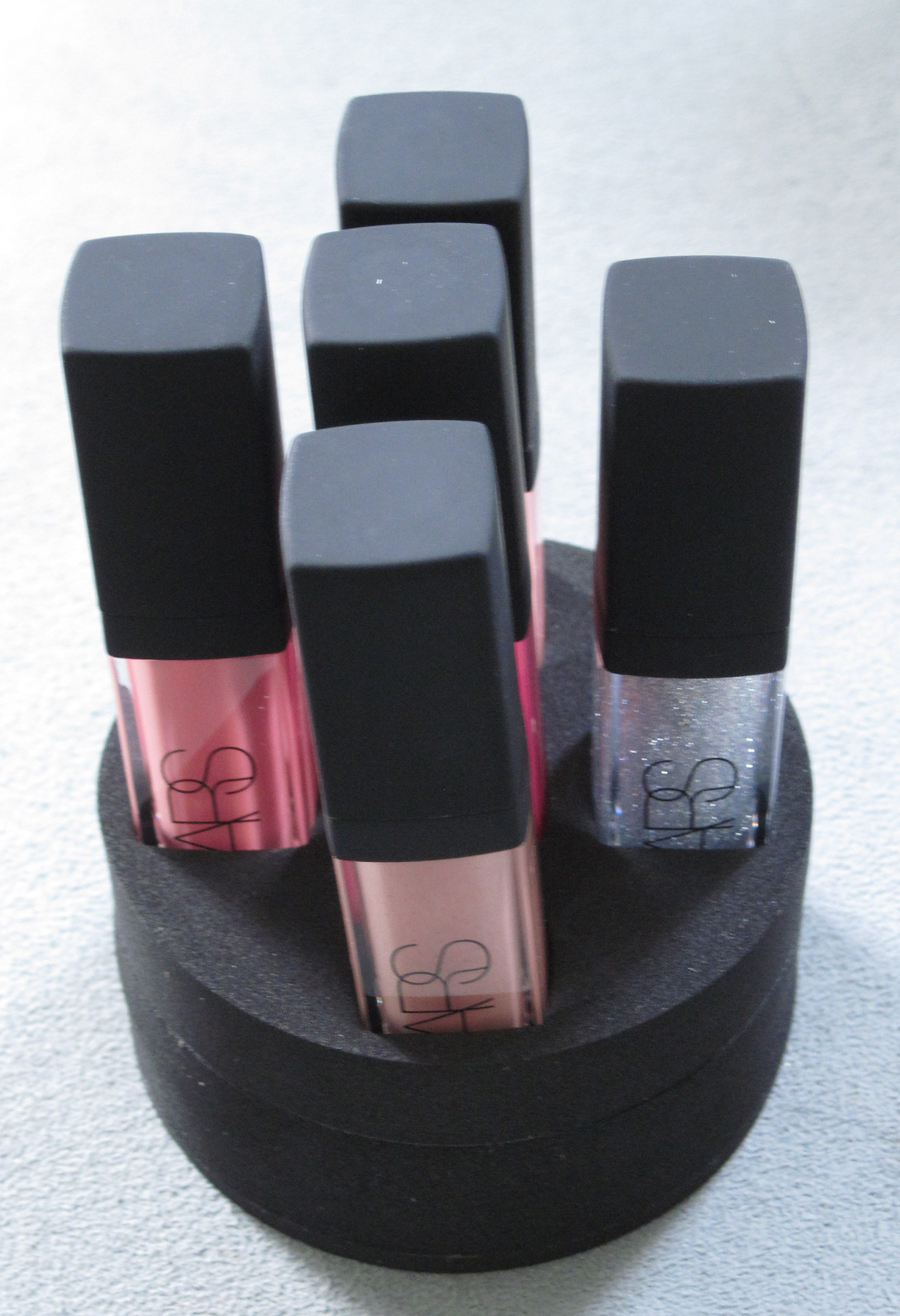
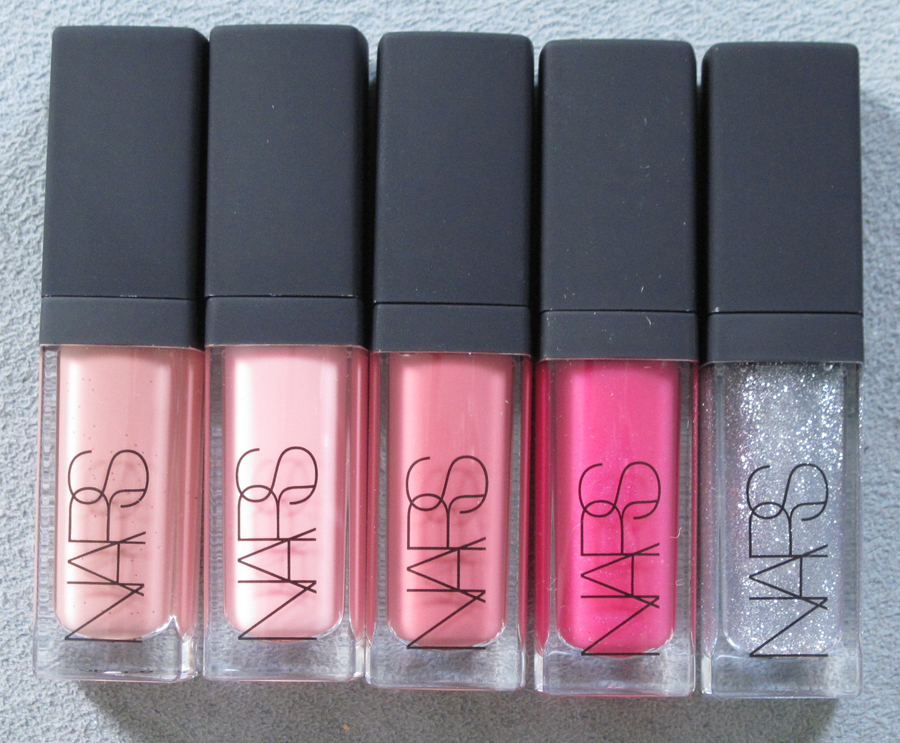
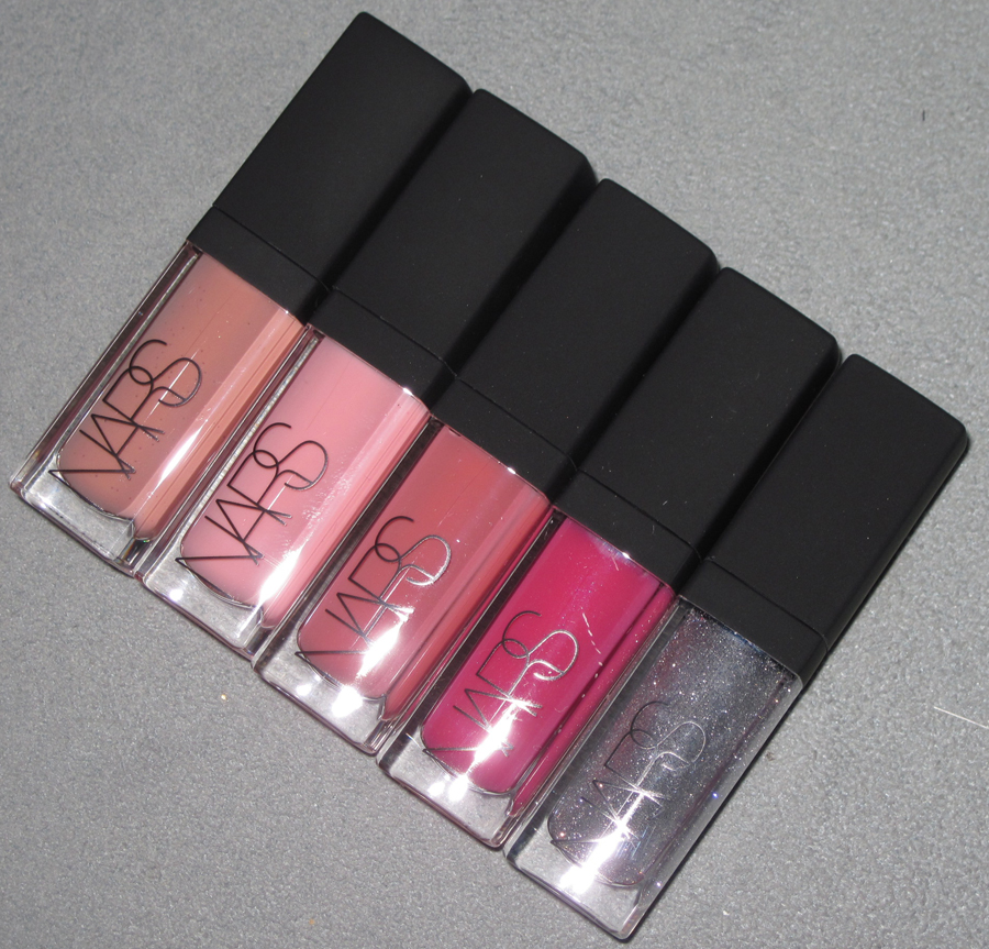
Another item I picked up from the Pop collection was the Kiss Gift Set, a set of five lip glosses housed in a collectible soup can printed with Warhol’s Lips. Each has a Warhol-related name: Silver Factory, Drella, Chelsea Girls, Blue Movie and Myths.
Unfortunately I wasn’t able to find much written about these particular Lips. Everything was either about Marilyn Monroe’s Lips (1962) or Stamped Lips (1959).
Within the can there was this nifty foam holder for the glosses so that they didn’t slide all over the place.
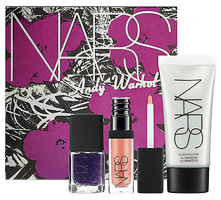
This collection is truly huge – there’s also this Walk on the Wild Side gift set featuring the aforementioned Flowers:
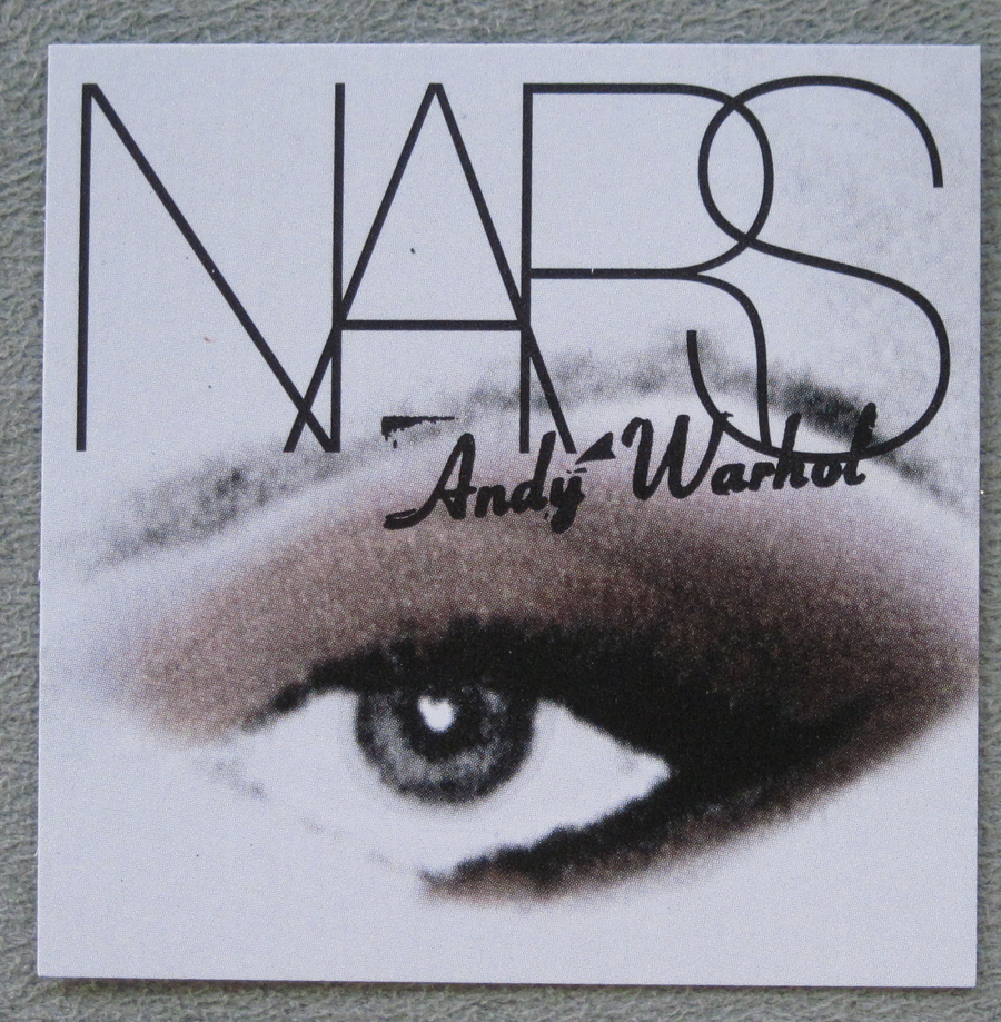
And this Debbie Harry Eye and Cheek Palette. “Inspired by Warhol’s use of ‘Diamond Dust,’ the palette’s colors sparkle with glitter and Diamond Powder, made of real micronized diamonds.”
Debbie Harry became friends with Warhol in the late 70s as her band Blondie was taking off. In 1980, Warhol invited Harry to sit for a portrait. He took hundreds of Polaroids and chose the one he liked most to silkscreen.
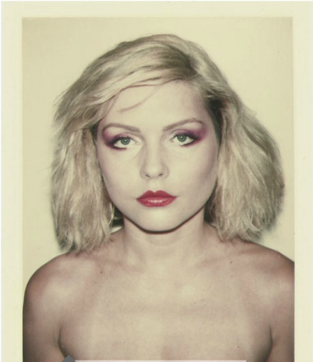
(image from christies.com)
Here is the pink version of the finished silkscreen, which realized $5,981,095 at a recent Sotheby’s auction.
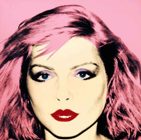
(image from artinfo.com)
The description from the Sotheby’s catalogue is better than anything I could come up with, so here goes:
“Built up of no fewer than five silk-screened layers of ink over the coloured acrylic ground, this portrait stands head and shoulders above its peers as a masterclass in the genre. Painted at a late high point in Warhol’s career, on the eve of the decade which saw a renewed creative enterprise in his art, Debbie Harry sits squarely in the lineage of great portraiture that links his images of the stellar trinity of Liz Taylor, Marilyn Monroe and Jackie Kennedy in the 1960s with his final fright-wig self portraits in the 1980s. Like the early portraits of female stage stars, Debbie Harry reveals Warhol’s lifelong fascination with celebrity and beauty; like his final self portraits, it exhibits the sheer perfection of Warhol’s flawless silkscreen technique, honed and refined over two decades…With the excellent registration of the silkscreen impression, Warhol juxtaposes Harry’s purple eye shadow, dark mascara, red lips, and distinctly strong bone structure against shocking pink hair and like colour background. The full frame composition, the arresting gaze of the subject and the seductive purse of the lips all lend wonderful plasticity to the work and exacerbate the carnality and sensuality of the subject matter…By 1980 Warhol’s silkscreen technique had been absolutely perfected in the present work there is a wonderful balance between the crisp record of the overall form, together with softer, more subtle areas of screen that shape the shadows around her eyes, cheek and neck. Warhol’s mastery of the technique allows him to explore the various nuances available to him within the silkscreen medium in this particular work. By using high contrast Polaroids, Warhol was able to play with the strong areas of black in the features and the bold swaths of colour in the blown out areas. The heightened photographic detail of Debbie Harry links her to Warhol’s Marilyn paintings where this method was first explored. A duality exists in the artist’s focus on stars and their celebrity as setting them apart, yet by screening and immortalizing their image Warhol seemingly brings them closer to us. Despite how beautiful his women are in life, they all become the more glamorous version of themselves in a Warhol portrait. He repeatedly expressed the utopian idea that everyone is a star, and even with existing stars he was able to catapult them to an elevated level of fame. Deliberately depicted in a flat, planar manner, Debbie Harry becomes akin to a Byzantine Madonna. There is no inquiry into the psychological or emotional depth of the sitter; rather, Warhol has again produced a ‘thing in itself’, an icon of popular culture, unspoiled by the subjective. In the present work, Debbie, like Warhol’s other celebrity women before her, is presented to the viewer as an object to be worshipped. Perhaps intentionally, Warhol chose to only complete four of these 42 by 42 inches silkscreened canvases – perpetuating the enduring allure of the singer and actress. The rarity of the work and the choice of subject matter lend the painting an increasingly mysterious aura that Warhol initially subscribed to his 1960s celebrity images – this work appears to be a metaphorical space for the invisibility of a celebrity’s inner person as opposed to the over-exposed visibility of their public image. Debbie Harry is the ultimate culmination of Warhol’s exploration of our public fascination with female public cultural icons…In this particular canvas, Debbie Harry, a familiar face to the public, has been flattened out by the flashbulb and Warhol has retouched reality by pushing his pictorial facts to an extreme. He does, however, maintain a range of human emotion, and the dialogue between public versus private personality of celebrity is still present. The seductive surface is broken down into bold abstract passages; the unarticulated features are nevertheless seared into our mind’s eye with the force of the contrasting positive/negative of his palette…Debbie Harry truly achieved the iconic symbolic status of popular culture and the present portrait reaffirms both her place and Warhol’s place at the apex of celebrity for eternity.”
In the same year as the Debbie Harry portrait, Warhol completed a series of prints using “diamond dust”, the most notable of images being shoes. He said, “I’m
doing shoes because I’m going back to my roots. In fact, I think maybe I
should do nothing but shoes from now on.” As he was starting out in the 50s, Warhol had worked as a commerical illustrator, making shoe advertisements for the I. Miller Shoe Company and Glamour magazine. Thus, he “recognised high-heels as agents of metamorphosis by which a
quotidian necessity of dress could become a totem of glamour…A deceptively straightforward motif, Warhol’s preoccupation with shoes is, in actuality, ripe with implications. On the most basic level, Warhol recognized the enormous subtext a pair of shoes communicates: their quality, make and style are fundamental financial status markers, just as they are also a basic means of personal expression. Warhol was thus not only fascinated by the power footwear is capable of conveying, but he also identified his own financial stability with his shoe renderings. He once remembered, ‘When I used to do shoe drawings for the magazines, I would get a certain amount for each shoe, so then I would count up my shoes to figure out how much I was going to get. I lived by the number of shoe drawings – when I counted them I knew how much money I had.'” (source)
In 1979, Rupert Smith introduced Warhol to a new material made from diamonds that he thought Warhol could use in his silkscreens. Warhol, with his extensive jewelry collection and his association of gems with movie star glamour and fame, was immediately taken with the idea of using this diamond dust. However, it proved to be too dry and not sparkly enough for Warhol, so Smith ordered pulverized glass from a supply company which yielded larger crystals. I think Warhol would have gotten a kick out of the fact that the micronized diamond particles used in the palette were based on his diamond dust, which was actually made of glass (but obviously, glass would not be suitable for wearing on your eyes or anywhere near your face, for that matter).
Warhol carefully arranged the shoes on white paper, and, as with the portrait of Debbie Harry, took Polaroids and picked one that appealed to him the most. “One of the most strikingly original intentions of this
choreography is that the final edited image dissects the fields of
abstraction and figuration, so that the outlines of the flattened shapes
invite contemplation on the semiotic associations of visual cognition.
The subject of shoes and the objects themselves always held particular
power over Andy Warhol, and this late work, executed when he was in his
early fifties, attempts to capture on grand scale his belief in the
alchemical power of high-heels…clearly these high-heels stand as talismanic trophies of an
alluring existence, and even as stand-in celebrities themselves. Diamond
Dust Shoes is testament to some of the most important of the themes
that lie at the heart of Warhol’s output, and its stark silhouettes,
floating across the limitless depths of reflective powder, strike an
unforgettable and mesmerising work of art.” (source) Additionally, Gagosian Gallery held an exhibition in 1999 devoted to Diamond Dust Shoes. Warhol’s friend Vincent Freemont later remarked, “The merger of women’s shoes and diamond dust was a perfect fit… Andy created the Diamond Dust Shoe paintings just as the
disco, lamé, and stilettos of Studio 54 had captured the imagination of
the Manhattan glitterati. Andy, who had been in the vanguard of the New
York club scene since the early 60’s, once again reflected the times he
was living in through his paintings.”
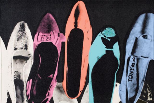
(image from artnet.com)
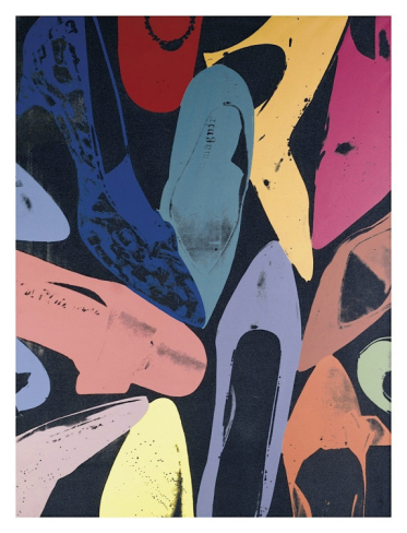
(image from art.com)
So that about does it for this portion of the Andy Warhol collection for NARS (hopefully you made it this far!) What is your favorite piece from the collection and favorite artwork it was based on? While I didn’t buy the Debbie Harry palette, I am in love with the idea of diamond dust and how Warhol applied it to images of shoes. But my favorite pieces from this part of the NARS collection, overall, are the flower palettes.


