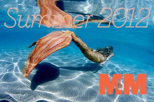
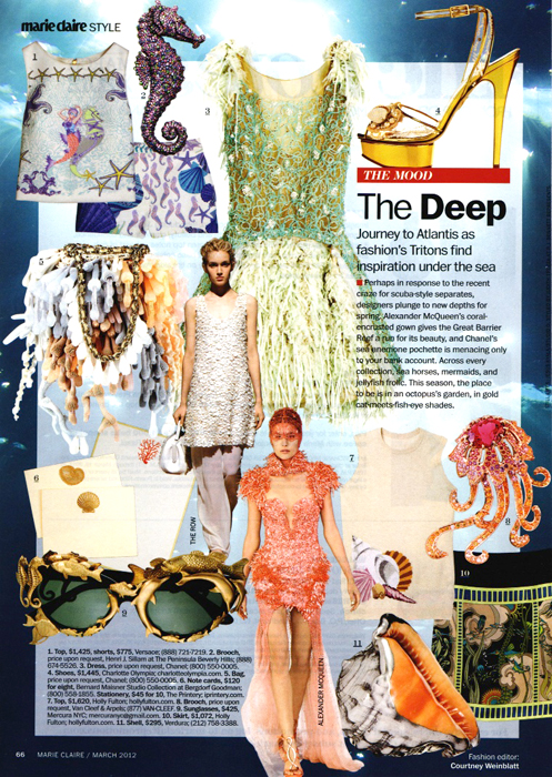
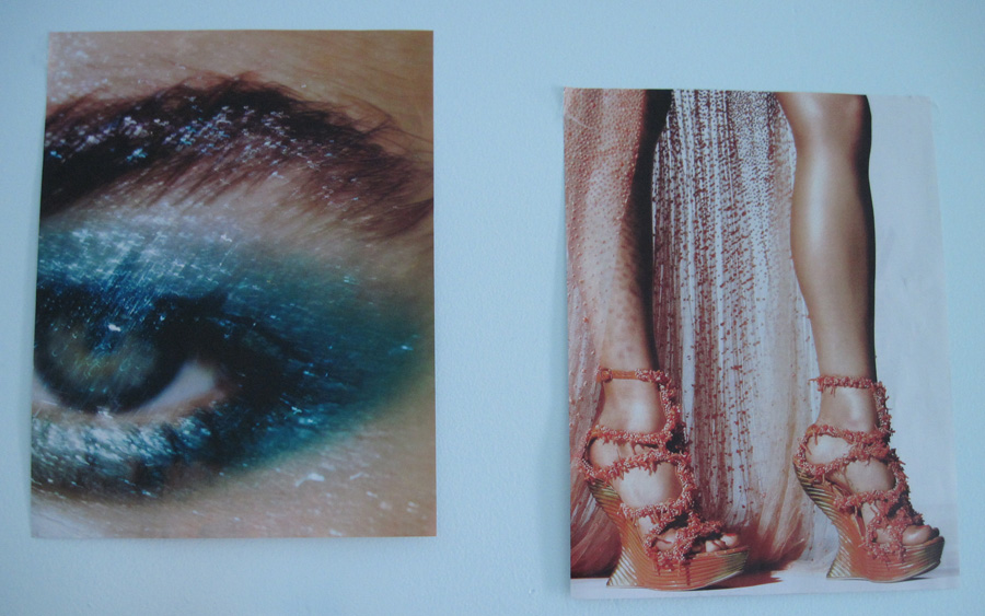
This exhibition was inspired by the "under the sea" trend that hit the runways for the spring/summer 2012 fashion collections – specifically, the ethereality and mystery contained within the dark depths of the sea as well as the play of light on the ocean. I loved Armani's concept of moonlight reflecting off the sea's surface, Versace's more literal take on the underwater theme, and McQueen's mind-blowingly gorgeous representation of ruffly anemones and seaweed in dress form, which appear to be swayed by ocean currents, along with a breathtaking dress dripping with coral. Here's the trend as rounded up by Marie Claire:
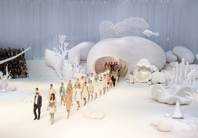
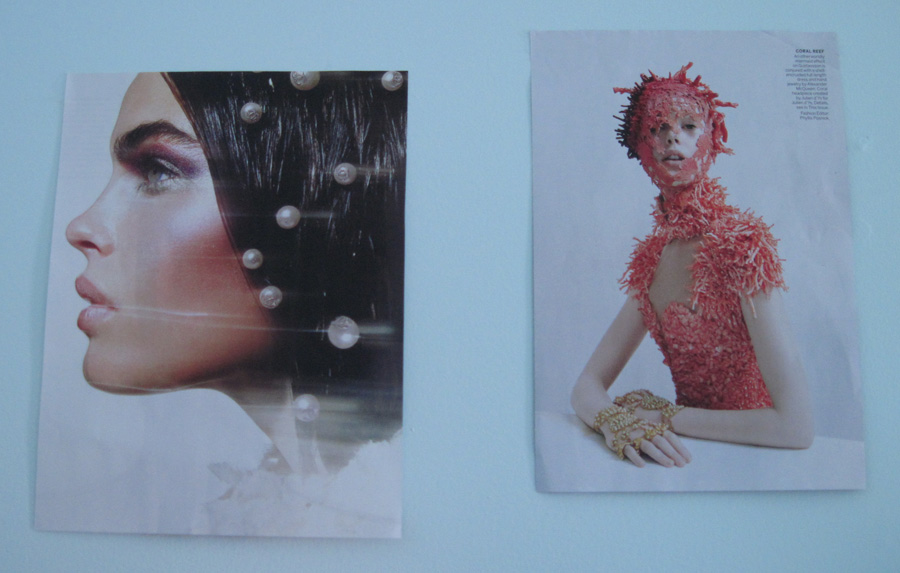
But I was most taken with Chanel's spring 2012 collection, which Vogue described as "an aquatic wonderland of gleaming white stingrays and sea horses adrift amongst coral branches and shells on a sandy sea bed. [The] models…looked like magical deep-sea sirens, from the pearls scattered in their hair to the sea-urchin shells that propped up the heels of their sandals." Here are some of my favorites from this collection.
First, the catwalk, which was totally amazing – if I had a real space for the Museum I'd do something just as extraordinary.
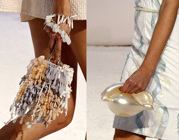
The accessories:
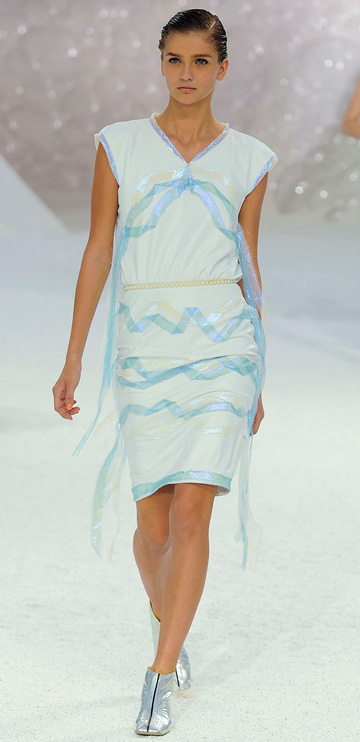
This dress, whose tendrils remind me of seaweed or even jellyfish tentacles gently flowing underwater:
And finally, the subdued makeup with pearl accents:
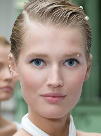
(images from tooclothesminded.com, vogue.com and fashionindie.com)
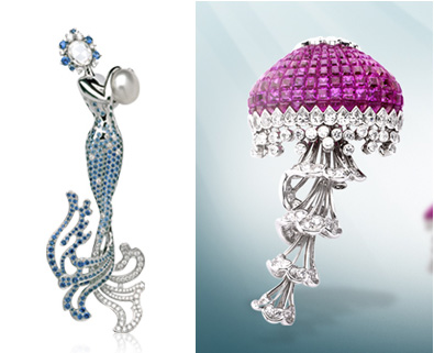
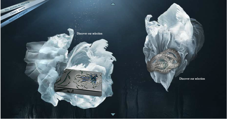
I was also intrigued by Van Cleef and Arpels' Atlantide collection, which featured a host of ocean-inspired pieces such as these beautiful mermaid and jellyfish pins.
But what really blew me away was the mini site the company set up for the collection – it perfectly articulates the feel I was going for. Here are some screenshots of it (but you should really visit the site directly to get the full effect):
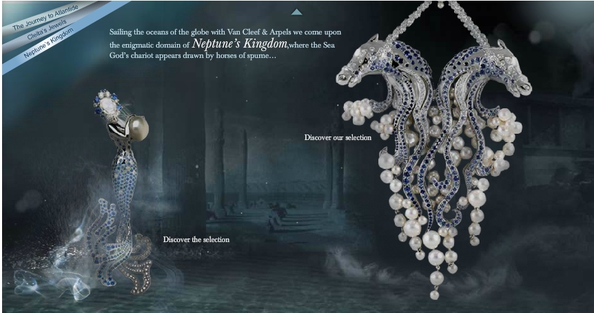
(images from vancleefarpels.com)
Of course, while I wanted to bring out an otherworldly, ethereal mood, I couldn't resist throwing in a few "fun" pieces as well – MAC's cheeky Hey Sailor! collection and a couple of Too-Faced's summery Quickie Chronicles capture the more carefree side of summer. I also chose pale blue paper for the labels, which I thought went well with the themes.
So that's what was going on in the Curator's noggin when setting up this exhibition. Enjoy!
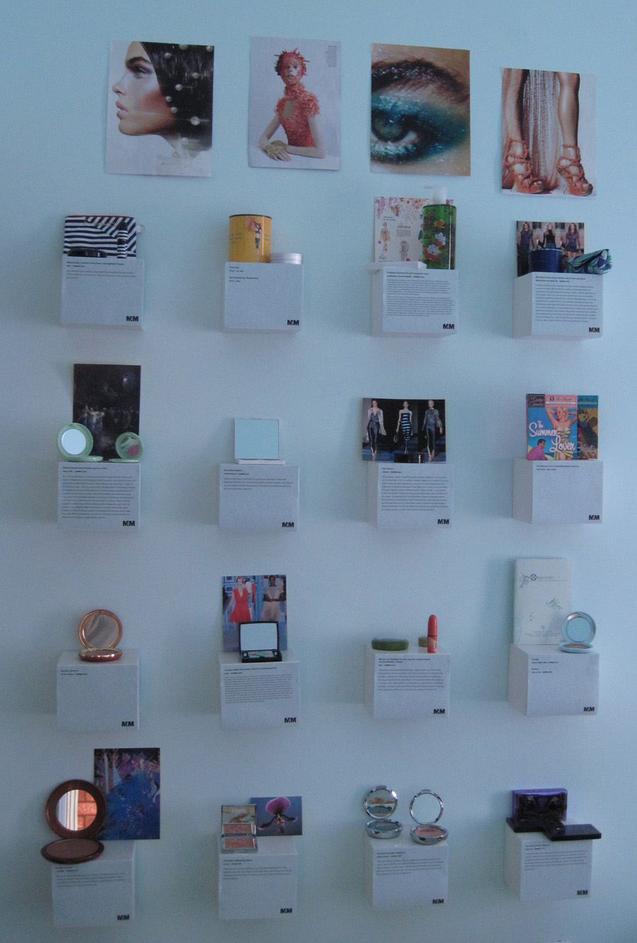
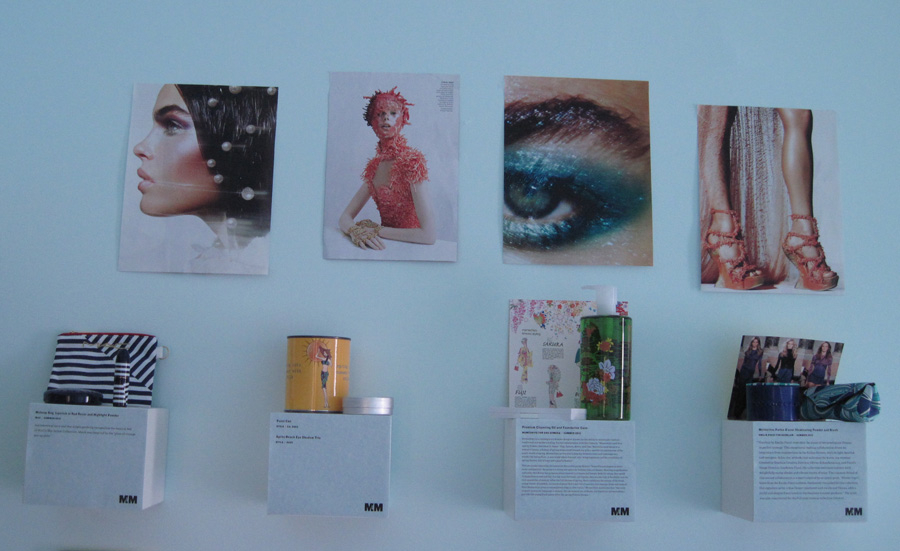
The top shelf, plus images from Vogue magazine that I was completely smitten with.
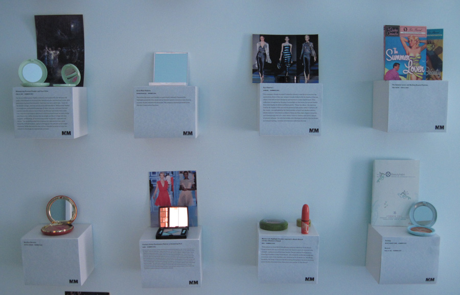
Middle shelves:
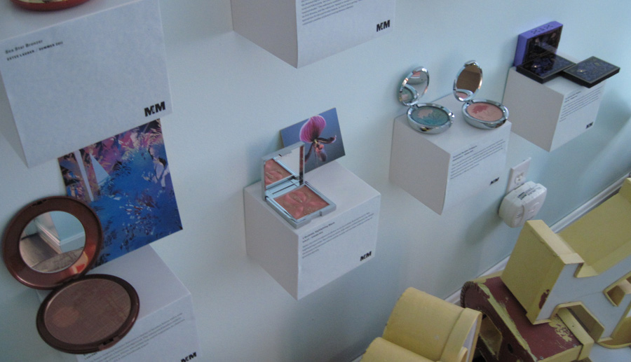
Bottom shelf:
Now for the individual shelves. Starting at the top, from left to right.
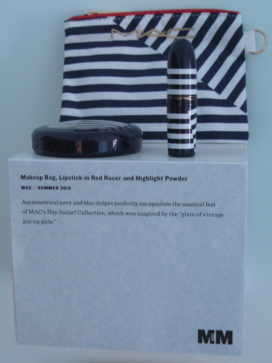
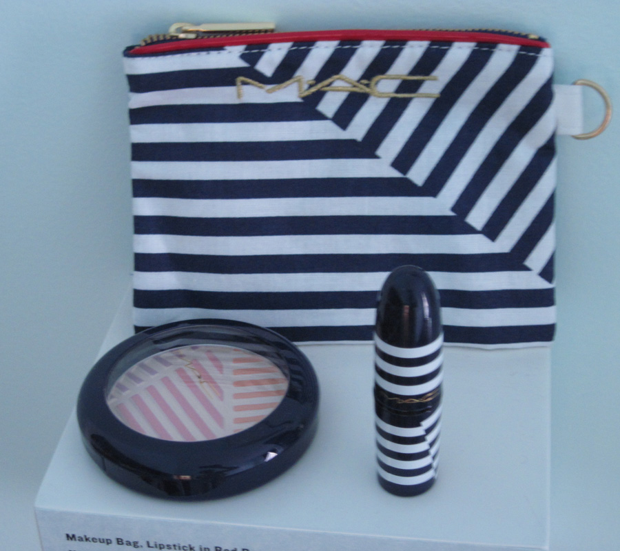
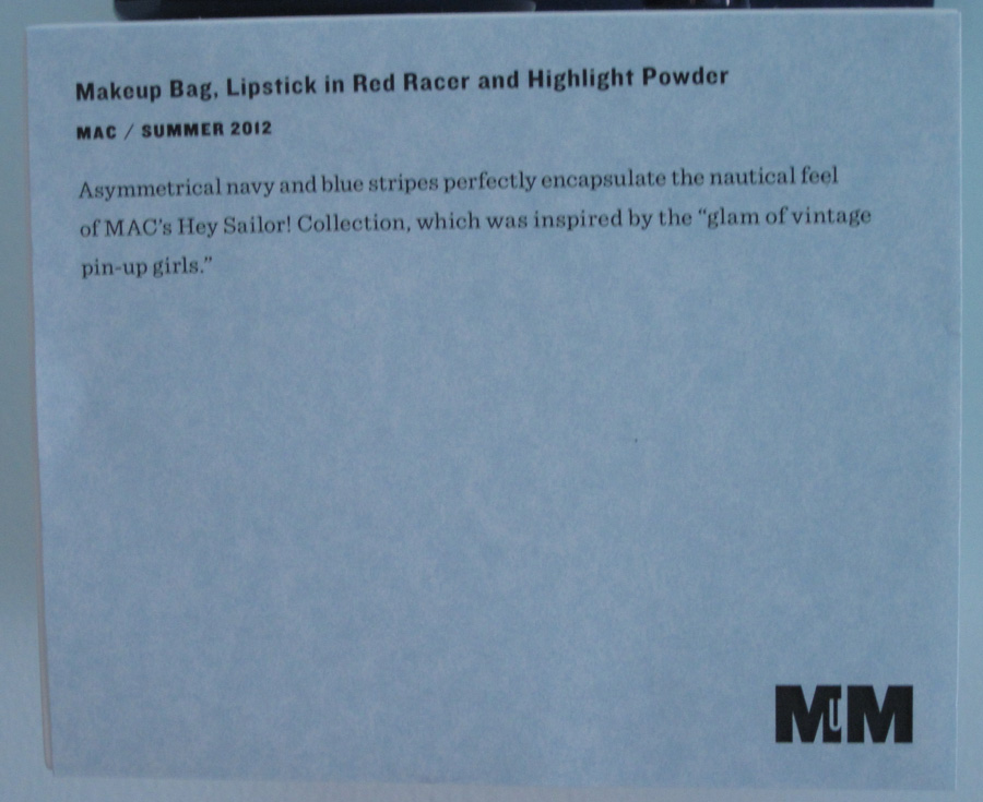
MAC Hey Sailor! collection:
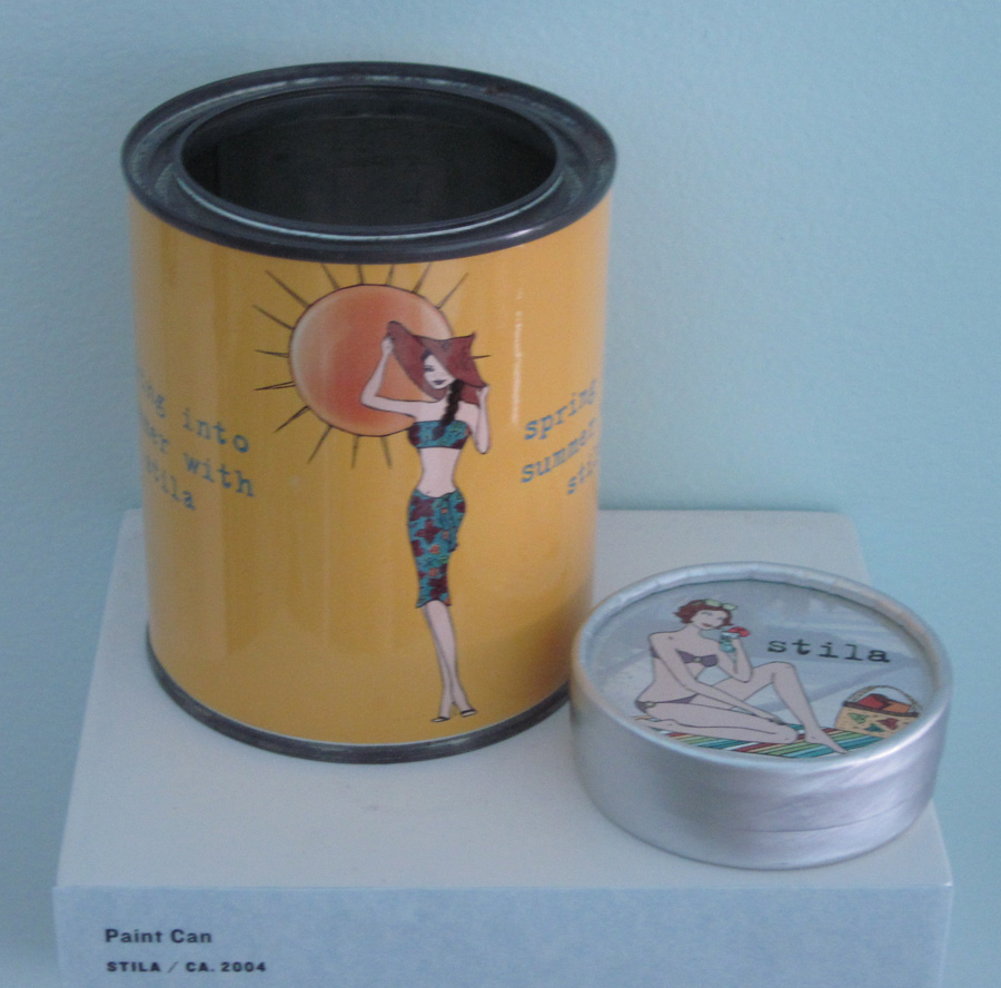
Some vintage Stila summer items:
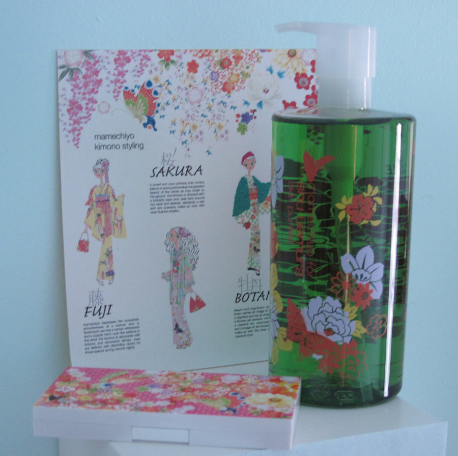
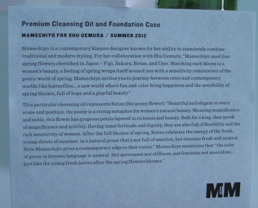
Mamechiyo for Shu Uemura cleansing oil and foundation case. This was a tough one, as the Mamechiyo collection deserves its very own exhibition.
Second shelf, from right to left.
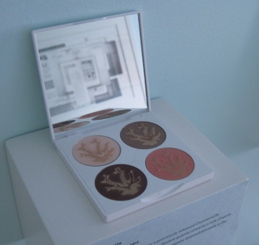
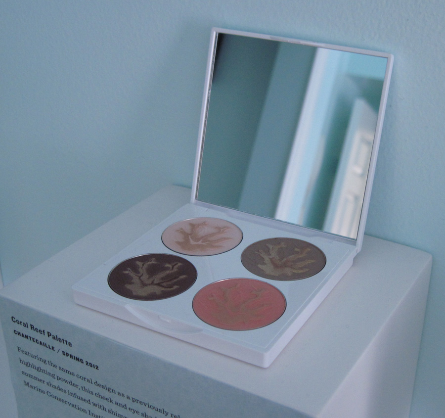
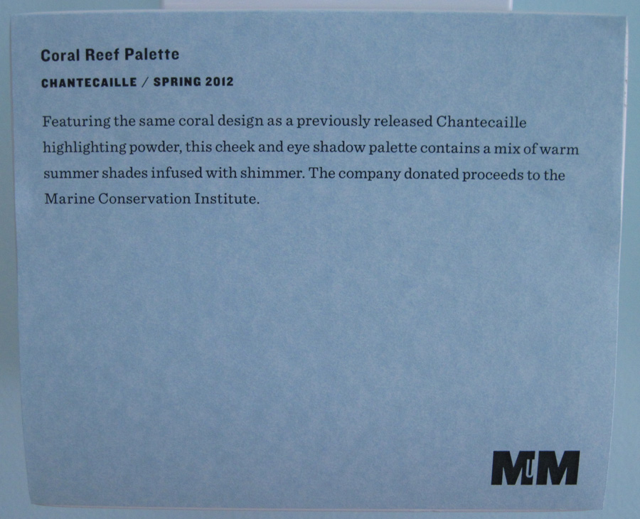
Chantecaille Coral Reef palette:
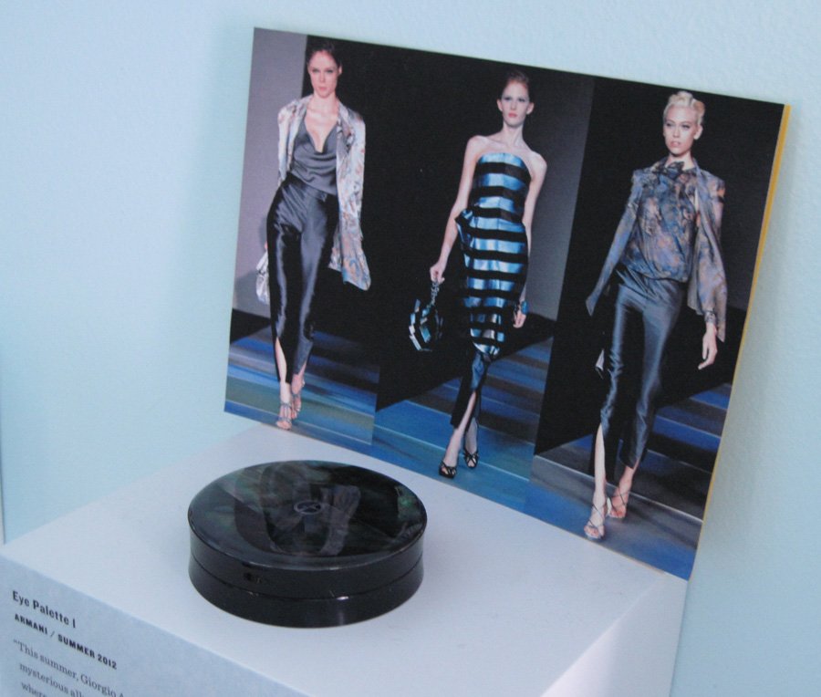
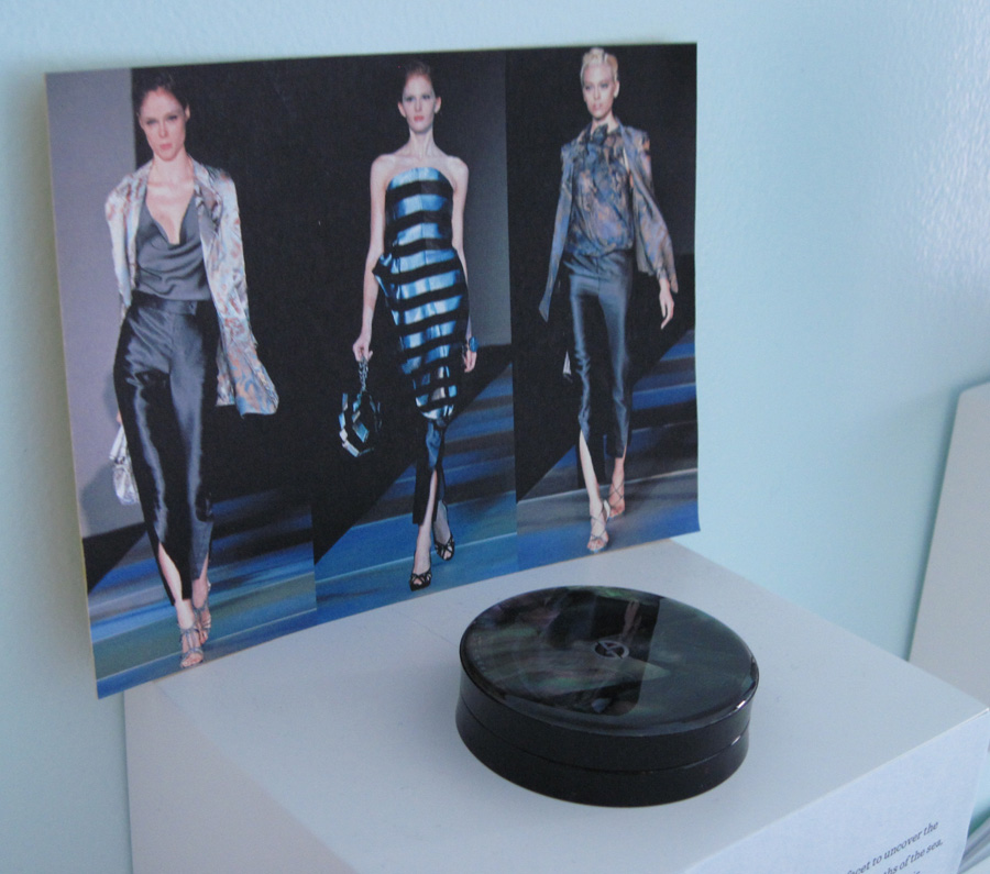
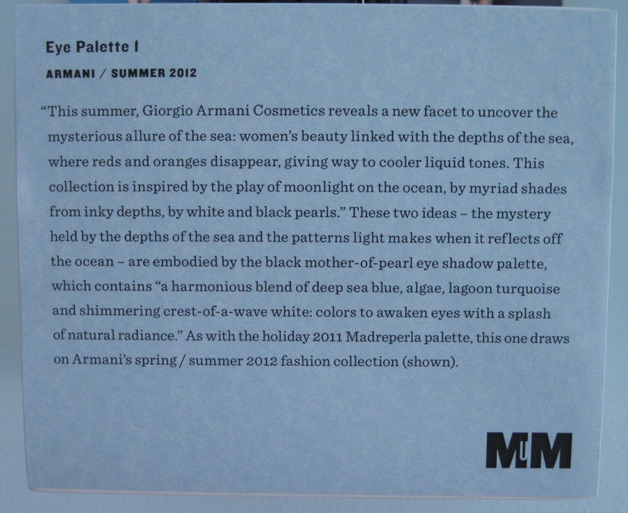
Armani summer 2012 palette:
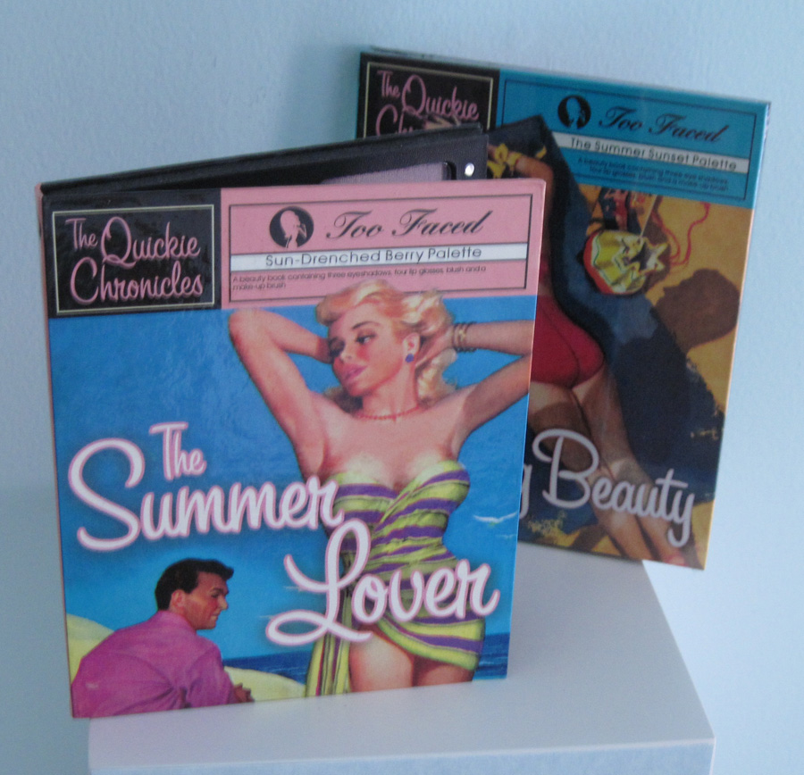
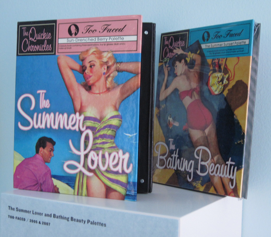
Too-Faced Quickie Chronicles palettes:
Third shelf, left to right.
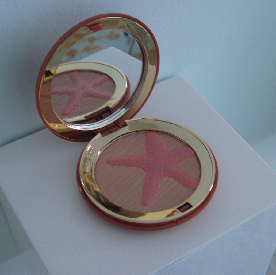
Estée Lauder Sea Star bronzer:
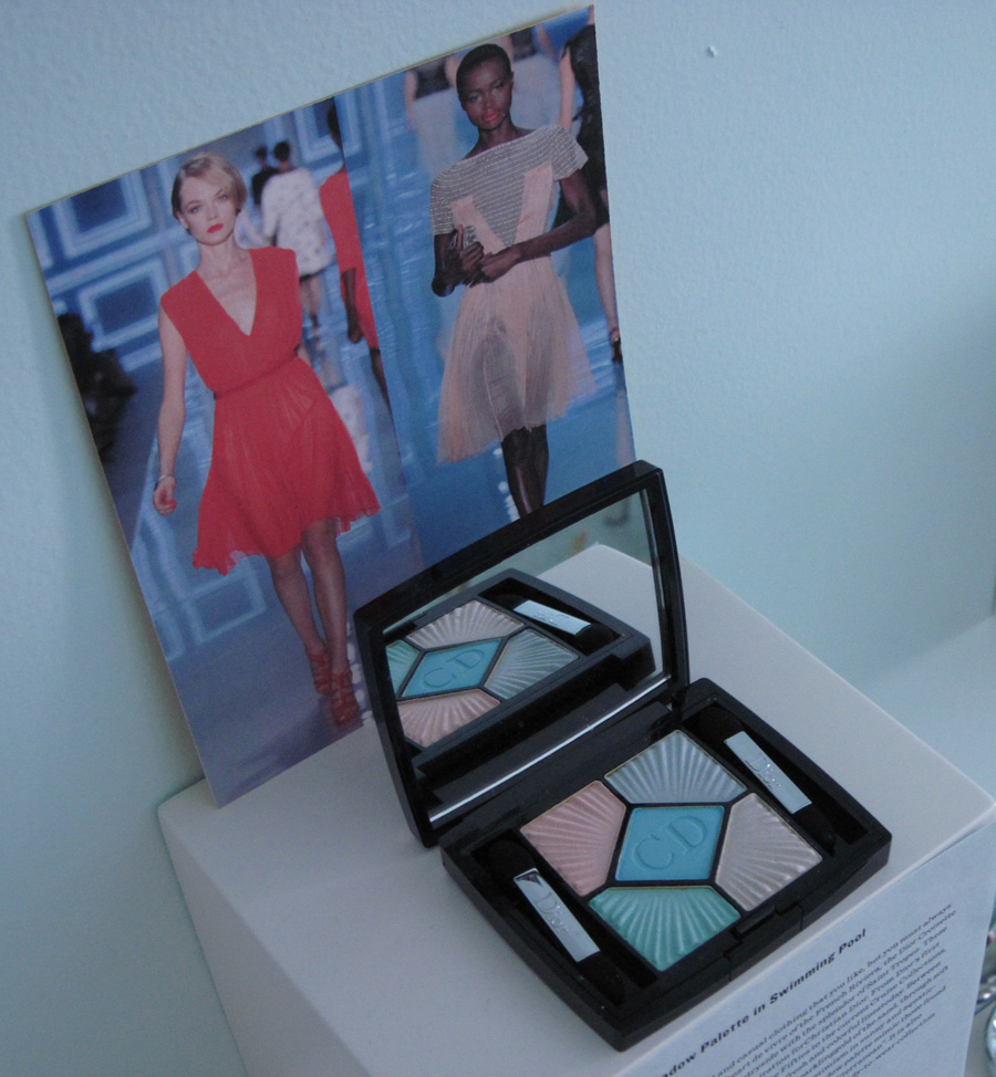
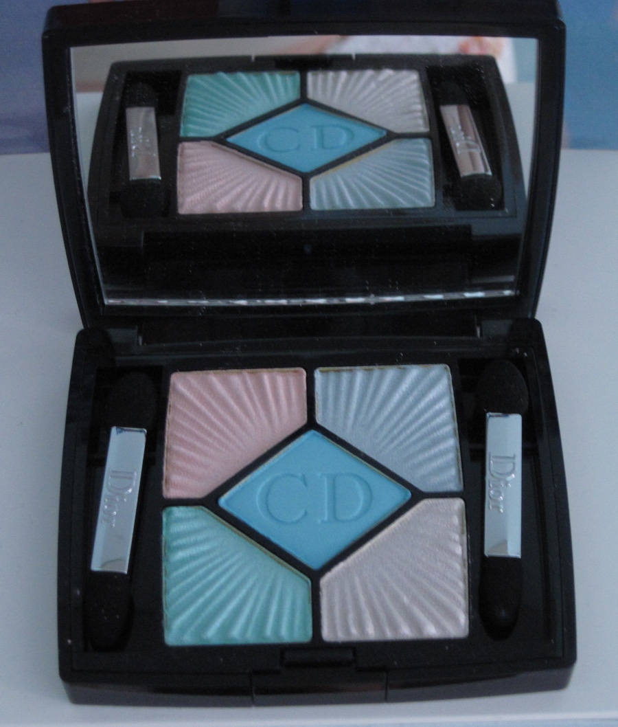
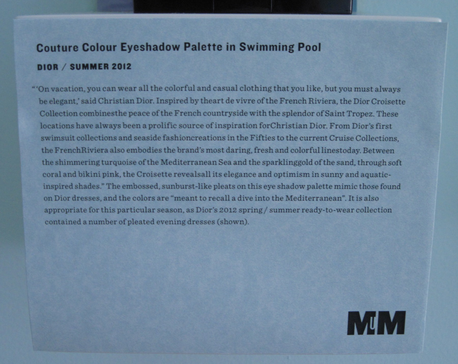
Dior eye shadow palette in Swimming Pool:
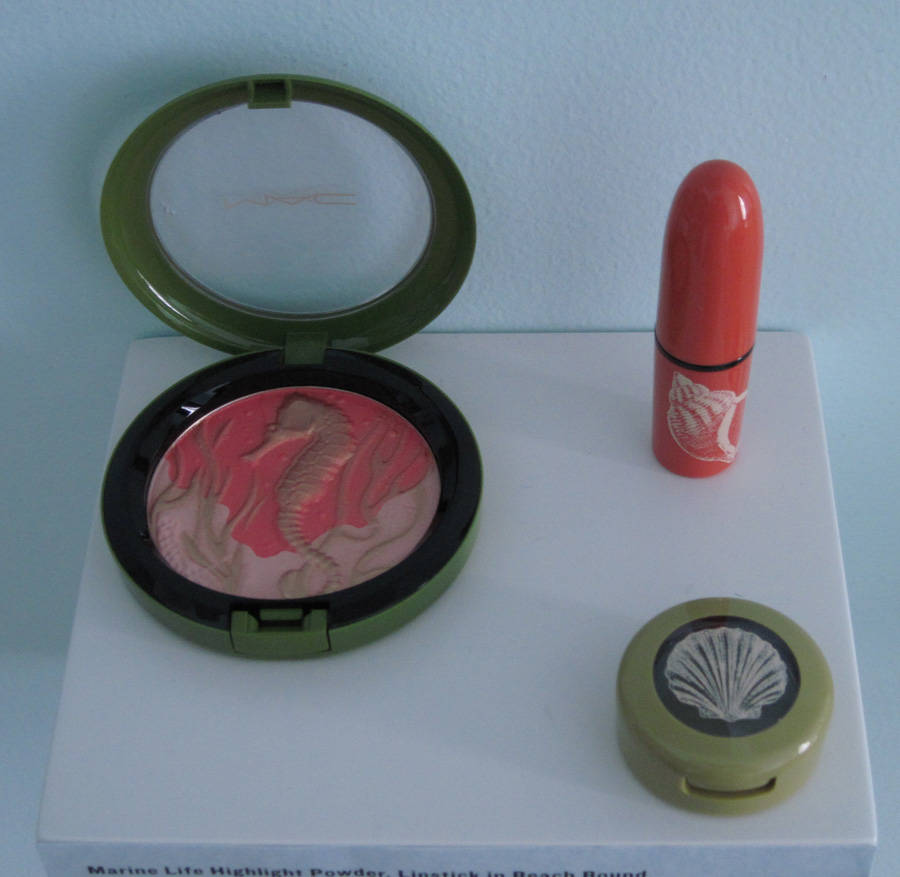
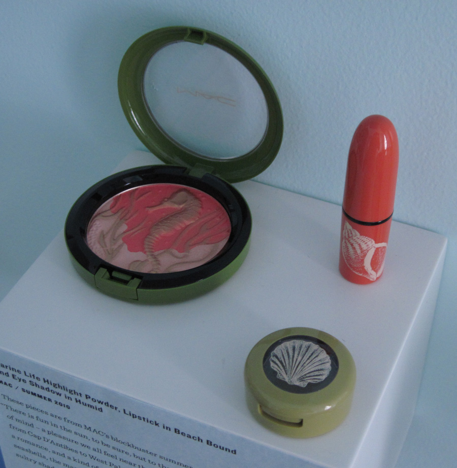
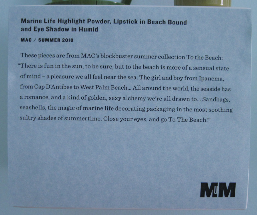
MAC To the Beach items:
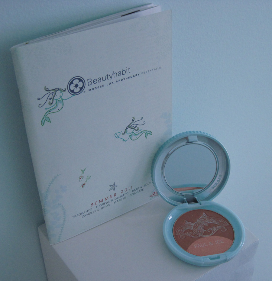
Beautyhabit.com catalog and Paul & Joe bronzer:
Bottom shelf, left to right.
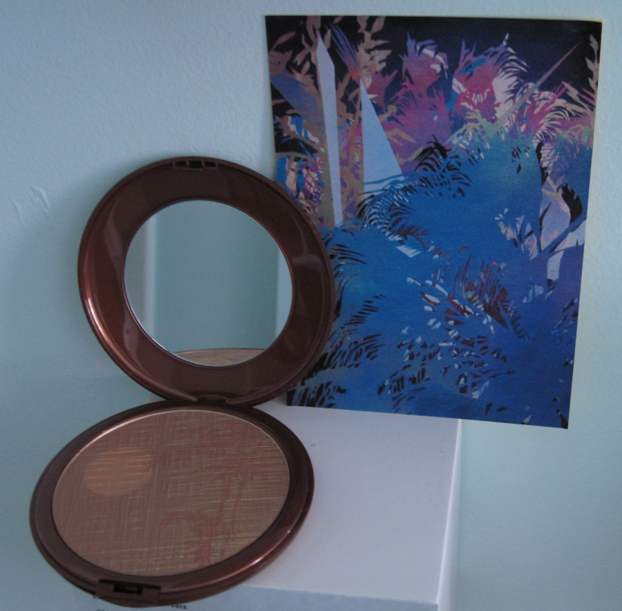
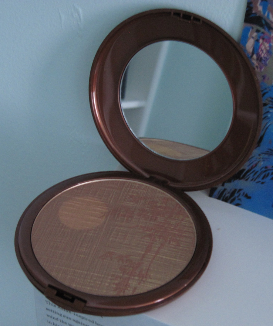
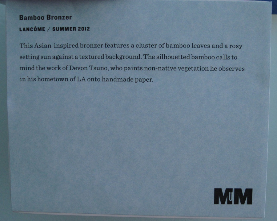
Lancôme Bamboo bronzer:
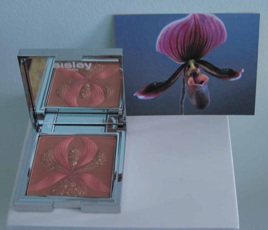
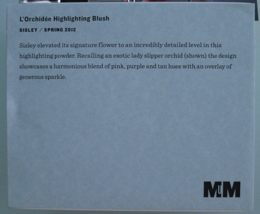
Sisley L'Orchidée palette:
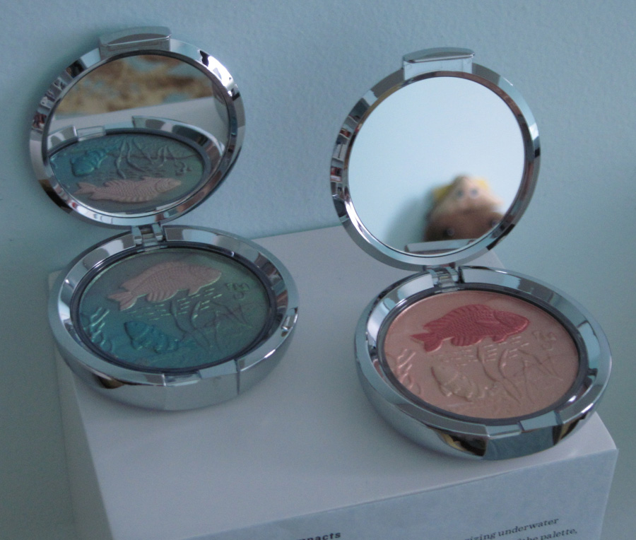
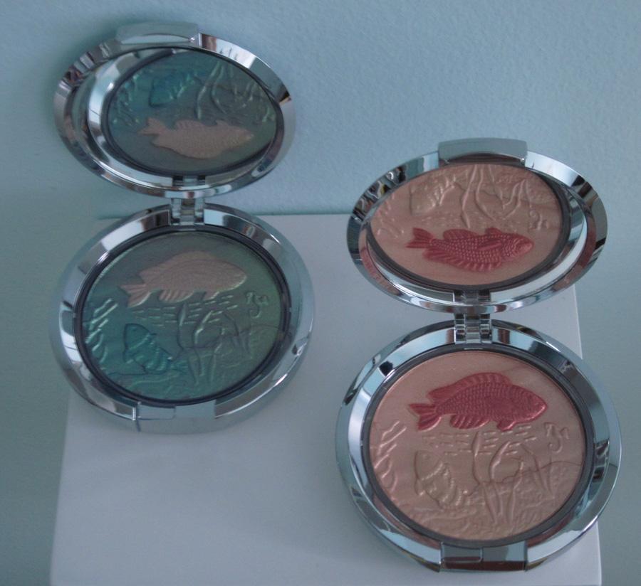
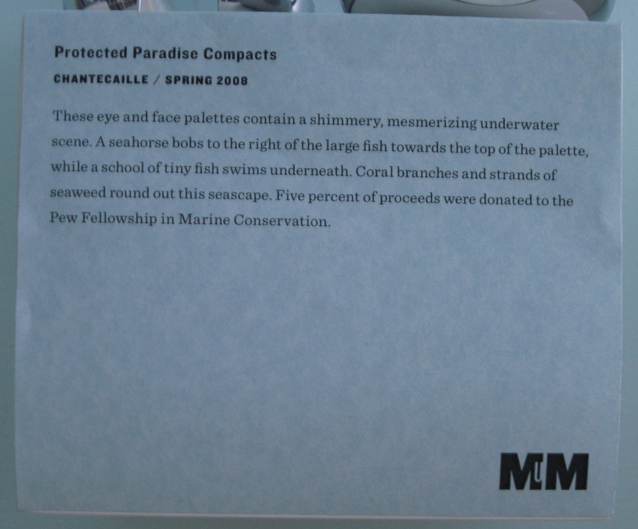
Chantecaille Protected Paradise palettes:
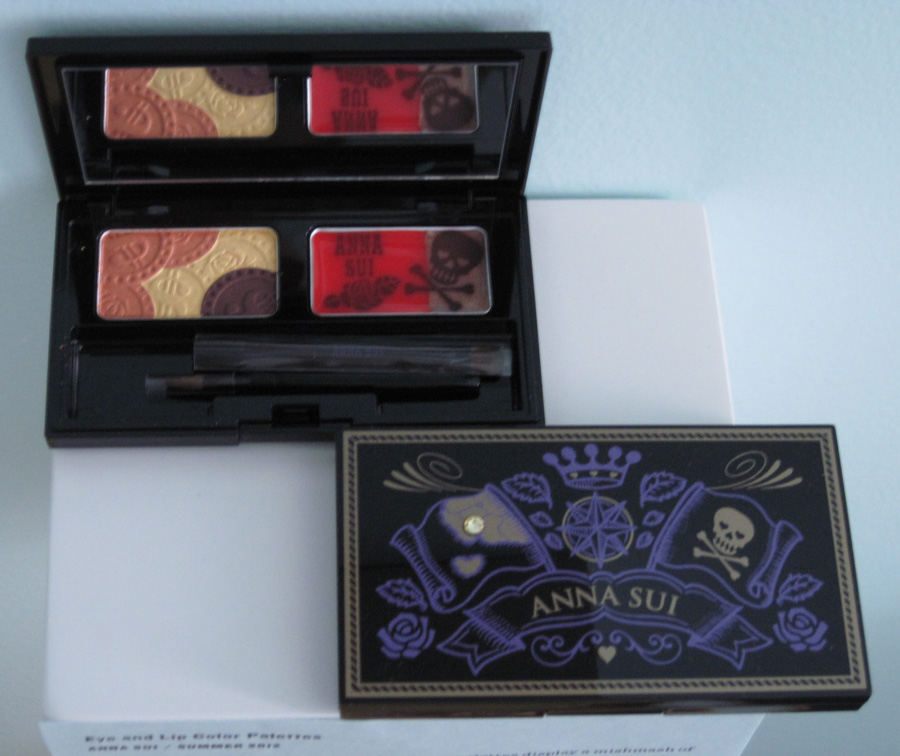
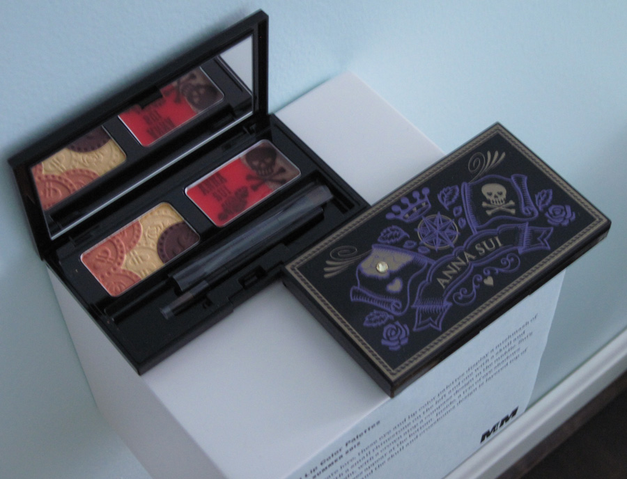
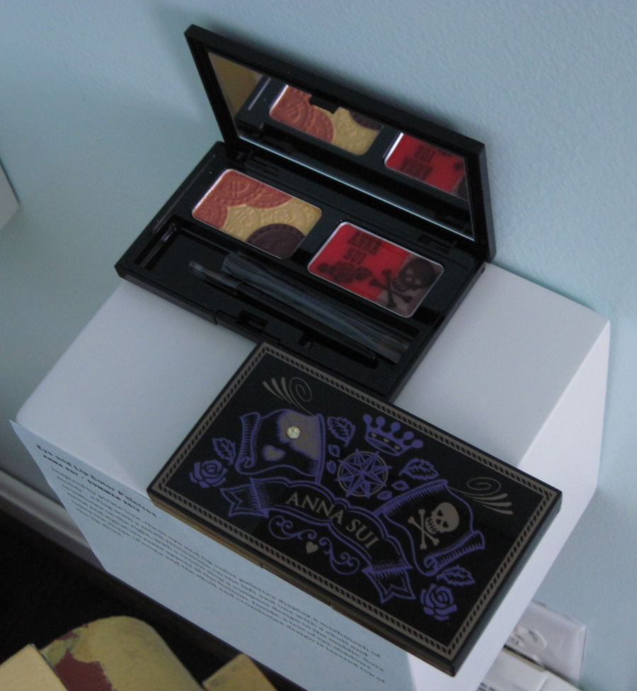
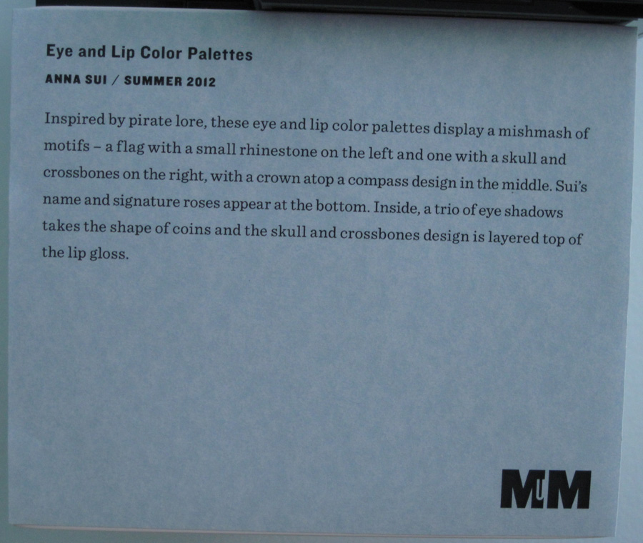
Anna Sui Eye and Lip palettes:
So what do you think? Please leave feedback in the comments!


Looks great, sailor!
Looks great, sailor!
Thank you so much!! I’m so happy and humbled that you stopped by!!
Thank you so much!! I’m so happy and humbled that you stopped by!!
what a beautiful display! enraptured!
what a beautiful display! enraptured!
Many thanks!! Positive feedback is always appreciated!!
Many thanks!! Positive feedback is always appreciated!!